
Sherif Wiwoloku
Brand Designer




Proud to share one of our latest branding projects from the studio Amion Farms, an agricultural brand created to represent a modern, responsible, and forward-thinking approach to farming.
The challenge was to create more than just a logo. We wanted to build a complete visual identity that communicates what Amion Farms stands for: sustainability, integrity, quality, innovation, and food security.
From the logo and colour system to brand applications, environmental branding, agricultural machinery, workwear, stationery, and digital touchpoints, every element was thoughtfully developed to create a consistent and credible brand experience.
The identity is rooted in the relationship between land, water, growth, and harvest, while the visual language brings a clean, confident, and contemporary feel to agriculture.
For me, the most rewarding part of this project was transforming the idea of farming into a brand that feels professional, ambitious, human, and ready for the future.
#BrandIdentity #BrandStrategy #BrandDesign #Agriculture #Agribusiness #LogoDesign #VisualIdentity
0
14
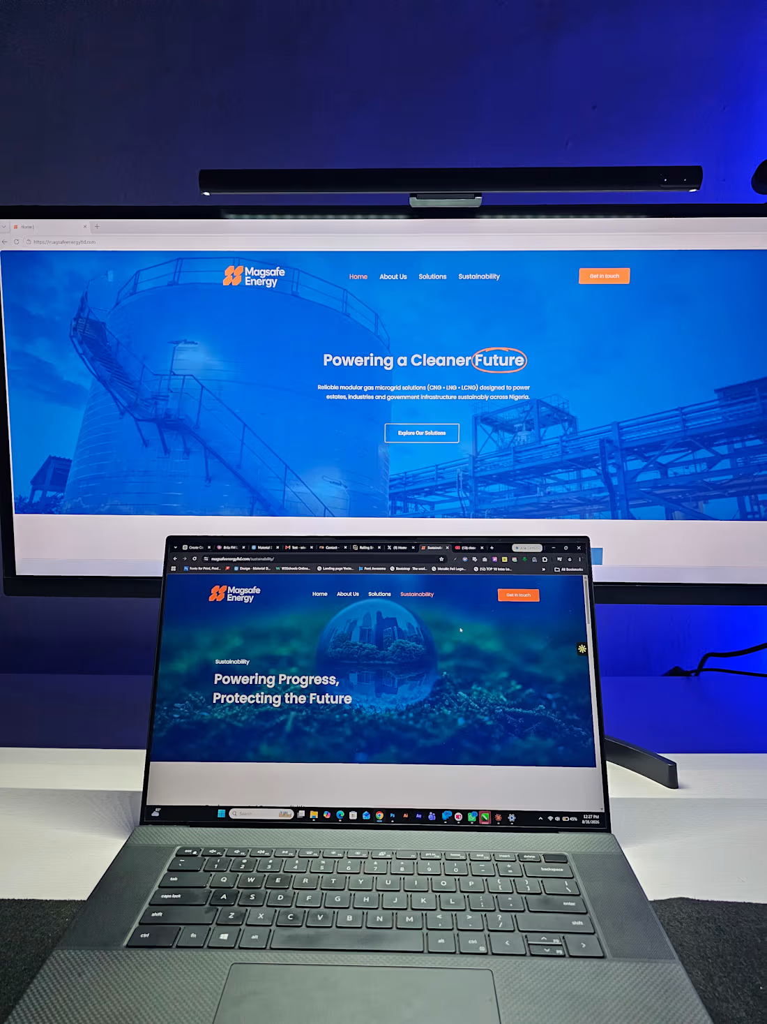
Magsafe Energy Website - Now Live
A website should be more than a digital brochure. It should communicate what a company stands for, make its capabilities easier to understand, and create confidence in the people considering working with it.
I’m excited to share the completion and launch of the new Magsafe Energy website.
Magsafe Energy is building a modern energy business around scalable gas-to-power solutions for Africa, with a focus on practical, reliable and commercially viable energy infrastructure.
The challenge was to translate that ambition into a digital experience that feels as capable and forward-looking as the business itself.
For this project, we focused on creating a website that:
• Clearly communicates Magsafe Energy’s vision and capabilities
• Positions the brand as a credible player in Africa’s evolving energy landscape
• Presents complex energy solutions in a simple, engaging way
• Gives each core service and solution its own clear digital presence
• Creates a stronger platform for business development, partnerships and enquiries
• Provides a scalable digital foundation as the company continues to grow
From Gas Microgrid Systems to Industrial & Estate Power, the website was designed to make Magsafe Energy’s solutions easier to understand while maintaining a strong, modern and professional brand presence.
What I’m particularly proud of is how the final experience brings together strategy, visual design, storytelling and functionality-turning the website into a genuine extension of the Magsafe Energy brand.
The new website is officially LIVE.
It was a great experience working on a project within the energy sector and translating an ambitious business vision into a digital experience built for growth.
0
26
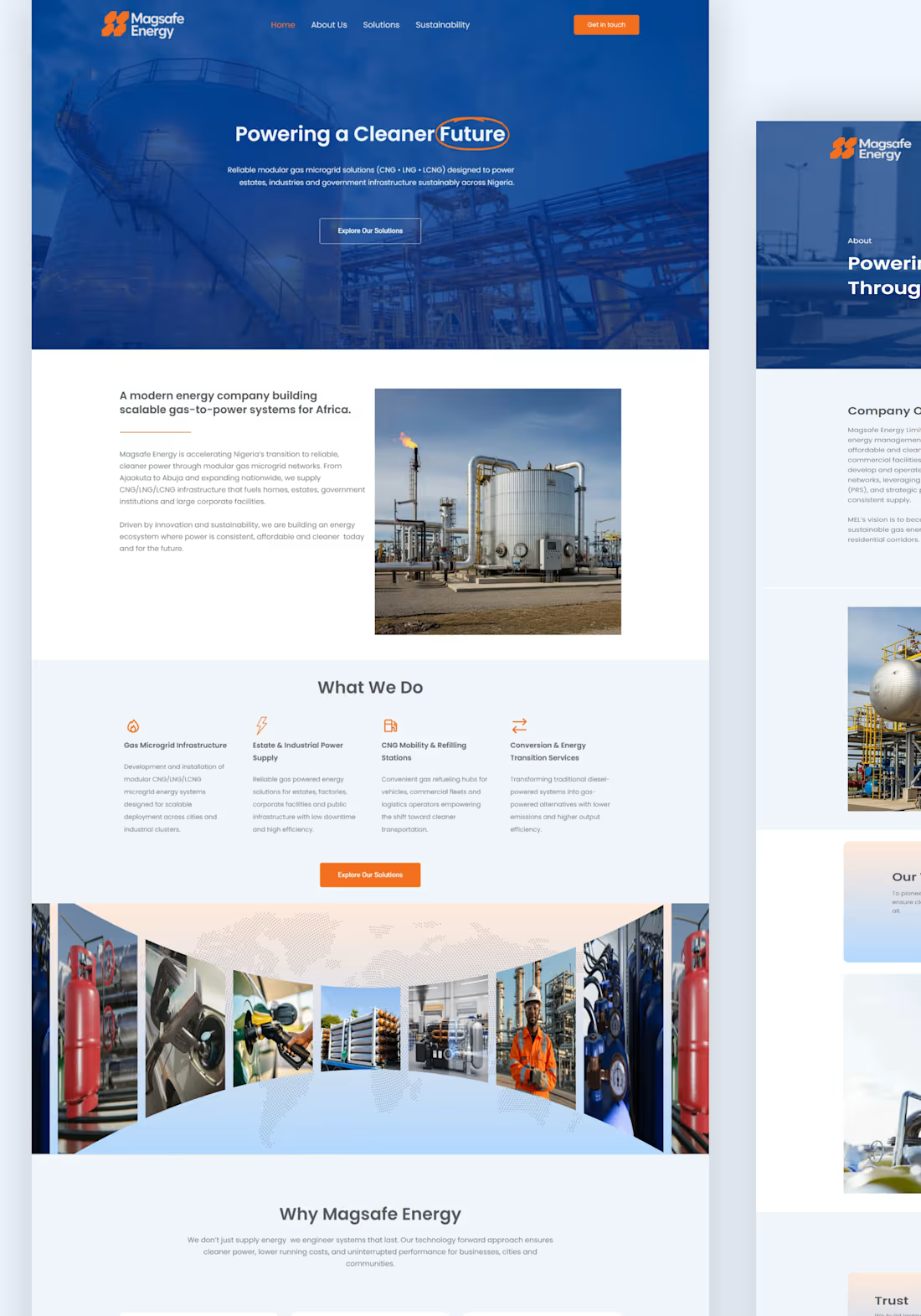
Magsafe Energy Website - Now Live
A website should be more than a digital brochure. It should communicate what a company stands for, make its capabilities easier to understand, and create confidence in the people considering working with it.
I’m excited to share the completion and launch of the new Magsafe Energy website.
Magsafe Energy is building a modern energy business around scalable gas-to-power solutions for Africa, with a focus on practical, reliable and commercially viable energy infrastructure.
The challenge was to translate that ambition into a digital experience that feels as capable and forward-looking as the business itself.
For this project, we focused on creating a website that:
• Clearly communicates Magsafe Energy’s vision and capabilities
• Positions the brand as a credible player in Africa’s evolving energy landscape
• Presents complex energy solutions in a simple, engaging way
• Gives each core service and solution its own clear digital presence
• Creates a stronger platform for business development, partnerships and enquiries
• Provides a scalable digital foundation as the company continues to grow
From Gas Microgrid Systems to Industrial & Estate Power, the website was designed to make Magsafe Energy’s solutions easier to understand while maintaining a strong, modern and professional brand presence.
What I’m particularly proud of is how the final experience brings together strategy, visual design, storytelling and functionality-turning the website into a genuine extension of the Magsafe Energy brand.
The new website is officially LIVE.
It was a great experience working on a project within the energy sector and translating an ambitious business vision into a digital experience built for growth.
1
2
90
Created this short UGC-style ad for Tomatil to explore how AI and motion design can work together to produce engaging brand content.
Workflow: @RoboNeo_ai → After Effects
1
49