Magsafe Energy Brand Identity - Wiwoloku Sherif
1
0
I'm excited to share the full brand identity project for Volgy Oil and Gas!
This project was all about shaping a bold, modern, and trustworthy identity for an energy company that’s driving change in the industry.
Volgy stands at the intersection of traditional energy and cleaner alternatives, bringing innovation to the oil and gas sector while staying committed to sustainability and community impact.
From refining the brand’s voice to designing a visual identity that commands presence, every step was focused on making Volgy not just a brand, but a symbol of progress and reliability. It’s been an incredible journey, and I’m looking forward to seeing the brand grow.
1
8
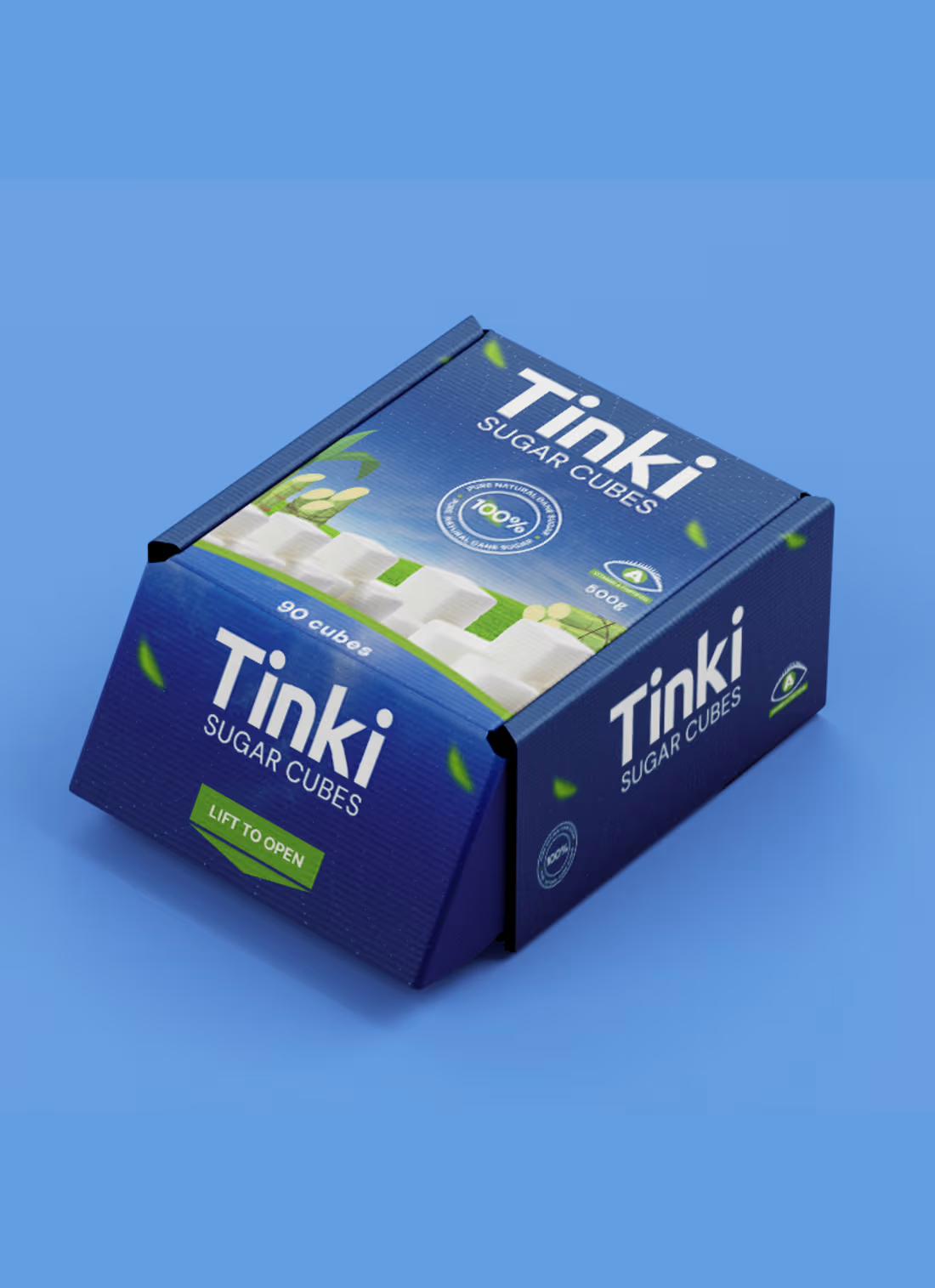
Excited to share a glimpse of the TINKI Sugar packaging design a product that’s about to hit the market! The goal was to create a market friendly, standout design that feels fresh, premium, and relatable to everyday consumers.
We focused on simplicity, clean visuals, and a modern touch that communicates purity and trust while keeping it visually appealing on the shelves. Every detail from color choice to layout was crafted to make TINKI Sugar not just another product, but one that connects emotionally and visually with its audience.
1
10
Delighted to finally share the completed brand identity for ACIML Afro-China Industrial & Manufacturing Layout Limited.
This project was built around a powerful idea: creating a visual identity that bridges Africa’s vast potential with China’s industrial strength. The challenge was designing a system that feels global, authoritative, and scalable across multiple industries, while remaining clear and intentional.
The final identity reflects collaboration, structure, and progress from the geometric logo mark inspired by African foundations and Chinese star symbolism, to a modern typography system and a cohesive visual language designed for long-term growth.
ACIML now stands with a strong, versatile identity that communicates trust, innovation, and cross continental partnership.
3
20
Healio Pharma Brand Identity
0
1
Scalter Brand Identity
1
0
Pavepay Brand Identity
0
0


