The network for creativity
Join 1.25M professional creatives like you
Connect with clients, get discovered, and run your business 100% commission-free
Creatives on Contra have earned over $150M and we are just getting started


The network for creativity
Join 1.25M professional creatives like you
Connect with clients, get discovered, and run your business 100% commission-free
Creatives on Contra have earned over $150M and we are just getting started



Related posts

What if sending money felt a little more like giving a gift?
For Nova, I explored a banking app that brings payments, cards, and a bit of personality together. You can check your balance, browse recent transactions, send or request money, top up, and pay bills.
My favorite part is the digital postcard feature. Before sending a transfer, you can add a little illustrated card—a heart, a birthday greeting, or a playful character. A simple way to make birthday money or a thank-you feel more personal.
I carried that same 3D character into onboarding, pairing it with bold red gradients and large, clear payment details. There’s room for play, while the recipient and amount stay easy to check.
Would you add a postcard to a transfer? I’d love to know what occasion you’d use it for.






What makes a candy brand recognizable across every pack?
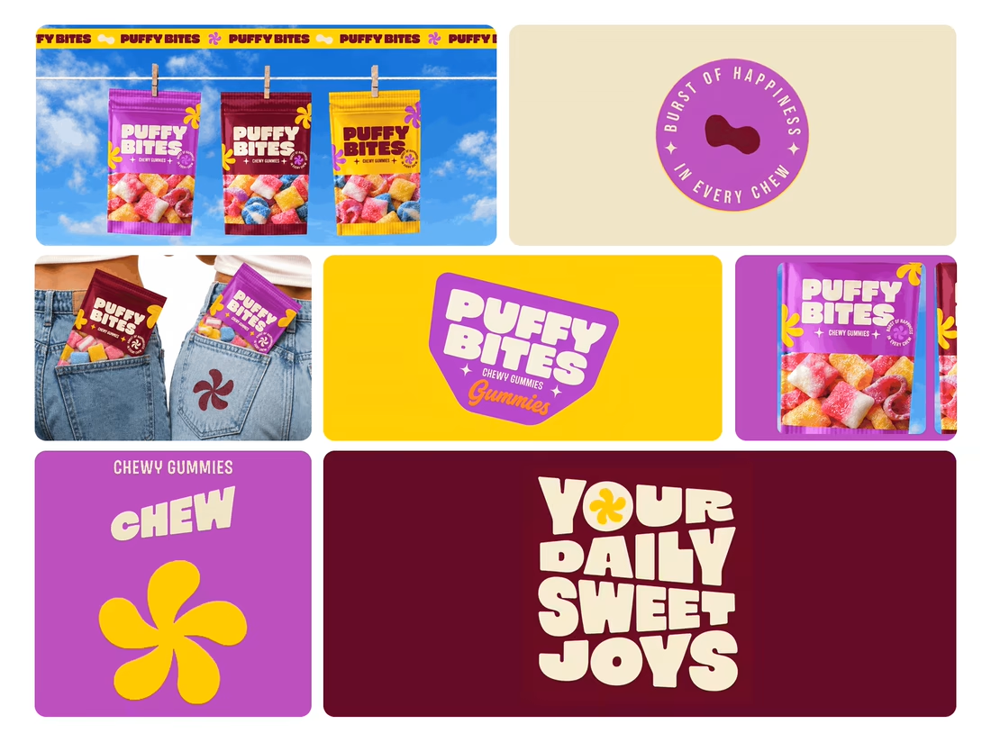
For Puffy Bites, I built the identity around rounded lettering, expressive symbols, and a palette of burgundy, purple, yellow, and cream.
The same visual language carries through pouch packaging, smaller wrappers, campaign imagery, and an animated brand showcase.
One design decision that ties it together: the packaging color changes, while the logo placement, product descriptor, and supporting graphics maintain a consistent structure.
I handled the full client project, from logo and visual identity to packaging and campaign applications.
Which colorway would catch your eye first—purple, burgundy, or yellow?
Explore the full Puffy Bites case study. If you’re developing a candy or snack brand, I’m available for branding and packaging projects.

Love it,
Great work

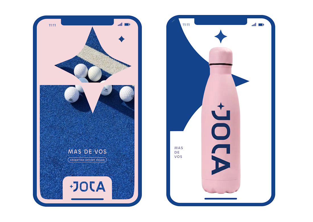
JOTA is an Argentine field hockey brand built for players who play with personality. The founder reached out to rethink how the brand shows up beyond the stick itself.


Wow project