The network for creativity
Join 1.25M professional creatives like you
Connect with clients, get discovered, and run your business 100% commission-free
Creatives on Contra have earned over $150M and we are just getting started
Back to feedPost

Remotlin is the best place to find your next remote job opportunities.
I have designed the website and the brand, with seamless and unique experience in mind.
Case study is here


Great Job, Alex

fabulous work, these colors together plus the eclectic, fun nature of your motion design / the chat bubbles citing work are a+++.

Nice work 🧡


the geist mono bit works really well here

Geist Mono running through the whole brand system is a bold call for a job board, most sites in this space go friendlier. Did you land on it for the tech credibility angle, or was it more about standing out visually from other remote job platforms?

Cool

Love geist mono man, top font!! 😍

That little row of rotating avatar dots at the top is a nice touch, it makes the brand feel alive rather than a static logo lockup. Was that part of your original pitch or something that came out of iterating once the client saw an early static version?


Excellent work🔥👏👏

Great 🔥

Sequencing the reveal as icon, then people, then the type spec, then the wordmark plays like a system walkthrough rather than a logo sting - it shows what the brand is built from instead of just what it looks like.

Looks good


I agree with Trueframe as well. It is looking great, but I don't know how great it is working.

The site feels really easy to explore. I like how the brand and website feel connected.

Superbbbb

Great work on this. The focus on making the experience seamless and distinctive is especially important for a platform like Remotlin, where usability and trust can make a big difference in the job search experience.
The network for creativity
Join 1.25M professional creatives like you
Connect with clients, get discovered, and run your business 100% commission-free
Creatives on Contra have earned over $150M and we are just getting started


Challenges
View all


Related posts

Brand Identity for Propane
Propane is an experience-led platform firm that helps organizations sell and scale complex offerings. We operate between traditional agencies and large
consultancies: strategic, but accountable to what actually gets built.
The brand identity for Propane is built as a disciplined, scalable system that
reflects its role as an experience-led platform firm operating between agencies and consultancies. Positioned at the intersection of human-centered thinking and industrial-grade complexity, the identity resolves this tension with calm confidence—balancing precision, systems logic, and usability without leaning into coldness or superficial warmth.
View full project and more structured context on the link above or my profile.
Feel free to share your constructive feedback ⚡

Yooo this visual language is great🔥

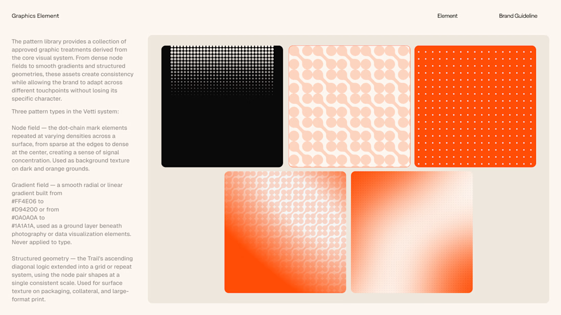
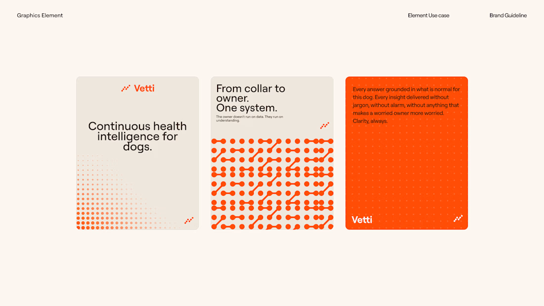
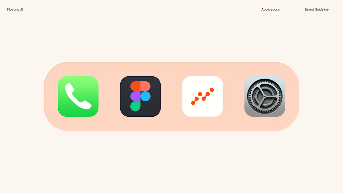
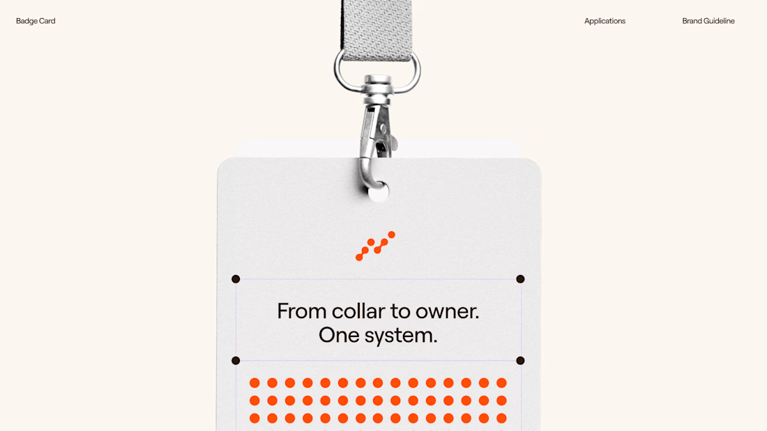
Vetti brand identity is out.
Smart health collar for dogs. The brief: make it feel like something you'd hand a life to. Not a gadget. Not a clinic.
Worked under @Daniel G Bright and @Bright Studios — they built the strategy, I built the system.
Trail mark. Roobert. #FF4E06. One typeface, two weights, no exceptions.
The emotion comes from the animal. The information comes from the technology.

Clean design 😍

What should a platform for tokenized private equity look like?
Probably not like another traditional bank.
For ICME, the client wanted a visual direction that felt modern, disruptive, and native to a new kind of financial market.
The challenge was finding the balance: make the experience bold enough to feel different, while keeping a complex product understandable and credible.
I developed a digital-brutalist direction with retrofuturist touches - oversized typography, hard contrast, pixel textures, raw layouts, blue gradients, and controlled motion.
I worked with Arash Attar and the ICME team across the landing page and parts of the wider product interface. This video focuses specifically on the landing-page experience.
The goal was to:
— Explain tokenized private-company equity more clearly
— Create a memorable visual identity for the product
— Speak to both investors and founders
— Make financial technology feel ambitious rather than conventional
Would this visual direction make you want to explore the product - or should financial platforms feel more restrained?


This is amazing, man.
Good job!


