The network for creativity
Join 1.25M professional creatives like you
Connect with clients, get discovered, and run your business 100% commission-free
Creatives on Contra have earned over $150M and we are just getting started
Back to feedPost
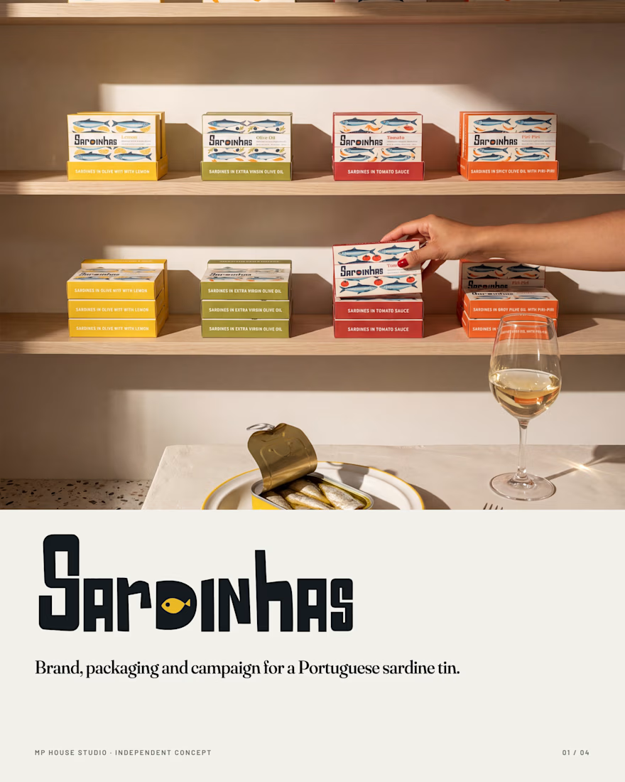
Sardinhas / Brand, Packaging & Campaign
Sardinhas is Portuguese for sardines. Nothing more, nothing less.
An independent brand concept for a Portuguese sardine tin, built end to end: identity, illustration, packaging, 3D and a ten-image editorial campaign. Four boards trace the work.
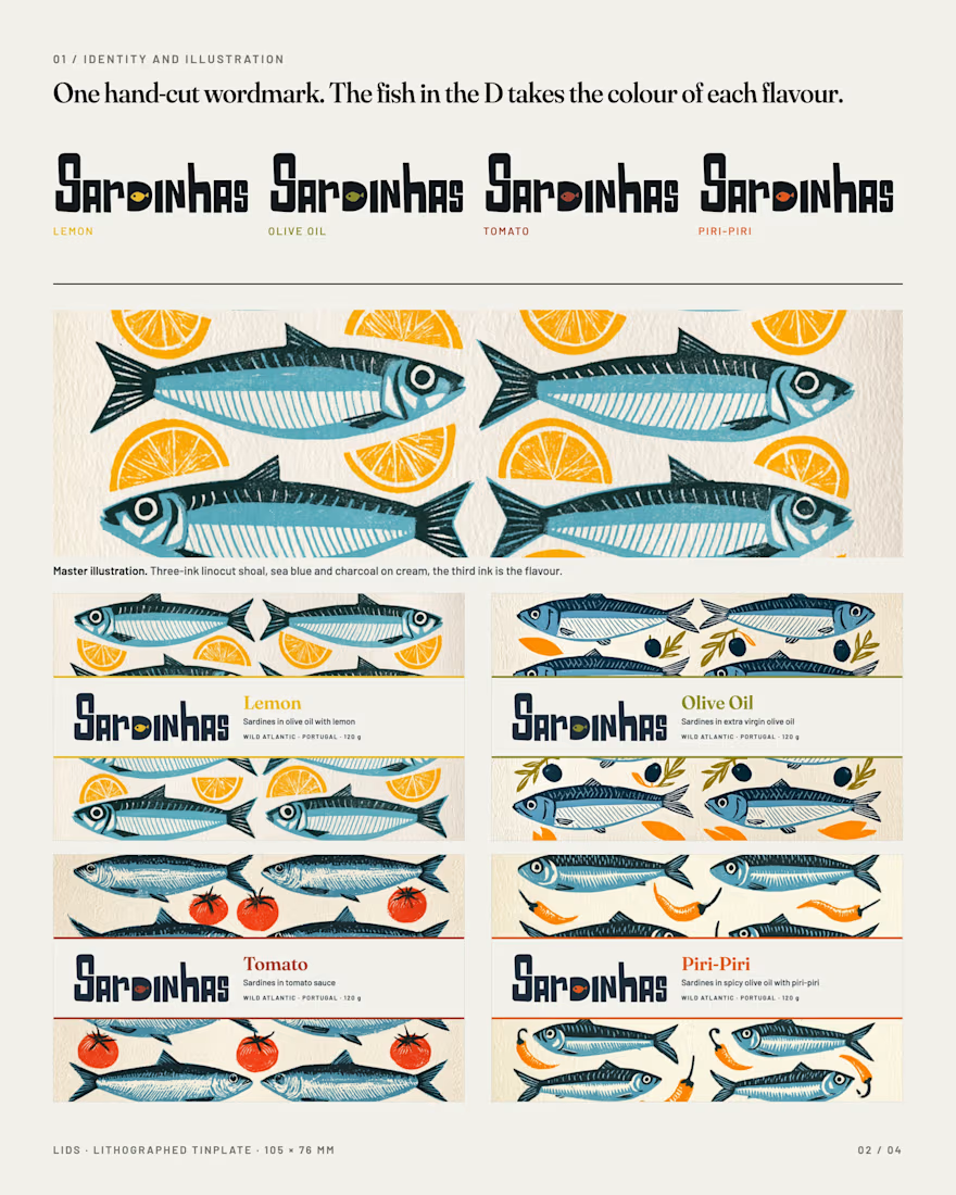
01 / Identity and illustration. The wordmark is hand-cut lettering with a sardine living inside the D. One rule runs through the whole system: the letters stay charcoal, and only the fish in the D takes the colour of each flavour. The illustration is a three-ink linocut shoal, sea blue and charcoal on cream paper, with a third ink that changes with the flavour: lemon, olive, tomato, piri-piri. Style explored in Midjourney V8, locked with a master image and derived across the four flavours.
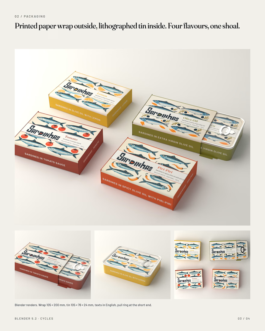
02 / Packaging. Two skins. Outside, a printed paper wrap with folded ends, the way Portuguese conservas have been sold for a century. Inside, a lithographed tin with the same shoal on the lid and the body in the flavour ink. Four flavours: Lemon, Olive Oil, Tomato, Piri-Piri. All texts, nutrition and barcode in English. Every tin and wrap was built and rendered in Blender, textures generated from the vector artwork at 20 px per mm.
03 / Campaign. One table, one sun. Cream plaster, hard late-afternoon light, the same hand in every frame. The colour never comes from the ground: it comes from the tin, the printed linen napkin and the food. Full petiscos tables, the tin opened at the centre, a shop interior, a printed paper bag, four napkins for four flavours. Photographs generated with Nano Banana Pro through Higgsfield at 4K, always with the Blender renders as product reference.
Tools: Midjourney V8 for the illustration language, Blender 5.2 for packaging and renders, Nano Banana Pro via Higgsfield for the campaign, Claude Code as the direction hub for the whole project.
Creative direction, brand identity, packaging and AI-assisted visual development by Mauricio Pontual / MP House Studio. Independent concept, not commissioned.
#BrandIdentity #PackagingDesign #ArtDirection #Illustration #Blender #GenerativeAI #FoodPhotography #Sardines




Beautiful work!

Thank you so much, Bella! Really appreciate it.

these look great!
Thanks, Nicolette! Glad you liked it.

The detail that gets me is the third ink changing per flavour while the shoal and the rest of the system stay locked, that's the kind of restraint that makes a four-flavour range feel like one brand instead of four competing labels. Claude Code as the direction hub for something...
Thanks so much, Diego. I really appreciate your eye on that detail.
Claude Code was mainly the automation hub across the project. It handled the program automation: the whole 3D side was modeled automatically in Blender through it, it connected the workflow with Higgsfield, and...

Polished work
Thanks, Rahman. Appreciate that.

Thanks, TRUEFRAME! Glad you liked

The rule that colour never comes from the ground in the campaign shots, only from the tin, napkin and food, is the kind of constraint that makes a whole shoot feel intentional instead of styled. Four boards to cover identity through campaign is thorough for a personal concept piece.
Thanks, Rafee. Really appreciate it.

Love the simplicity here, it gives the brand such a nice feel
Thanks, Boluwatife. Really appreciate it.

This is amazing! I’d give you two goats if I could 👏🏾👏🏾
Thanks so much, Ayomide! That’s such a huge compliment. Really appreciate it!

Thanks, Nessa! Really appreciate it.

Thanks, Juice!

Brilliant work! 🌟
Thank you, DESH. Glad you liked it!

Clever detailing on the fish in the packaging! 🐟
Happy you noticed that detail, Vijay. Thank you!
The network for creativity
Join 1.25M professional creatives like you
Connect with clients, get discovered, and run your business 100% commission-free
Creatives on Contra have earned over $150M and we are just getting started











Related posts

The team is cooking
Motion design for the logo we are making for Nation e-commerce


Wou


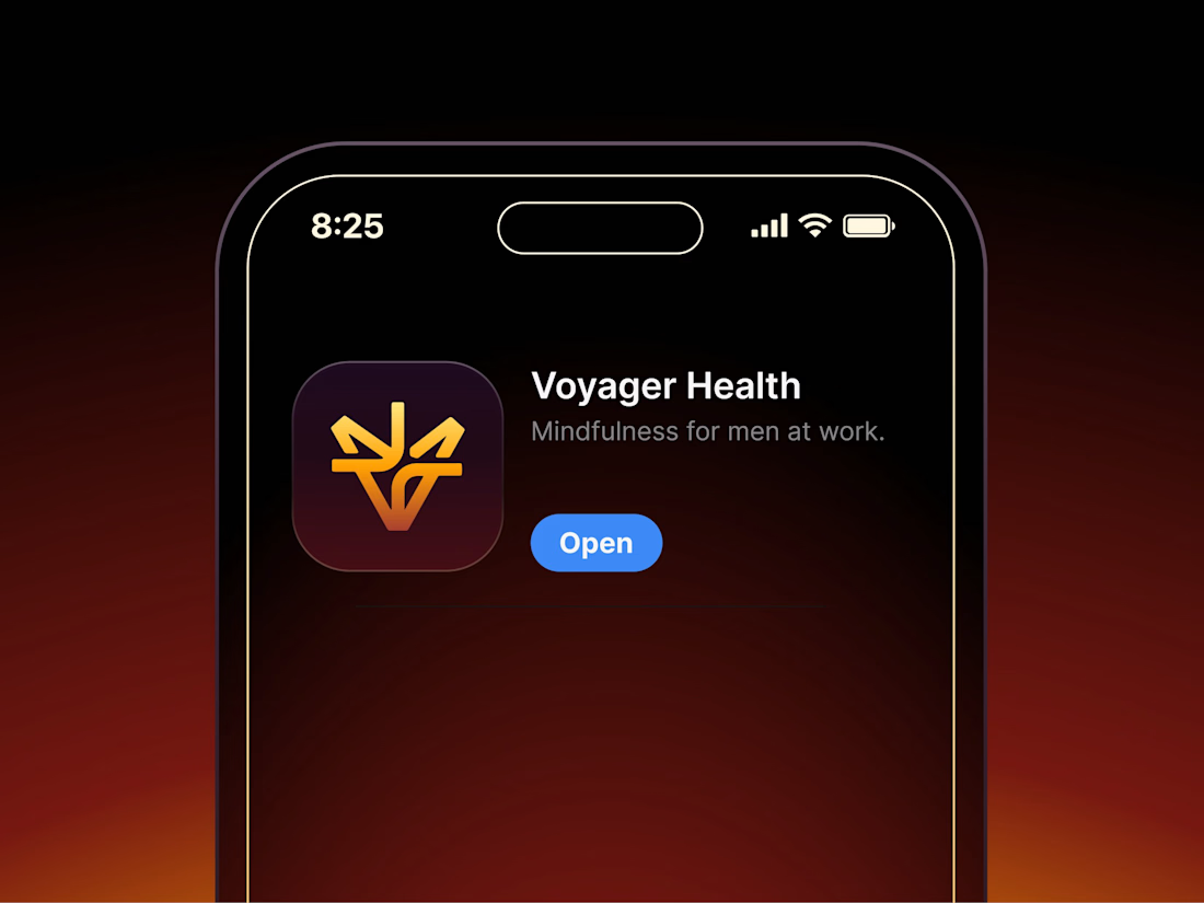

Aryna, that golden symbol pops so nicely against the plum background ✨

The most serious brand I’ve ever worked on mails you a phone shaped like a shell.
Deadpan voice. Inflated letters. One strange object a month.
STILL LIFE SERVICE, case study out now.
Would you open the box?

I'd open the box for sure! Inflated letters with a deadpan voice is such a fun mix.