The network for creativity
Join 1.25M professional creatives like you
Connect with clients, get discovered, and run your business 100% commission-free
Creatives on Contra have earned over $150M and we are just getting started
Back to feedPost

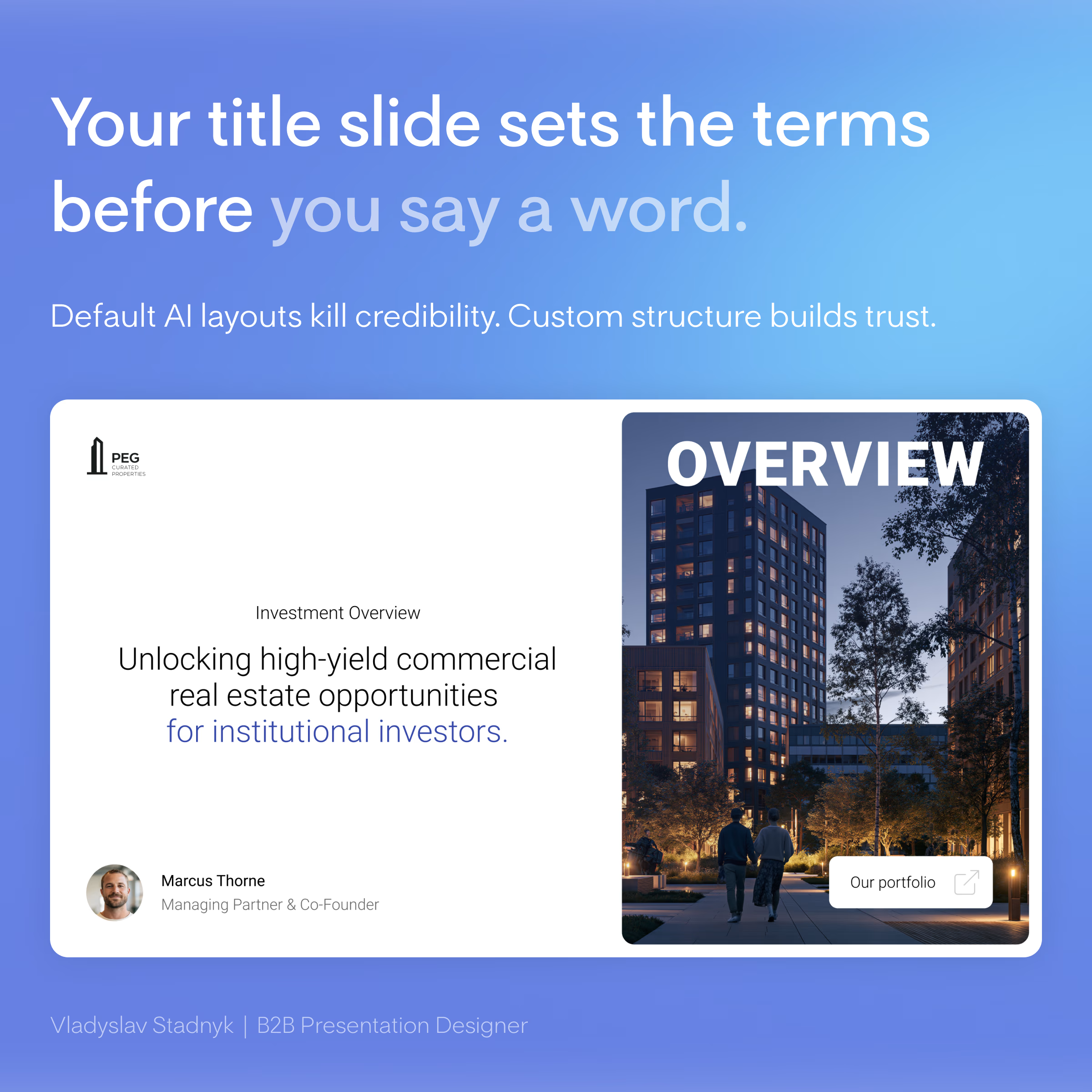
Your title slide decides if investors keep reading. Right now, it looks like an AI generated it in 2 minutes.
Investors open dozens of files a week. Every second deck starts with the exact same AI-generated layout... same default fonts... same generic "Company Update 2026"... 🤖
When you ask for millions to fund commercial properties, aesthetics equal trust. A lazy title slide sends a clear message. It says you cut corners. It shows a massive lack of attention to detail. You burn your credibility before the investors even see your financial models.
I recently redesigned a deck for a real estate investment group. They used a basic AI template with a low-quality stock photo of a skyline. We scrapped it entirely. We built a custom grid, added a single high contrast architectural shot, and wrote a one-sentence value proposition. That simple shift instantly framed them as top-tier institutional players.
What is the biggest red flag you see on a pitch deck title slide? 🚩
Infographic DesignAdobe IllustratorAdobe PhotoshopPresentation DesignPitch Deck DesignerMicrosoft PowerPoint



Great work 🙂
The network for creativity
Join 1.25M professional creatives like you
Connect with clients, get discovered, and run your business 100% commission-free
Creatives on Contra have earned over $150M and we are just getting started

Challenges
View all


Related posts

Seasonal identity for Beat Film Festival. The challenge: create a concept where cinema helps audiences process a turbulent cultural and historical moment — staying relevant and resonant rather than offering escape from it.
The identity metaphor for BFF is a shared journey —
audience and festival alike searching for solid ground.
"Get on Board" is an invitation to hop into the same boat, riding together the waves of emotion sparked by film and shaped by the turbulence around us. Beat becomes the lighthouse in that storm — a sense of safety, belonging, and a moment worth sharing.


The gradient makes the whole identity special, what do you think?

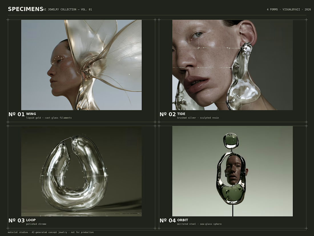
I created these futuristic earring concepts in Midjourney, then packaged them into a clean case-study layout — cutouts, numbering, material callouts — ready for a lookbook or pitch deck.

Love this!

ENDURX — Smartwatch & Fitness Tech Landing Page ⌚🔥
ENDURX is a landing page concept for a performance-focused smartwatch built around endurance, health tracking, and active everyday lifestyles.
The goal was to make the product feel powerful and energetic from the first screen while keeping the experience premium and product-focused. A bold orange palette, oversized typography, and a large smartwatch visual create a strong sense of movement and performance.
Special attention was given to:
• a product-first hero composition that makes the smartwatch the main visual focus ⌚;
• oversized “ENDURANCE” typography to communicate strength and performance;
• an intense orange gradient that gives the brand a distinctive, energetic identity 🟠;
• supporting product details around health metrics, activity tracking, battery life, and comfort;
• a clear “Get Started” CTA positioned close to the main product;
• additional product imagery that highlights the strap and all-day comfort;
• clean navigation around Features, Health, Reviews, and Contact;
• responsive mobile layouts that preserve the visual impact while simplifying the information hierarchy 📱;
• a compact mobile menu with social touchpoints and easy access to key sections.
The result is a bold digital experience that positions ENDURX as a modern wearable for people who want technology that keeps up with an active lifestyle.
Looking to launch a wearable, fitness product, or consumer tech brand?
Let’s create a product experience built to perform 🚀


:😍