The network for creativity
Join 1.25M professional creatives like you
Connect with clients, get discovered, and run your business 100% commission-free
Creatives on Contra have earned over $150M and we are just getting started
Back to feedPost
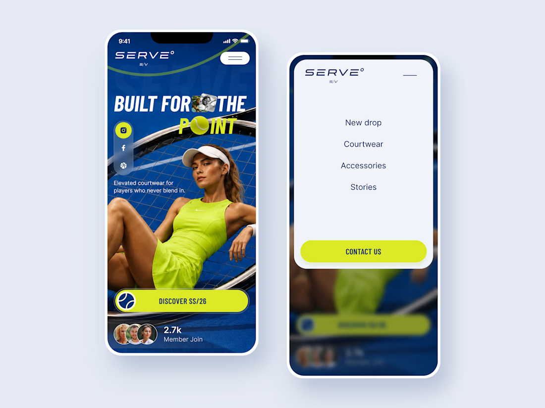
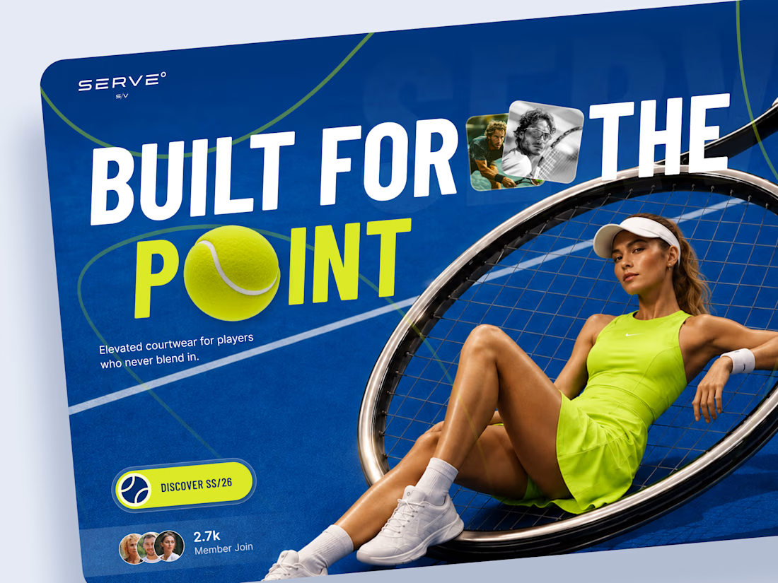
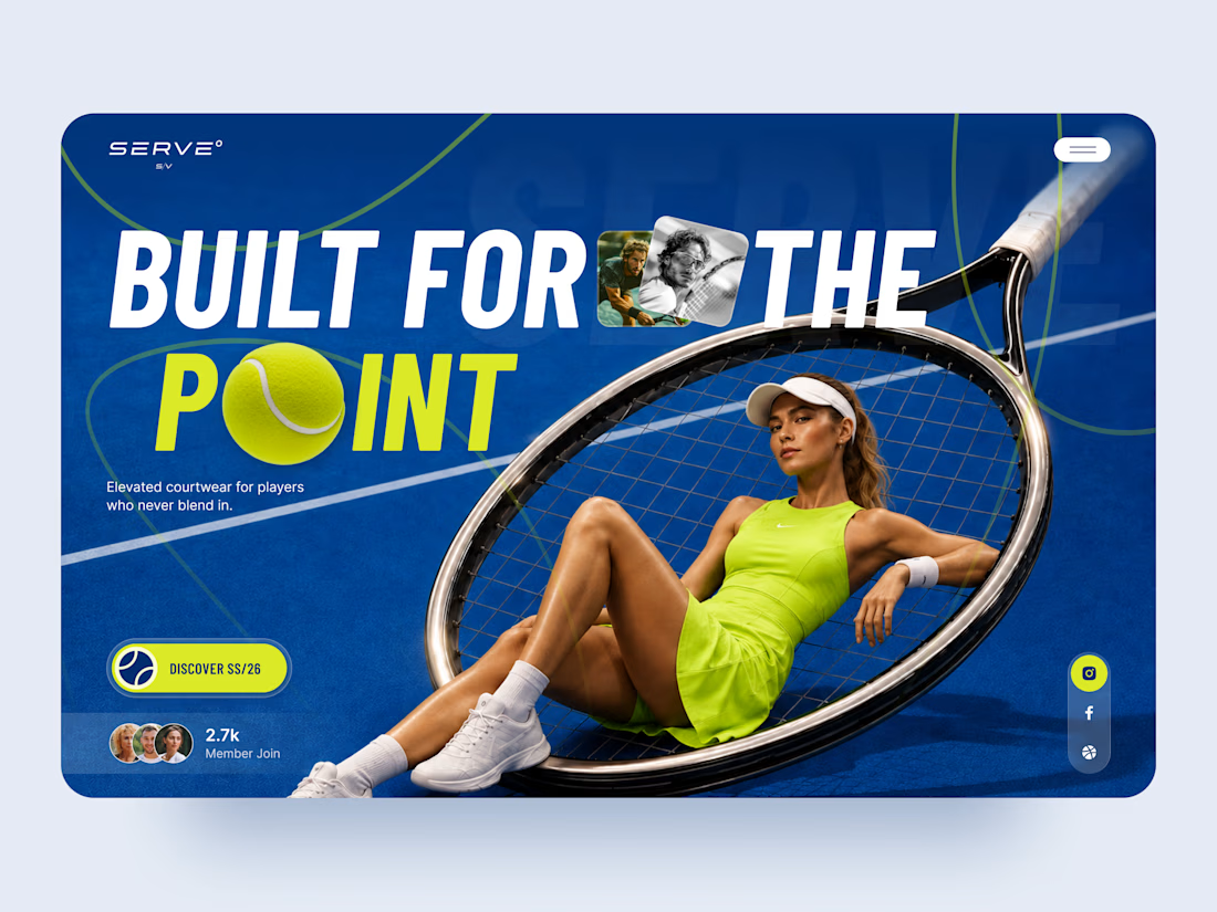
SERVE — Tennis Courtwear Landing Page 🎾
SERVE is a bold landing page concept for a contemporary tennis and courtwear brand built around performance, style, and attitude.
The goal was to move away from the traditional clean, minimal sportswear aesthetic and create something with more energy and personality. Deep court blue, electric tennis yellow, oversized typography, and layered photography give the experience a strong editorial feel.
Special attention was given to:
• a hero composition built around the tennis racket and athlete
• oversized typography that feels energetic and campaign-driven
• electric yellow accents inspired by the tennis ball 🎾
• layered photography and graphic elements that create depth
• a strong CTA for the SS/26 collection
• social and community elements that make the brand feel active
• a simplified mobile composition that keeps the same visual impact
• a clean mobile menu that contrasts with the expressive hero
The result is a high-energy digital experience that blends sports performance with fashion-forward art direction.
Looking to create a bold website for your sports, fashion, or lifestyle brand? Let’s build something people remember ⚡



Really love this one

Damn 👀


ball as the O in POINT

Love the campaign feel here

I love this very nice 👌

great work🎉


glad this didn't go the safe minimal route

Love the vibe 🎾

Very clean and beautiful, weldone 🥰

way to work an unlikely color combo to the fullest extent! this looks amazing.


The racket framing the hero shot carries so much of this. Electric yellow on court blue feels loud in the best way, way more campaign than catalog. Curious which part of the page you'd fight hardest to keep if a real sportswear client wanted to tone it down.
soooo goated

This is premium.

So good 🔥

Just love the overall looks 😍

T O P!!


Love the color combination 😍
The network for creativity
Join 1.25M professional creatives like you
Connect with clients, get discovered, and run your business 100% commission-free
Creatives on Contra have earned over $150M and we are just getting started











Related posts

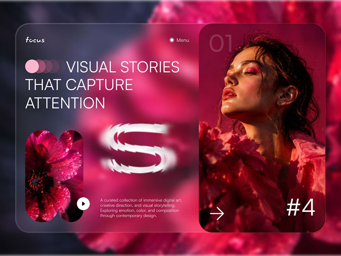
FOCUS — Creative Portfolio & Digital Art Website 🌸✨
A visually expressive website concept for a creative portfolio, built around digital art, bold imagery, and visual storytelling
The design combines vibrant pink tones, soft gradients, experimental typography, and immersive photography to create a distinctive editorial experience
Special attention was given to:
• Bold editorial hero composition
• Vibrant pink and dark color palette
• Experimental typography and visual details
• Immersive photography and digital artwork
• Creative project gallery and navigation
• Responsive mobile experience
• Clean layouts with a strong visual identity
The result is an expressive digital experience that puts creativity, emotion, and visual storytelling at the center of every screen 💗
Looking to create a standout portfolio or website for a creative brand? Let’s connect 🚀
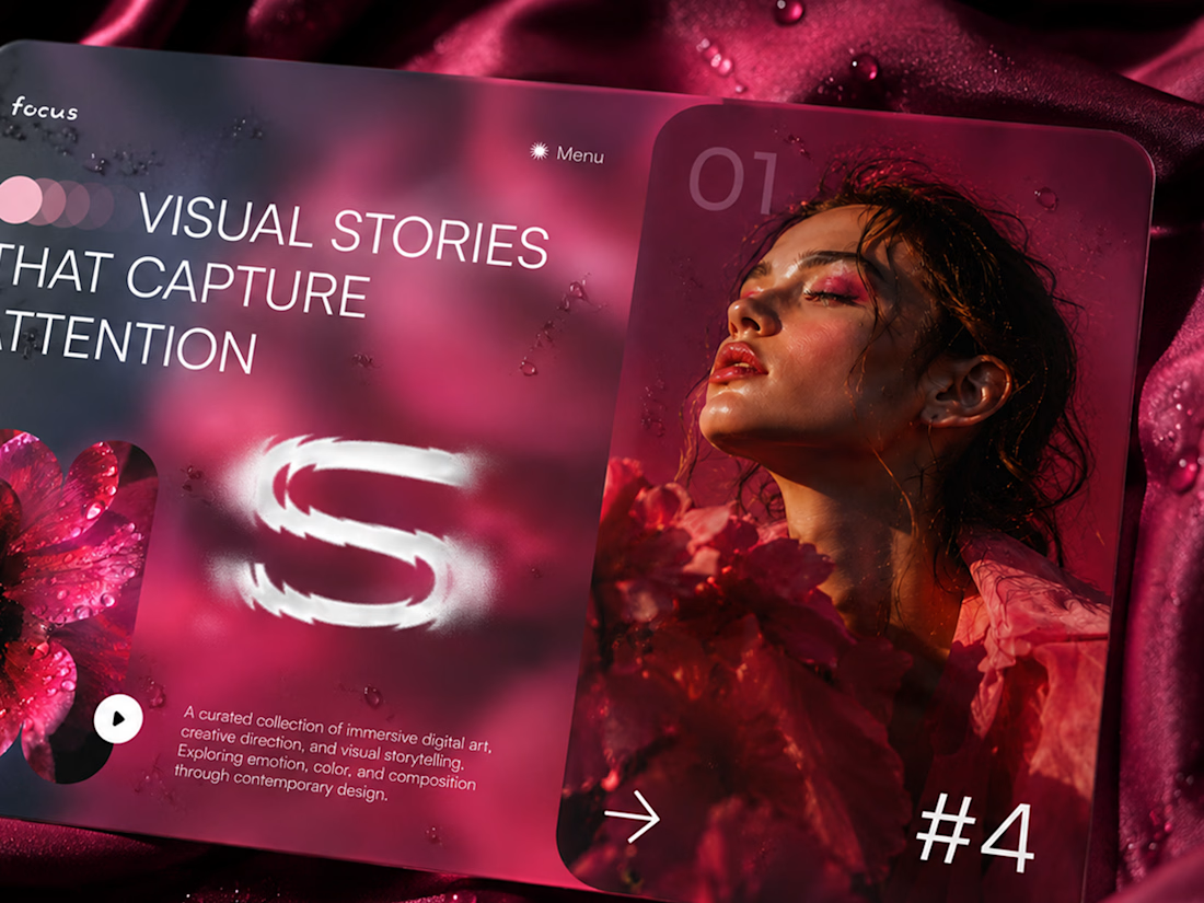
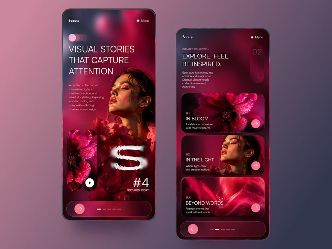

The vibrant pink against the dark palette gives this such a bold editorial feel. The experimental typography is the star here.

What if creating felt more natural? 🌼
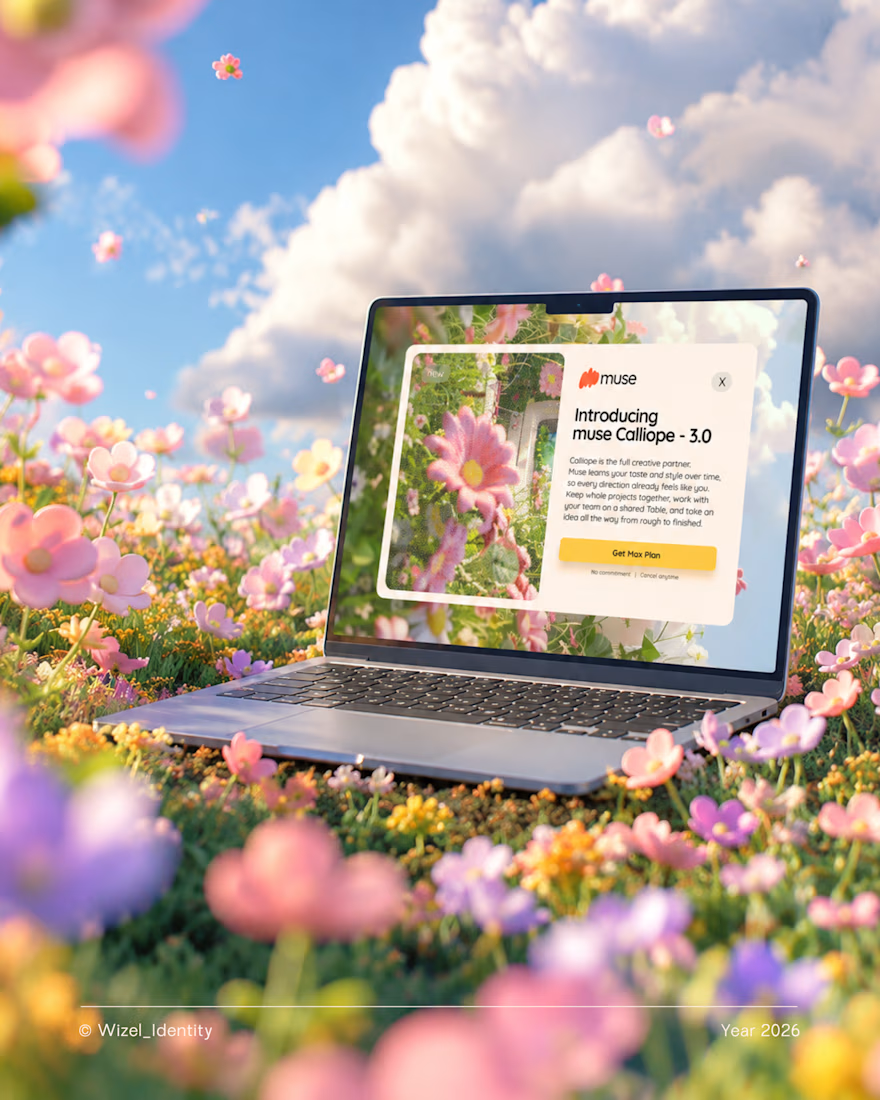
Meet Muse, an AI creative companion that helps turn rough ideas into clear concepts.
The thought you can't quite explain. The idea that's still taking shape. The concept you're trying to bring to life.
Muse meets you right there.
For this identity, I explored a visual direction that feels playful, expressive, and full of possibility, a reflection of what creativity can feel like when you have room to explore.
Brand identity design for Muse.
Designed by Wizel_Identity. © 2026
#BrandIdentity #VisualIdentity #BrandDesign #CreativeTechnology #AI

T O P!

Design Exploration: Hero Section of Architecture Website. Which one do you think much better?


12 voted
43%
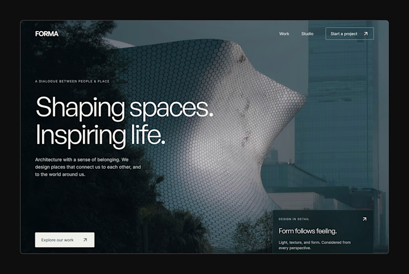
16 voted
57%
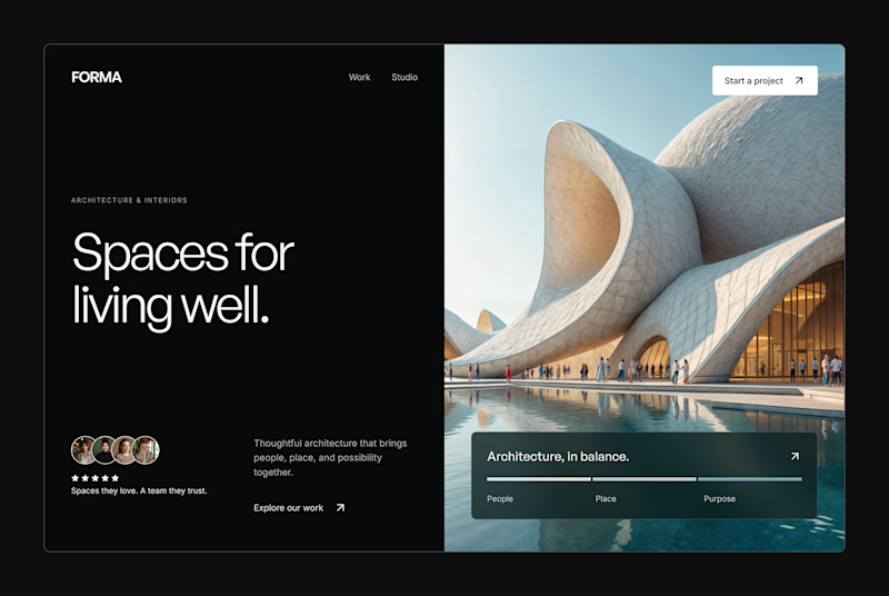
28 votes
Closed

