The network for creativity
Join 1.25M professional creatives like you
Connect with clients, get discovered, and run your business 100% commission-free
Creatives on Contra have earned over $150M and we are just getting started
Back to feedPost
The KFC product detail page had a problem that's pretty common in high-traffic ordering flows.
It worked fine most of the time. But at the moment customers needed to make a decision like customizing a meal, confirming selections, adding to the cart, it introduced just enough confusion to slow things down or cause drop-off.
Three specific issues: the mobile layout buried key content below an oversized image, customization options were duplicated in a way that felt broken, and there was no clear view of selections before checkout.
The work focused on those three things only. No full redesign, no new features.
Result: 88% task success across platforms, 20% faster completion, and 90% of participants reported higher satisfaction.
Full breakdown on my portfolio: https://www.patlopes.com/case/kfc-pdp-redesign
Good job
Looks good
Clean and modern! 🔥
good work
The network for creativity
Join 1.25M professional creatives like you
Connect with clients, get discovered, and run your business 100% commission-free
Creatives on Contra have earned over $150M and we are just getting started
Related posts
Cool
Summer inspired a small design experiment ☀️ We created two hero concepts for the same website. One follows a classic layout. The other takes a more editorial approach with oversized typography and a less conventional composition.
Which direction would you choose for a real project? 1 or 2?
72 voted
62%
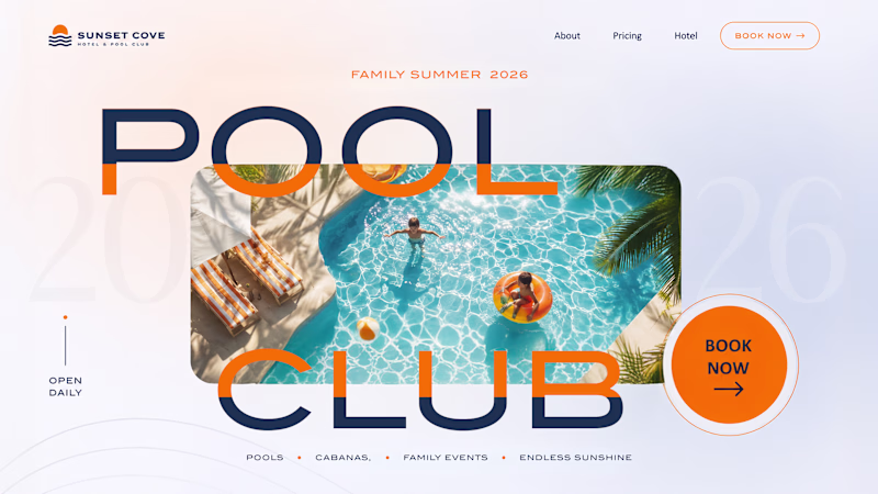
45 voted
38%
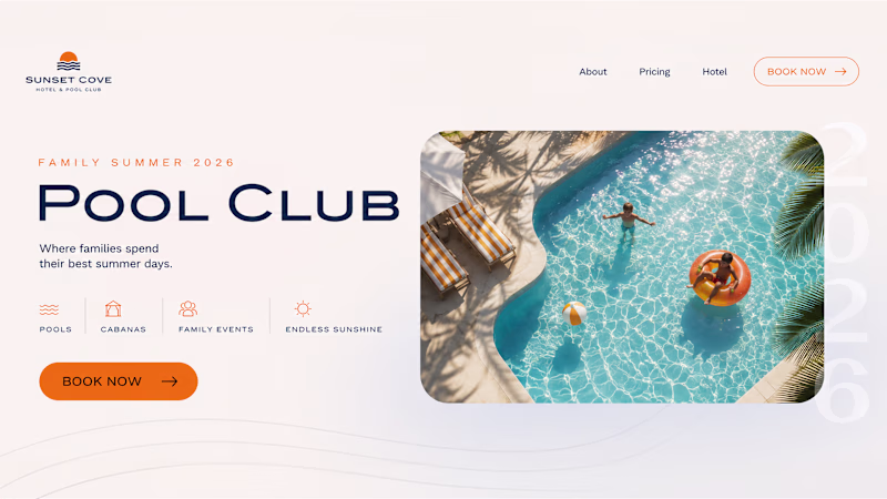
117 votes
Closed
Trending
Claude
Claude has entered the design space. How are you using Claude Design?
Contra University
Learn from expert creatives how to earn more using next-gen AI tools.
MagicPath
The canvas is infinite, and exploration is becoming the workflow. How are you using MagicPath?
creativeaiflow
Creative AI workflows are evolving. What tools do you use, and what are their strengths and weaknesses?
freelancerlife
Freelancer life is wins, pivots, and everything in between. What’s yours right now?