The network for creativity
Join 1.25M professional creatives like you
Connect with clients, get discovered, and run your business 100% commission-free
Creatives on Contra have earned over $150M and we are just getting started
Back to feedPost

A short animation to show what M::Studio is about | Branding - Web Design - Motion - Social media content


The network for creativity
Join 1.25M professional creatives like you
Connect with clients, get discovered, and run your business 100% commission-free
Creatives on Contra have earned over $150M and we are just getting started








Related posts

VÉLLE - Minimal Luxury Fashion Brand Identity
A conceptual fashion brand built on quiet luxury and timeless essentials.
What I did:
→ Logo Design (Primary + Secondary)
→ Brand Identity & Color System
→ Product Mockups (T-Shirt, Cap, Tote Bag)
Concept: Less is more. Clean serif typography with subtle accent for premium feel.
Palette: Beige #E8DDD0 / Black #0A0A0A
Full case study on Behance: behance.net/gallery/257321557
Open for freelance projects - DM for fashion branding.


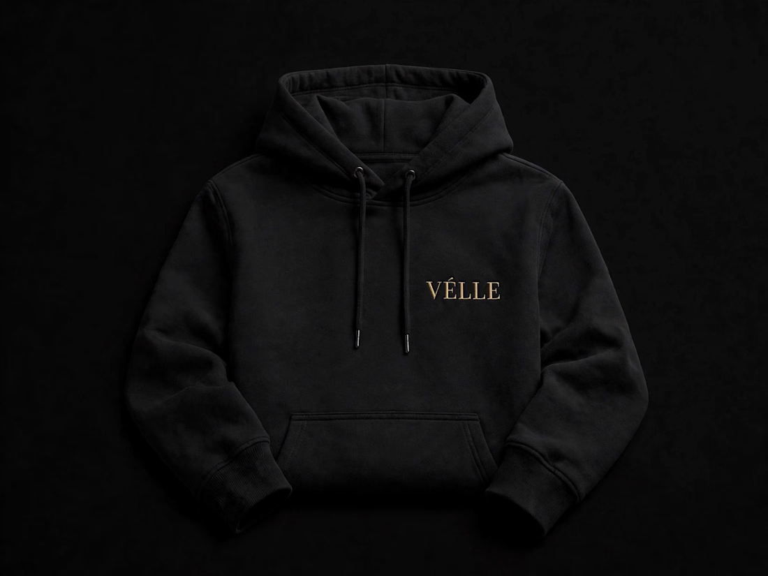
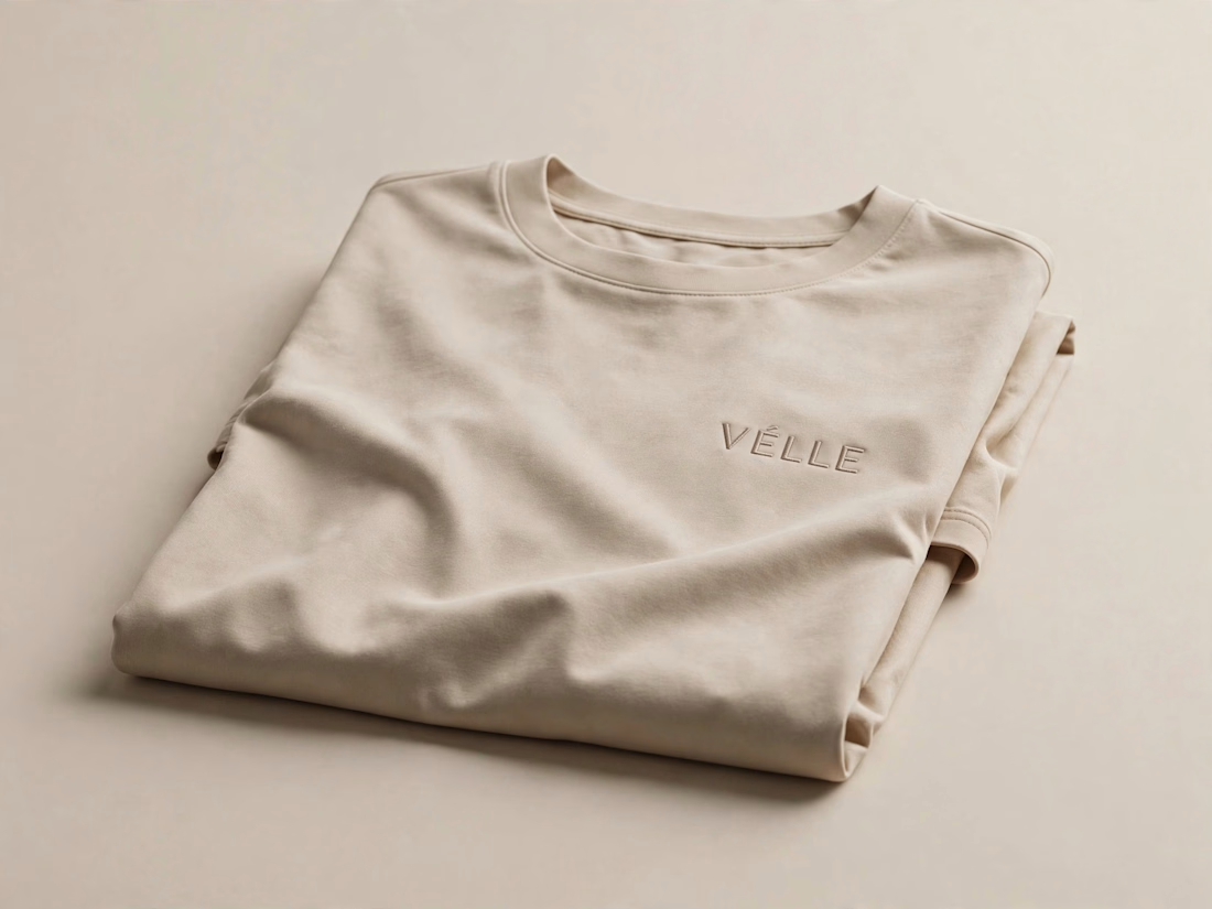
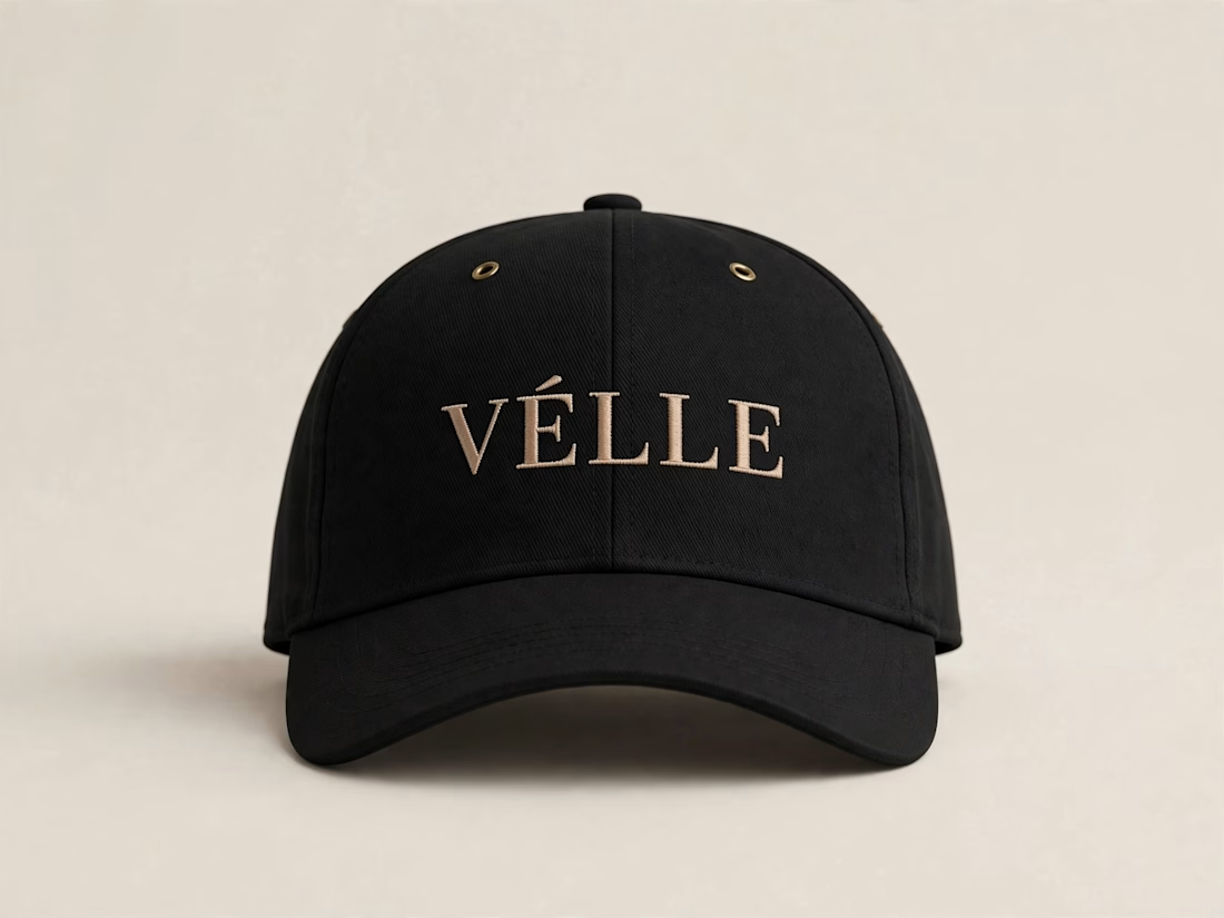
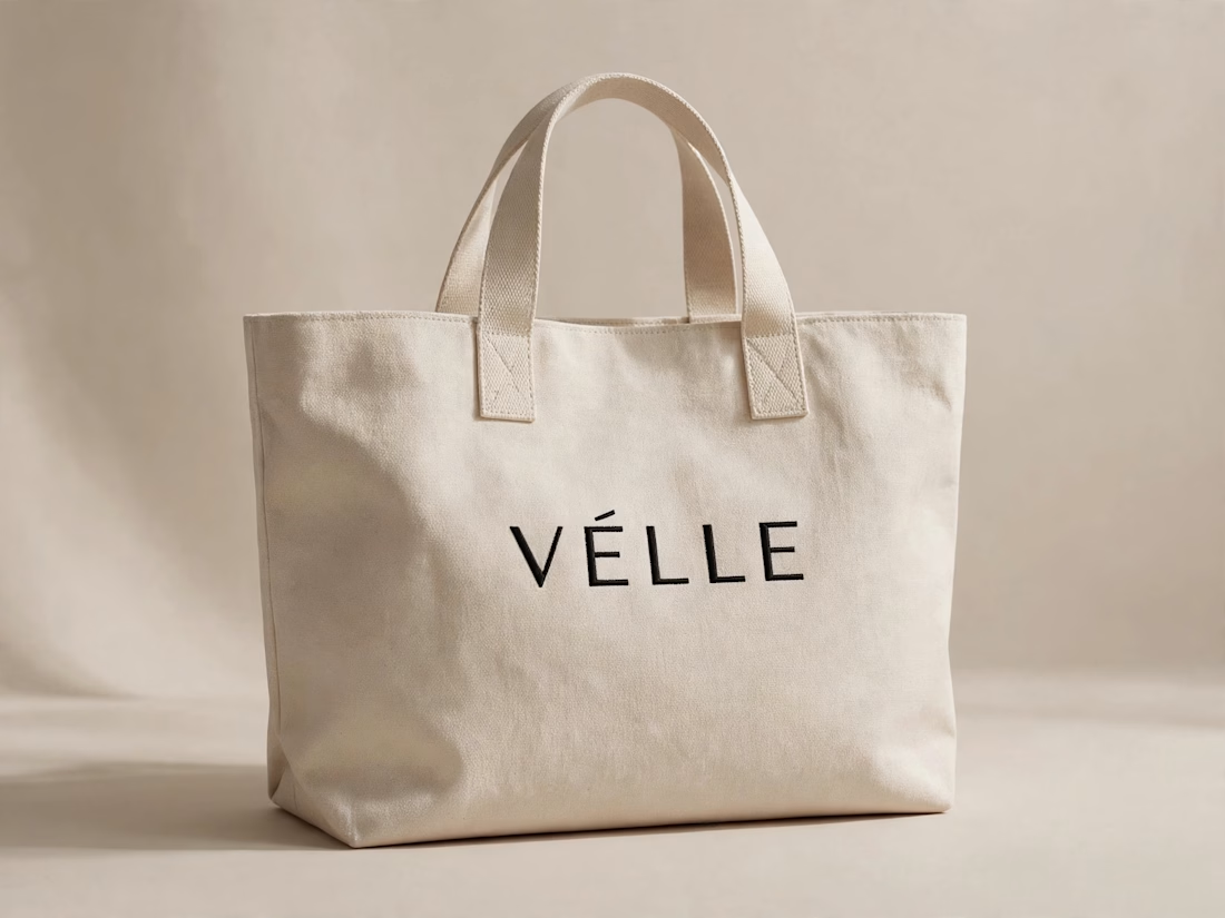

love the minimal direction on this. VÉLLE feels expensive but not loud, the tote and cap mockups are so good

Exploring hero sections for Nation e-commerce
Loving the direction

Solid layout, Miguel! The contrast between the clean typography and those interactive bento-style cards is crisp. Building this layout with smooth CSS grid transitions or GSAP pin scrolling would make the UX feel incredibly interactive.

New logo & brand identity under 1 week for Get Stuff Digital ✨