The network for creativity
Join 1.25M professional creatives like you
Connect with clients, get discovered, and run your business 100% commission-free
Creatives on Contra have earned over $150M and we are just getting started
Back to feedPost
Taste Test

What visual causes you the most jazz? Our opinions are divided, so we need your support
33 voted
41%
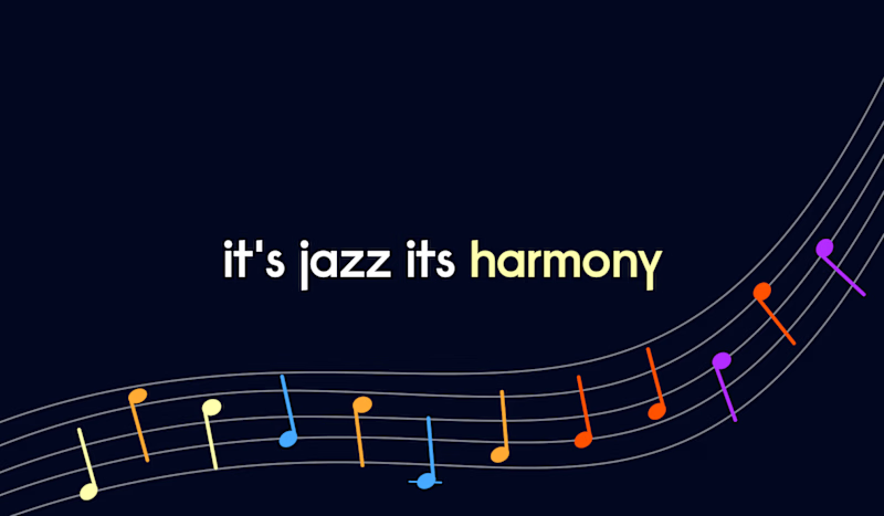
48 voted
59%
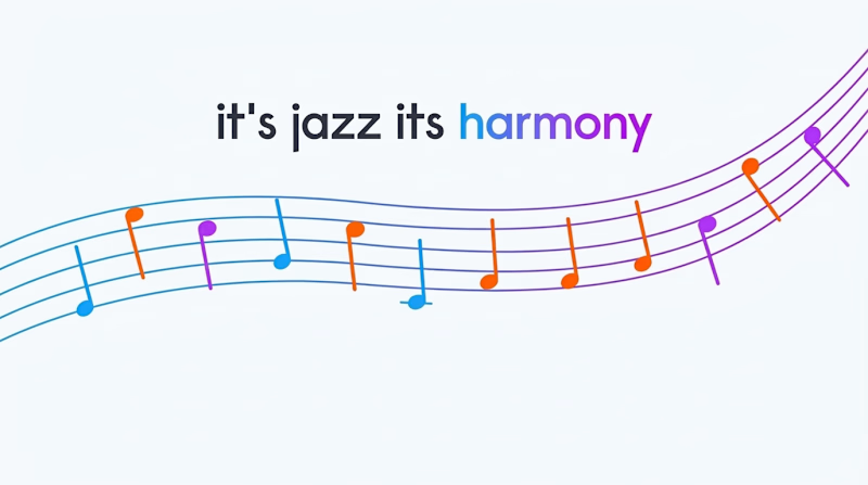
81 votes
Closed

The dark one is really super clean and its just popped up and think dark one would be stand out.

You are most welcome, mate! what was the project about?

Option 1 looks good!
Thanks, Lviv 🙌

I really like how Option 1 keeps the mood more atmospheric while still making the typography and rhythm stand out
Thank you for your valuable opinion

i usually opt for dark options, but i love the light here! it keeps the feeling uplifting & effervescent, unpredictable like jazz music itself.
wow, an interesting observation
i'm big on underlying meaning, hahah. it reminds me of a line from the musical 'next to normal' where it's mentioned that classical is 'boring' as it's just 'playing the notes on the page' while jazz has infinite space for possibility & branching off into the new, unexplored...
This isn't just observation—it's depth 😊

Actually it was a tough choice for me. They both look good but I slightly prefer the dark one.
I call it a 51/49 decision
Precisely.👊🏼😆
🤜🤛 Thanks


option 1, the dark one hits
Thank you. Dark is undoubtedly in the lead so far.

Option 1 Best
Thanks, it's very useful 🙌

Tough choice here, I don't think I can connect the techy looking gradient to jazz, so perhaps Option 1 gets my vote.
From a copy perspective, I would add comma or period after jazz.
Thanks 👍

The black one gives the most jazz
Useful 👍

The black one is better
Thanks, Michael. It looks like it is undisputed leader
Exactly 💯

Dark one wow🔥
Amina, thanks for your wow opinion 🙌

option one

This is the first such interesting review about option 2. Basically This is the first such interesting review about option 2. Basically everyone writes about option 1
Thanks 👍

A. im a sucker for dark moder

Option 2 - the lighter version. The gradient in Harmony is sick!!
Love it
The network for creativity
Join 1.25M professional creatives like you
Connect with clients, get discovered, and run your business 100% commission-free
Creatives on Contra have earned over $150M and we are just getting started
Trending
retrofuturism
Share your favorite designs from the past exploring the distant future. Or your own take on the aesthetic 🚀
halftone
Dots. Texture. Grain. Let's see your designs using the halftone technique.

Midjourney
Creatives are showing off what they're making with Midjourney.
colorgrade
Video editors sound off: How do you enhance the mood of your video in color grading?
Related posts

A small fragment from a new project.👀 I tried two different approaches for the same animation.
Same idea, different timing and movement.
Which one would you go with? A or B? And why?💭
29 voted
53%
26 voted
47%
55 votes
Closed

Had tough time choosing these 🎀

The hero sets the tone for the whole page.
Exploring a couple of ways to get it right.
38 voted
68%
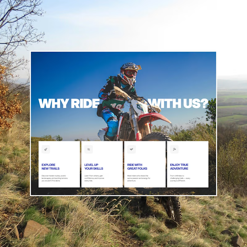
18 voted
32%
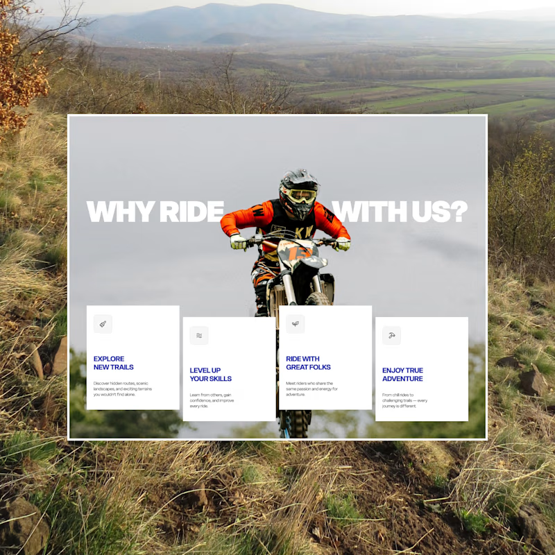
56 votes
Closed

I can go with A

Need your eye here!🦩🕶️
Option A – Soft pink
Option B – Bold dark
What's your vote?
15 voted
24%

47 voted
76%

62 votes
Closed
not sure who picked option A 😄