The network for creativity
Join 1.25M professional creatives like you
Connect with clients, get discovered, and run your business 100% commission-free
Creatives on Contra have earned over $150M and we are just getting started
Back to feedPost
Meet Neris 🌊 a concept running brand named after the river that flows through Vilnius. The monogram is one continuous line that bends like water. No sharp turns, just like a good long run (in theory).
Neris is self-initiated concept. I gave myself a challenge: one concept a day, Neris goes first, so lace up.


The one-line monogram flowing like the river is a lovely idea. I'm curious how it behaves when it shrinks to favicon or shoe-tag size, since a single continuous stroke can thicken and lose its bends at small scale.

Thanks for the thoughtful feedback! As the design scales down, the monogram can simplify to just the letter N, which is distinctive and memorable enough to stand on its own.
A standalone N for the smallest sizes makes sense, and it leaves the full flowing line free for places with room to breathe, like packaging or a big wall graphic. Does the N keep a hint of the river's curve, or is it a clean break?

The network for creativity
Join 1.25M professional creatives like you
Connect with clients, get discovered, and run your business 100% commission-free
Creatives on Contra have earned over $150M and we are just getting started






Related posts

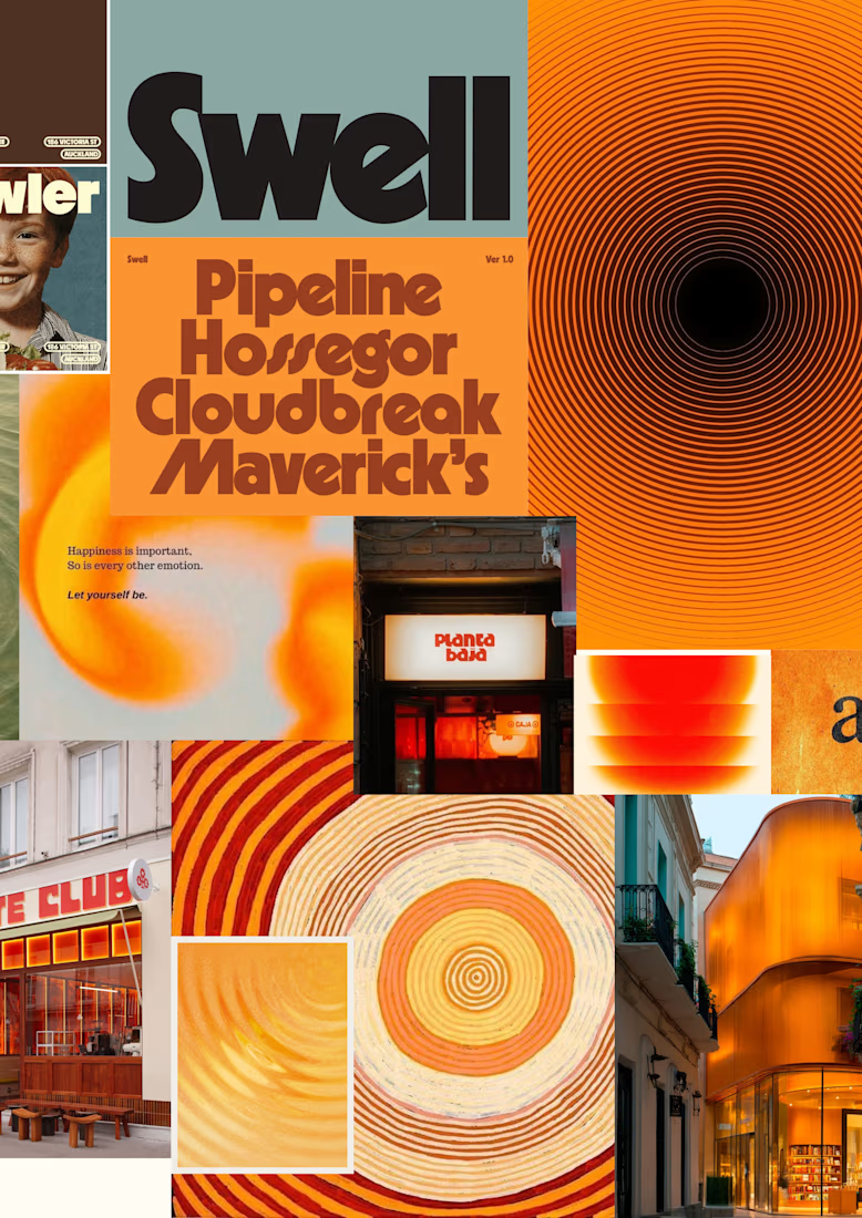
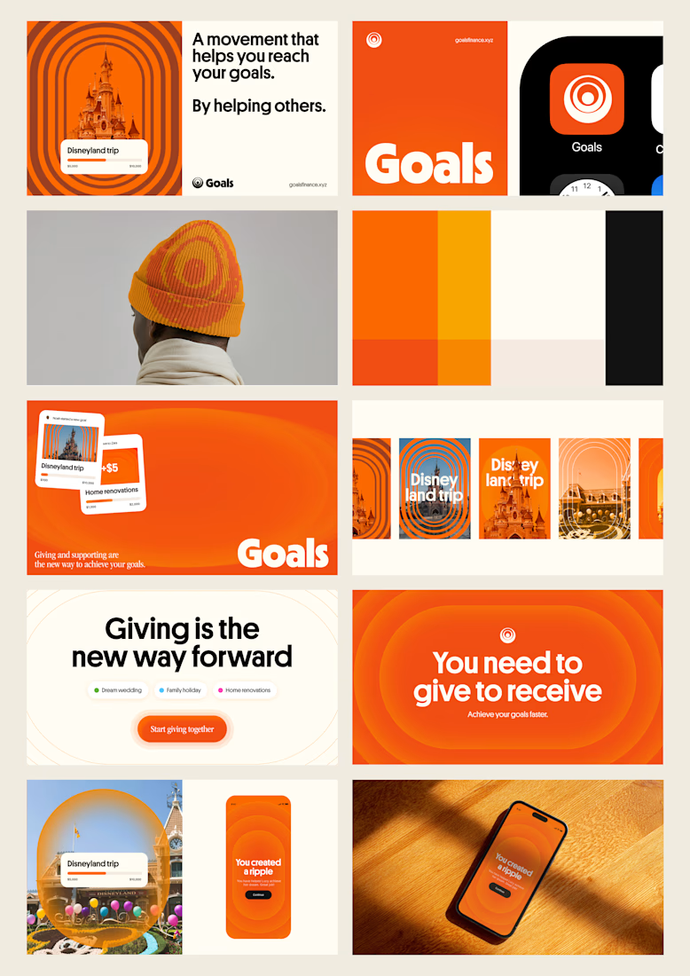
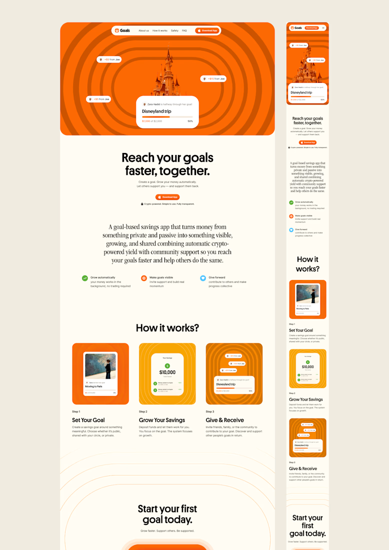
one of my favourite things about running a one-person studio is that nothing gets lost in translation.
the idea behind the brand is the same idea that shapes the website and the product.
no handovers, no starting from scratch, no trying to explain the vision to someone new.
a little look at how that came together for goals, from the first moodboard to the app ↓
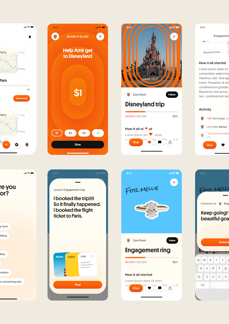

Love it!


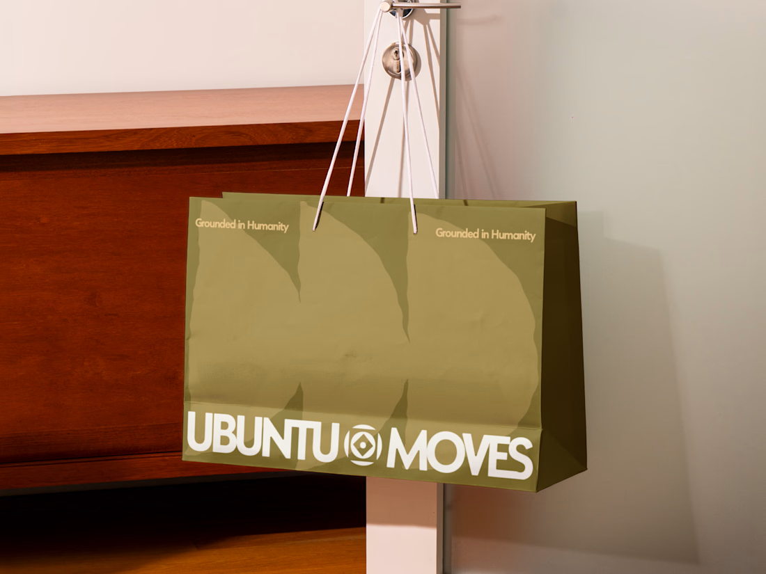
Grounded in humanity, made for movement.
Packaging and custom Framer website design for Ubuntu Moves, a wellness brand inspired by the belief that “I am because we are.”
Earthy colors, expressive patterns, and bold typography bring its sense of connection into the physical and digital experience.
Thanks @Can Girgin for the Framer development💫


The olive shopping bag with the wordmark split around that circular emblem looks great in the warm light, and the big tonal arches printed behind it add movement without shouting.

NEOL. Making of the Hero
NEOL develops CuGlide™, a copper-based lubricant technology that reduces wear between metal parts.
I recently designed their website. The hero was the hardest part: two gears in contact, with a thin copper film where they meet. That's why I built it in 3D instead of generating it: AI video can't give that level of control and precision.
From the first draft to the live site.


Sleek work!