The network for creativity
Join 1.25M professional creatives like you
Connect with clients, get discovered, and run your business 100% commission-free
Creatives on Contra have earned over $150M and we are just getting started
Back to feedPost
Built a concept website for an autonomous surveillance robot fully interactive 3D scene running live in Spline.
Dark environment, electric blue lightning, the unit sitting right in the middle of it. The kind of hero section that doesn't need a headline to make a point.


Creativity out of roof. Amazing website 😍


Stunning work 👏

Thanks !

Thank you Cipher


Cool!

And I found the design gets my second goat of the day! 👍
Thanks Akin !


Nice work🔥👏👏

looks, sick 🔥

Looks Amazing 🔥

You're an amazing designer!
Thanks Victor 🙌
The network for creativity
Join 1.25M professional creatives like you
Connect with clients, get discovered, and run your business 100% commission-free
Creatives on Contra have earned over $150M and we are just getting started




Related posts

What should a creative agency website actually feel like?
For Orvika, we didn't want another agency site built around the same safe layouts and predictable sections.
We pushed the visual direction further with oversized typography, editorial layouts, bold imagery, and stronger contrast, while keeping the experience structured enough to communicate the agency's work and capabilities clearly.
The goal wasn't just to make it look different.
It was to make the agency feel different.
Designed in Figma and built in Framer.
We're sharing more of the websites and digital experiences we've been working on here over the next few weeks.


Very neat man

Been working on my 6th framer template. Almost ready, just a couple of things left.
What do you guys think?

Instead of images size cover frame, make it bigger in X, that as slides , also scroll the image from X 0 to 100 - cool parallax effect ⭐

ADCB × Shukran - Credit Card Landing Page.
I designed a landing page for the co-branded credit card partnership between ADCB and Shukran, Landmark Group’s loyalty programme.
The page brings together the card’s benefits, participating brands and application entry point, helping visitors understand the offering and explore how to get started.
The design uses a black-and-gold palette, prominent card imagery and distinct content sections to present a wide range of rewards in a cohesive visual experience. The work shown includes the landing-page design, benefits presentation and “How it works” section.

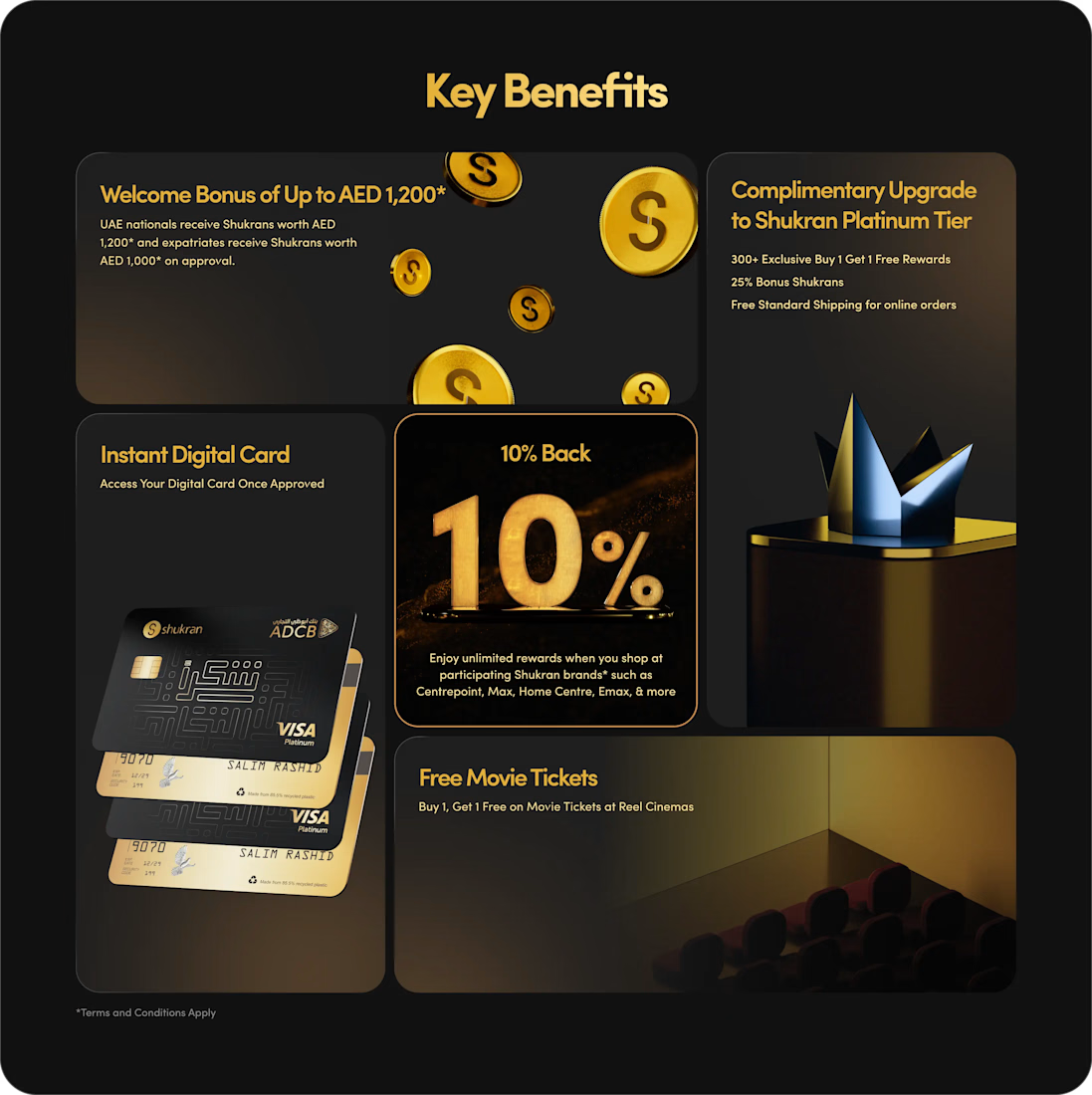
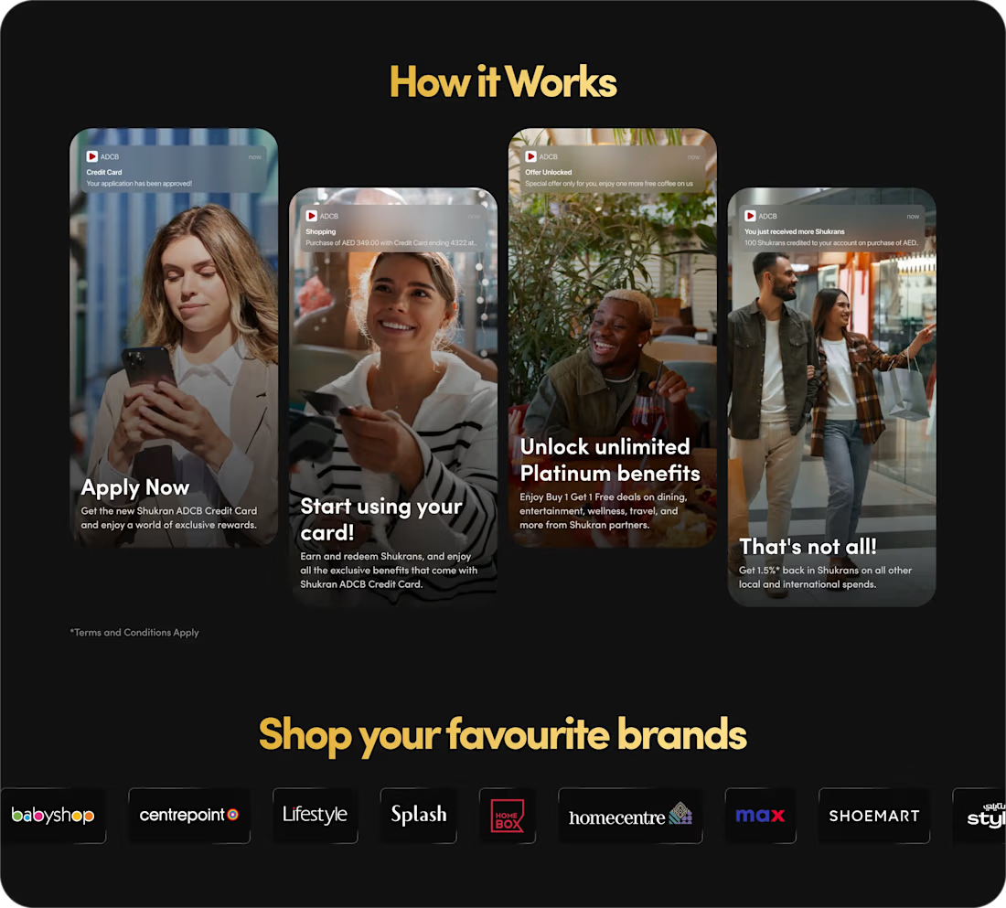
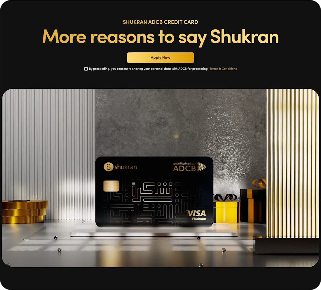
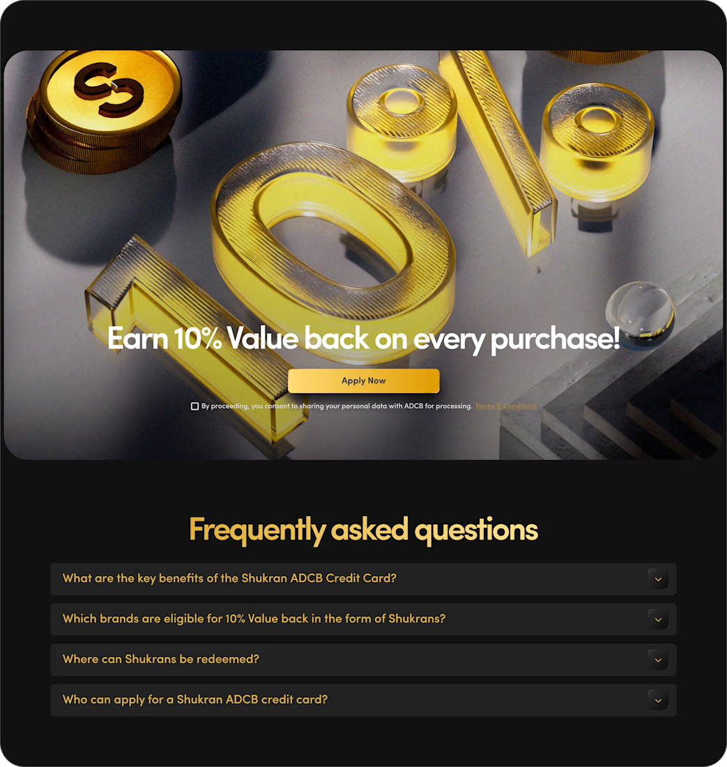

The benefits and application path are presented with clarity.