The network for creativity
Join 1.25M professional creatives like you
Connect with clients, get discovered, and run your business 100% commission-free
Creatives on Contra have earned over $150M and we are just getting started
Back to feedPost

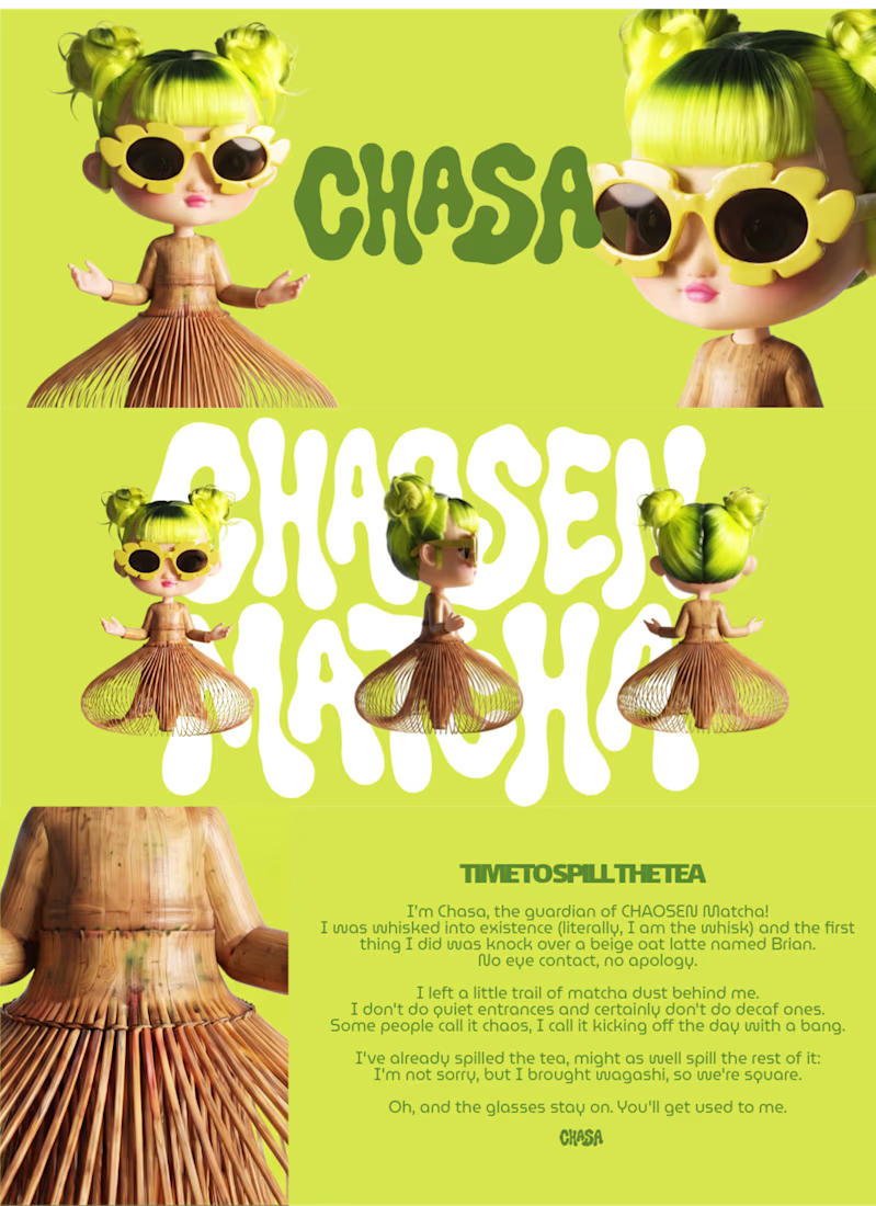
Time to spill the tea 😈🍵
I’m Chasa, the guardian of CHAOSEN Matcha! I was whisked into existence (literally, I am the whisk) and the first thing I did was knock over a beige oat latte named Brian.
I left a little trail of matcha dust behind me because I don't do quiet entrances and certainly don't do decaf ones. Some people call it chaos, I call it starting the day with a bang.
I've already spilled the tea, might as well spill the rest of it: I'm not sorry, but I brought wagashi, so we're square.
Oh, and the glasses stay on. You'll get used to me. 😎
Overview
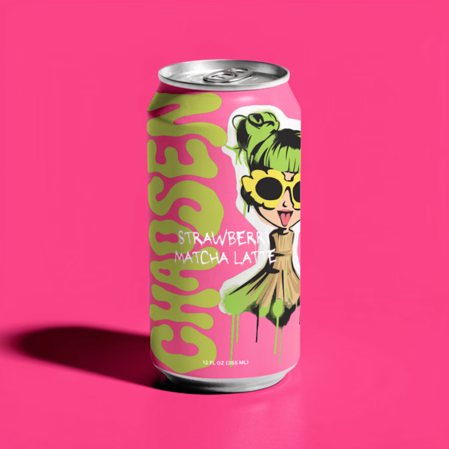
CHAOSEN Matcha is a fictional matcha brand with a louder, more expressive point of view. I wanted to move away from the quiet, polished matcha look and build something sharper, messier, and more memorable.
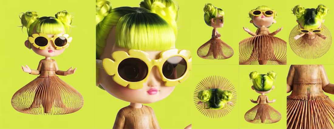
The mascot is Chasa, a mischievous matcha guardian inspired by the shape of a bamboo chasen whisk. She has neon green hair, oversized yellow flower sunglasses, a chasen-inspired silhouette, and a personality that feels cute, bold, and slightly unhinged in the best way. The goal was to make her feel like a real character who could live across packaging, posters, product visuals, and motion without losing her identity.
Character Brief
Chasa was whisked into existence from the first splash of CHAOSEN Matcha. She brings attitude, humor, and a little disorder to a category that often feels too quiet. Her look is built around a few strong visual anchors: the chasen dress, neon green hair, yellow flower sunglasses, and a mischievous expression. Wherever she shows up, she still feels instantly recognizable.
Visual Identity
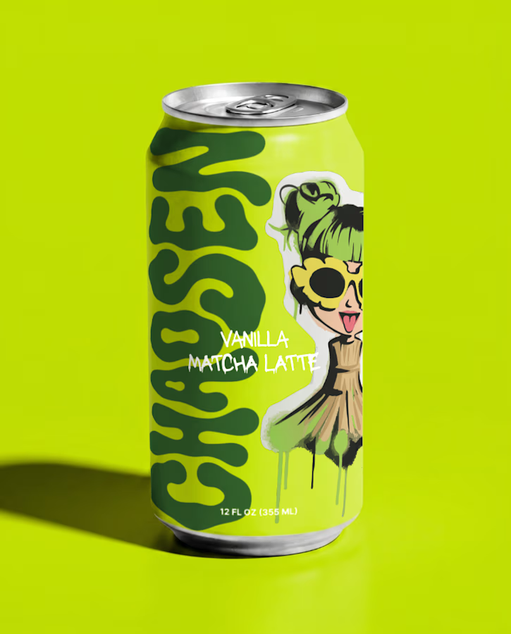
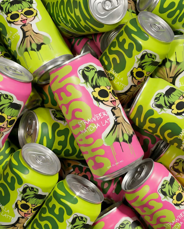
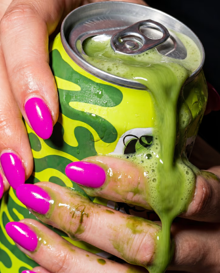
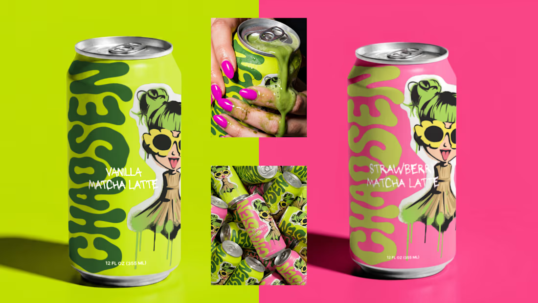
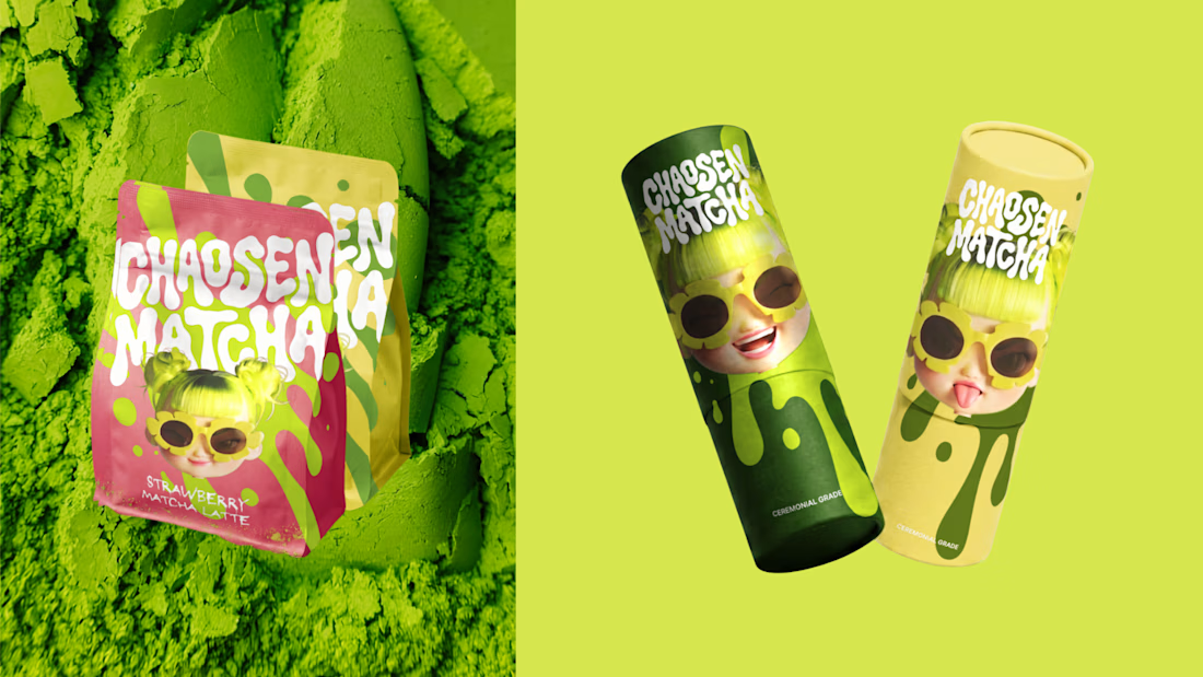
The visual system is bold, graphic, and product-first. I used saturated green, yellow, and pink with matcha spill shapes, custom lettering, and character-led layouts to make the brand feel collectible and high-impact.
The key identity elements are:
Chasa’s bamboo chasen-inspired silhouette
Neon green hair
Oversized yellow flower sunglasses
Matcha spill graphics
Bold organic lettering
Premium packaging with a disruptive edge
The biggest challenge was making Chasa feel consistent across different formats. I focused on repeatable details: her chasen silhouette, neon green hair, yellow sunglasses, mischievous face, and bold matcha energy. Across the identity board, packaging, posters, and social media, the goal was for her to always feel like the same little troublemaker.
I’ve been using Recraft for over a year now. I mostly used the platform for image generation, downloaded those assets and turned them into video via Higgsfield or Adobe. Recraft is by far one of my favorite image generators so it was super satisfying being able to stay within the platform for bulk of the workflow without jumping to another tool for image-to-video. 🖤
Recraft Project Link: https://www.recraft.ai/project/9810be15-a7d5-4d0d-b136-996369e10134

Product applications

WOAH! 💚
The network for creativity
Join 1.25M professional creatives like you
Connect with clients, get discovered, and run your business 100% commission-free
Creatives on Contra have earned over $150M and we are just getting started
Related posts

SPROUT — Grow Good Things 🌱
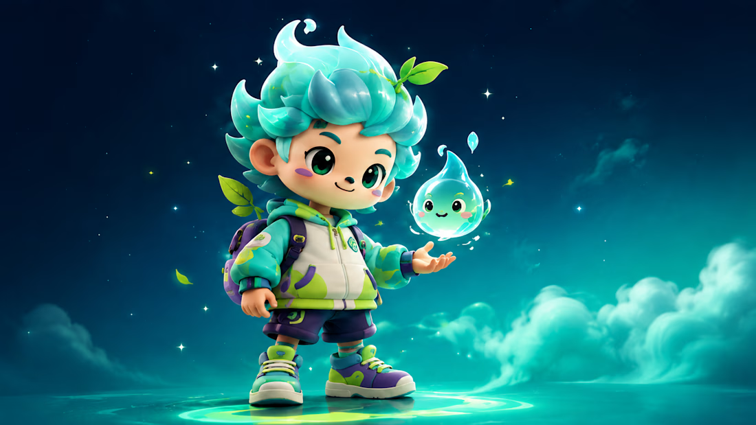
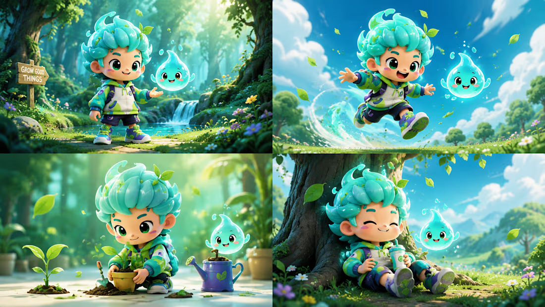
SPROUT is an original mascot created for a fictional eco-lifestyle brand that encourages people to make small everyday actions count—planting, recycling, protecting nature, and spreading kindness.
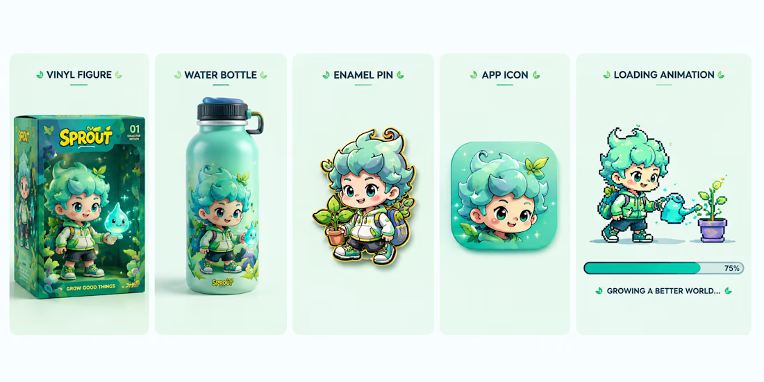
Rather than designing just a cute character, I built an entire visual identity system around Sprout, ensuring the mascot stays instantly recognizable across every touchpoint. From the custom wordmark and color palette to merchandise, packaging, stickers, app icon, environmental storytelling, and animation, every asset was created to feel like part of one cohesive world.
The floating water spirit represents life, growth, and hope, while Sprout's glowing leaf symbolizes that even the smallest act can create lasting change.
This project explores how a single mascot can become the face of an entire fictional brand through consistent design, storytelling, and scalable applications.
🌱 Character Brief
Name: SPROUT
Role: Guardian of Growth
Personality: Curious, optimistic, adventurous, compassionate, playful, and endlessly encouraging.
Sprout believes every tiny action matters. Whether planting a seed, helping nature, or inspiring someone else, Sprout reminds us that big change always starts small.
Recraft Project
Explore the full project here:
#RecraftAI #CharacterDesign #MascotDesign #BrandIdentity #CreativeAI #Illustration #3DCharacter #DesignChallenge #BrandDesign #ConceptArt #AIArtist #MotionDesign #GraphicDesign #EcoBrand #DigitalArt
Ultra-premium collectible designer mascot brand "SPROUT".

GILLA — Geared for the Climb ⛰️
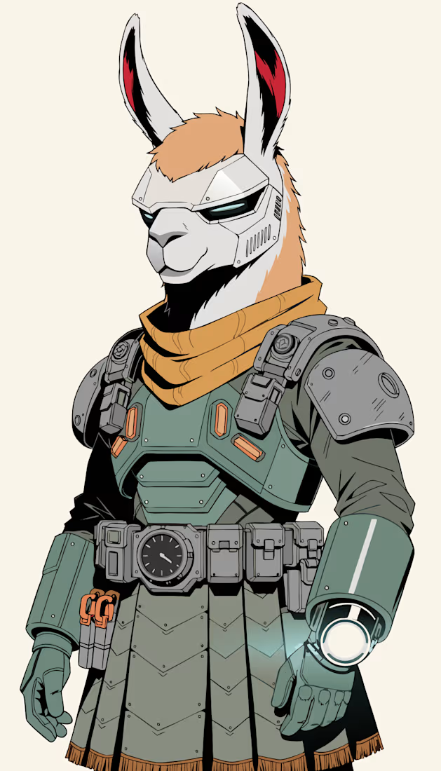
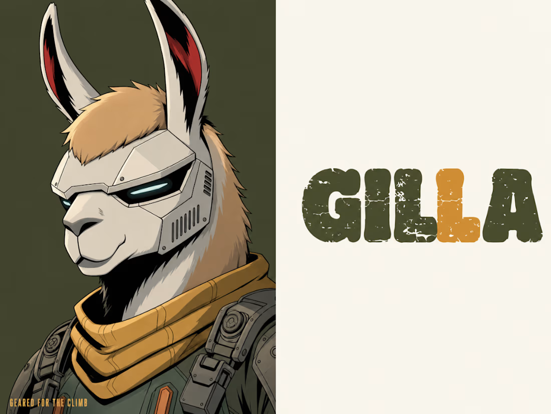
GILLA is an original mascot created for a fictional cyberfuturism outdoor gear brand — a llama warrior who treats every trail like a mission and every pack like precious cargo.
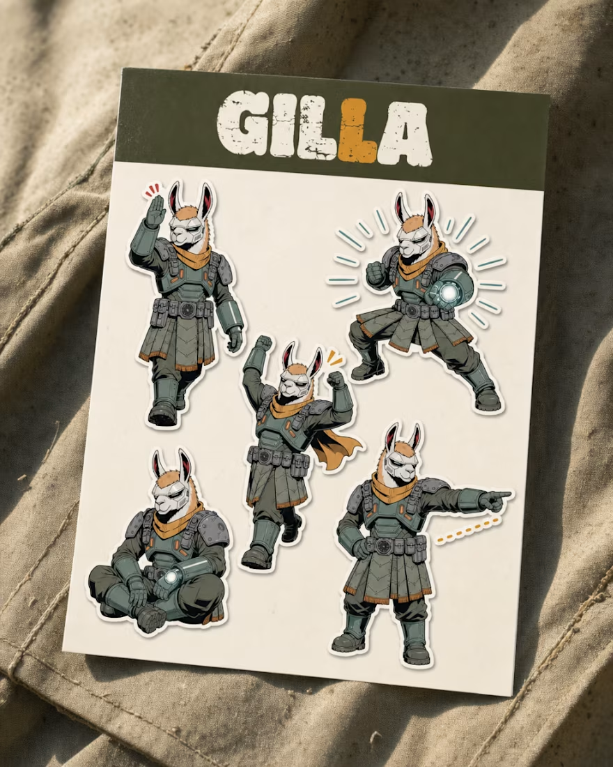
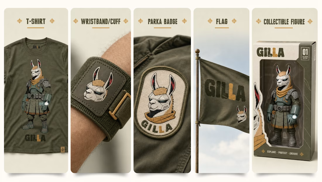
Instead of just designing a character, I built a full visual identity system around Gilla: wordmark, color palette, brand poster, sticker sheet, and product mockups across apparel, patches, flags, and collectibles. The goal was for the mascot to stay instantly recognizable across every touchpoint, from a t-shirt print to a parka badge. Mascot and wordmark were generated and refined with Recraft V4.1 Pro Vector, keeping every core asset clean and production-ready from concept to final application.
The cyberfuturism visor-mask and wrist-mounted blaster stand for readiness and precision, while the mustard-gold scarf is a nod to Andean pack-llama heritage, animals that carried cargo across mountain passes long before "outdoor gear" was even an industry. Strong but not loud: tactical without losing warmth.
This project is an exploration of how one mascot, grounded in real material culture instead of generic sci-fi tropes, can carry an entire fictional outdoor brand across illustration, product design, and motion.
🦙 Character Brief
Name: GILLA
Role: Trail guardian & gear-bearer
Personality: Strong, soldier-disciplined, mission-first.
Explore the full project here:


I couldn't just stand aside and not join in on the fun of this character challenge. So let me share this mesh animation I did a while back for the Stompers app. These guys have an incredible creative direction and really fun app design. I had a blast animating these characters and hope you'll enjoy watching it.


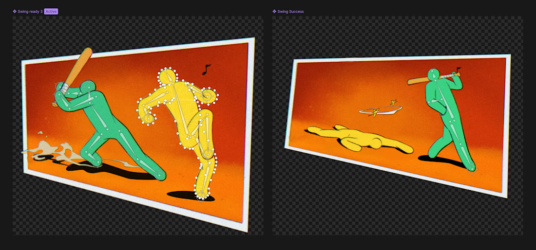

Looks great! Curious about the choice to go with mesh. I tend to avoid it, had some bad experiences with crashes and performance, so I usually stick to vectors 😂




Trending

Claude
Claude has entered the design space. How are you using Claude Design?

Contra University
Learn from expert creatives how to earn more using next-gen AI tools.
fifaworldcup2026
The World Cup is here and the whole world's watching. How are you designing for the world stage?
creativeaiflow
Creative AI workflows are evolving. What tools do you use, and what are their strengths and weaknesses?
freelancerlife
Freelancer life is wins, pivots, and everything in between. What’s yours right now?