
pro
Ashlyn Johnson
Creative direction for social media
New to Contra
Ashlyn is ready for their next project!
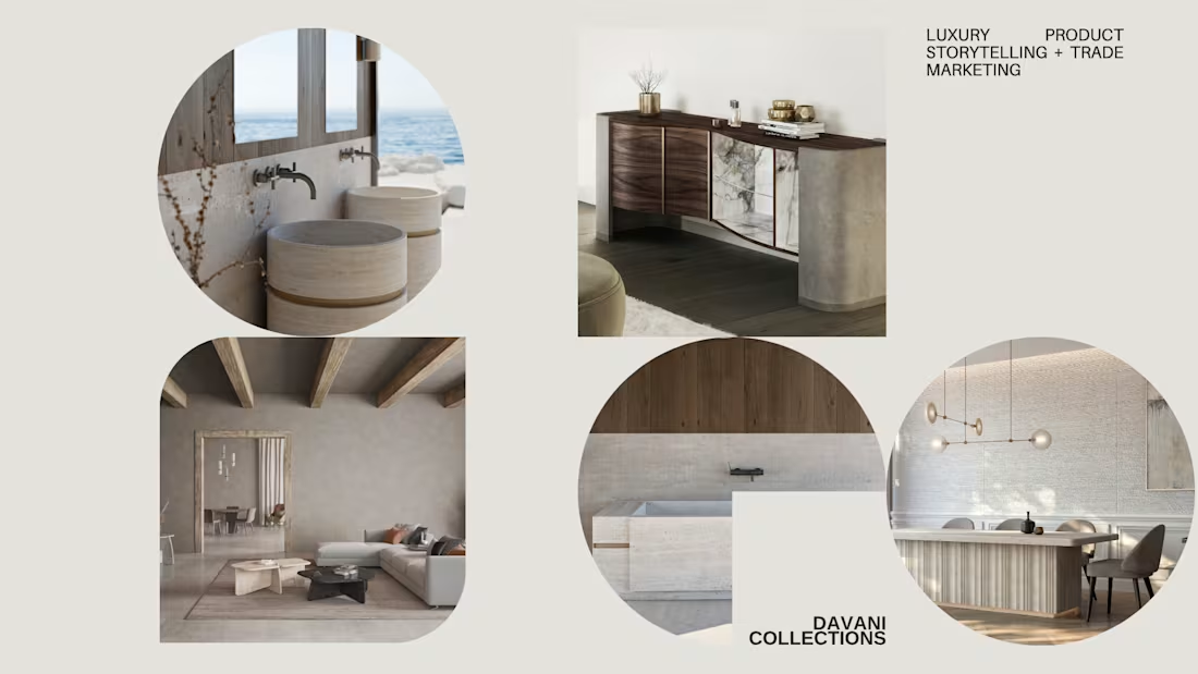
Before my involvement, DAVANI was showing up online almost entirely through catalog renderings. The pieces were beautiful, but the feed felt repetitive and overly transactional. It was asking the audience to look at products before giving them a reason to feel the world those products belonged to. As a result, the brand was not seeing meaningful engagement, platform growth, or inquiries from interior designers, luxury showrooms, and trade partners.
Before scheduling a single post, I stepped back and built a visual identity beyond product photos and renderings. I curated a quieter, more atmospheric direction rooted in stone, water, light, negative space, organic texture, and the sensual permanence of material. Alongside the serene coastal visuals, I also brought in more raw footage and photography directly from the Italian fabrication partners, using behind-the-scenes process imagery to reveal the hands, tools, surfaces, and true craft behind each piece.
This shift gave the brand a more layered digital presence. Instead of selling product after product, the feed began to unfold like a design language: restrained, elemental, and deeply connected to the feeling of luxury living. The atmospheric visuals created emotional context, while the fabrication content added depth, credibility, and transparency. Together, they allowed the brand’s story, voice, and promise to reveal themselves slowly, making the collection feel less like furniture and more like an architectural presence shaped by material, craft, and permanence.
0
4
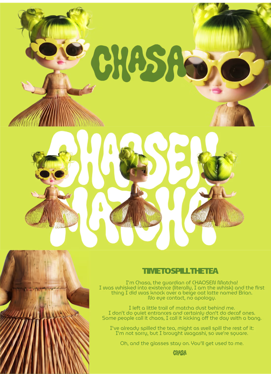
Time to spill the tea 😈🍵
I’m Chasa, the guardian of CHAOSEN Matcha! I was whisked into existence (literally, I am the whisk) and the first thing I did was knock over a beige oat latte named Brian.
I left a little trail of matcha dust behind me because I don't do quiet entrances and certainly don't do decaf ones. Some people call it chaos, I call it starting the day with a bang.
I've already spilled the tea, might as well spill the rest of it: I'm not sorry, but I brought wagashi, so we're square.
Oh, and the glasses stay on. You'll get used to me. 😎
Overview
CHAOSEN Matcha is a fictional matcha brand with a louder, more expressive point of view. I wanted to move away from the quiet, polished matcha look and build something sharper, messier, and more memorable.
The mascot is Chasa, a mischievous matcha guardian inspired by the shape of a bamboo chasen whisk. She has neon green hair, oversized yellow flower sunglasses, a chasen-inspired silhouette, and a personality that feels cute, bold, and slightly unhinged in the best way. The goal was to make her feel like a real character who could live across packaging, posters, product visuals, and motion without losing her identity.
Character Brief
Chasa was whisked into existence from the first splash of CHAOSEN Matcha. She brings attitude, humor, and a little disorder to a category that often feels too quiet. Her look is built around a few strong visual anchors: the chasen dress, neon green hair, yellow flower sunglasses, and a mischievous expression. Wherever she shows up, she still feels instantly recognizable.
Visual Identity
The visual system is bold, graphic, and product-first. I used saturated green, yellow, and pink with matcha spill shapes, custom lettering, and character-led layouts to make the brand feel collectible and high-impact.
The key identity elements are:
Chasa’s bamboo chasen-inspired silhouette
Neon green hair
Oversized yellow flower sunglasses
Matcha spill graphics
Bold organic lettering
Premium packaging with a disruptive edge
The biggest challenge was making Chasa feel consistent across different formats. I focused on repeatable details: her chasen silhouette, neon green hair, yellow sunglasses, mischievous face, and bold matcha energy. Across the identity board, packaging, posters, and social media, the goal was for her to always feel like the same little troublemaker.
I’ve been using Recraft for over a year now. I mostly used the platform for image generation, downloaded those assets and turned them into video via Higgsfield or Adobe. Recraft is by far one of my favorite image generators so it was super satisfying being able to stay within the platform for bulk of the workflow without jumping to another tool for image-to-video. 🖤
Recraft Project Link: https://www.recraft.ai/project/9810be15-a7d5-4d0d-b136-996369e10134
3
3
223
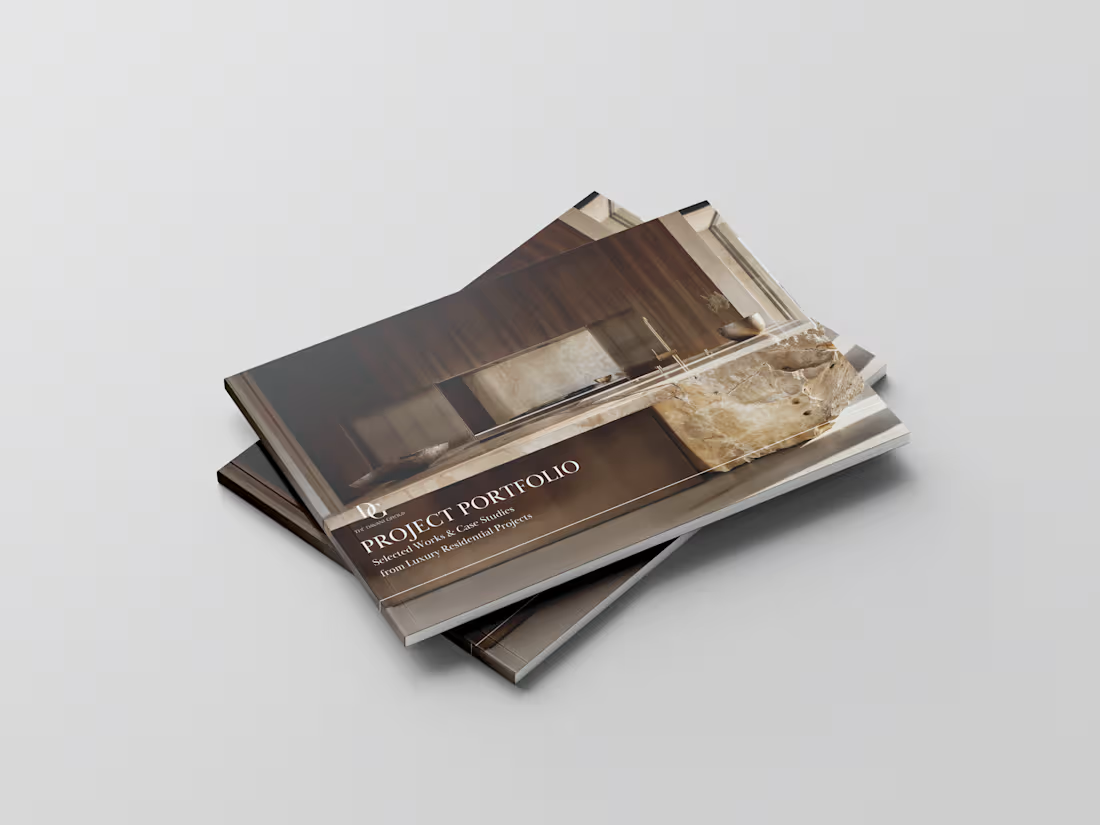
Project Portfolio for Luxury Millwork + Custom Stone Vendor
0
69
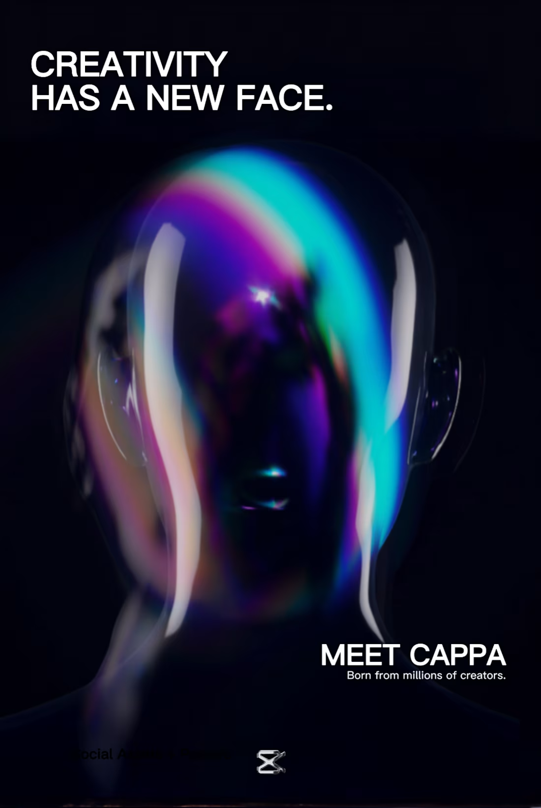
Meet CAPPA.
1
1
212