The network for creativity
Join 1.25M professional creatives like you
Connect with clients, get discovered, and run your business 100% commission-free
Creatives on Contra have earned over $150M and we are just getting started
Back to feedPost
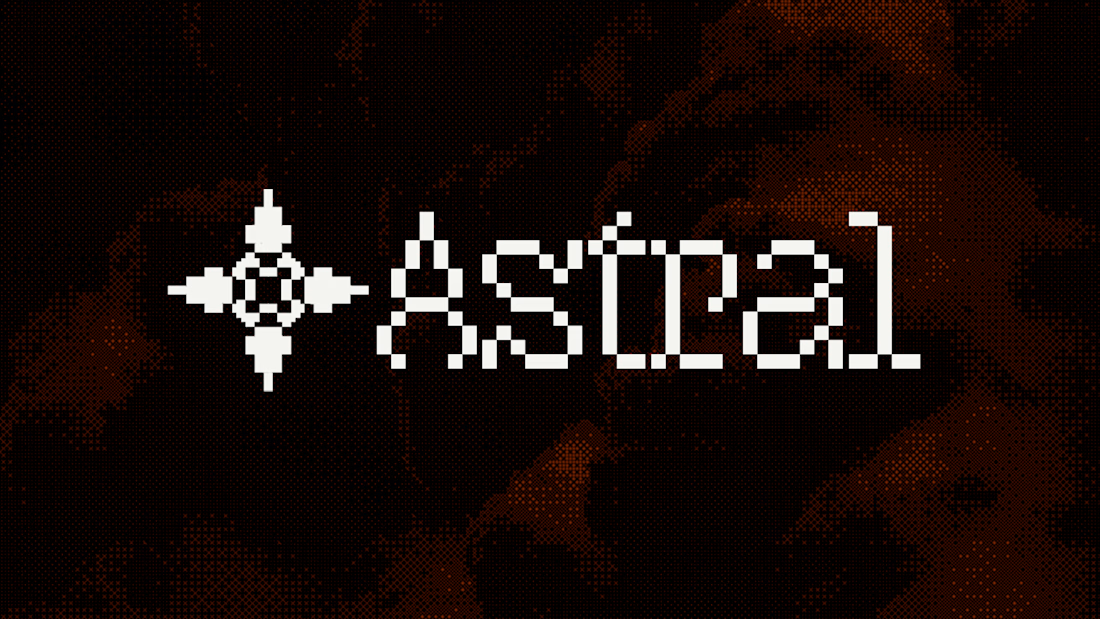
We've been sharing ASTRAL piece by piece. Here's a look at what holds the whole identity together. ↓
A brand starts getting interesting when the logo stops doing all the work.
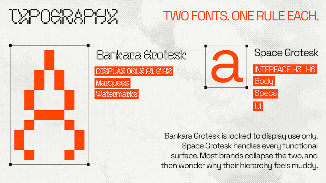
→ Two typefaces, each with a clear role
→ A restrained palette built around one unmistakable signal
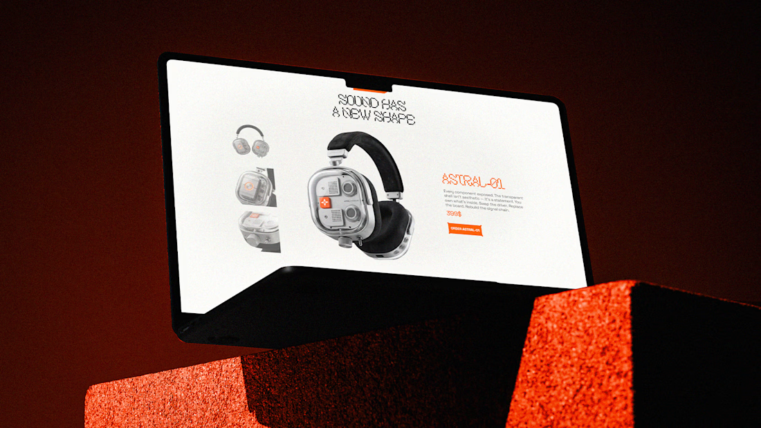
→ A visual language that moves naturally from product to interface
Every decision belongs to the same world. From the mark and typography to the product and digital experience.
The goal was simple: make ASTRAL recognizable wherever it shows up.
We've been seeing some incredible work from the Contra community lately. Curious to hear what part of the ASTRAL identity stands out to you most. 👀



Amazing work👏🔥🔥

Thank you so much 🙌

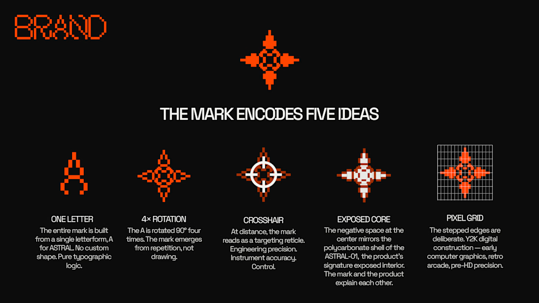
The mark encoding five ideas is what stands out to me, most identity systems stop at "looks good" and skip the part where the shape actually means something. Pairing that pixel wordmark with the cleaner grotesk for UI is a smart contrast too.
Thank you so much, you get the whole idea!


The consistency across type, color, and product is what makes the identity feel so strong.
Thank you!
consistency matters the most for any brand in order to make it look impressive enough.

Such good work!
Thank you so much!

epic!
Thank you so much Nicolette !
The network for creativity
Join 1.25M professional creatives like you
Connect with clients, get discovered, and run your business 100% commission-free
Creatives on Contra have earned over $150M and we are just getting started











Related posts


this is really nice 100%. nice job


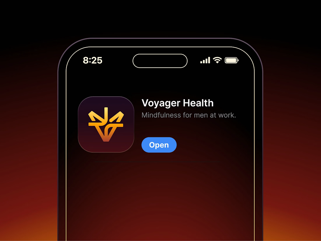

Aryna, that golden symbol pops so nicely against the plum background ✨

Finally a Contra Top Independent!
Been part of this community for a few years now, sharing my work, joining challenges, meeting some great people, and even picking up a few wins along the way.
I've genuinely enjoyed being part of Contra and seeing how much the platform has grown.
This one means a lot. Big thanks to the Contra team for the recognition!
More to come!
