The network for creativity
Join 1.25M professional creatives like you
Connect with clients, get discovered, and run your business 100% commission-free
Creatives on Contra have earned over $150M and we are just getting started
Back to feedPost


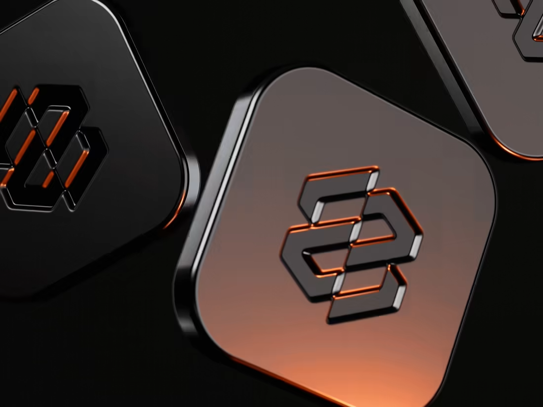
The Powermatic case study is now on Contra.
It's the full story in six chapters: the challenge, the home page, the brand, Careers, the grid and the build. This time with the motion too: the home page scroll, the menu drum and the logo animation.
One detail I didn't mention last time. The preloader fills the logo with the page's real loading progress, fonts and the hero photo included. When it's full, the page is ready.
Everything is designed and hand-coded by me, no framework.
If you have a minute, a like or a comment helps the work reach more people.

The orange light catching the edges of the Powermatic mark on the dark tiles looks tactile and premium. Which of the six chapters took the longest, the grid or the build?
The network for creativity
Join 1.25M professional creatives like you
Connect with clients, get discovered, and run your business 100% commission-free
Creatives on Contra have earned over $150M and we are just getting started





Related posts


A bold, modern landing page for a creative agency, built around immersive visuals and strong typography. We’d love to hear your thoughts!


Ovéa — care with character.
One skincare identity across bottles, jars and tubes. I designed the wordmark, pink-and-cobalt packaging system, campaign applications and digital mockups, then brought the collection into motion.
A consistent visual language, with room for each product to feel individual.
View the full case study. Building a skincare brand? Let’s talk about your identity and packaging.

Love the colour direction and the visual language. Everything feels so well thought out. The overall look is beautiful.


I do my best work when I'm excited about it. This took me under 2h from start to finish. Might have to get more selective about the projects I take on from now on.


Looks so cool🔥I really wonder how you make all the characters and animations.


