
Overview
Trusted technology partner for growing businesses.
Powermatic Technologies® helps growing companies take a digital product from strategy and design to engineering. I drew the logo and the identity, designed the site in Figma, built it in code and wrote its copy.
Scope: logo and identity, home page, menu, Careers with role pages, About, Blog, mobile
Platform: custom code (HTML, CSS, JavaScript)
Year: 2026
Live site: live.helloprokhorov.com/powermatic
01 — Challenge
A technology partner has to show how it works before anyone gets in touch.
Audience. The site speaks to growing companies that need a team for their product. People in that position usually compare several partners at once, and they want to know early how an engagement works and roughly what it costs.
Task. So the first screen had to carry the offer, the way of working and a starting price. The site also has a second audience, people who might join the company, and they needed a way in of their own.
Question 01: What it does
Question 02: How it works
Question 03: What it costs
Question 04: How to join
02 — Home Page
The home page answers a buyer's questions in the order they come.
First screen. Studio sites often hide the price. Here the first screen shows the engagement model, the starting price, the process and support.
Order. Below come proof in numbers, the approach, three ways to work together with prices, notes from the blog and a short FAQ. The page ends on one email.
Engagement: Project · Team · Partner
Starting at: $8,000 / project
Process: Discovery first
After launch: Ongoing support
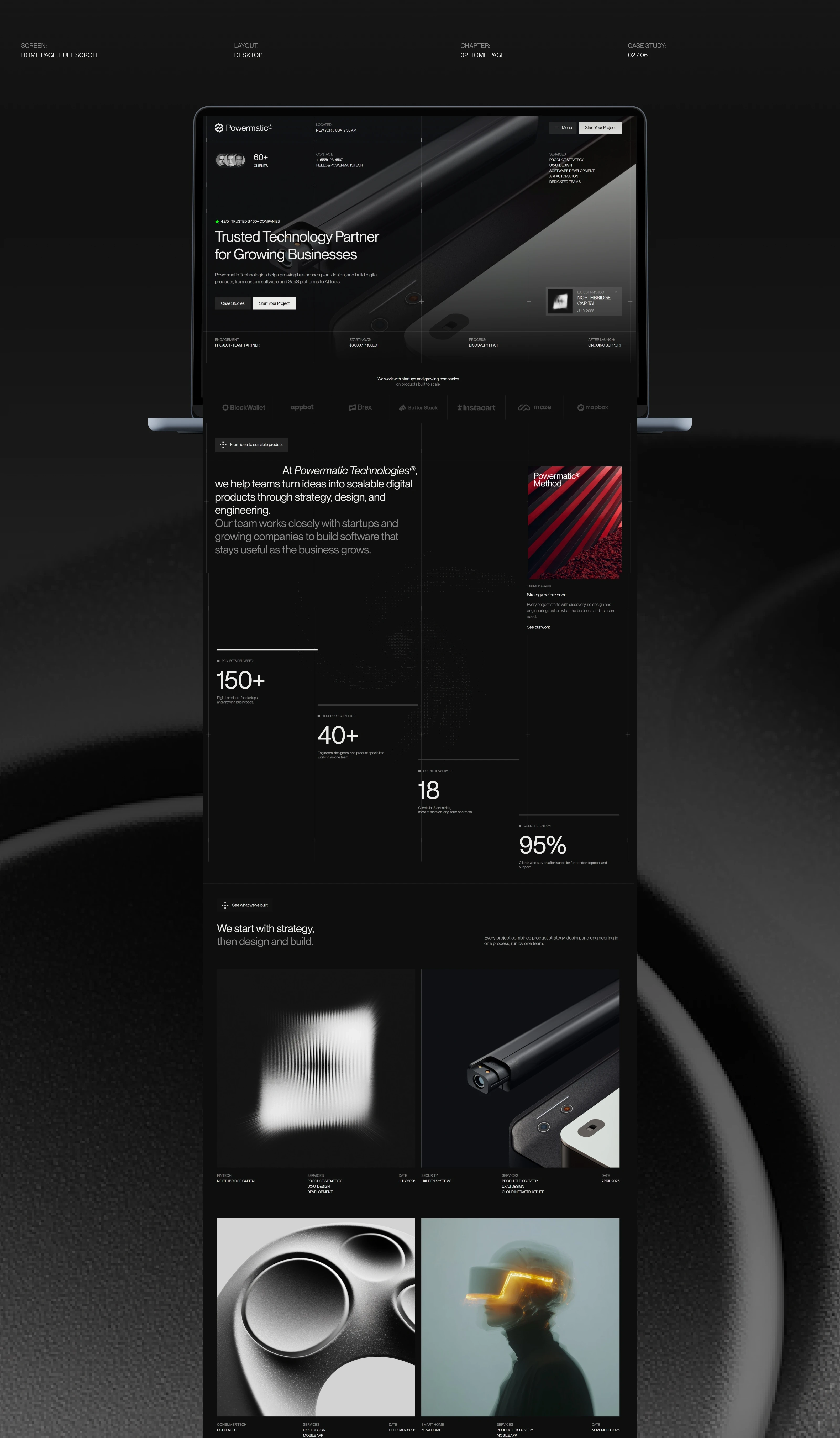
The Powermatic home page on a laptop, full scroll: hero, numbers, approach and cases
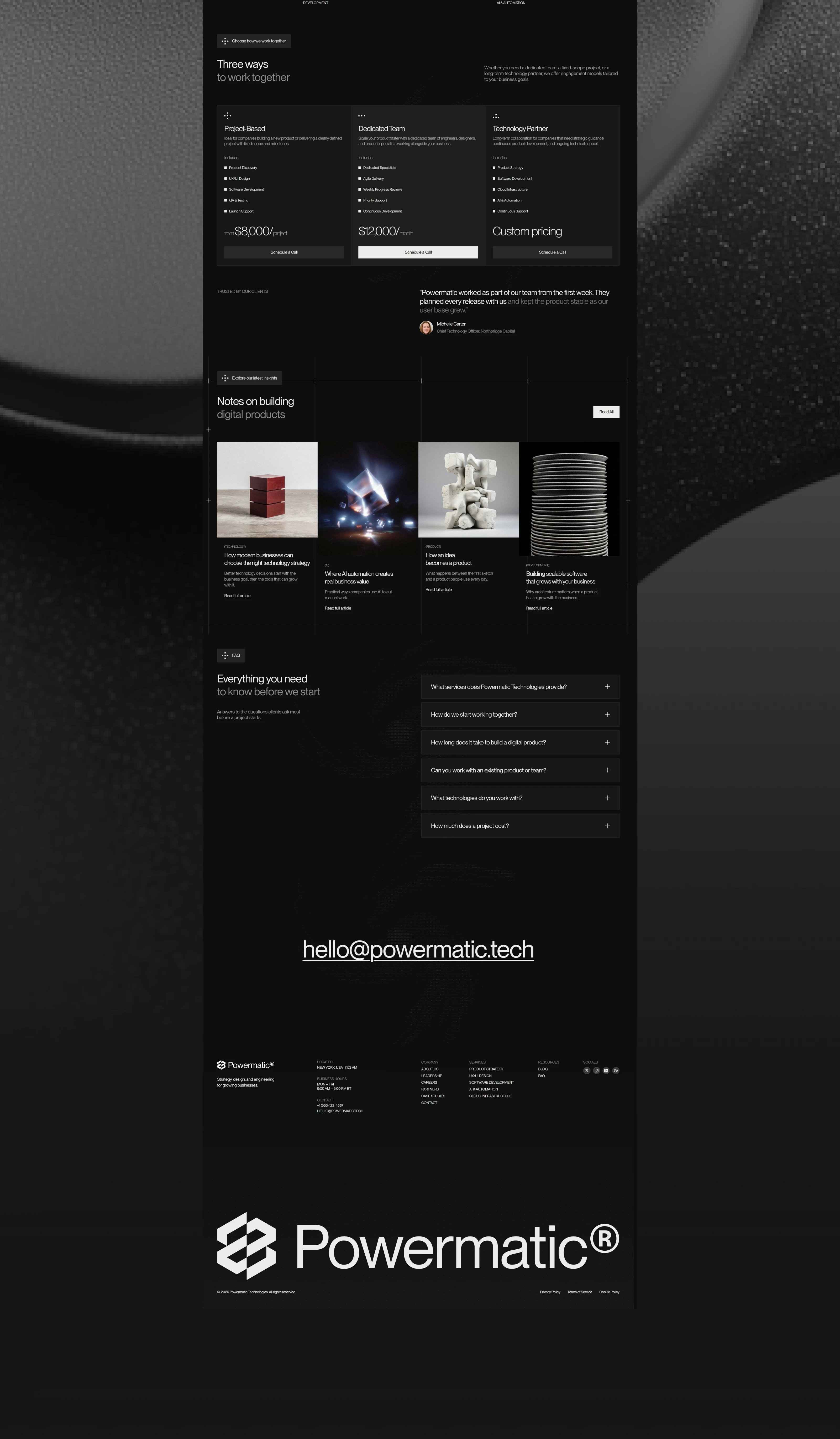
The Powermatic home page, continued: pricing, testimonial, blog, FAQ and footer
03 — Brand Direction
A graphite mark that holds up on screen and on things.
Mark. Two chevrons and a wordmark. The mark animates on the site and prints clean on a lanyard.
Type. One family sets the whole site. Uppercase labels keep data easy to scan, and the light weight keeps big numbers calm.
Mark: animated, engraved in 3D
Colour: Graphite, 9 tokens
Typeface: PP Neue Montreal
Photography: mono, light grain
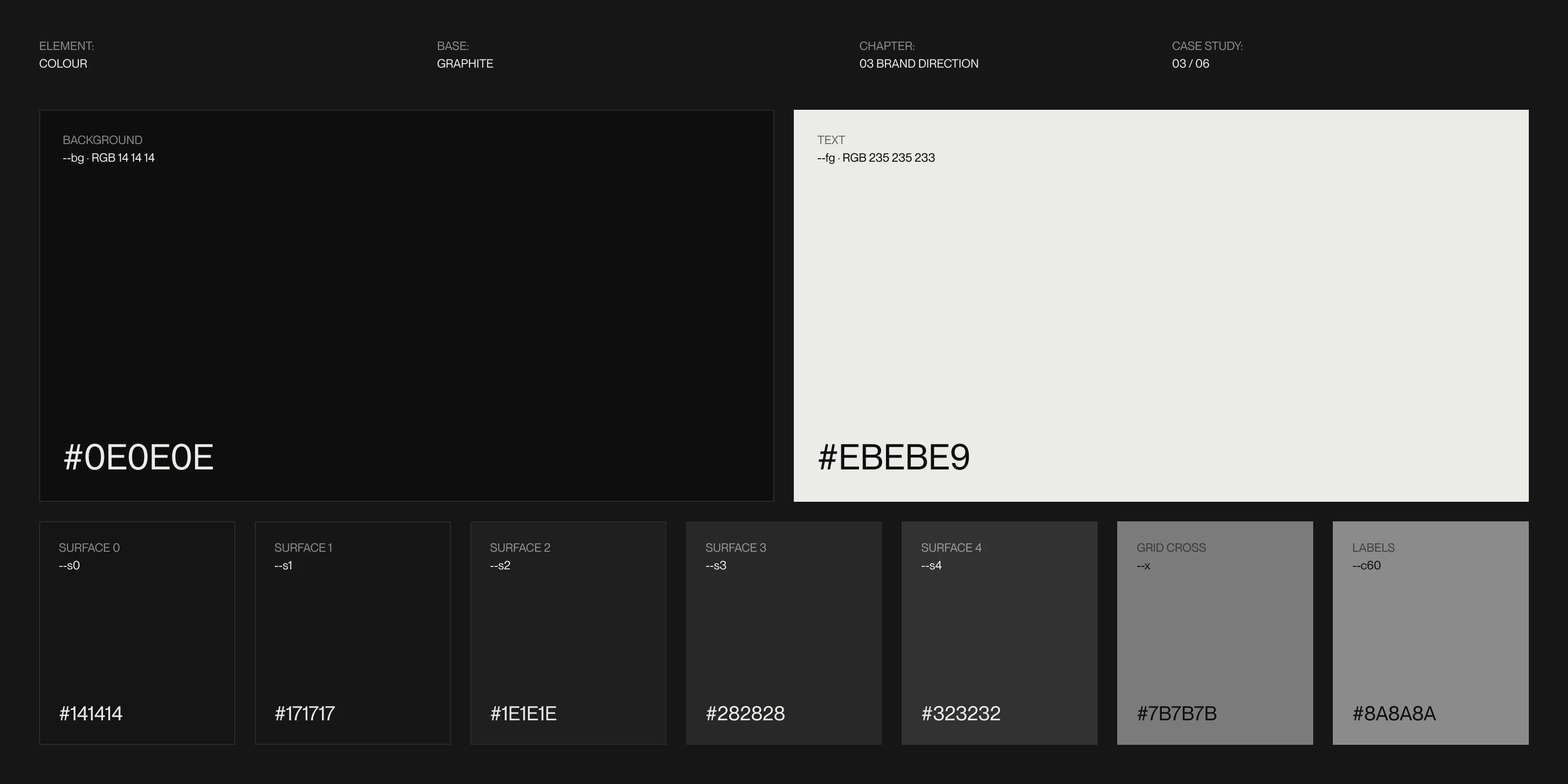
The Graphite palette: background #0E0E0E, text #EBEBE9 and the surface greys between them
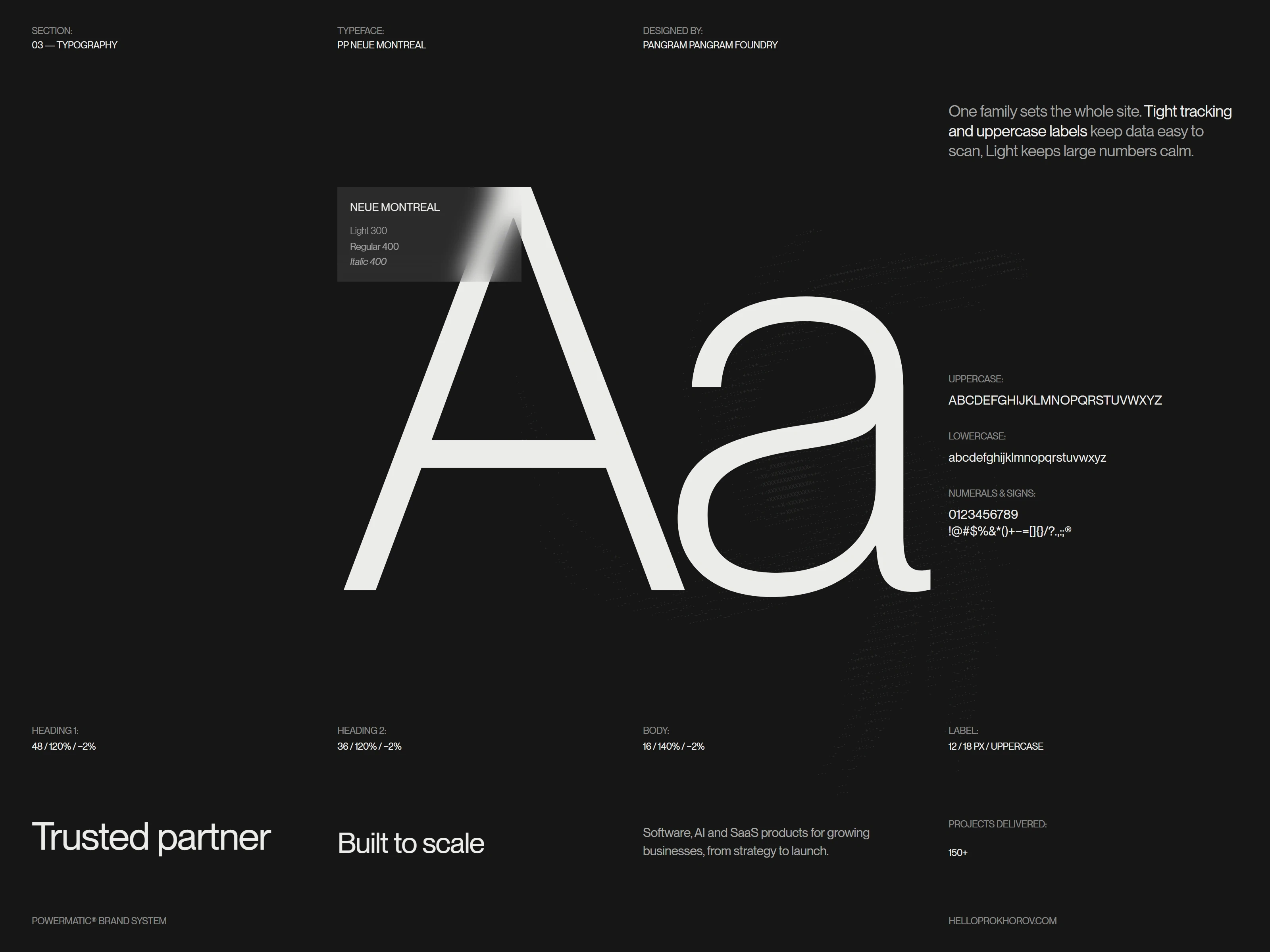
PP Neue Montreal specimen for Powermatic: Light, Regular and Italic, heading, body and label styles
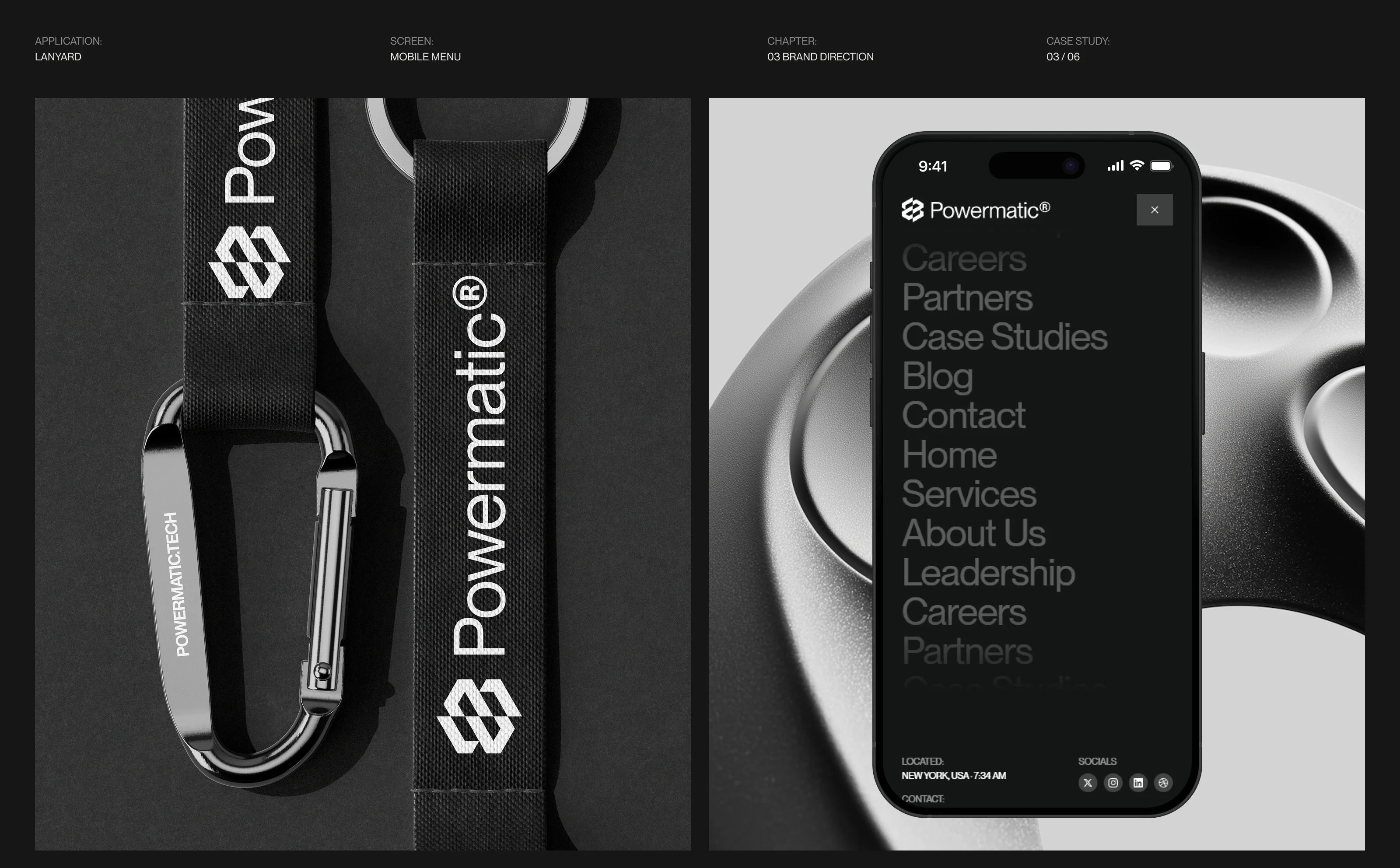
A Powermatic lanyard next to the menu on a phone
04 — Careers
Careers opens straight on the open roles.
Roles. Six roles set in large type, each with team, location and salary beside it. The list reads at a glance.
Decision. My first version reused the home page layout and read as the same page again. Inner pages got their own composition: labels left, content right.
Open roles: 6 + open application
Beside each role: team · location · salary
Inner pages: labels left, content right
Search: job posting markup
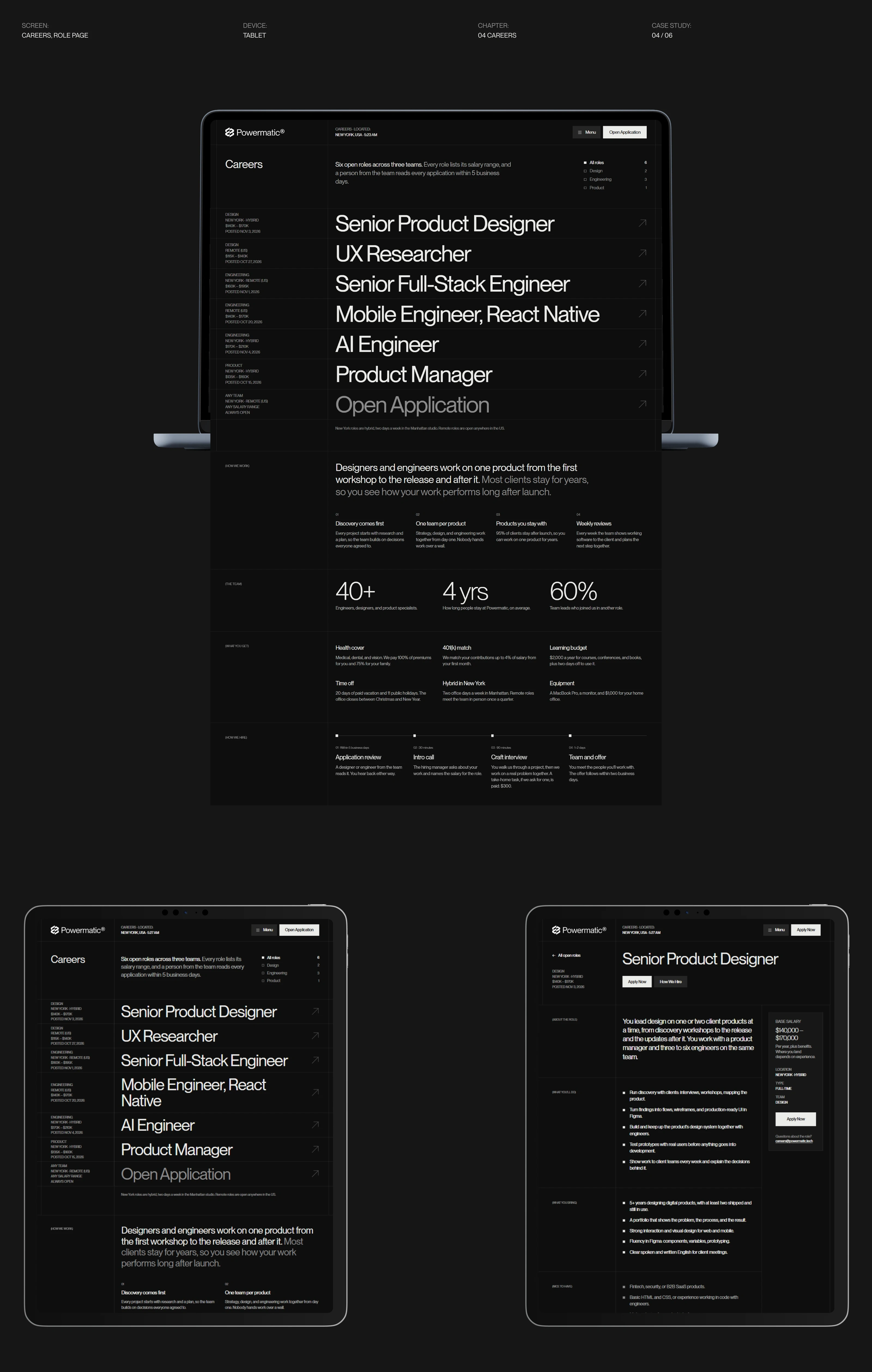
The Careers page and a role page on a laptop and tablets
05 — Visual Language
The grid runs from the page onto the photos.
Grid. Four columns drawn as thin lines, with small crosses where they meet. The same lines sit over photos, so every frame lines up with the page.
Brand in use. The mark and the line "Trusted Technology Partner" go on a T-shirt. The phone beside it shows a case page on the same grid.
Grid: 4 columns
Merch: T-shirt, lanyard
Tagline: Trusted Technology Partner
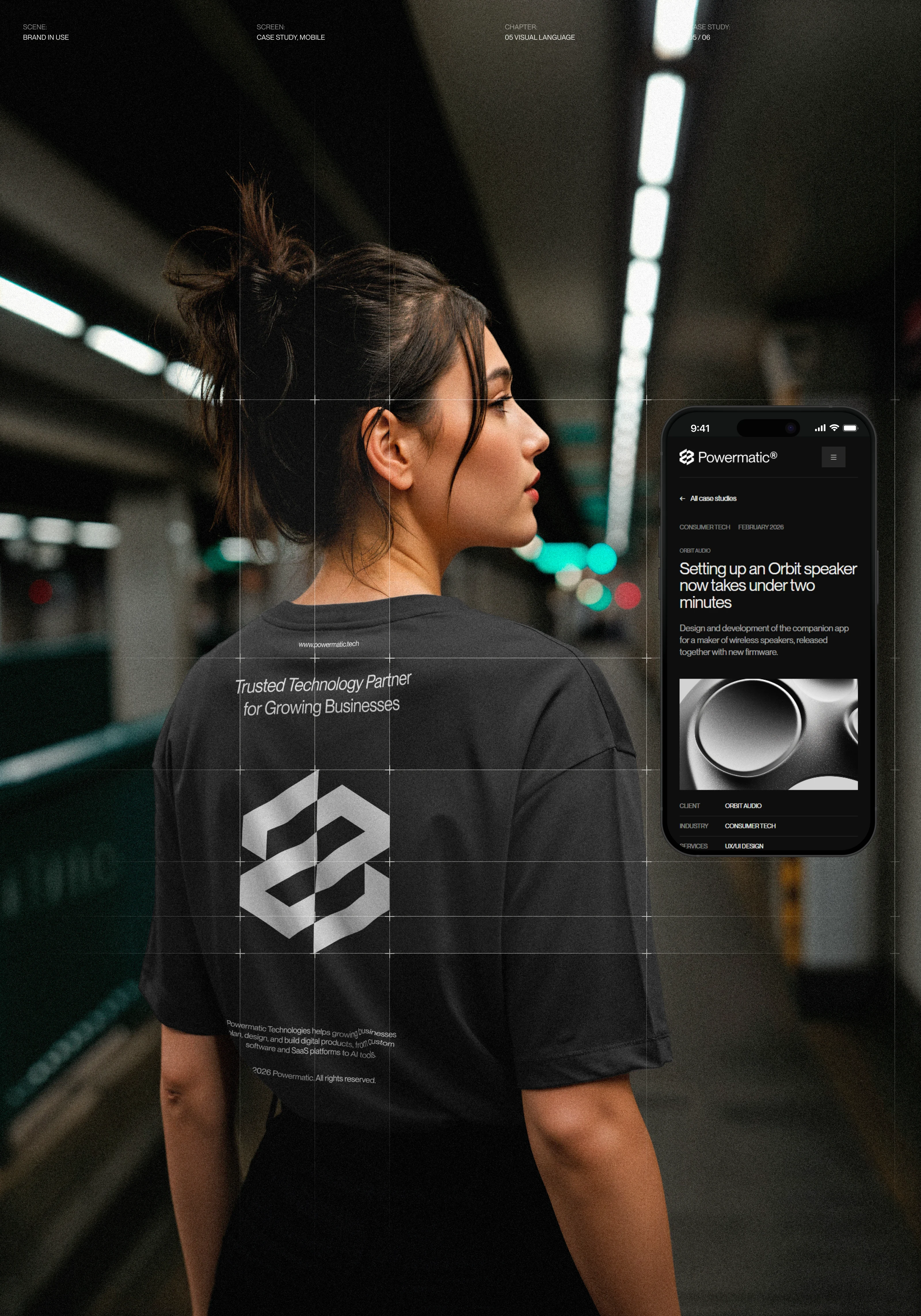
A Powermatic T-shirt in a subway station, next to a case page on a phone, with the grid lines over the photo
06 — Blog & Build
The blog holds together from a phone to a wide screen.
Blog. The list opens on the newest post. An article gets a large image, a short lead and a sign-up for monthly emails.
Build. Plain HTML, CSS and JavaScript, no framework. Blocks stack on phones and grow with the screen on wide monitors. A small Python script generates Careers, About and the blog from one shared shell, so a change to the menu or footer reaches every page.
Devices: phone, tablet, desktop, ultrawide
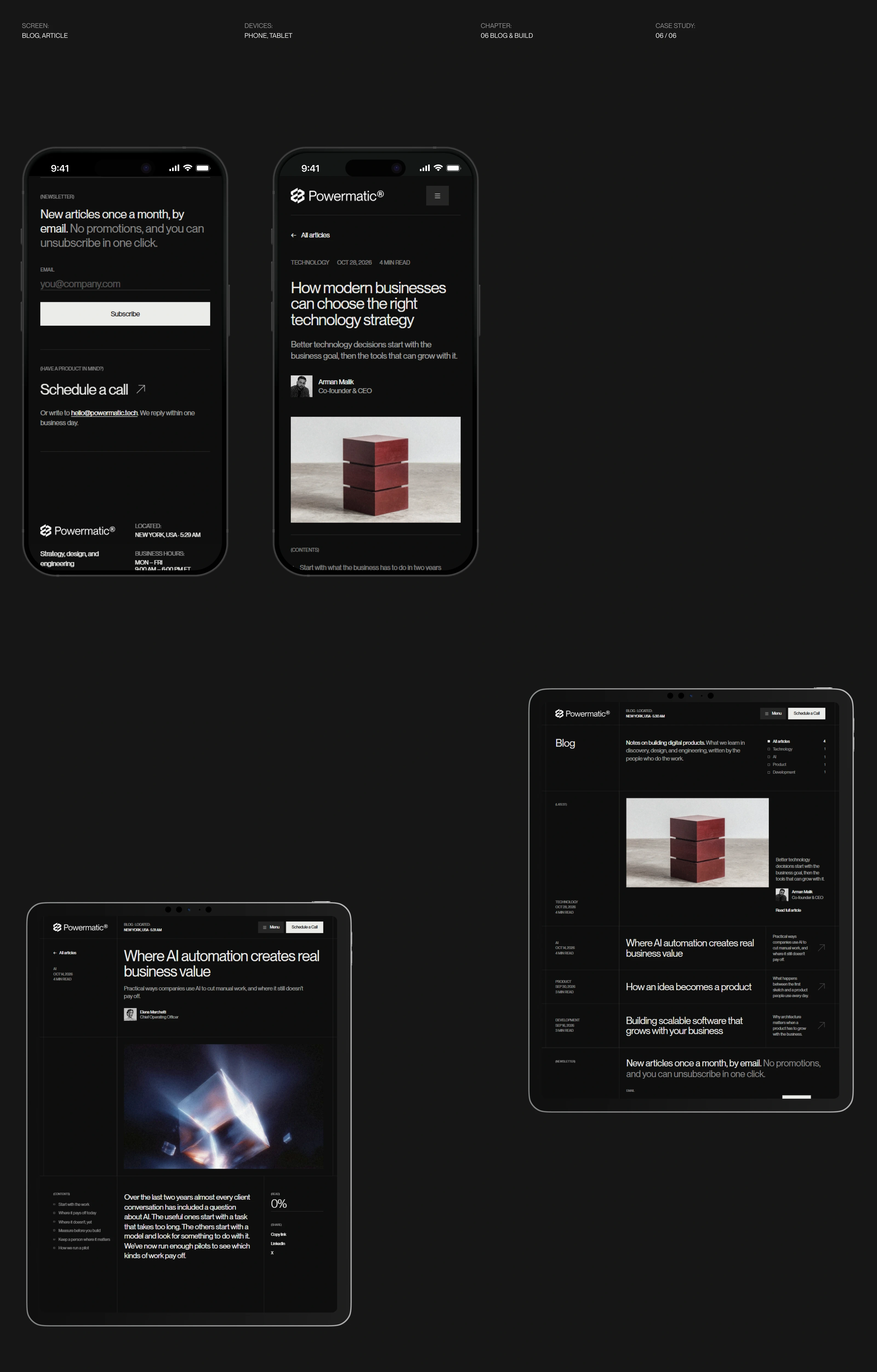
The Powermatic blog index and articles on phones and tablets
The site is live with the home page, Careers, About and the blog: live.helloprokhorov.com/powermatic
Photos and renders are used for presentation purposes only. Stock photos belong to their authors.
1 like · 2 views · Nov 12, 2026
A site that shows buyers the offer, the process and the price on the first screen. Brand, design and code by me.

