The network for creativity
Join 1.25M professional creatives like you
Connect with clients, get discovered, and run your business 100% commission-free
Creatives on Contra have earned over $150M and we are just getting started
Back to feedPost

Giving Zain Surgicals a Digital Glow-Up 💚
For the Base44 × Contra #GiveItAGlow challenge, I reimagined the digital experience of Zain Surgicals, a local mobility and healthcare equipment business.
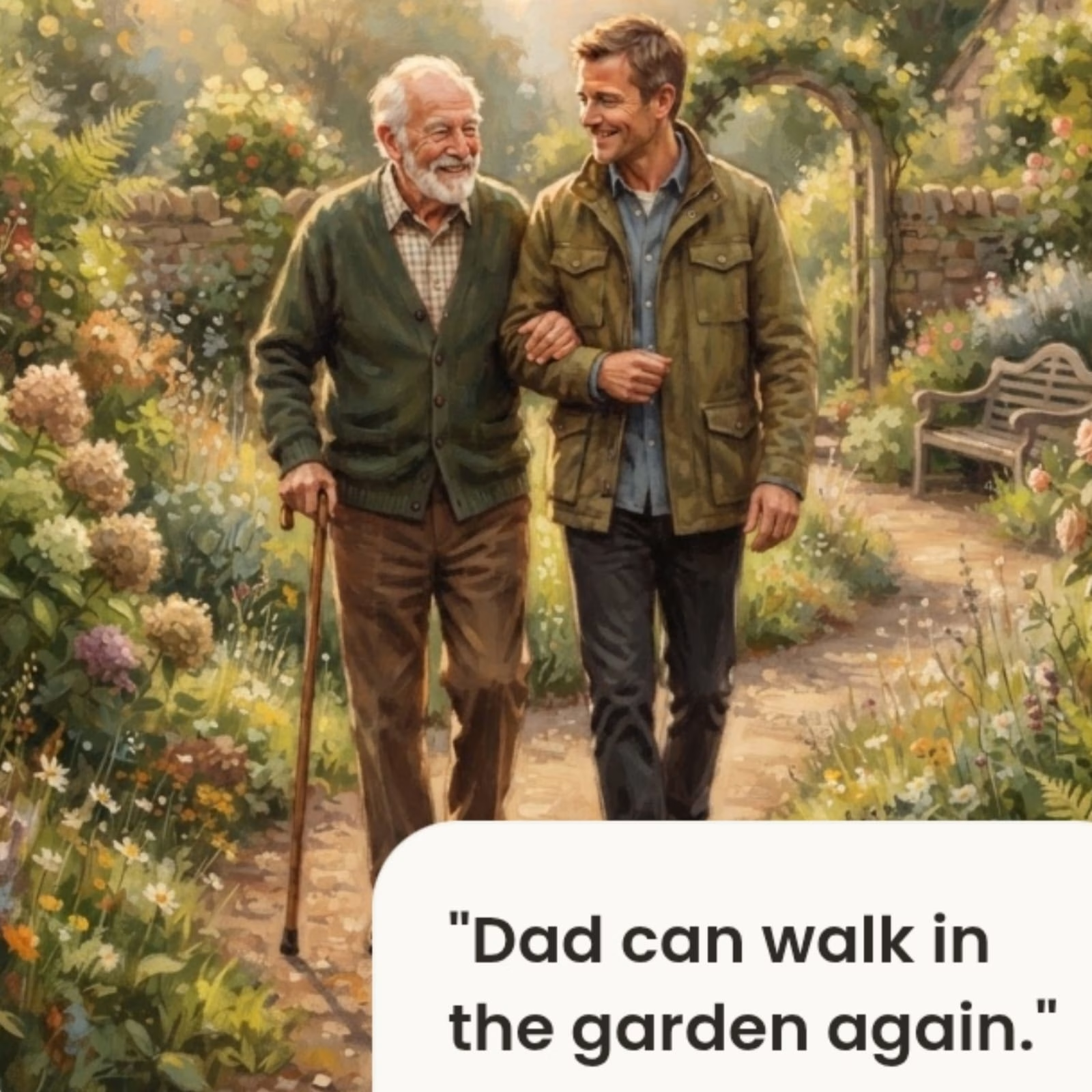
Rather than designing a conventional medical equipment website, I wanted to create an experience centered on dignity, independence, and compassionate care. The goal was to make families feel supported from the moment they visit the website.
What I built:
✨ A complete modern website redesign in Base44
📱 Fully responsive, mobile-first experience
🤖 AI-powered assistant to help customers discover the right mobility solutions
💬 WhatsApp integration for quick customer communication
🛒 Improved product browsing and service discovery
💚 A warm visual identity with storytelling, accessibility, and thoughtful interactions designed to create a more human experience
This project challenged me to combine UX design, branding, accessibility, automation, and storytelling into one cohesive digital experience that demonstrates how thoughtful design can better serve both businesses and the people who rely on them.
Built Link:
Disclaimer: This is an independent redesign created for the Base44 × Contra #GiveItAGlow challenge. It is not affiliated with or endorsed by Zain Surgicals
X Post Link:
#GiveItAGlow #Base44 #WebDesign #UXDesign #Accessibility #AI #HealthcareDesign #DigitalTransformation
The network for creativity
Join 1.25M professional creatives like you
Connect with clients, get discovered, and run your business 100% commission-free
Creatives on Contra have earned over $150M and we are just getting started




Related posts

What should a creative agency website actually feel like?
For Orvika, we didn't want another agency site built around the same safe layouts and predictable sections.
We pushed the visual direction further with oversized typography, editorial layouts, bold imagery, and stronger contrast, while keeping the experience structured enough to communicate the agency's work and capabilities clearly.
The goal wasn't just to make it look different.
It was to make the agency feel different.
Designed in Figma and built in Framer.
We're sharing more of the websites and digital experiences we've been working on here over the next few weeks.




Very neat man

💳 Making Financial Products Feel Simple
I designed this finance website for Sendit, with one goal in mind: make everyday payments feel simple, trustworthy, and effortless.
The design focuses on:
Clear messaging and strong visual hierarchy
Trust-focused finance UI
Simple payment interactions
Clean, modern layouts
Conversion-focused sections
A responsive experience designed around the user
For fintech products, good design isn’t just about looking modern. It’s about making people feel confident when money is involved.
If you’re building a fintech, SaaS, payment platform, or financial product and need a website that communicates trust and clarity, I’d love to work with you.


Solid execution on a hard brief.

Website Design | UI/UX Design | Web Design
A modern website design concept focused on creating a clean, engaging, and user-friendly digital experience.
The design combines strong visual hierarchy, intuitive navigation, thoughtful spacing, and responsive layouts to create an interface that feels polished while keeping the user journey simple and clear.
From the overall page structure to typography, imagery, and calls-to-action, each element was designed to create a cohesive experience that works across desktop and mobile.


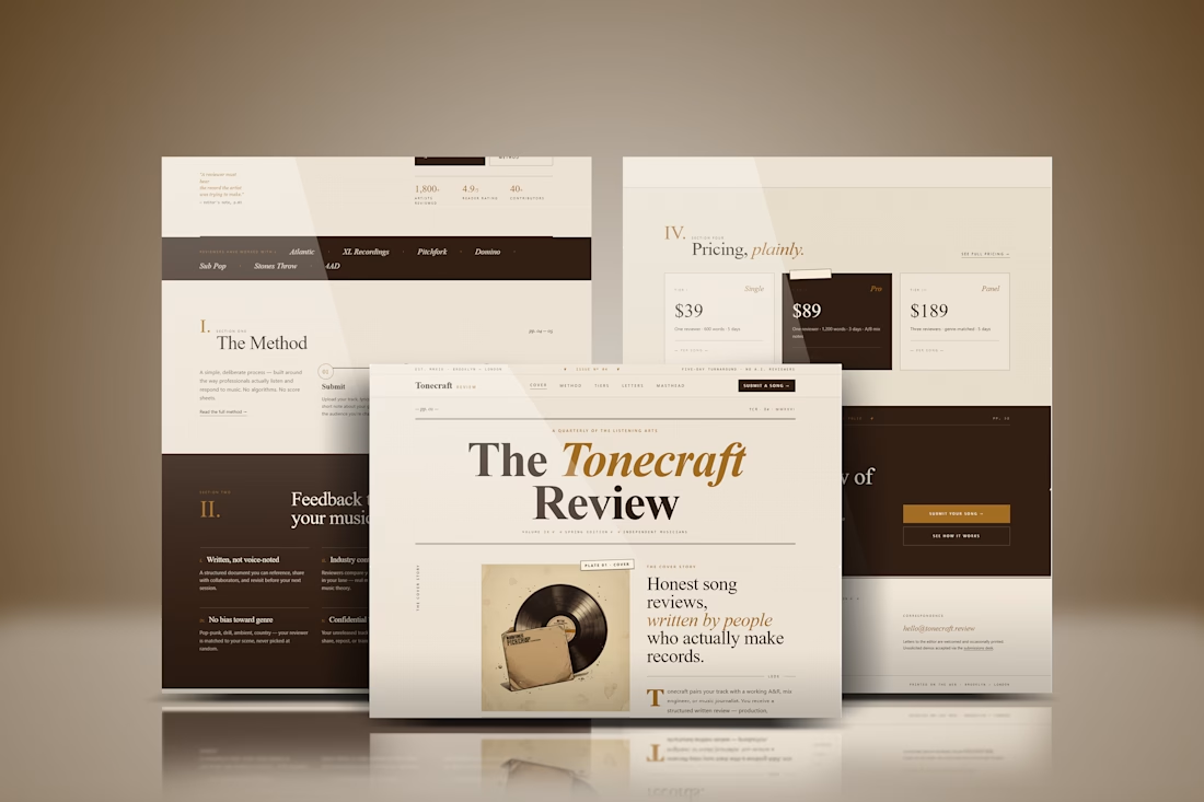

The spacing and hierarchy keep the experience approachable.