The network for creativity
Join 1.25M professional creatives like you
Connect with clients, get discovered, and run your business 100% commission-free
Creatives on Contra have earned over $150M and we are just getting started
Back to feedPost

An exhibition stand can look impressive in a render and still fail to communicate how the space actually works.
For this project, the goal was to visualize more than the stand’s appearance. The visualization needed to show how the brand identity, visitor circulation, seating, display areas, and meeting spaces work together within the stand.
From the eye-level view, the white structural frame creates a strong architectural outline, while the green accents, timber lattice screens, integrated planting, and illuminated branding reinforce the visual identity without closing off the space.
The top view adds another layer of understanding. It makes the arrangement of seating, meeting areas, display elements, and circulation much easier to read.
That combination was important because an exhibition stand has to communicate two things at once: how the brand looks and how visitors experience the space.
This is something I always consider in architectural visualization. A strong visualization should not only make a design look attractive; it should make the design easier to understand.
The image should help explain the space, not just decorate it.
#architecturalvisualization #3dvisualization #exhibitiondesign #3drendering #giftolayinka_
tradeshowboothexhibitionsatanddesignboothdesign3D RenderingArchitecture & Interior DesignInterior Design Adobe Photoshop


The network for creativity
Join 1.25M professional creatives like you
Connect with clients, get discovered, and run your business 100% commission-free
Creatives on Contra have earned over $150M and we are just getting started





Related posts

How do you design a contemporary logo for something so deeply connected to tradition?
That was the main question behind my logo design for Opern.news. Opera comes with centuries of history, recognizable architecture, and a very strong cultural identity. But Opern.news is a digital platform, a place for current stories, information, and communication.
I wanted to find a simple visual idea that could connect those two worlds.
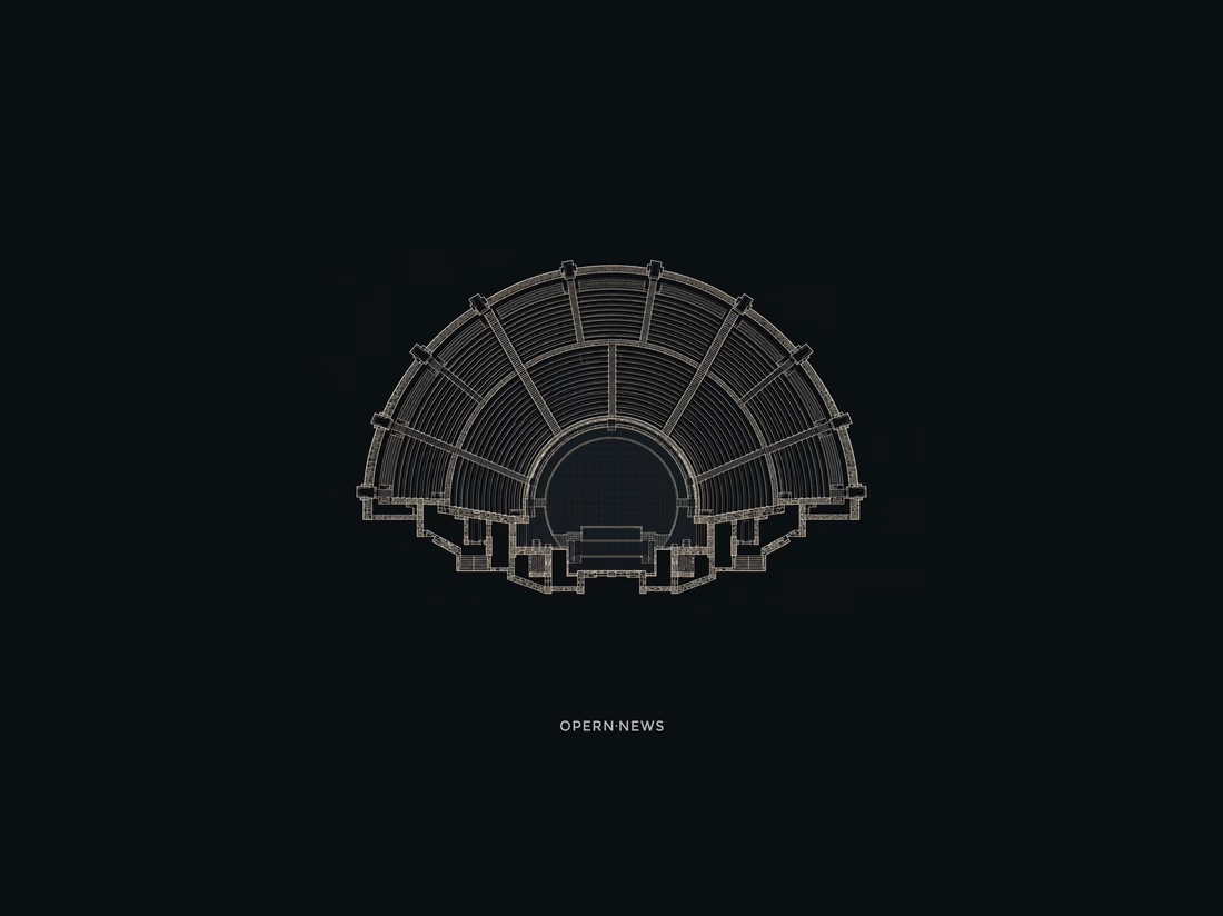
The answer came from looking down at the architecture of theaters and amphitheaters. The stage and surrounding rows of seats gradually became a minimal geometric symbol.
And then I noticed a second meaning in the same form: the lines also felt like broadcast waves, representing news, communication, and the flow of information.
One symbol, two readings: opera + news. Opera and communication. Tradition and the present.



Good project work



SERVE — Tennis Courtwear Landing Page 🎾
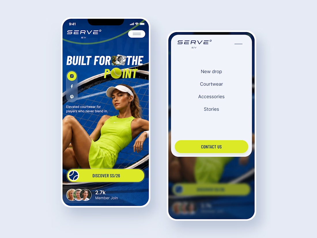
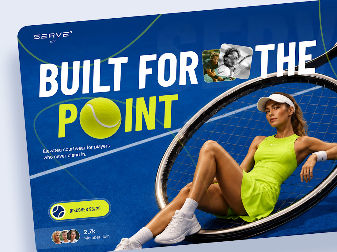
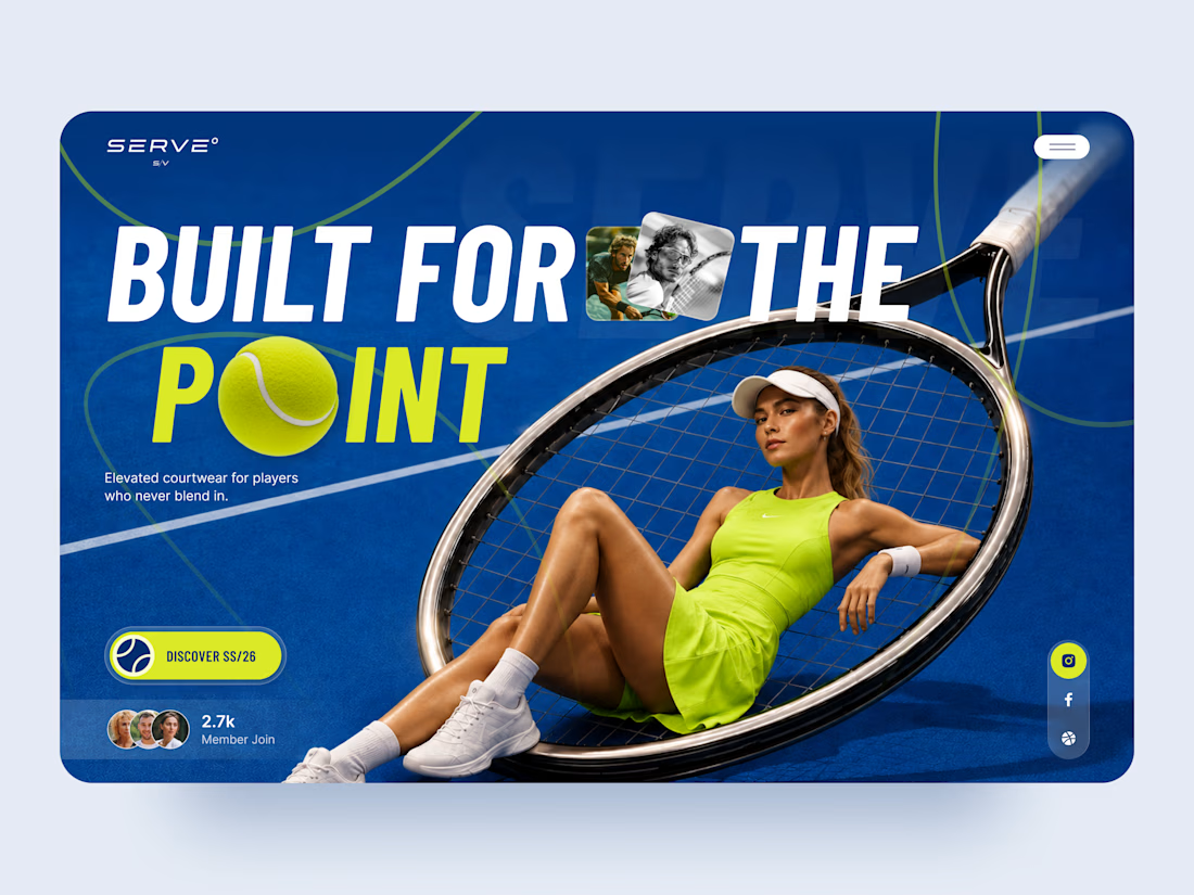
SERVE is a bold landing page concept for a contemporary tennis and courtwear brand built around performance, style, and attitude.
The goal was to move away from the traditional clean, minimal sportswear aesthetic and create something with more energy and personality. Deep court blue, electric tennis yellow, oversized typography, and layered photography give the experience a strong editorial feel.
Special attention was given to:
• a hero composition built around the tennis racket and athlete
• oversized typography that feels energetic and campaign-driven
• electric yellow accents inspired by the tennis ball 🎾
• layered photography and graphic elements that create depth
• a strong CTA for the SS/26 collection
• social and community elements that make the brand feel active
• a simplified mobile composition that keeps the same visual impact
• a clean mobile menu that contrasts with the expressive hero
The result is a high-energy digital experience that blends sports performance with fashion-forward art direction.
Looking to create a bold website for your sports, fashion, or lifestyle brand? Let’s build something people remember ⚡