The network for creativity
Join 1.25M professional creatives like you
Connect with clients, get discovered, and run your business 100% commission-free
Creatives on Contra have earned over $150M and we are just getting started
Back to feedPost
How do you design a contemporary logo for something so deeply connected to tradition?
That was the main question behind my logo design for Opern.news. Opera comes with centuries of history, recognizable architecture, and a very strong cultural identity. But Opern.news is a digital platform, a place for current stories, information, and communication.
I wanted to find a simple visual idea that could connect those two worlds.
The answer came from looking down at the architecture of theaters and amphitheaters. The stage and surrounding rows of seats gradually became a minimal geometric symbol.
And then I noticed a second meaning in the same form: the lines also felt like broadcast waves, representing news, communication, and the flow of information.
One symbol, two readings: opera + news. Opera and communication. Tradition and the present.


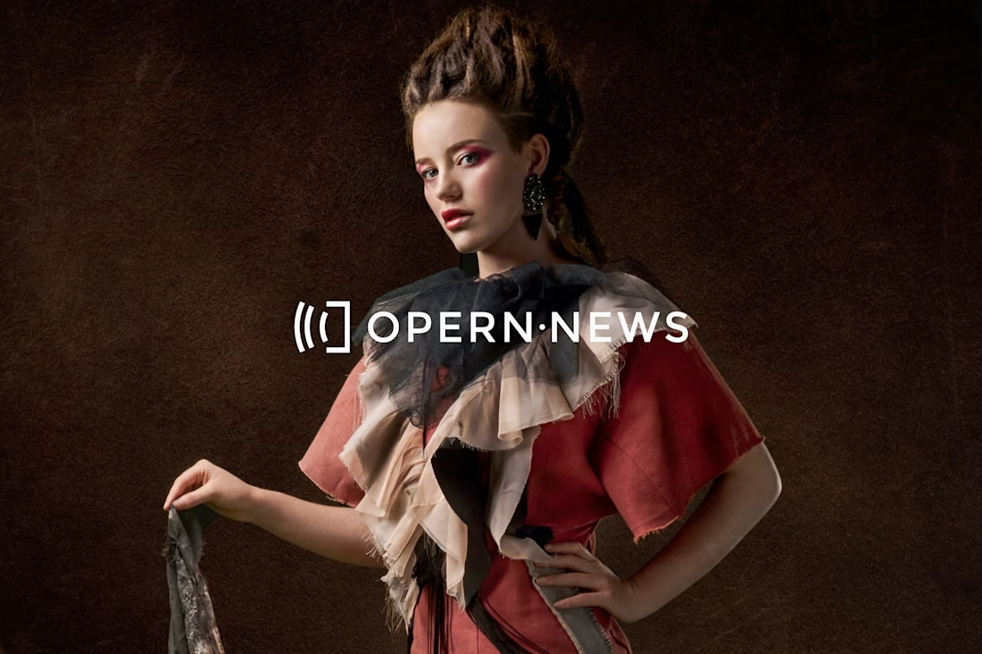

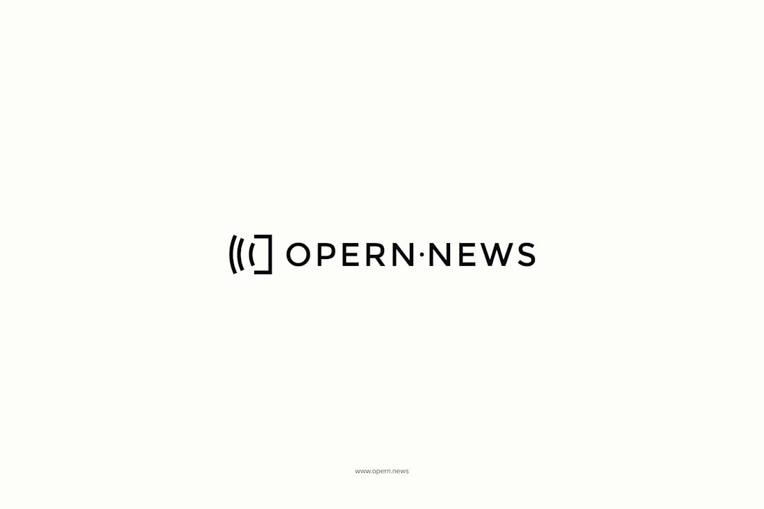

The overhead amphitheatre read is the part I keep coming back to, it gives you a mark about the room rather than the music, which is probably why it avoids the costume-y feel opera marks usually fall into. Did the broadcast-wave reading turn up on its own while you were drawing,...

Well, the initial idea was to capture the architecture and atmosphere of the space, and the broadcast-wave interpretation emerged naturally as the form developed. So, it was one of those details that made the concept feel even more complete.

So cool!!
Thank you 🙌

Nice work
Thanks, Sujon 🙌


opera meets digital, nice concept
Thanks, Nazar!

Curious how you handled the favicon version. Do you keep all the arcs at 16px, or simplify the mark for browser tabs?
It actually holds up really well at 16px, so we kept all the arcs. There was no need for simplification.

One symbol reading as both opera and news is a genuinely clever bit of thinking, tradition and the present in one mark. The arc feels like a stage and a signal at once, modern but still reverent. That crimson and gold keeps the grandeur without going stuffy. Beautiful system.
Thank you Aditya 🙌

Nice work!
Thanks Nimesh 🙌

Nice one

Good project work
Thank you Naim🙌
The network for creativity
Join 1.25M professional creatives like you
Connect with clients, get discovered, and run your business 100% commission-free
Creatives on Contra have earned over $150M and we are just getting started











Related posts

A little peek at the brand work we did for Elio Mortgage.
A warm, approachable identity full of warm vibrant colors paired with soft sun rising inspired gradients, inner glows and custom illustrations & more. Loved this direction!
Full case study coming soon, from process to final identity.
Plenty of logo explorations to share too!


That color palette takes the whole identity to a different level!! I loove it.

Brand Expressions -- Olivir



Thats so crazy!!!!!! Seeing this I feel we humans are still far better than AI

FOCUS — Creative Portfolio & Digital Art Website 🌸✨
A visually expressive website concept for a creative portfolio, built around digital art, bold imagery, and visual storytelling
The design combines vibrant pink tones, soft gradients, experimental typography, and immersive photography to create a distinctive editorial experience
Special attention was given to:
• Bold editorial hero composition
• Vibrant pink and dark color palette
• Experimental typography and visual details
• Immersive photography and digital artwork
• Creative project gallery and navigation
• Responsive mobile experience
• Clean layouts with a strong visual identity
The result is an expressive digital experience that puts creativity, emotion, and visual storytelling at the center of every screen 💗
Looking to create a standout portfolio or website for a creative brand? Let’s connect 🚀



