The network for creativity
Join 1.25M professional creatives like you
Connect with clients, get discovered, and run your business 100% commission-free
Creatives on Contra have earned over $150M and we are just getting started
Back to feedPost
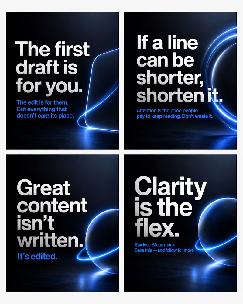
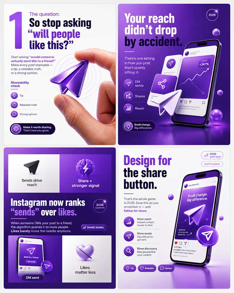
Taste Test


Same type of content. Two completely different design systems.
One is dark and cinematic, minimal type, deep gradients, one glowing accent doing all the work.
The other is bright and energetic, bold colour, playful 3D elements, and a lot more visual detail.
Neither is "better", they speak to different brands and different audiences. That's the real skill: matching the design language to who's meant to feel it.
Which direction pulls you in 👇
#carouseldesign #branddesign #visualidentity
4 voted
80%
1 voted
20%
5 votes
Closed


always minimalism
The network for creativity
Join 1.25M professional creatives like you
Connect with clients, get discovered, and run your business 100% commission-free
Creatives on Contra have earned over $150M and we are just getting started
Trending
retrofuturism
Share your favorite designs from the past exploring the distant future. Or your own take on the aesthetic 🚀
halftone
Dots. Texture. Grain. Let's see your designs using the halftone technique.

Midjourney
Creatives are showing off what they're making with Midjourney.
colorgrade
Video editors sound off: How do you enhance the mood of your video in color grading?


Related posts

A brand refresh doesn’t always start with one “perfect” direction.
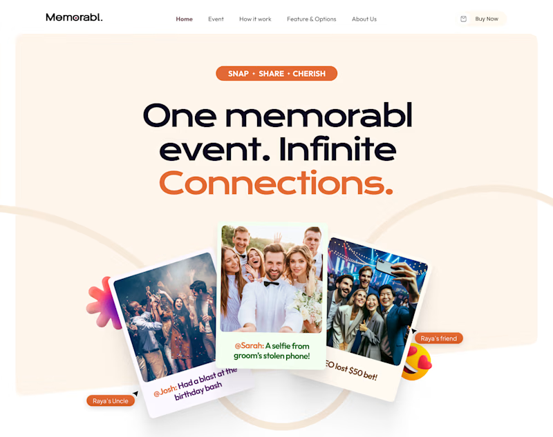
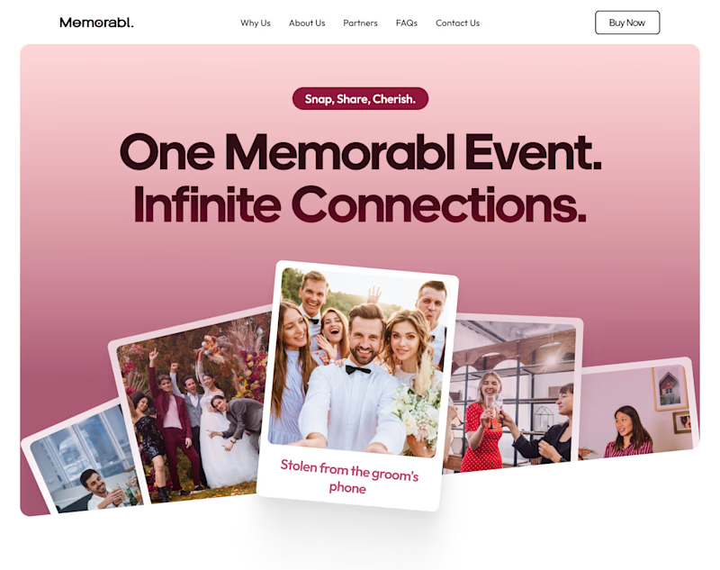
For Memorabl, I explored two very different homepage routes, both built around the same idea but with totally different personalities.
Option🅰️: Warm + playful
Soft neutrals, orange accents, layered photography, and a more expressive feel.
Option🅱️: Bold + editorial
A stronger pink palette, cleaner composition, larger typography, and a more polished look.
Since I was also refreshing the brand, I wanted the client to see how far the identity could stretch before choosing a direction.
Same product. Same goal. Two very different first impressions.
Which one would you choose and why? 👀
9 voted
64%
5 voted
36%
14 votes
Closed

I’ll go with option A, because it’s highly all the elements in your hero, and color combination goes very well all together.

Building a visual studio (video, motion, design, vfx) rooted in hyperrealistic futurism.
Our vision is to develop accelerated storytelling formats: AI-generative tools and scripts, detailed post-production techniques, human creativity at the core.
Name’s still TBD. The mark’s closed. Help us pick!
Which one works better?


12 voted
33%
24 voted
67%
36 votes
Closed

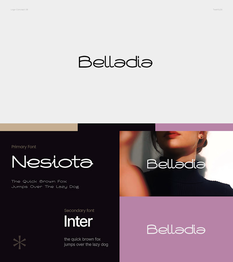
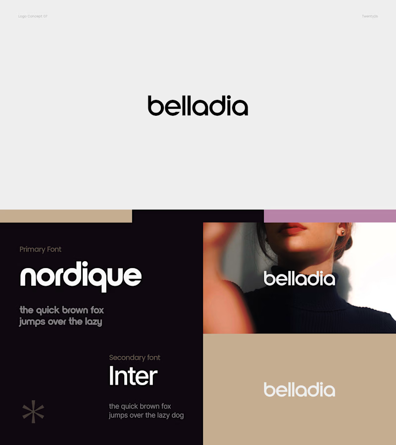
✨ Two logo directions. One final choice.
For Belladia, I explored two very different approaches — one feels elegant and lightweight, while the other is bold, clean, and confident.
Which direction would you pick for the brand? 👀
A — Elegant & Refined
B — Bold & Modern
Vote below 👇 and tell me which one feels more memorable! 🎨
9 voted
28%
23 voted
72%
32 votes
Closed
