The network for creativity
Join 1.25M professional creatives like you
Connect with clients, get discovered, and run your business 100% commission-free
Creatives on Contra have earned over $150M and we are just getting started
Back to feedPost
Taste Test

Building a visual studio (video, motion, design, vfx) rooted in hyperrealistic futurism.
Our vision is to develop accelerated storytelling formats: AI-generative tools and scripts, detailed post-production techniques, human creativity at the core.
Name’s still TBD. The mark’s closed. Help us pick!
Which one works better?


12 voted
33%
24 voted
67%
36 votes
Closed

B for me 🙌 A* feels a little too close to a hashtag at first glance. Can you see it? 😂
Ha! Yes I thought about that. I like that it feels like pixels and it's kind of abstract. B feels more "normal" but probably reads better across multiple uses.
Thanks for voting btw! 🚀
Ive also got an A/B poll up - would love to see which one you'd pick 😊

b is much better
wishing you luck on the studio!
Thank you Juan! Much appreciated!

Way too many logos exist like the first one so I like the 2nd one much more. Great work!

Logo Mark A reads cleaner to me at small sizes, which matters a lot for a video/motion studio since it'll mostly show up as a tiny profile icon. Did you test both at favicon size before opening it up to votes?
Yeah, actually that was the main reason behind designing B as an alternative. For socials, locking mark A inside a circle became too small for me actually. I felt that while I like the aesthetics of A a lot, it has too many elements and can become confusing in small sizes. Thanks so much for the detailed comment 🙌

Logo Mark A


A, easily

B mark more clean then A.

Absolutely amazing work

🔥 🔥 🔥

We liked both - version : )

Logo Mark B
Thanks to everyone who voted! Working on locking the brand system this week + spec video demo projects. Excited to keep sharing good stuff here. Love this community, super grateful for the feedback! 😊 🚀

Amazing ....
The network for creativity
Join 1.25M professional creatives like you
Connect with clients, get discovered, and run your business 100% commission-free
Creatives on Contra have earned over $150M and we are just getting started



Related posts

Exploring two different hero directions for a new project.
Same message, two completely different visual approaches.
Which one makes a stronger first impression?
A or B? Curious to hear your thoughts!

36 voted
90%
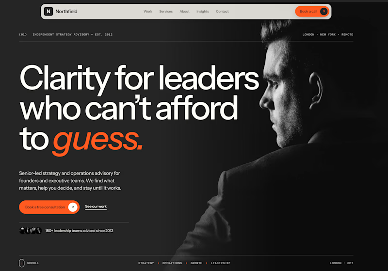
4 voted
10%
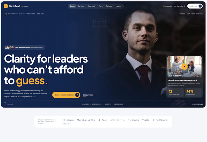
40 votes
Closed

Both are strong. I lean towards the dark version, because the orange accent on the italic "guess." pops and the profile portrait gives it a more editorial, confident feel. The navy one reads a bit more corporate, which could suit a more conservative audience. Nice exploration!

Two directions. One NFT marketplace.
Which visual direction would you choose?
🖤 A — Dark & Futuristic
🤍 B — Bright & Minimal
Both explore the future of Web3, but with completely different visual identities.
Drop your vote in the comments: A or B?
#UIUXDesign #WebDesign #NFT #Web3 #ProductDesign

10 voted
29%
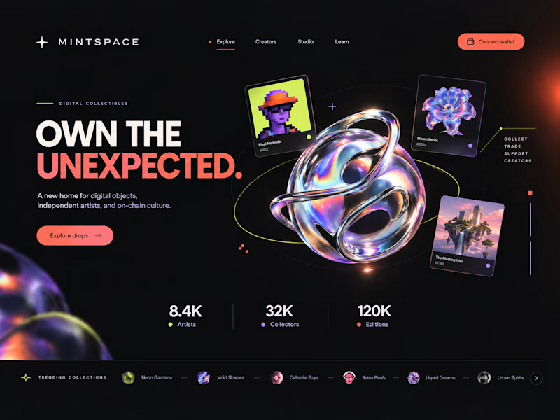
25 voted
71%
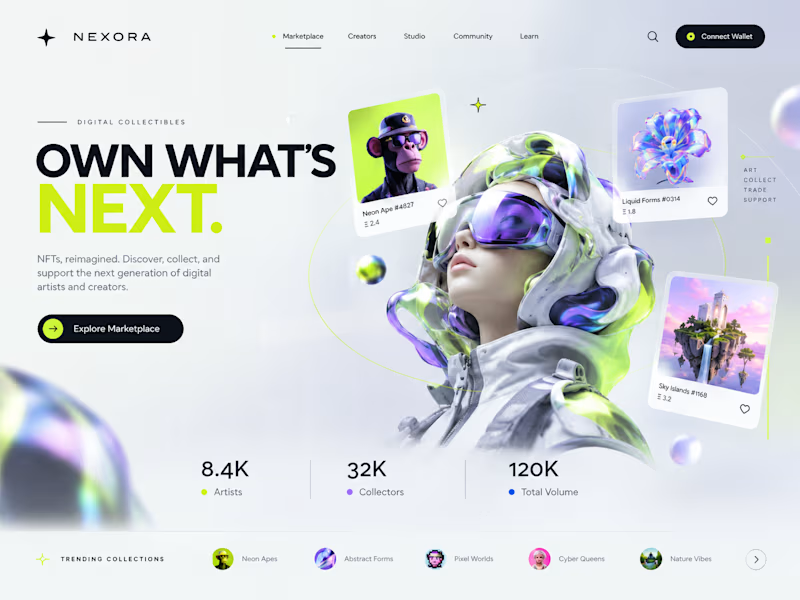
35 votes
Closed

Strong design, well done

Designed an AI research workspace where the agent plans the work and fills a sheet with cited sources as it goes.
Same screen, two modes. Which one would you work in all day? 👀

13 voted
72%
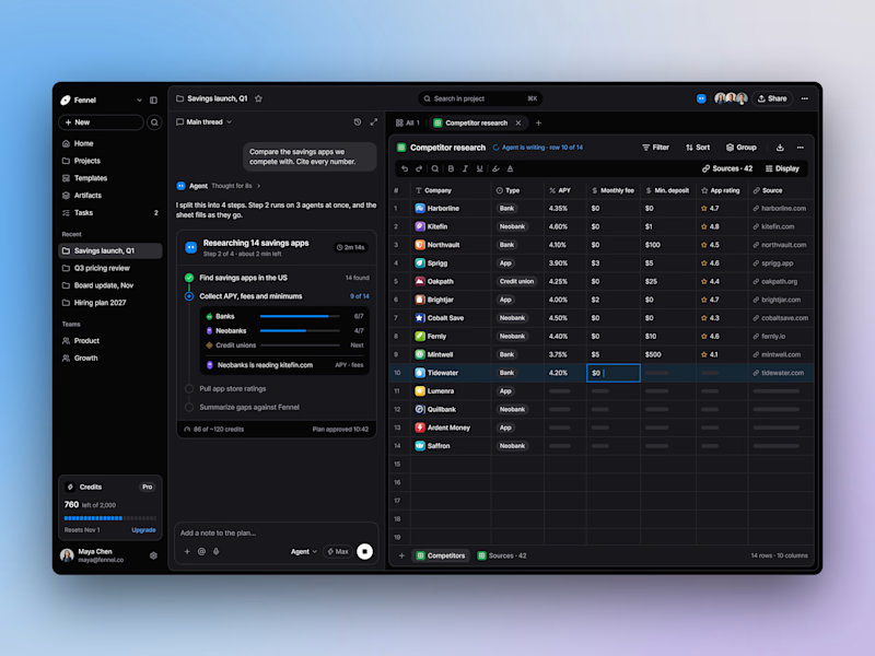
5 voted
28%
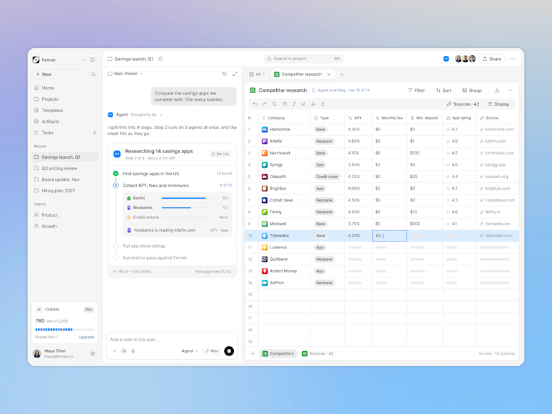
18 votes
Closed

Keeping the research plan and cited results side by side is a useful way to make the agent’s work easier to inspect. I’d lean toward light mode for reading the table in daylight. How do you distinguish a verified source from one that still needs review?