The network for creativity
Join 1.25M professional creatives like you
Connect with clients, get discovered, and run your business 100% commission-free
Creatives on Contra have earned over $150M and we are just getting started
Back to feedPost
Taste Test

✨ Two logo directions. One final choice.
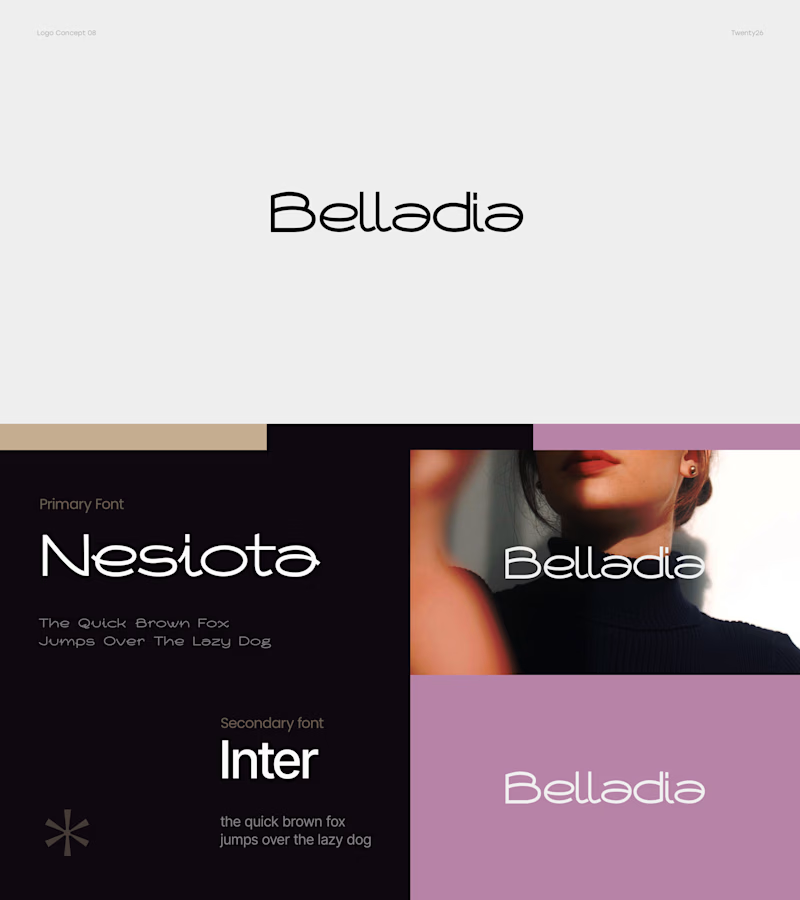
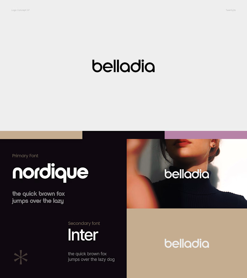
For Belladia, I explored two very different approaches — one feels elegant and lightweight, while the other is bold, clean, and confident.
Which direction would you pick for the brand? 👀
A — Elegant & Refined
B — Bold & Modern
Vote below 👇 and tell me which one feels more memorable! 🎨
9 voted
28%
23 voted
72%
32 votes
Closed

Bold and Modern 🔥

huge fan of the font shift on B!

It depends, what's the brand about? I love the bolder approach but I feel like I have seen it before. Whereas I haven't seen mucho of A and it catches my attention as well.

A for me. It feels like it has more of its own personality, especially for beauty.

The lowercase "belladia" in B travels better across the tag and packaging shots than A's capitalized script — it stays legible small, which matters more for a wordmark than which board feels more "premium" at full size.


B is so gorgeous and a million times better than the first. Great workkk


B for me, more memorable

To be honest it depends on the brand but if you want my preference, I will pick “B” is better with luxury fashion and make the brand feel trusted


Depends on the personality of the brand tbh.
Like if its classic, or somehow traditional type relevant
Its much likely I would go with Elegant but if I want to have some bold nice touch I would consider the bold one
And yeah, not hating any of these cuz I really loved both of them.
...

I like A
The network for creativity
Join 1.25M professional creatives like you
Connect with clients, get discovered, and run your business 100% commission-free
Creatives on Contra have earned over $150M and we are just getting started





Related posts


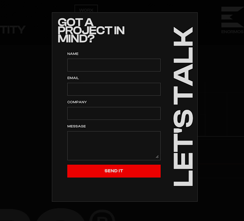
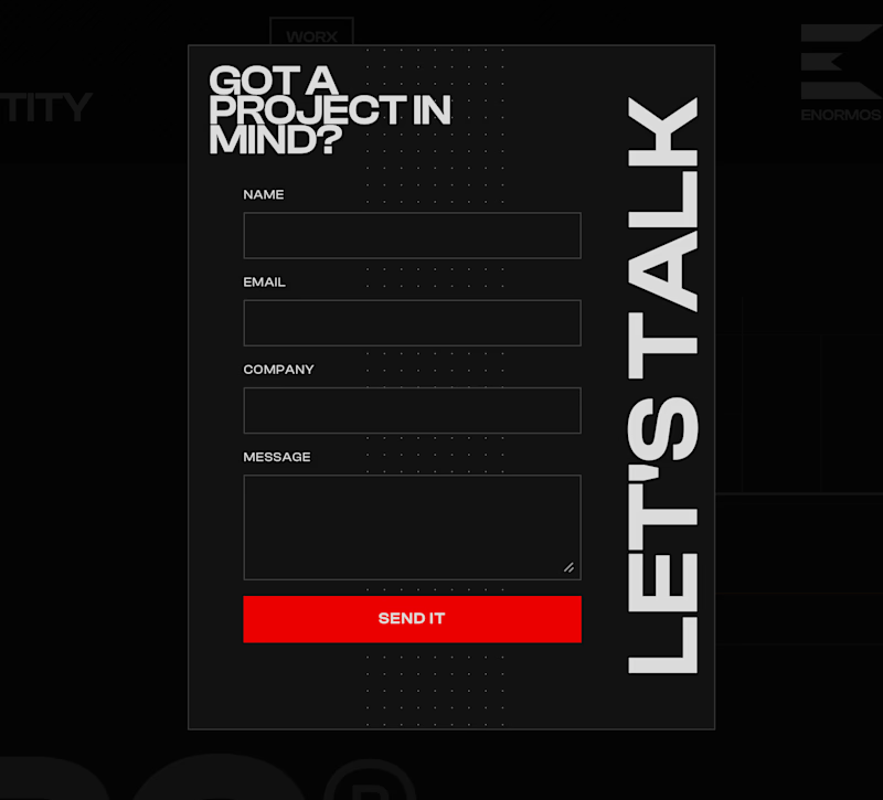
Working on this contact form for my own portfolio. Do you like it with or without the line of dots?
7 voted
44%
9 voted
56%
16 votes
Closed


Created these interactive animation variants for a section in my recent web design project.
Which one do you think grabs users’ attention and keeps them engaged?
Linear ✲ or Dotted⚪?


24 voted
52%
22 voted
48%
46 votes
Closed

dotted one

Which hero direction feels right for this founder-focused brand?
While working on the homepage for Sean Parsons, a brand focused on empowering non-technical founders to launch tech startups, I explored two different visual directions for the hero section. Same message, same structure, just a different mood and color system.
Option 1 - Warm Olive. Dark, grounded, and editorial, giving a warm, established, expert feel.
Option 2 - Light Purple. Clean, modern, and vibrant, giving a fresh, SaaS-like, approachable feel.
Would love your honest UX/UI take, which direction feels more trustworthy, engaging, and aligned with a founder-focused brand, and why?
25 voted
69%
11 voted
31%
36 votes
Closed

I like worm Olive most because it has different personality