The network for creativity
Join 1.25M professional creatives like you
Connect with clients, get discovered, and run your business 100% commission-free
Creatives on Contra have earned over $150M and we are just getting started
Back to feedPost
Taste Test


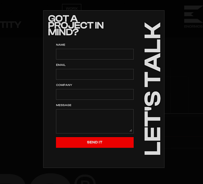
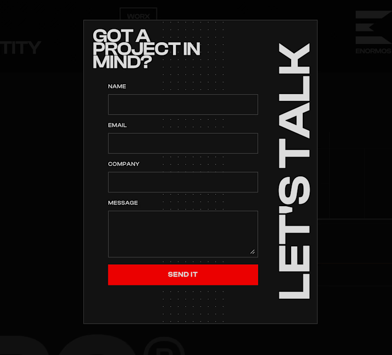
Working on this contact form for my own portfolio. Do you like it with or without the line of dots?
7 voted
44%
9 voted
56%
16 votes
Closed

Thanks Ganesh, do you think the dots visibility is good or should they be a bit brighter?
Nice one bruv

With, but I'd mask them out behind the field stack. Right now the dots and the input underlines are thin light lines at roughly the same weight, so they compete exactly where you want the eye to settle - texture around the form, clean behind it.
Thanks. I usually mask them out behind text I'll see how this looks.

Voted with the dots for a bit of texture, but honestly, the core layout is strong enough that it really doesn't change the overall vibe.
Thank you. Probably why I couldn't decide.

Thanks for your input Nirooz

With dots for me. The subtle texture gives the form a bit of personality and stops it feeling like a default template block. Without is cleaner but more forgettable, and a contact form is the last thing you want people to skim past.

With the dots! They add a bit of personality and guide the eye nicely through the fields. Without feels cleaner but a little plain for a portfolio
Thank you Tabish. I think they will stay
Good thought. it works either way but does add that extra touch. Thanks Man


with the dots, needs that texture
The network for creativity
Join 1.25M professional creatives like you
Connect with clients, get discovered, and run your business 100% commission-free
Creatives on Contra have earned over $150M and we are just getting started





Related posts

Built the site for Linea — a boutique rail brand where the whole UI is made of the same rule as the print system.
Every route card's red line isn't decoration, it's that route's actual elevation profile. Fare tiers aren't styled, they're the same data at different density.
The logo's sparkle mark even resolves from the exact same contour-drawing logic, live on the page.
One idea, all the way down → Here

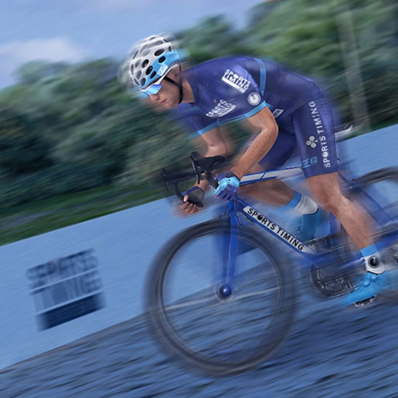
These 2020 banners for Sports Timing Systems took me hours upon hours. I had to use various tools and resources: 3D Max, 3D models, stock images, all mixed and edited in Photoshop.
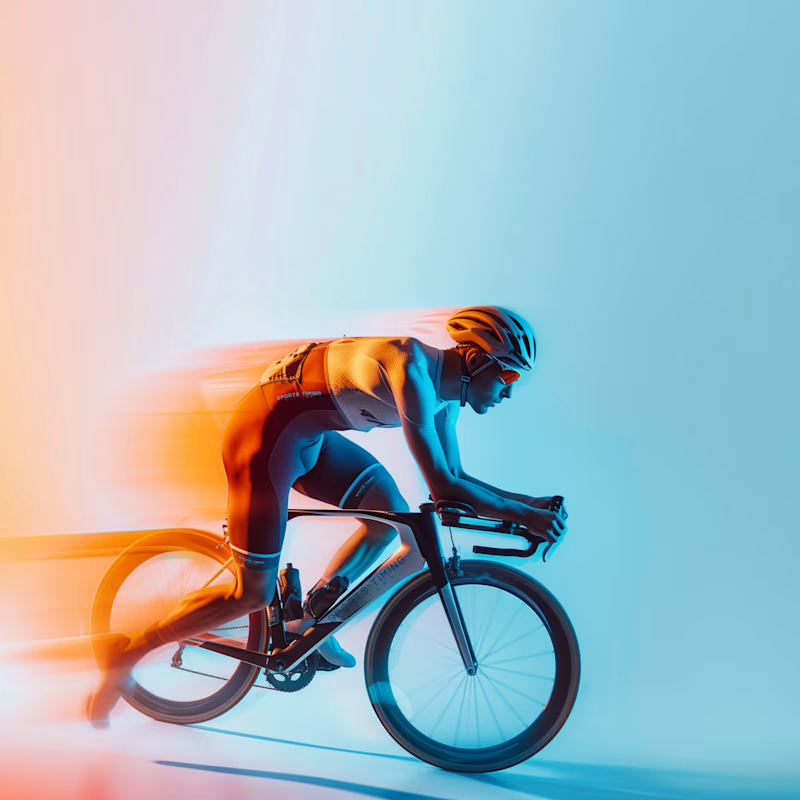
When I did the brand evolution in 2024, I swapped the 3D models for AI-gen, yet the final looks/effects were post-produced in Adobe PS.
Which one feels neater, better, cooler, eye-catching?
In both cases visuals were made as series, matching the full branding I developed at the time.

8 voted
26%
23 voted
74%
31 votes
Closed

Definitely A looks current and the design feels neater and cleaner

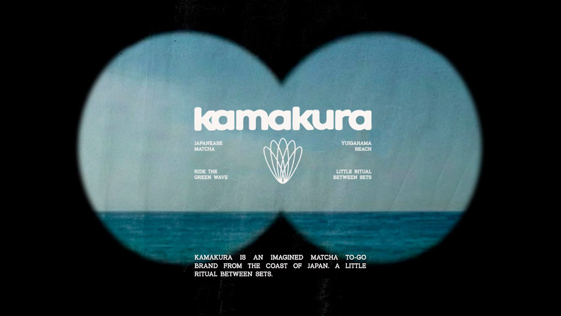
Somewhere between Japan, surf culture, and a very unnecessary amount of matcha. 🍵🌊
This passion project was created for @designerbriefs , but the direction became a little personal.
I visited Kamakura earlier this year, and fell in love with the whole vibe. It’s Japan, but with a slower, more relaxed energy. Surf culture, cozy streets, friendly people, and that easygoing coastal feeling where nobody seems to be in too much of a rush. Basically, my kind of place. 🫶
So when I saw the brief for a Japanese matcha brand, I knew I wanted to take it in that direction. Not just traditional Japanese tea culture, but the meeting point between ritual and relaxation, structure and spontaneity, matcha and surfboards.
And that’s how KAMAKURA came to life.
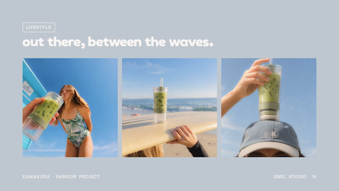
A Matcha To-Go Kit designed for your post-surf pause, with ceremonial matcha, oat milk, a bamboo whisk, a reusable cup, and packaging you can plant after use. 🌱
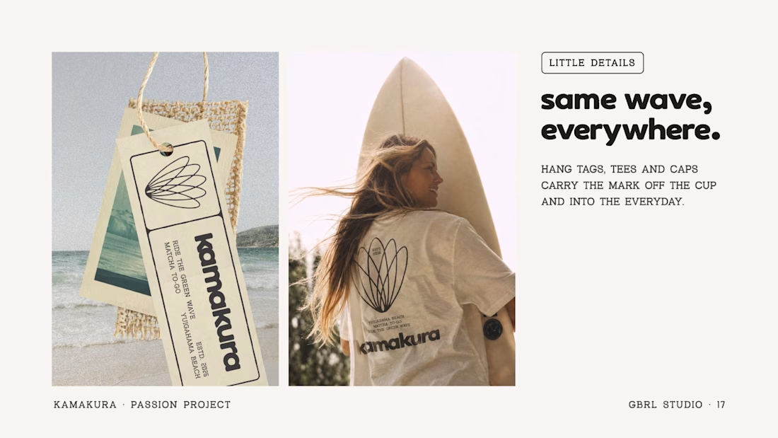
The icon brings both worlds together, with surfboards arranged into the shape of a matcha whisk. Because, naturally, even the logo had to catch a wave.
Ride the green wave. 🌊
#Kamakura #MatchaBranding #BrandIdentity #PassionProject #dbckamakura



Love this Gabriela! 🤍
I you don't mind sharing, what's the display font?