The network for creativity
Join 1.25M professional creatives like you
Connect with clients, get discovered, and run your business 100% commission-free
Creatives on Contra have earned over $150M and we are just getting started
Back to feedPost
Taste Test


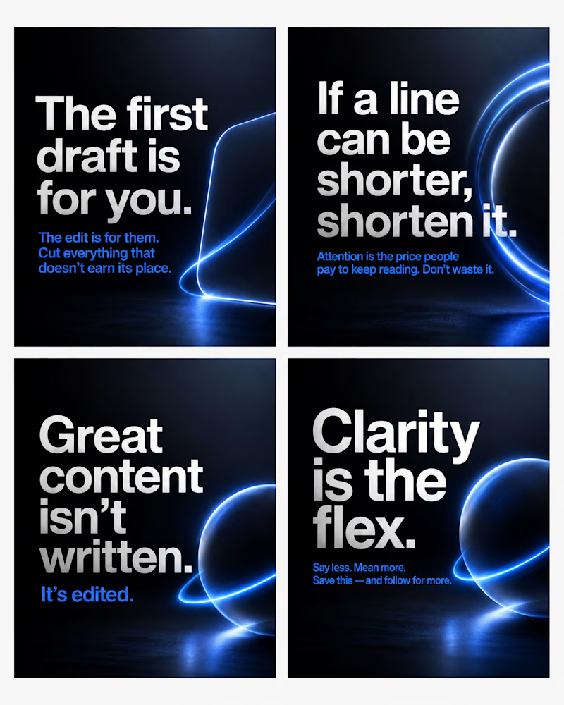
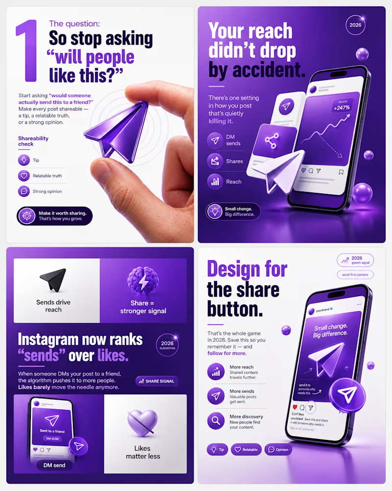
Same type of content. Two completely different design systems.
One is dark and cinematic, minimal type, deep gradients, one glowing accent doing all the work.
The other is bright and energetic, bold colour, playful 3D elements, and a lot more visual detail.
Neither is "better", they speak to different brands and different audiences. That's the real skill: matching the design language to who's meant to feel it.
Which direction pulls you in 👇
#carouseldesign #branddesign #visualidentity
5 votes
Ends in 1d

always minimalism


The network for creativity
Join 1.25M professional creatives like you
Connect with clients, get discovered, and run your business 100% commission-free
Creatives on Contra have earned over $150M and we are just getting started
Related posts


How do you turn a brand mascot into a visual system people actually remember?
🐆 Our lynx represents sharp thinking, curiosity, and attention to detail.
For this motion experiment, we pushed the mark into a softer, unexpected direction - rebuilding it with different textures.
Same identity, different emotion.
Which texture fits the Lynksen identity best - flowers, grass, or something else? 👇✨



I personally love the soft blue and white version the most. Nice to scale it into the brand campaign or ad video 😃

Small visual changes can completely change how a product feels.
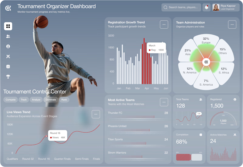
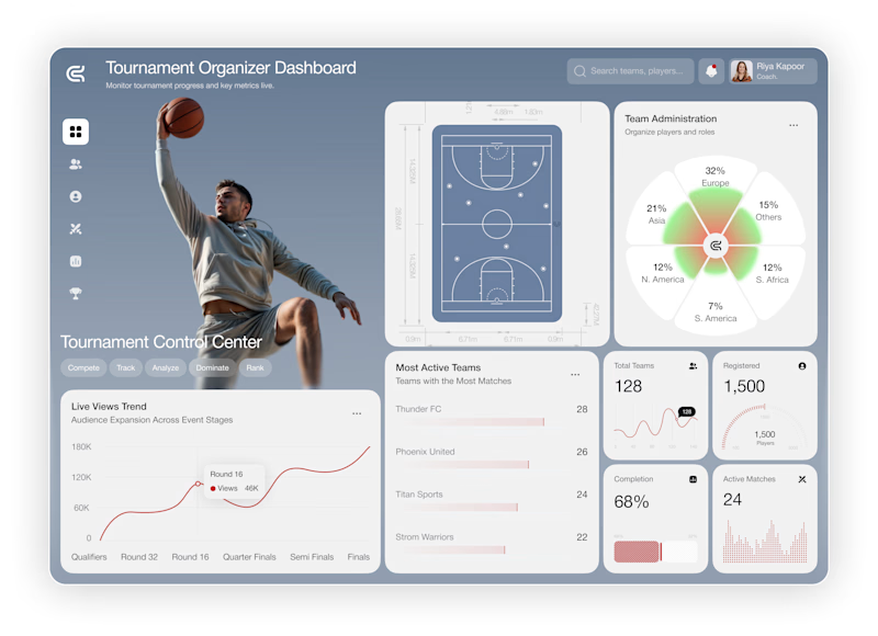
Imagine you're the client.
You paid for this dashboard.
Which version would you approve?
🅰️ A
🅱️ B
I'm curious what catches your eye first.
#uidesign #dashboard #saas #figma #productdesign #webdesign #uxdesign #sports #designfeedback #contra

14 voted
58%
10 voted
42%
24 votes
Closed

I prefer A. The hero section grabs my attention immediately.


Which is better? Left - Slightly angled waves with Lato Fontface, Right Straight Waves with Hubot Sans Fontface- remember its for an Air Conditioning Services Brand. Also open to any additional ideas or feedback. Thanks Contra Community!
2 voted
25%
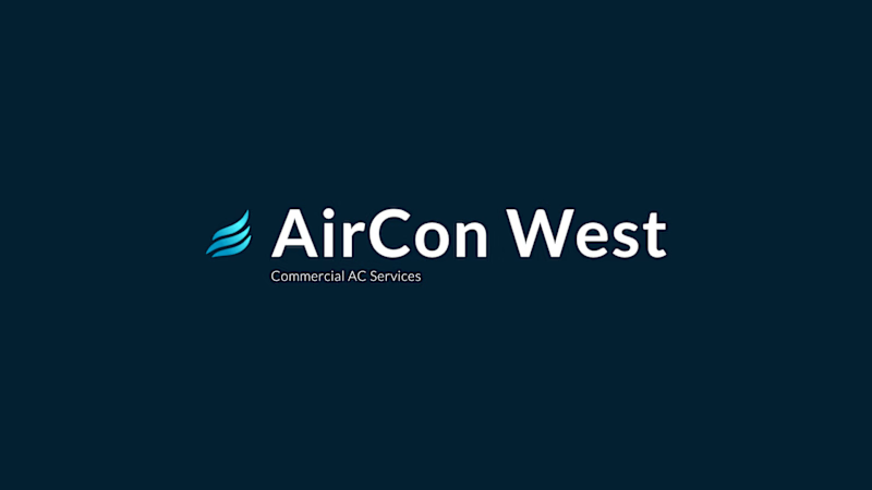
6 voted
75%
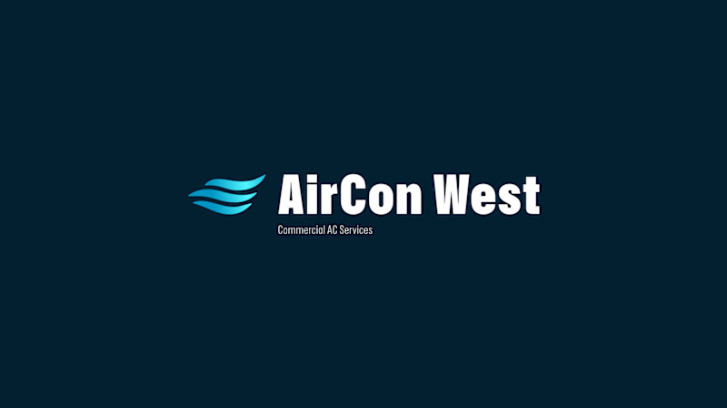
8 votes
Closed

Leaning toward the straight waves with Hubot Sans, it reads calmer and more "trustworthy service" for an AC brand, whereas the angled version feels a bit more like a tech startup. Is the client leaning premium/luxury or more everyday reliable with this rebrand?








Trending

Claude
Claude has entered the design space. How are you using Claude Design?

Contra University
Learn from expert creatives how to earn more using next-gen AI tools.
fifaworldcup2026
The World Cup is here and the whole world's watching. How are you designing for the world stage?
creativeaiflow
Creative AI workflows are evolving. What tools do you use, and what are their strengths and weaknesses?
freelancerlife
Freelancer life is wins, pivots, and everything in between. What’s yours right now?