The network for creativity
Join 1.25M professional creatives like you
Connect with clients, get discovered, and run your business 100% commission-free
Creatives on Contra have earned over $150M and we are just getting started
Back to feedPost
Taste Test


Which is better? Left - Slightly angled waves with Lato Fontface, Right Straight Waves with Hubot Sans Fontface- remember its for an Air Conditioning Services Brand. Also open to any additional ideas or feedback. Thanks Contra Community!

2 voted
25%
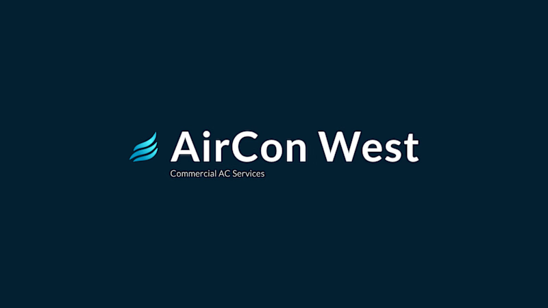
6 voted
75%
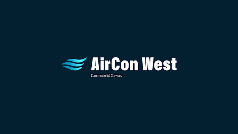
8 votes
Closed

I would correct the kerning in the first one 🫶

Leaning toward the straight waves with Hubot Sans, it reads calmer and more "trustworthy service" for an AC brand, whereas the angled version feels a bit more like a tech startup. Is the client leaning premium/luxury or more everyday reliable with this rebrand?
That makes sense, more premium was the direction.
Nailed it!
The network for creativity
Join 1.25M professional creatives like you
Connect with clients, get discovered, and run your business 100% commission-free
Creatives on Contra have earned over $150M and we are just getting started
Trending

Claude
Claude has entered the design space. How are you using it?

Contra University
Learn from expert creatives how to earn more using next-gen AI tools.
Brand Design
The best brand designers are on Contra. Scroll to see what's trending in brand design. What are you building?
creativeaiflow
Creative AI workflows are evolving. What tools do you use, and what are their strengths and weaknesses?
freelancerlife
Freelancer life is wins, pivots, and everything in between. What’s yours right now?



Related posts


need your eyes on this one :)
two hero options for a private tutoring platform we're working on at @effekt_design
left or right?
4 voted
15%
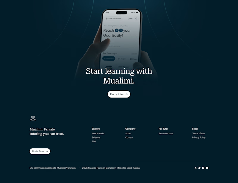
23 voted
85%
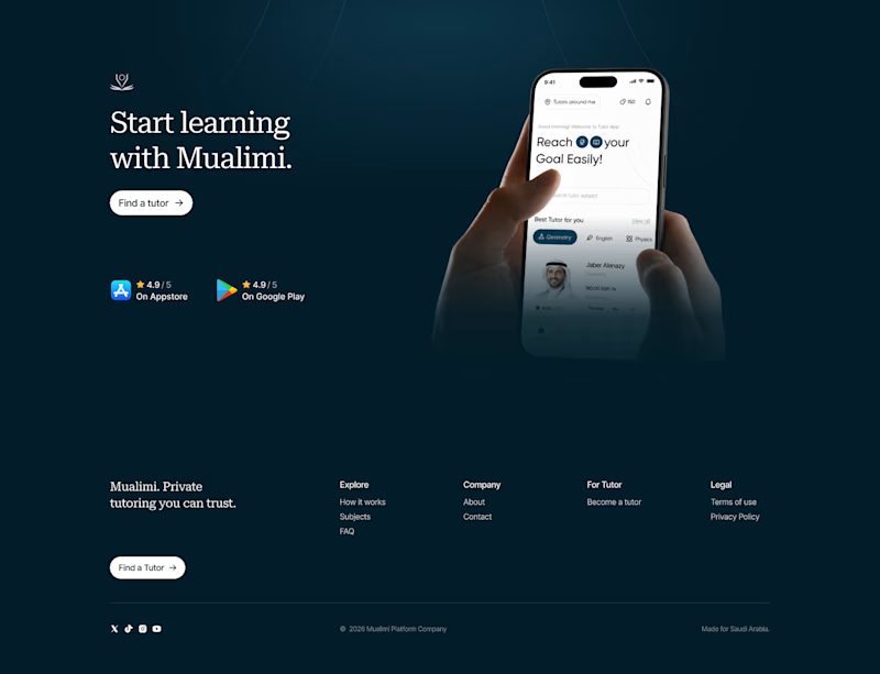
27 votes
Closed

Went with the right aligned version. Left aligned text is easier to scan first and the CTA doesn't have to compete with the phone mockup for attention like it does in the centered one.

Built this landing page using Figma + Claude Fable 5.
https://novaabank.netlify.app


Wow , i mean now words still cannot belive ai did this

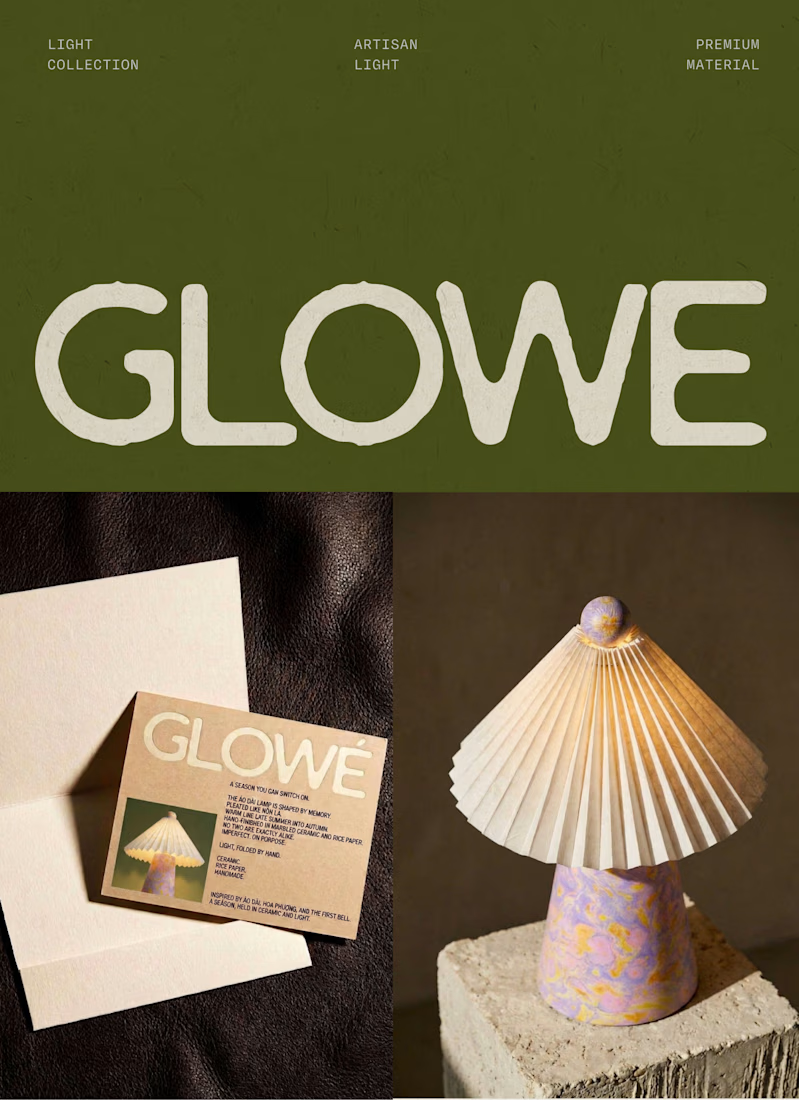
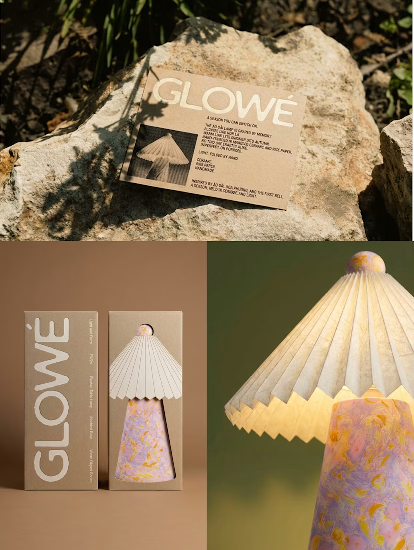
Designing a table lamp inspired by Vietnamese “áo dài” and “nón lá” with @Envato at the centre of my workflow.
Starting from a black-and-white sketch, I built the lamp's ceramic base and rice-paper shade using Envato's AI toolkit, tagging reference materials directly so AI wasn't guessing at textures it can't always read from an image alone.
AI was great at generating options. It was not great at knowing which option was right; I rejected a full batch that technically worked but lost the silhouette I actually wanted, and hand-retouched a detail (the finial) that AI kept leaving unfinished.
The bigger call AI couldn't make: timing this launch to back-to-school season in Vietnam, when áo dài comes back out. That's not a style choice; it's a commercial one.
See the full process and the part AI couldn't do in the VIDEO below. 👇
#envatochallenge @envato




Great Submission!