The network for creativity
Join 1.25M professional creatives like you
Connect with clients, get discovered, and run your business 100% commission-free
Creatives on Contra have earned over $150M and we are just getting started
Back to feedPost


A logo designed to feel calm, balanced, and intentional.
For this Yoga identity, I focused on simplicity — combining an abstract human form with clean typography to create a mark that feels peaceful, modern, and memorable.
Good branding doesn’t need to be complicated. Sometimes, removing what isn’t needed makes the idea stronger.
Any thoughts about design ot motion graphics ? Lemme know in the comment section . Looking forward to work with more clients


The network for creativity
Join 1.25M professional creatives like you
Connect with clients, get discovered, and run your business 100% commission-free
Creatives on Contra have earned over $150M and we are just getting started







Related posts

Meriot personal portfolio Website Homepage showcase
A portfolio website designed to turn personal expertise into a strong digital presence.
The goal was to create a website that communicates experience, personality, expertise, and credibility within the first few seconds.
I focused on:
Clear positioning and personal branding
Strong visual hierarchy
Editorial-style typography
Project-focused storytelling
UX/Product Design service presentation
Testimonials and social proof
Clear CTA for potential clients
Responsive, conversion-focused layouts
The visual direction combines minimal typography, bold imagery, dark/light sections, and subtle interactions to give the portfolio a distinctive personality without making it difficult to navigate.


Top notch execution

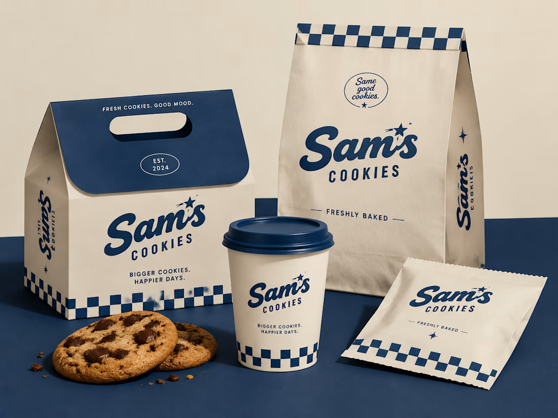
Turning a simple cookie into a memorable brand experience.
A packaging concept created to combine strategy, nostalgia, and a timeless American feel.
#BrandIdentity #PackagingDesign #FoodBranding #CreativeDirection

Beautiful design 😍

Design Direction Poll!
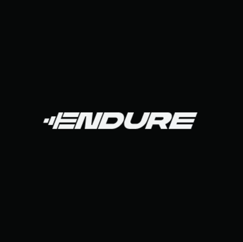
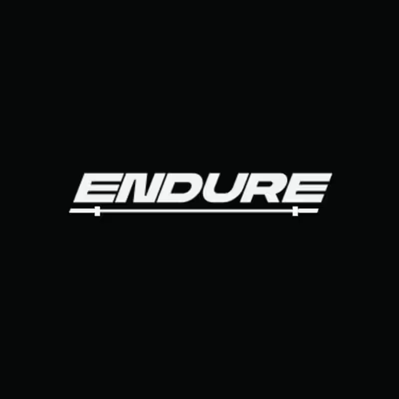
Two versions of the same Endure logo concept; same aggressive italic letterforms, same racing DNA. One detail changes the entire read.
Which version hits harder? 👇
14 voted
78%
4 voted
22%
18 votes
Closed
