The network for creativity
Join 1.25M professional creatives like you
Connect with clients, get discovered, and run your business 100% commission-free
Creatives on Contra have earned over $150M and we are just getting started
Back to feedPost

Been exploring WebGL + shaders through this cylindrical image gallery.
A few things I’m taking from it:
- Think about the surface before the individual images.
- Small speed differences can add a lot of depth.
- Shaders work best when they support the interaction.
- Most of the polish is in fixing seams, timing and transitions.
- Performance quickly becomes part of the design.
Still experimenting with how far this can go while keeping it useful for real websites.


Creative work

Awesome work!

Wow this is amazing

Super cool animation Franco!! 🚀

"Most of the polish is in fixing seams, timing and transitions" is such an underrated truth about shader work, that's the invisible 80% nobody claps for. Where's the line for you between a fun experiment and something you'd actually ship on a client site?

fascinating stuff, it's interesting how shape can do so much for perspective.

Honestly it looks amazing, I'm sure it's going to be fun to use. I wonder is it User friendly?
The network for creativity
Join 1.25M professional creatives like you
Connect with clients, get discovered, and run your business 100% commission-free
Creatives on Contra have earned over $150M and we are just getting started










Related posts

Figma Football
An unofficial football concept inspired by Figma and its visual language.
The ball was created using a custom 3D generator I built in ChatGPT, with animated interface icons and graphics developed with Claude.
Part design experiment, part exploration of how custom AI-powered tools can become part of the creative process.


The interface icons translate surprisingly well into a football identity.


😍

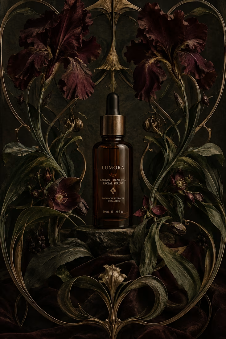
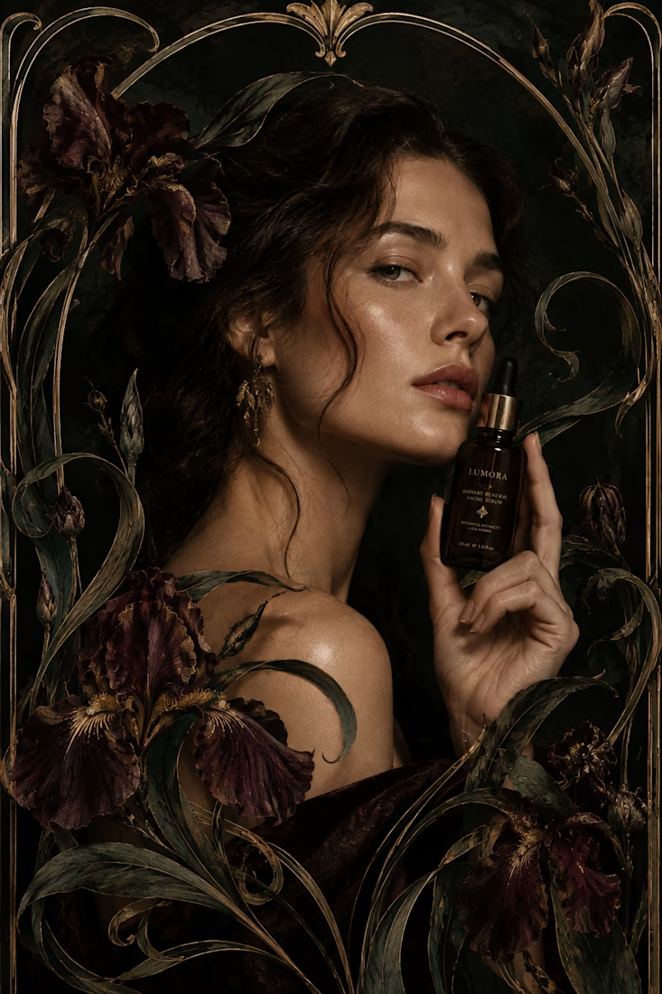
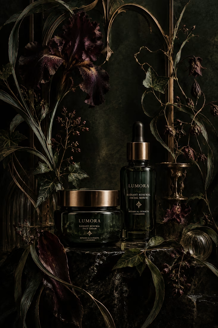
What would happen if a modern skincare product had to communicate without the visual language we associate with beauty today?
Instead, I went back to Art Nouveau, where typography, illustration, architecture, and ornament were treated as one visual system.
The subject actually...

thanks for sharing!

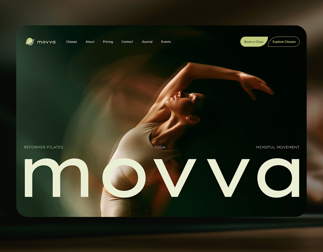
MOVVA is now featured on Contra 🤍
I’m especially happy about this because working on this template was a creative outlet for me.
I wanted to build something useful for a business: a website that covers what a studio needs when it opens, from an easy-to-use schedule to clearly structured class information, with a solid foundation for SEO.
At the same time, I wanted it to feel beautiful. To bring a sense of movement, lightness, and the joy of taking a class into the design. To capture that friendly atmosphere that makes you want to walk into a studio and give it a try.
Thank you, Contra team!


Huge congrats on getting featured! 🤍 MOVVA looks stunning - love the mindful movement vibe and that hero image. Super useful concept for studios. Well deserved feature!