The network for creativity
Join 1.25M professional creatives like you
Connect with clients, get discovered, and run your business 100% commission-free
Creatives on Contra have earned over $150M and we are just getting started
Back to feedPost

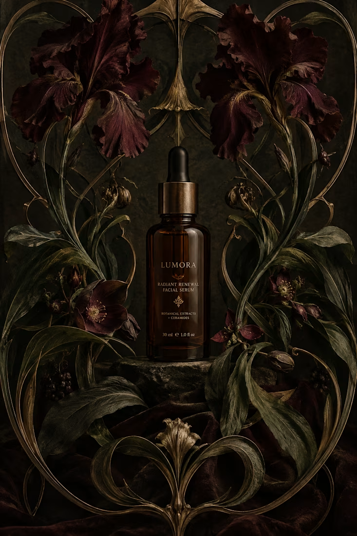
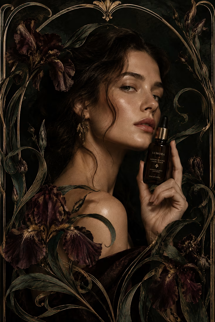
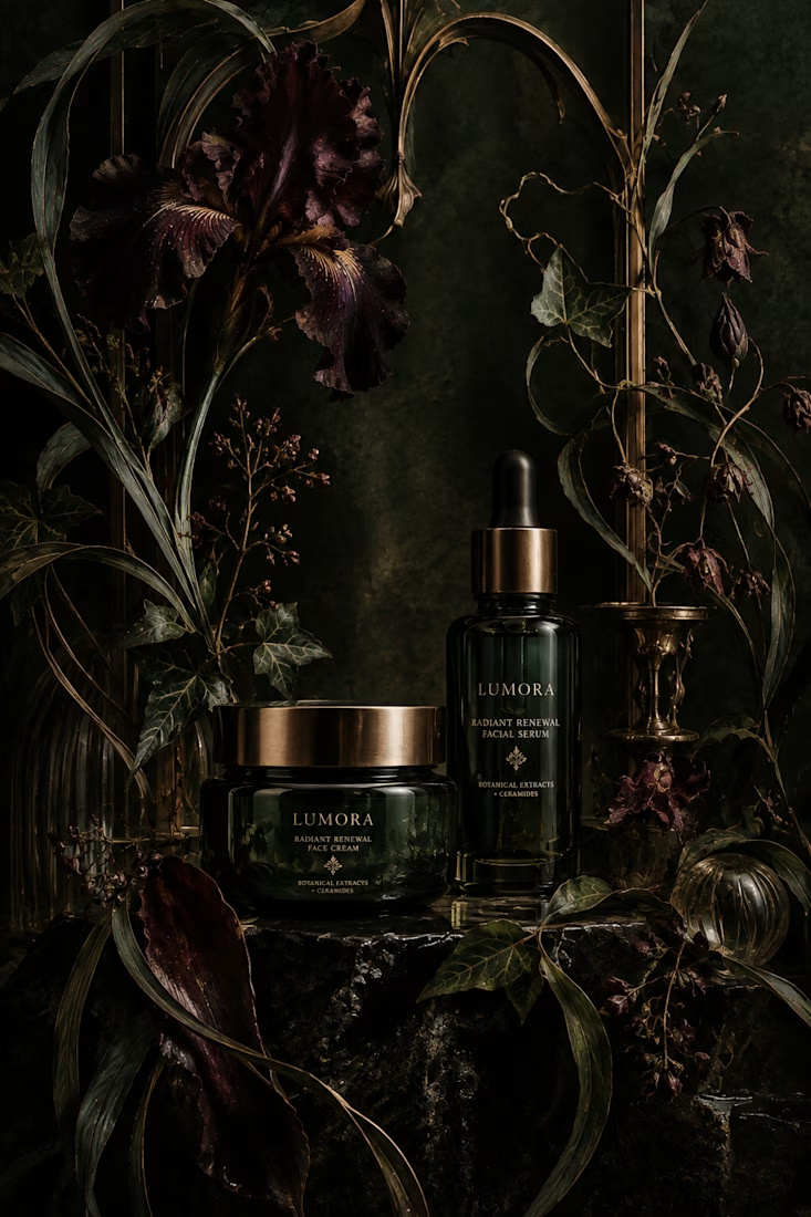
What would happen if a modern skincare product had to communicate without the visual language we associate with beauty today?
Instead, I went back to Art Nouveau, where typography, illustration, architecture, and ornament were treated as one visual system.
The subject actually felt surprisingly natural for the era. Art Nouveau was heavily inspired by nature, craftsmanship, beauty, and organic forms, all ideas that still show up constantly in skincare branding today.
One rule I refused to break: the decoration had to belong to the composition. It couldn't just be added on top to make something “look vintage.”
So... what modern product would you love to see reimagined in another design era? 👀



I love that idea! The contrast between modern tech and Art Deco or Brutalism would be really cool to explore. I can already imagine a smartwatch with those bold geometric details or earbuds with a more architectural, sculptural look. It would be interesting to see how far you...

So cool! 👍

This is amazing

The rule about decoration having to belong to the composition, not just get bolted on to look vintage, is the real takeaway here. I'd love to see something like a router or a webcam done in Bauhaus instead, functional grid and primary color coding replacing the usual glossy tech skin.
Thank you! And I would love to see that!

A modern AI product in Art Deco would be ridiculously fun to see. The contrast between something so new and that visual language could work really well.
I agree!

This looks good

That dark floral palette with the gold accents is doing exactly what Art Nouveau intended - making luxury feel rooted rather than sterile. The rule about decoration belonging to the composition is one most modern packaging breaks constantly. Really beautiful work.

You did a great work on this project. Love it!

obsessed with this. the botanicals feel actually grown into the layout, not pasted on. did you fight ChatGPT a lot to keep the ornament this disciplined, or did it lean into the era pretty easily?
I didn't fight it at all! I found out actually that ChatGPT is superior in terms of image generation. It tends to be veeery consistent when working on the same chat!


art nouveau skincare, didn't expect that to work but it does
Right??

Wow, the combination, the elegant, the contrast works so damn well
Thaaaanks!

awesome work

🫶🏻🫶🏻🫶🏻

Love the thinking behind this. Art Nouveau feels surprisingly natural for skincare because the organic forms aren’t just decoration, they reinforce the product category itself. The restraint in the palette keeps it from feeling like a period piece too. Beautifully considered.

Looks like a premium product. Mock up is also going well.

Fantastic

Very nice, but you should add some lighting from the sides to illuminate the product—to create an accent, so to speak—otherwise, it blends in with the background!

nice project, fabulous !

Reimagining skincare through Art Nouveau is such a thoughtful concept, Anita. The botanicals feel woven into the composition rather than decorated on, and the dark floral palette is gorgeous. Beautiful thinking.


Offfffff I love this!!

The botanical curves make the ornament feel connected to the skincare story, rather than just a vintage frame. I would love to see refillable household products explored through Bauhaus: the geometry could help distinguish the range while keeping the labels practical.
The network for creativity
Join 1.25M professional creatives like you
Connect with clients, get discovered, and run your business 100% commission-free
Creatives on Contra have earned over $150M and we are just getting started



Related posts

Motion Design & Art Direction
I design motion from the first composition to the final frame, combining typography, graphic design and animation.
This self-initiated series shows how I work with timing, weight and visual hierarchy. Letters stretch and rebound, geometric forms trigger chain reactions, and transitions carry one composition into the next. Each movement follows the same graphic language while giving each film a distinct pace.
My focus is on how a design behaves over time: where the eye goes, how an element arrives, and when a transition needs to hold or accelerate.


Nice!


ESE GIN — Between the Dunes | Visual Identity & Packaging
ESE GIN draws its curves from the dunes. The signature S catches the light in sculpted olive glass and leaves its imprint in wax.


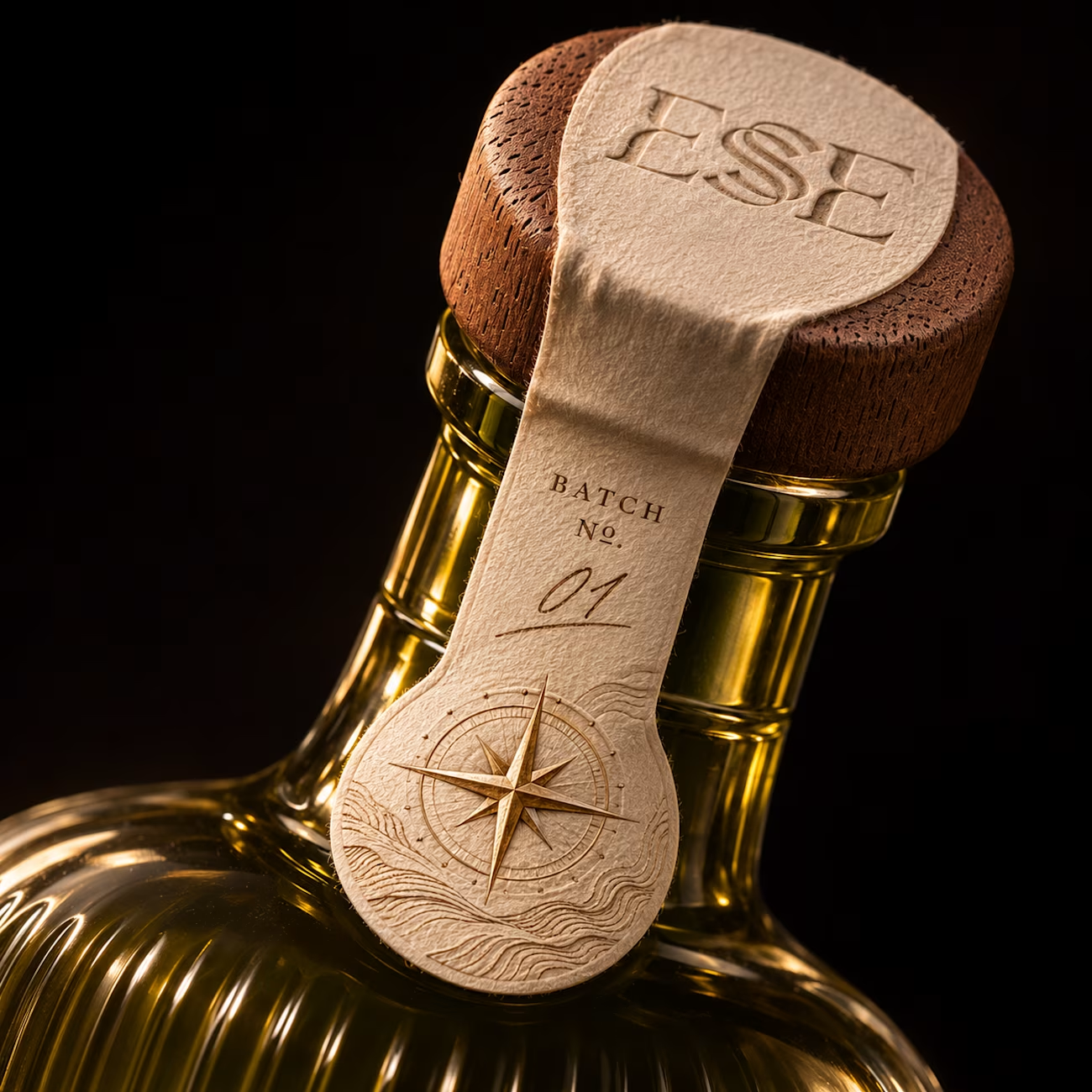
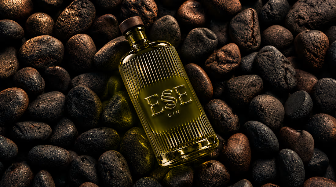
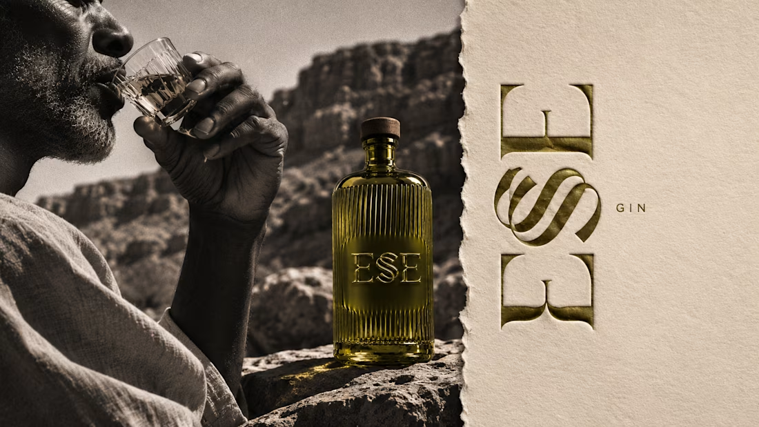
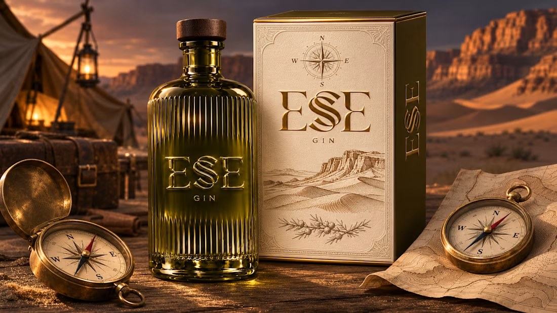

This is gorgeous, Maya — the sculpted olive glass with that S catching the light is such a clever way to carry the dunes into the bottle itself. And the wax seal imprint is a beautiful finishing touch, it gives the whole thing a crafted, almost apothecary feel. Really cohesive...




I love it too