The network for creativity
Join 1.25M professional creatives like you
Connect with clients, get discovered, and run your business 100% commission-free
Creatives on Contra have earned over $150M and we are just getting started
Back to feedPost

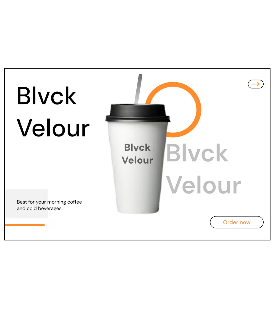
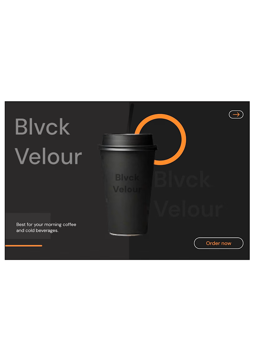
Two directions. One brand. Two completely different moods.
I explored two visual directions for the same coffee packaging concept ; a light/clean version and a dark/bold version.
Both communicate the same brand, but they create completely different moods.
Option A — Light: clean, minimal, fresh
Option B — Dark: bold, premium, more dramatic
If you were the client, which one would you choose?
And more importantly, what makes you choose it?
I’m curious to hear how other designers and creatives approach this kind of visual decision.
Do let me know in the comments.

The network for creativity
Join 1.25M professional creatives like you
Connect with clients, get discovered, and run your business 100% commission-free
Creatives on Contra have earned over $150M and we are just getting started
Trending
retrofuturism
Share your favorite designs from the past exploring the distant future. Or your own take on the aesthetic 🚀
halftone
Dots. Texture. Grain. Let's see your designs using the halftone technique.

Midjourney
Creatives are showing off what they're making with Midjourney.
colorgrade
Video editors sound off: How do you enhance the mood of your video in color grading?





Related posts

When selling a premium service, mentorship, or high-value framework, a generic template fails to convey the true depth of your offer. The challenge I solved here was translating a multi-stage methodology into an intuitive, high-converting digital experience, built natively on Webflow.
By combining an editorial landscape aesthetic with modern, scroll-triggered interactions, I turned an abstract concept into a seamless visual journey.
Methodology Visualized: I designed custom interactive nodes (Relaxation → Attention → Motivation) that walk users step-by-step through the core process.
Webflow Build: I developed the full site on Webflow with clean HTML/CSS architecture, fluid animations, and fast load speeds.
Editorial Identity: I paired a warm color palette and subtle grid architecture with vintage illustration elements to build immediate authority.
Flexibility: I set up a clean Webflow CMS structure so you can easily update content without touching code.
Need a custom site that clearly communicates the value of your framework and converts visitors into clients? Send me a message and let’s discuss your project!


Amazing work!

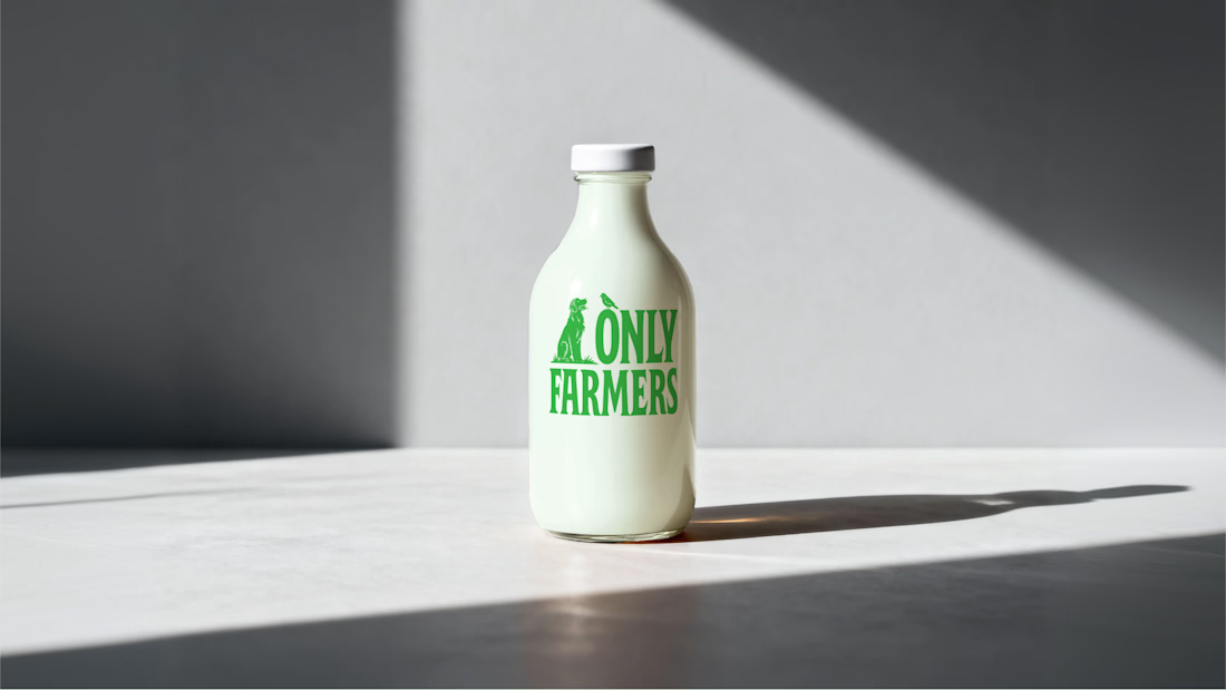
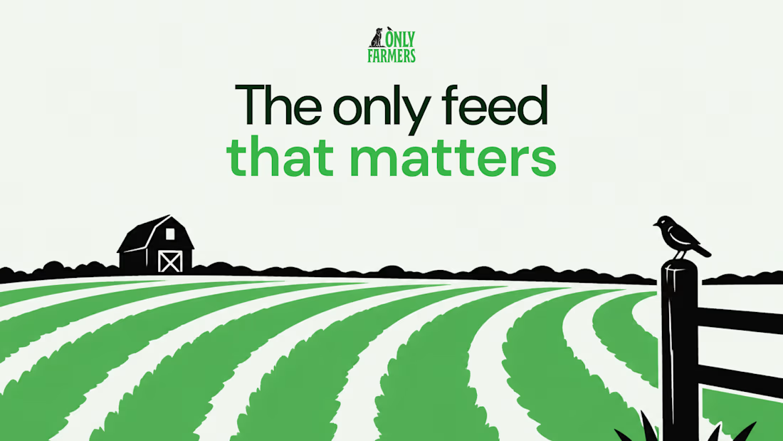
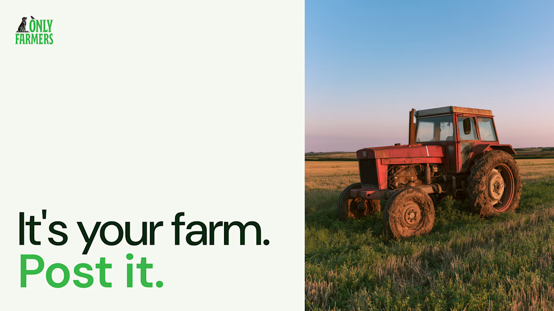
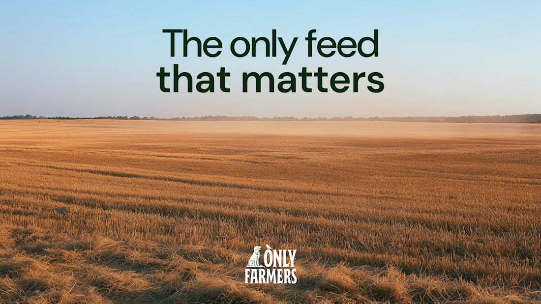

Love the dog and bird in the logo, it gives me the feeling of those old farm movies. Nice work thats very clever.

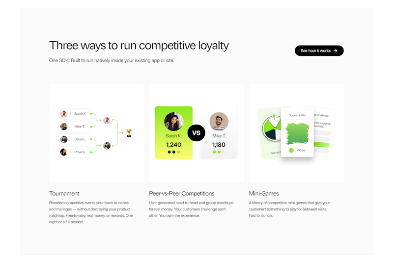
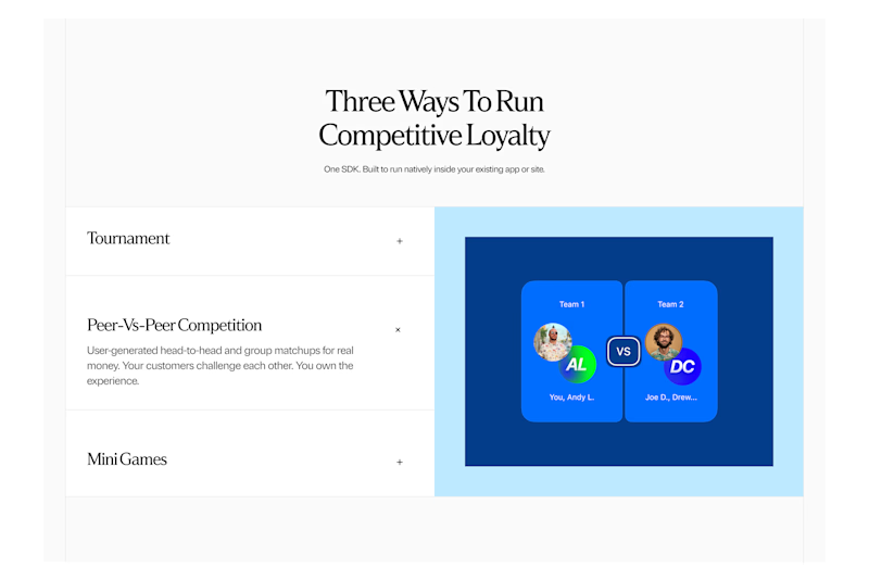
Which option will you choose and why?
Lucra: How it works Section Exploration
35 voted
76%
11 voted
24%
46 votes
Closed

A looks Good