The network for creativity
Join 1.25M professional creatives like you
Connect with clients, get discovered, and run your business 100% commission-free
Creatives on Contra have earned over $150M and we are just getting started
Back to feedPost
What if a gallery felt like scrolling through someone’s feed?
For Namaste Studios, I wanted the gallery section to have a bit more personality than the usual collection of neatly arranged images.
So I borrowed a visual language we already know instinctively: Instagram posts.
The cards sit around the main content and stay sticky as you scroll, creating this playful, layered composition that slowly unfolds with the page.
It makes the section feel less like “here are some photos from our studio” and more like you’re getting little glimpses into the world of Namaste.
Sometimes a familiar interaction, used in a slightly unexpected way, is all a section needs.
Built for my Namaste Studios Framer template. 🌿


Love it 🧡

Thank you, Nazmul. 🙌

Love the cards!
Thanks, Bella! 😊

The sticky layered cards make the whole section feel alive instead of static, such a smart borrow from something people already scroll all day. Was this built with Framer's native scroll effects, or did you need custom code overrides to get that stickiness feeling right?
Thanks, Diego! 🙌 And yep, it’s all done natively in Framer, no custom code overrides. Just Framer’s native sticky positioning and scroll effects doing the work. 😊

Interaction design always pulls me in. 🔥 The motion makes the whole experience feel alive. ❤
Exactly! 🙌 It’s amazing how much a little motion can change the feel of an otherwise static layout. ❤️


Love this idea. Using a familiar interaction like Instagram makes the gallery feel way more interesting.
Totally! 🙌 I think borrowing familiar patterns can make a section feel much more intuitive while still giving it its own personality.


Outstanding work !
Thanks! 🙌

Looks awesome
Appreciate! 🙌

Totally! I designed it with exactly that in mind. 😊

Nice work!
Thank you! 😊

Good work🔥👏
Thanks a lot!

How does this sticky card animation adjust for smaller screens or mobile views?
Check out the live version! 🚀

Beautiful
Thanks! 🙌


the ig framing is smart, feels familiar straight away
Thanks, Nazar!

Borrowing the Instagram scroll pattern for a gallery is such a smart move, people already know exactly how to interact with it without thinking. Curious how it tested with the client though, did they need convincing to move away from a more traditional gallery grid?
Thanks! It’s actually part of a template.

You nailed it 👍
Thanks, Emmanuel!

Incredible work, truly inspiring stuff!
Appreciate! 🙌

Thanks a lot!

Wow Amazing Project😍
Thanks, Yaroslav! 😊

Your shot is exceptional. I'm overwhelmed with the quality of work!
Appreciate the kind words! 🙌

this looks so creative
Cheers, Daxesh!

Such a clever take on a photo gallery! Turning familiar feed cards into sticky-scroll elements makes the layout feel super engaging and modern. Beautiful work for Framer! 🌿✨
Thank you! 🙌 I wanted to make the gallery feel a little less predictable, so the sticky cards felt like a fun way to add some movement without overcomplicating it.

good website design
Thanks, Mayowa!


The feed idea fits so well here.
Happy you like it! 🙌


Such a unique card design!
Thanks, Tarik! 🙌

This is such a clever approach! 🔥 Using a familiar social-media interaction makes the gallery feel much more dynamic and memorable. Love how the sticky cards add personality without taking away from the work. 🌿
Appreciate the feedback! 😊
Absolutely! 😊 I really appreciate you taking the time to check it out. I’m always exploring new ways to make digital experiences feel more engaging and memorable. Would love to see what you’re working on too!

Cool!
Cheers! 🙌
The network for creativity
Join 1.25M professional creatives like you
Connect with clients, get discovered, and run your business 100% commission-free
Creatives on Contra have earned over $150M and we are just getting started





Related posts


Very nice

Most creative brands try to say everything at once.
More colour.
More shapes.
More visual noise.
But for this identity exploration, the idea was simpler:
Make creativity feel meaningful.
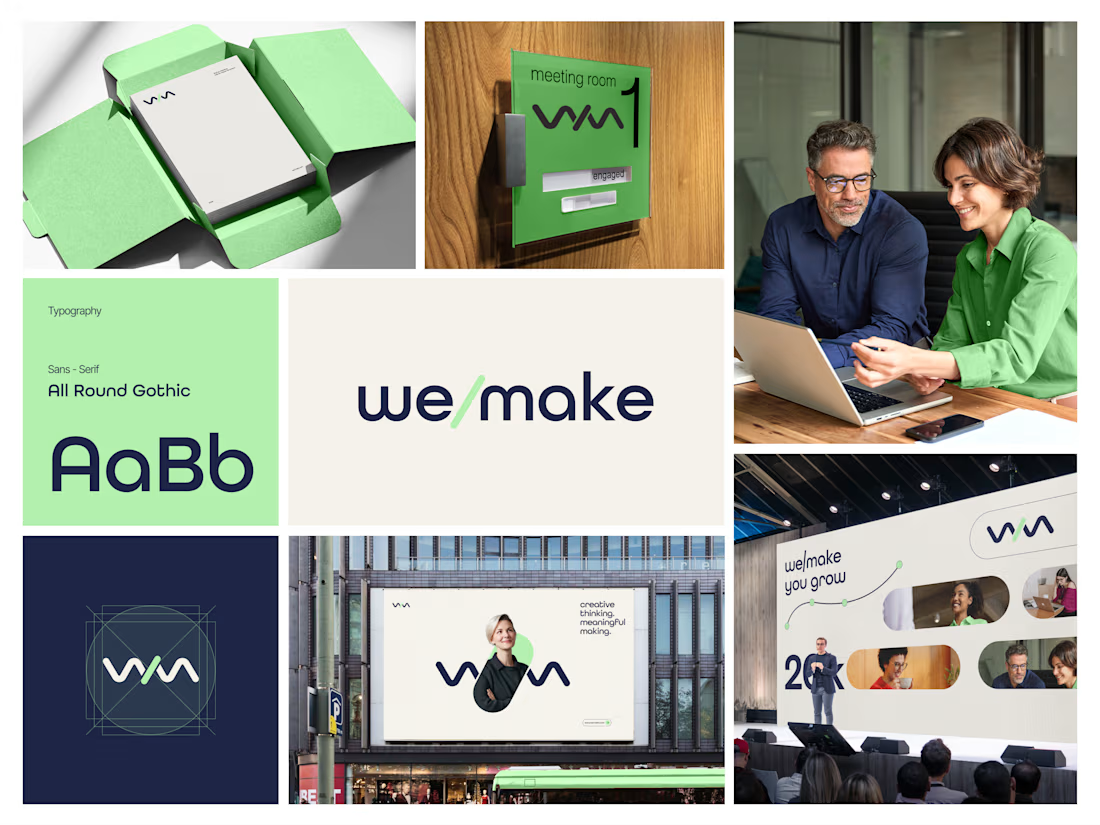
Introducing we/make, a bold, human-centred visual identity built around collaboration, growth, and purposeful making.
The mark is designed as a flexible expression of “we” and “make” coming together.
It represents:
• Ideas turning into action
• People creating together
• Growth through meaningful work
• A creative process that stays clear, warm, and confident
The visual system pairs a deep navy foundation with a fresh green accent, bringing together trust, focus, energy, and optimism.
Rounded typography and soft graphic elements keep the brand approachable, while the structured layouts give it a modern, professional feel.
From stationery and meeting-room signage to campaigns, billboards, and event spaces, the identity is built to work wherever creativity needs to show up.
Creative thinking. Meaningful making.
Would love to hear your thoughts on the visual direction.
What stands out to you first, the logo, colour palette, or overall brand feel?
#BrandIdentity #BrandDesign #CreativeDirection #VisualIdentity #GraphicDesign #LogoDesign



Doppel — Threat Graph
Making complex cybersecurity concepts clear through motion.
For the Doppel Threat Graph product film, I contributed to the visual development and animation. The product connects digital threats across multiple channels, revealing how individual signals form part of a coordinated attack campaign.
The challenge was to translate this technical functionality into a clear visual narrative—showing why the connections between threats matter and how they help reveal the bigger picture.
My work covered storyboard and motion exploration, animation, and scene refinement throughout the feedback process. The focus was on introducing information progressively and guiding attention toward the relationships central to the product’s value.
The result is an animated product film that introduces Doppel Threat Graph and makes its core functionality easier to understand. The project demonstrates how motion design can bring clarity to a complex software product.
Services: Storyboard Exploration · Motion · Animation


That's unbelievable great job 🎉🎉🔥🔥