The network for creativity
Join 1.25M professional creatives like you
Connect with clients, get discovered, and run your business 100% commission-free
Creatives on Contra have earned over $150M and we are just getting started
Back to feedPost

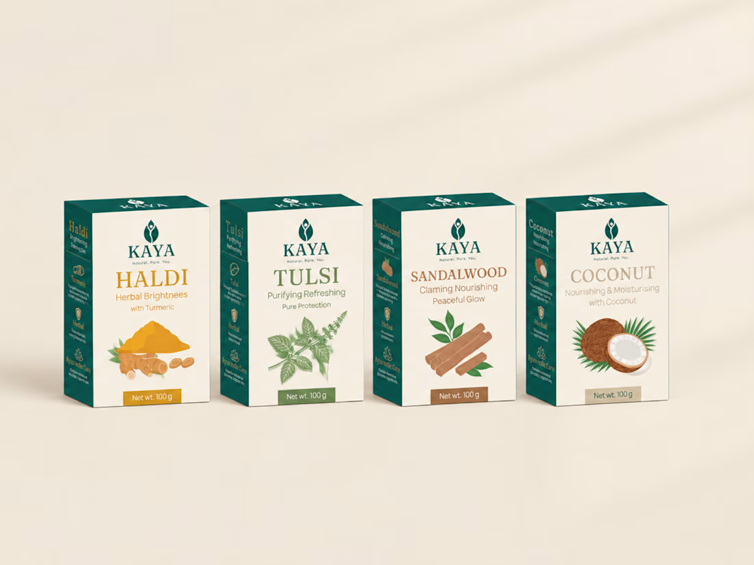
I designed a soap brand around one feeling: the comfort of a mother's homemade soap, in the language of modern luxury.
Meet KAYA, a conceptual Ayurvedic soap identity. Kaya means "body" in Sanskrit.
What I designed:
🌿 A leaf-and-figure symbol with a Fraunces wordmark
🌿 One packaging system across four variants: Haldi, Tulsi, Sandalwood and Coconut
The challenge was making a natural brand feel premium without the usual rustic herbal look.
Which of the four variants do you think works best, Haldi, Tulsi, Sandalwood or Coconut? Tell me in the comments. 👇
Conceptual project. Open to brand identity and packaging projects.
The network for creativity
Join 1.25M professional creatives like you
Connect with clients, get discovered, and run your business 100% commission-free
Creatives on Contra have earned over $150M and we are just getting started





Related posts


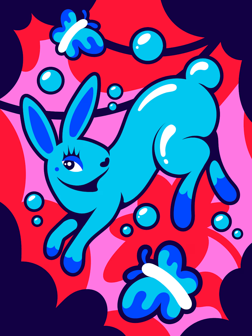

I truly love the the illustration

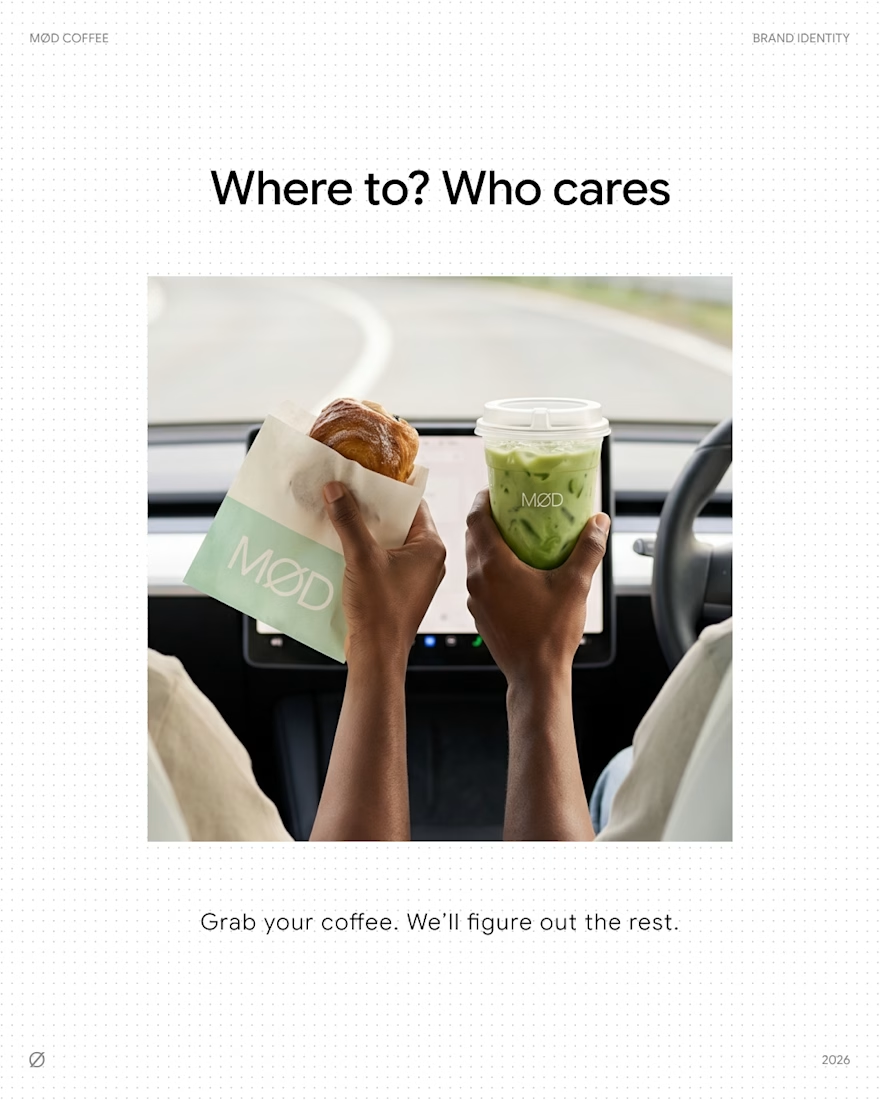
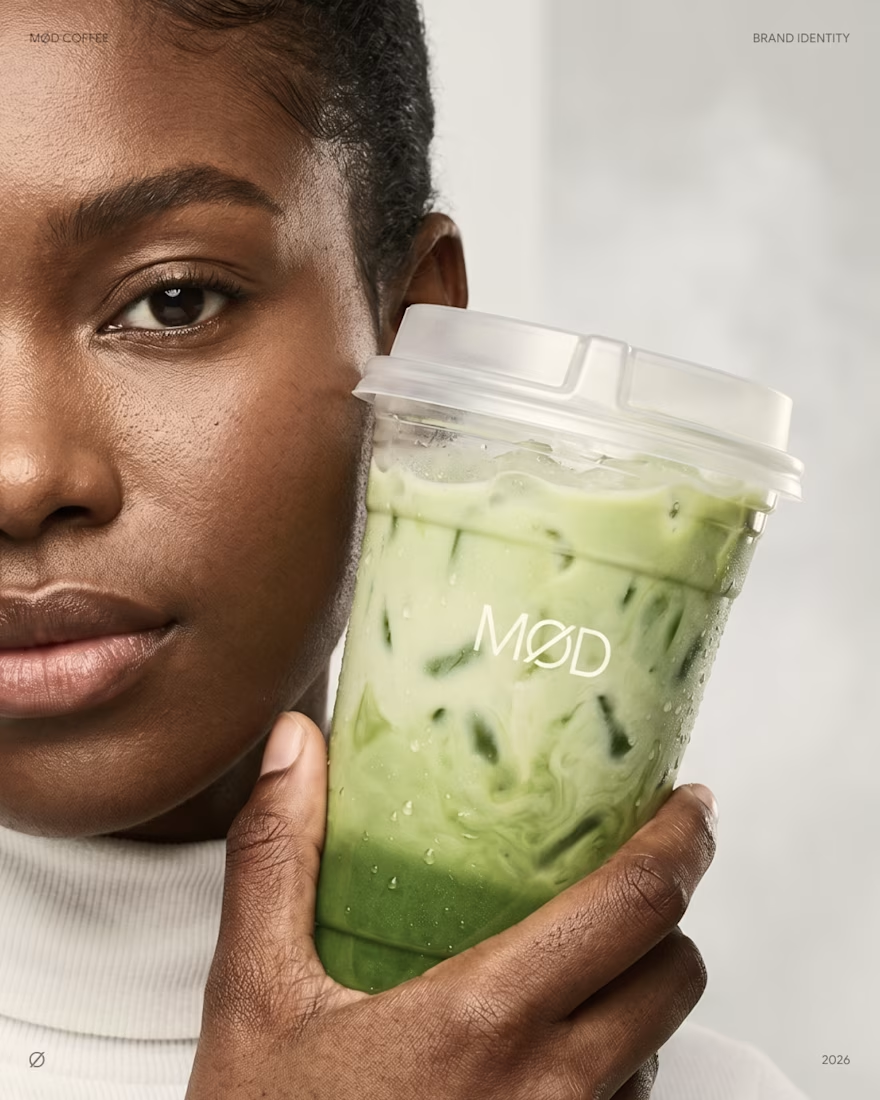
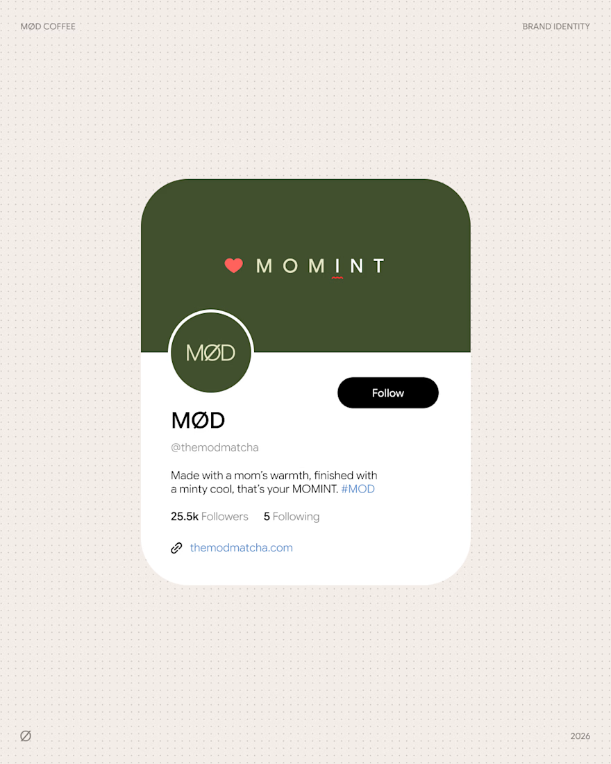
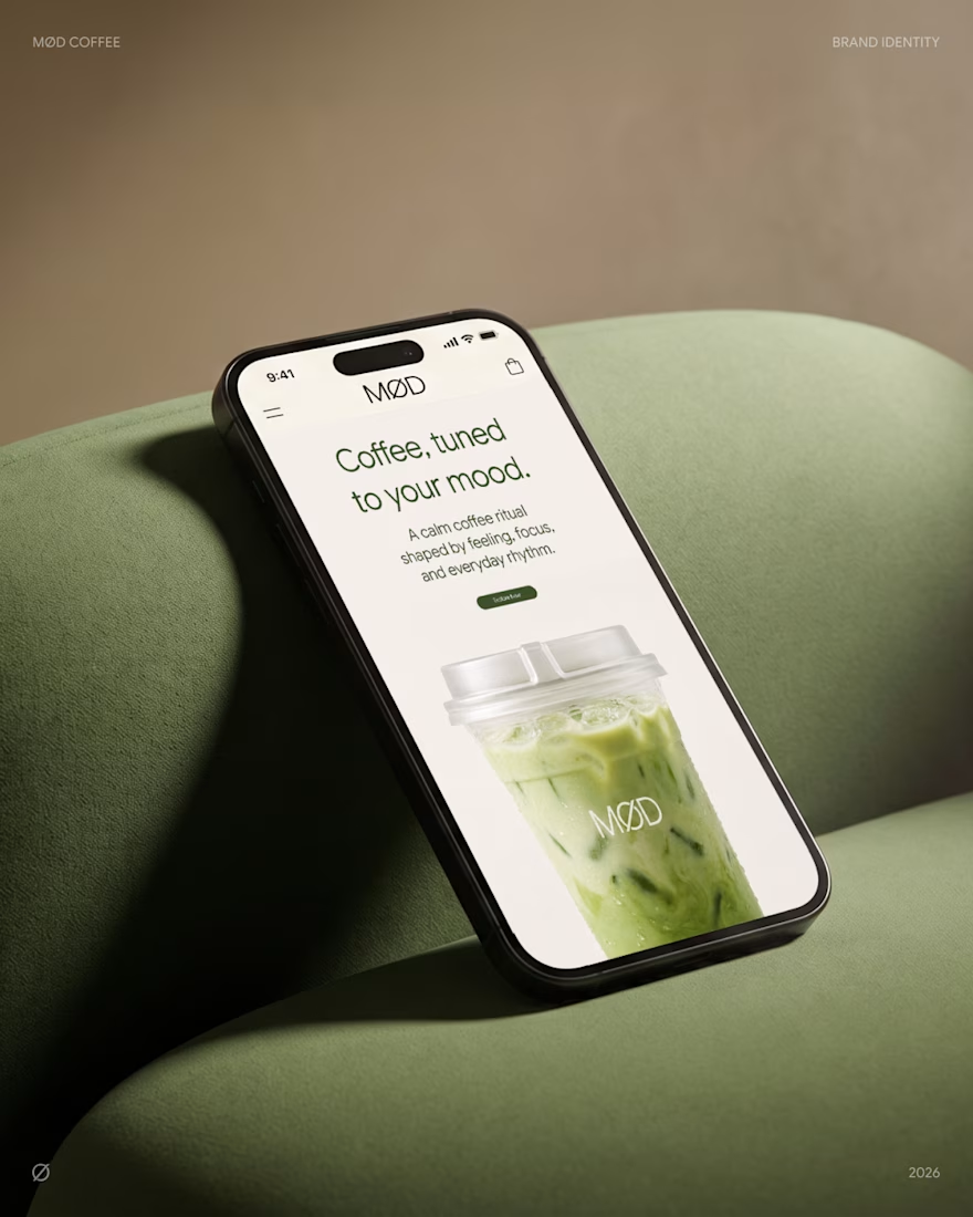
MØD Coffee. Matcha Cafe Brand Identity & Packaging
MØD is a matcha cafe brand built on one line: coffee, tuned to your mood.
The identity carries an easy, unhurried voice across every touchpoint. "Where to? Who cares" on the go. "Grab your coffee. We'll figure out the rest." on the counter. Signature drinks like MOMINT bring it to the menu: made with a mom's warmth, finished with a minty cool.
Scope: logo, cup and bag packaging, website, social media.
Full case study: MØD Coffee
Which slide would make you order?😊
branddesignpackagingdesignbrandingLogo DesignPackaging DesignBrand DesignAdobe IllustratorAdobe PhotoshopFigma



love the mobile mockup 👍

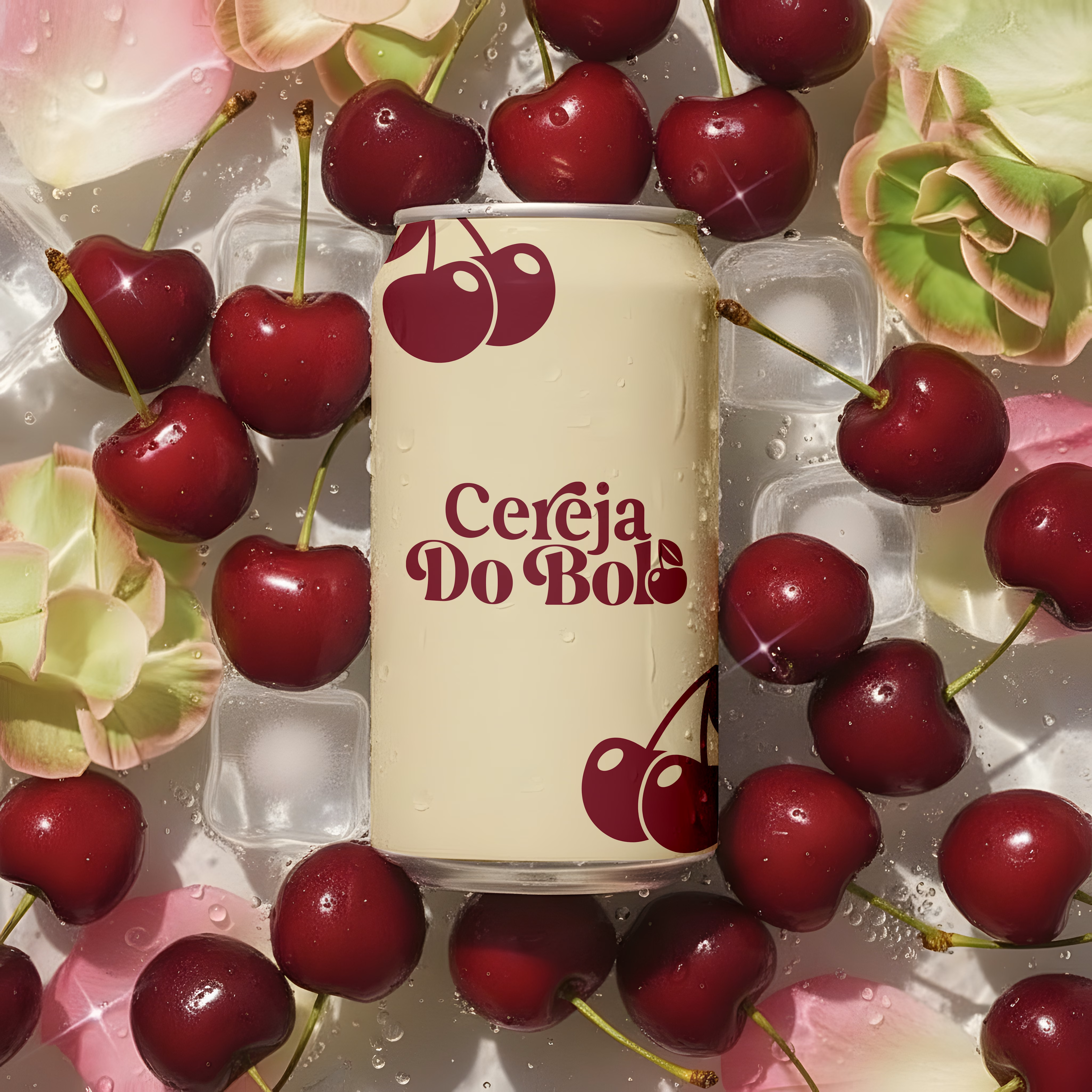
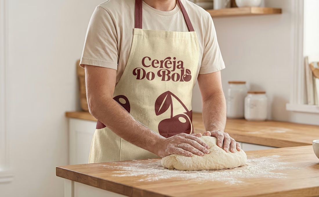
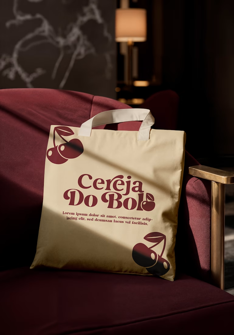
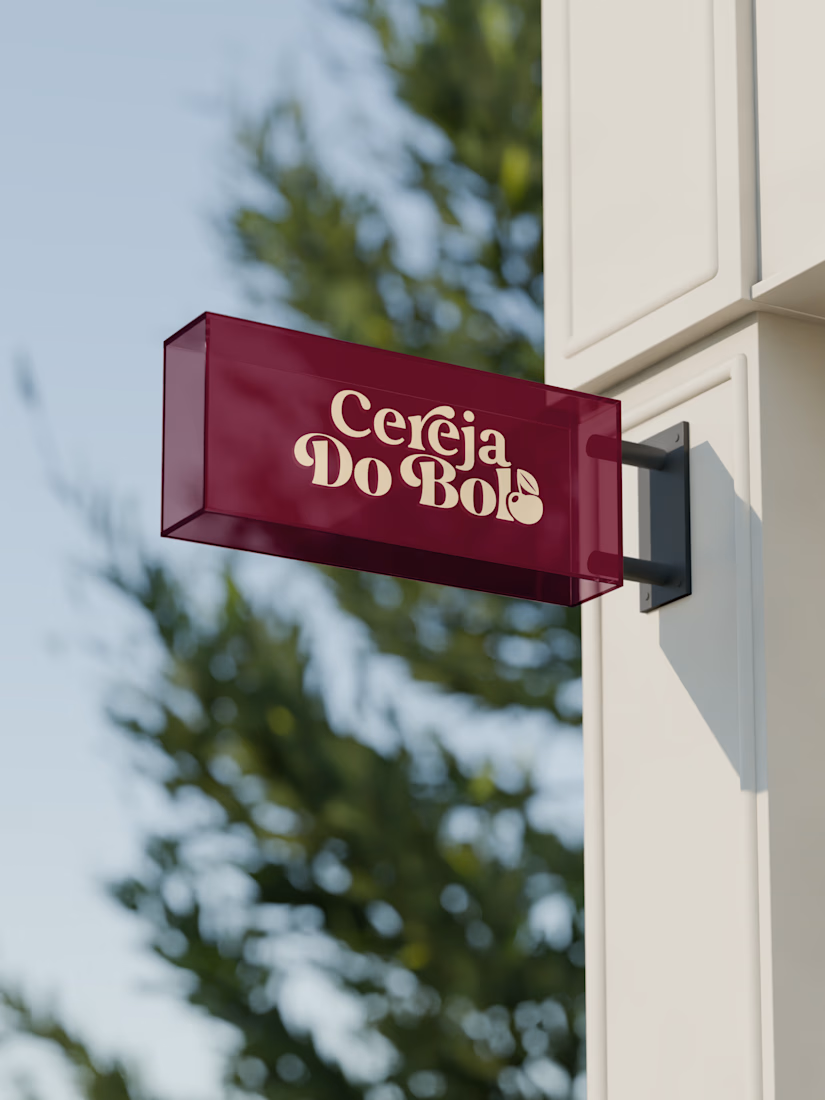
Brand Identity & Packaging Design
A complete visual identity and packaging concept for Cerveja do Bolo, including branded packaging, merchandise, and outdoor signage. I developed the visual direction and applied the brand consistently across multiple touchpoints to create a cohesive and recognizable identity.

Wow, love it