The network for creativity
Join 1.25M professional creatives like you
Connect with clients, get discovered, and run your business 100% commission-free
Creatives on Contra have earned over $150M and we are just getting started
Back to feedPost
MØD Coffee. Matcha Cafe Brand Identity & Packaging
MØD is a matcha cafe brand built on one line: coffee, tuned to your mood.
The identity carries an easy, unhurried voice across every touchpoint. "Where to? Who cares" on the go. "Grab your coffee. We'll figure out the rest." on the counter. Signature drinks like MOMINT bring it to the menu: made with a mom's warmth, finished with a minty cool.
Scope: logo, cup and bag packaging, website, social media.
Full case study: MØD Coffee
Which slide would make you order?😊
branddesignpackagingdesignbrandingLogo DesignPackaging DesignBrand DesignAdobe IllustratorAdobe PhotoshopFigma


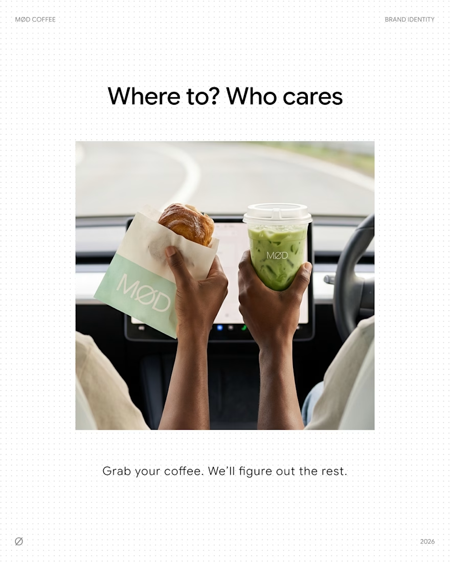
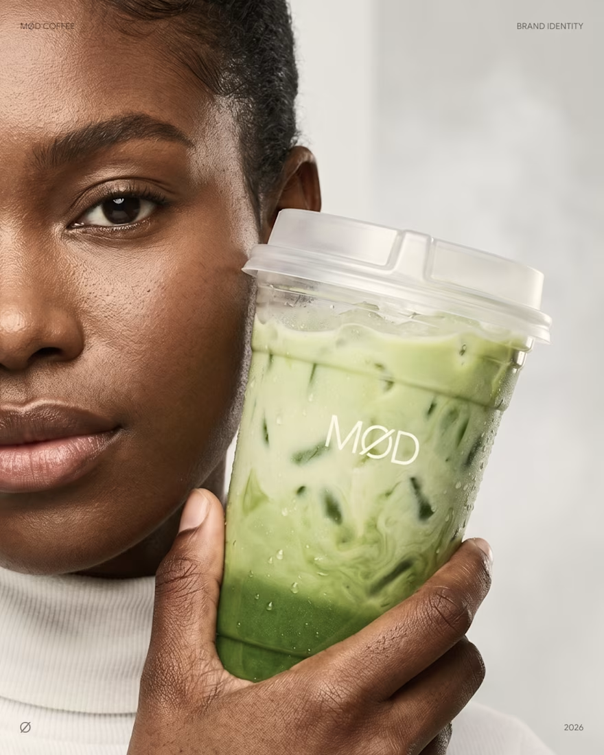
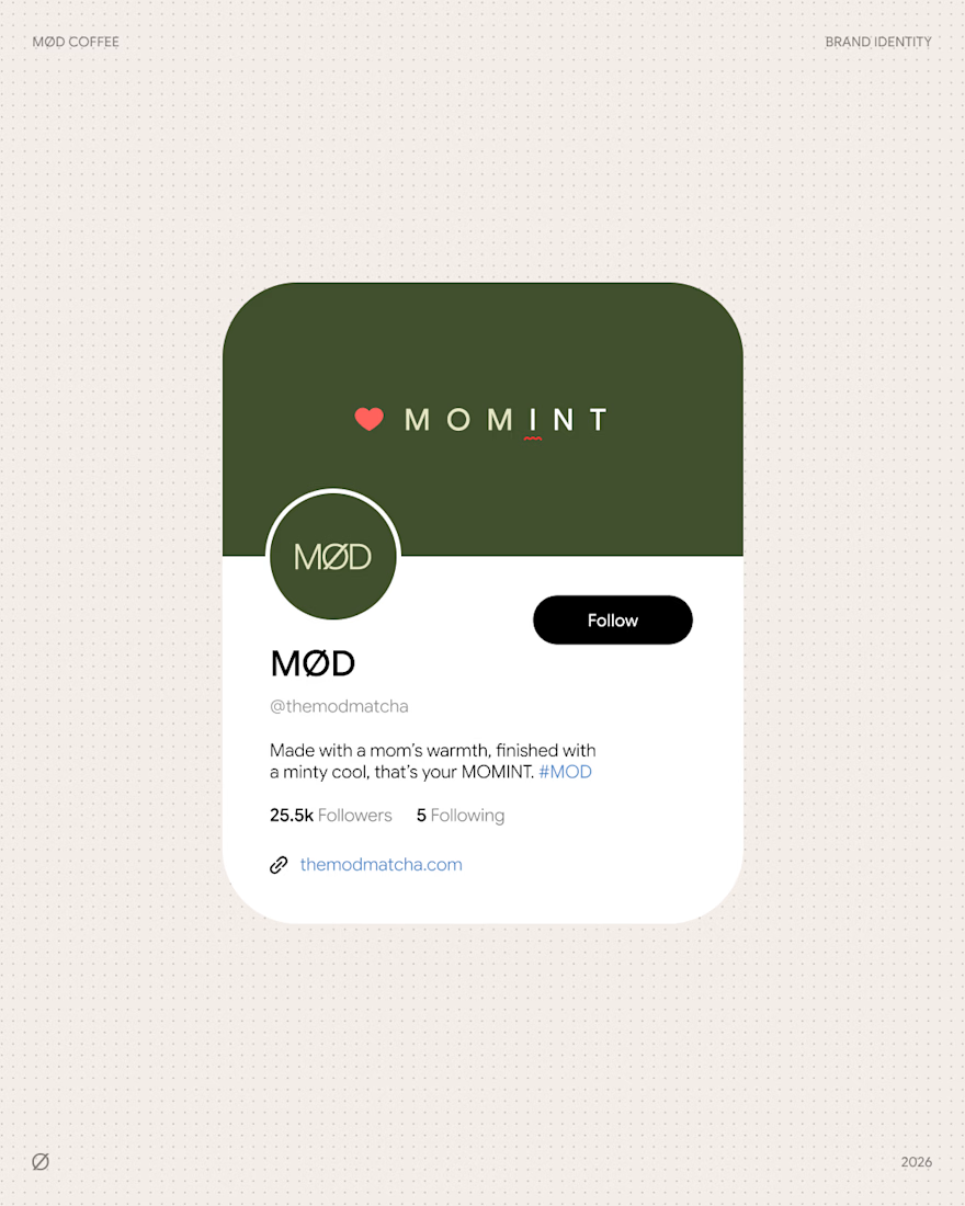
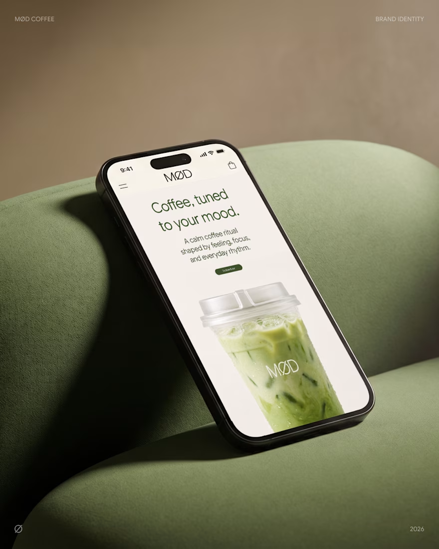

The MOMINT cup, because the drink name is where the voice stops being packaging copy and becomes something a person actually says out loud at the counter. That's also the exposure with a voice-led identity - the lines are doing the differentiating, and lines are the first thing...

Thanks Artur, good question.
MOMINT is my favourite too. Honestly, MØD came from "mood". People drink coffee when they're tired, happy, stressed, or out with someone, and every line came from that. So for me the rule is simple: if a line doesn't fit a mood, it doesn't fit MØD.

Very refreshing!!

Good Visual.

love the mobile mockup 👍
Thanks ser!

The network for creativity
Join 1.25M professional creatives like you
Connect with clients, get discovered, and run your business 100% commission-free
Creatives on Contra have earned over $150M and we are just getting started







Related posts

Introducing MONETA, a digital banking brand concept designed for modern businesses that need a banking experience built around clarity, speed, and confidence.



wow the branding is surprisingly premium

A new visual identity for Reroll.
We turned the O in the name into a die and built the wider brand language around that simple idea.
The project includes:
• Logo design
• Social media identity
• Logo animation
• Custom playing card back
• 3D visual assets
Creative direction: Dmitry Lepisov
Identity design + motion: Arthur Skripnik
Created by Lepisov Branding
Some of the 3D visuals and animation were made in Spline.


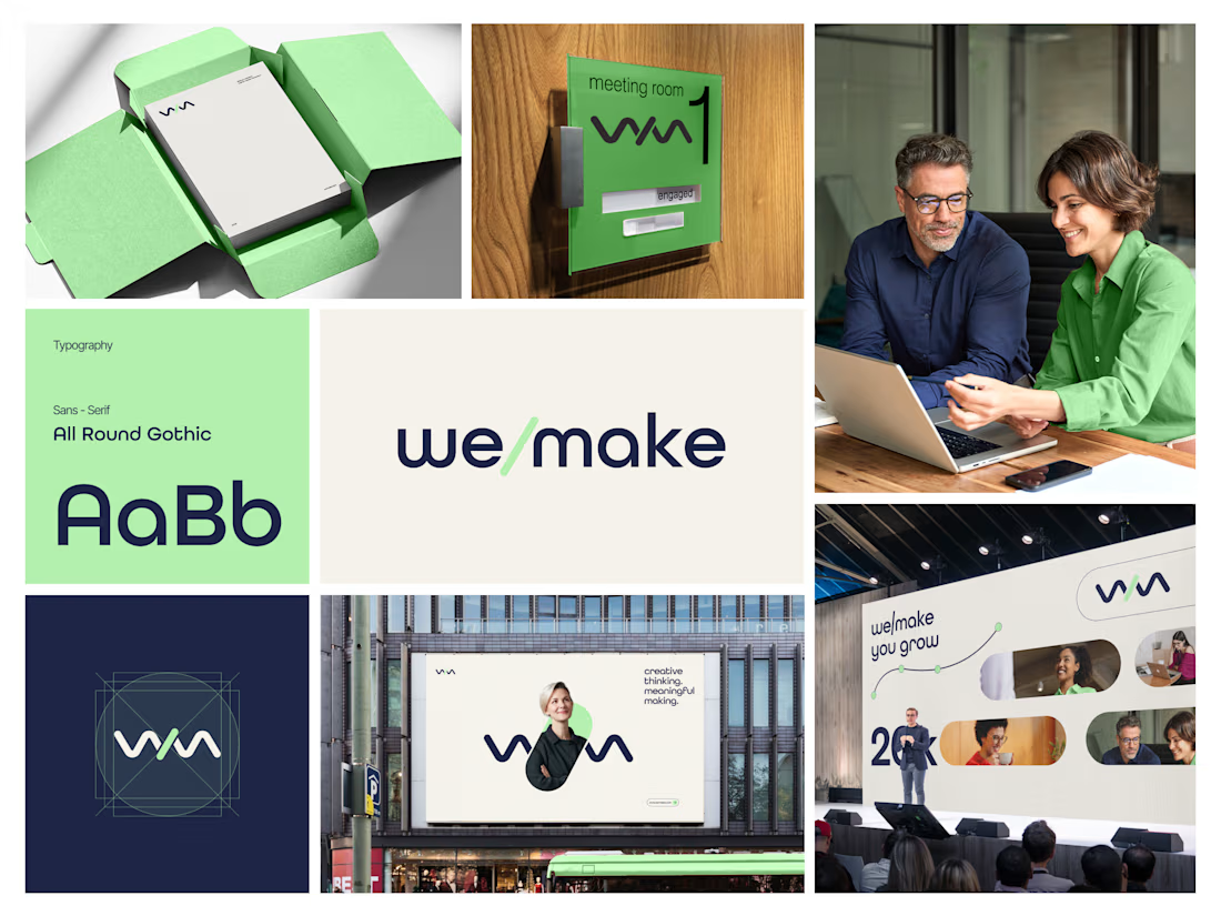
We/Make - Brand Identity Designed for Business Growth
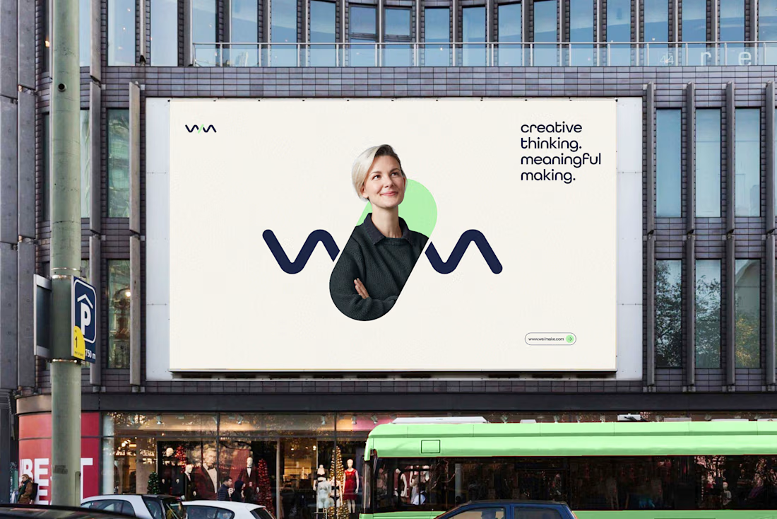
A strategic brand identity for We/Make, built to create a stronger market presence, communicate credibility, and give the business a clear, recognizable visual position.
Rather than creating a logo in isolation, we developed a scalable identity system that helps the brand communicate consistently across digital touchpoints and build stronger recognition as the business grows.
The focus:
→ Clearer brand positioning
→ Stronger visual recognition
→ More credible & professional presence
→ Consistent communication across touchpoints
→ A flexible identity system built for long-term growth
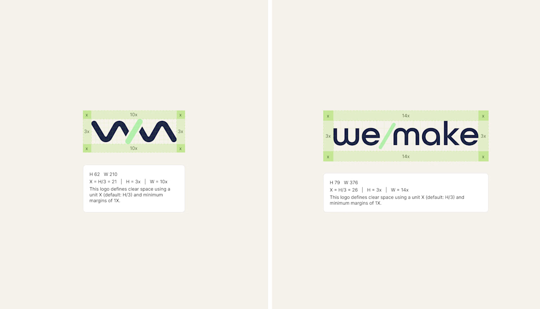
Deliverables: Logo Identity · Visual System · Typography · Color Direction · Brand Guidelines · Logo Construction & Clear Space
Brand Strategy | Brand Identity | Logo Design | Visual Identity | Brand Guidelines | Business Branding
#BrandIdentity #BrandStrategy #LogoDesign #VisualIdentity #Branding #BrandGuidelines #BusinessBranding #BrandDesign #ContraDesigner #CreativeStrategy

This is brilliant