The network for creativity
Join 1.25M professional creatives like you
Connect with clients, get discovered, and run your business 100% commission-free
Creatives on Contra have earned over $150M and we are just getting started
Back to feedPost

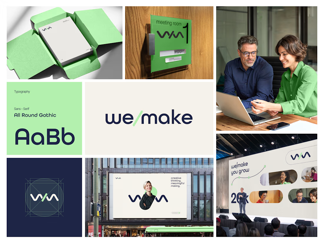
We/Make - Brand Identity Designed for Business Growth
A strategic brand identity for We/Make, built to create a stronger market presence, communicate credibility, and give the business a clear, recognizable visual position.
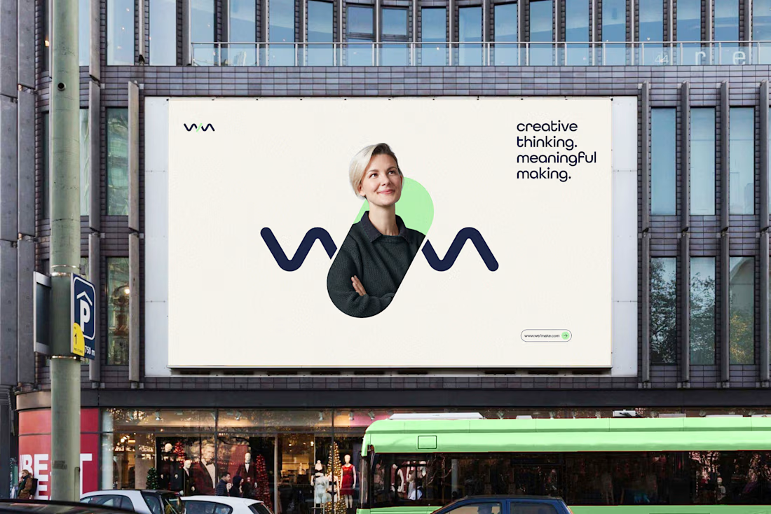
Rather than creating a logo in isolation, we developed a scalable identity system that helps the brand communicate consistently across digital touchpoints and build stronger recognition as the business grows.
The focus:
→ Clearer brand positioning
→ Stronger visual recognition
→ More credible & professional presence
→ Consistent communication across touchpoints
→ A flexible identity system built for long-term growth
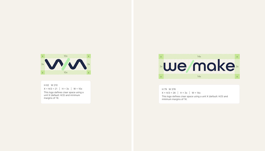
Deliverables: Logo Identity · Visual System · Typography · Color Direction · Brand Guidelines · Logo Construction & Clear Space
Brand Strategy | Brand Identity | Logo Design | Visual Identity | Brand Guidelines | Business Branding
#BrandIdentity #BrandStrategy #LogoDesign #VisualIdentity #Branding #BrandGuidelines #BusinessBranding #BrandDesign #ContraDesigner #CreativeStrategy




Great

This is brilliant

Very Impressive Logo.

TOP!!

GREAT
The network for creativity
Join 1.25M professional creatives like you
Connect with clients, get discovered, and run your business 100% commission-free
Creatives on Contra have earned over $150M and we are just getting started








Related posts

Rhyen Lab: Brand Identity & Packaging for a Skincare Brand
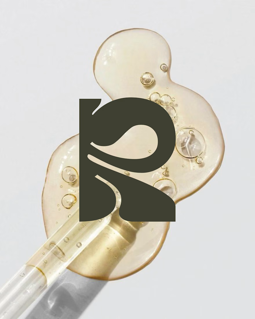
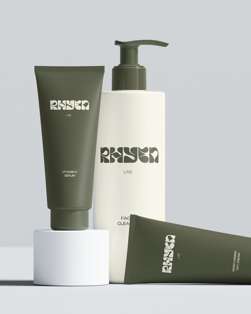
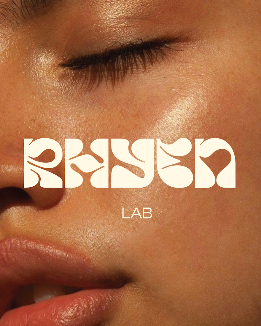
Rhyen Lab is a skincare brand built around science-backed formulas and a sensorial, human approach to beauty. The challenge was to create an identity that feels clinical enough to be trusted, yet warm and expressive enough to stand out in a crowded market.
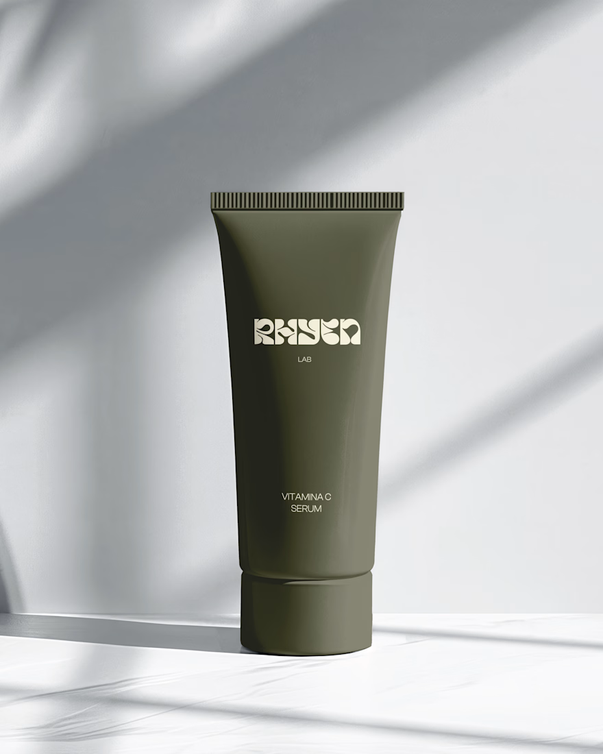
I designed a custom wordmark with fluid, organic letterforms that echo the texture of serums and oils, paired with a bold monogram “R” for compact applications. A palette of deep olive green and soft cream keeps the brand grounded, natural and premium, while macro photography of skin and product textures reinforces the sensorial tone.
The system was applied across packaging for the Vitamin C Serum, Facial Cleanser and Moisturising Day Cream, ensuring consistency across tubes and bottles.
Deliverables: Logo & monogram · Visual identity · Color palette · Packaging design · Art direction

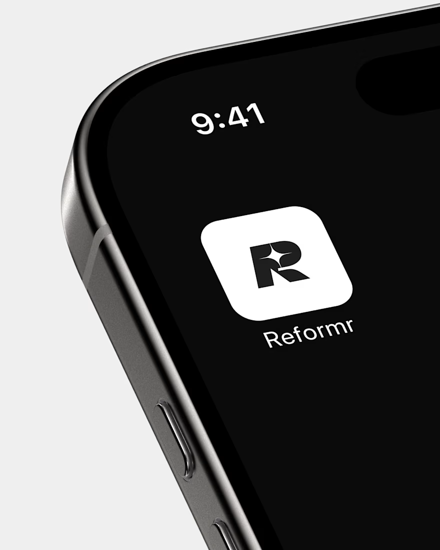
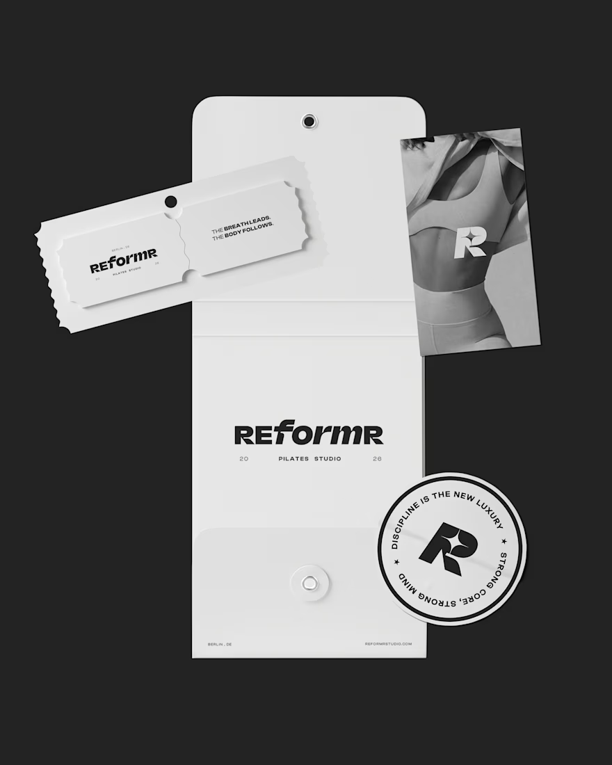
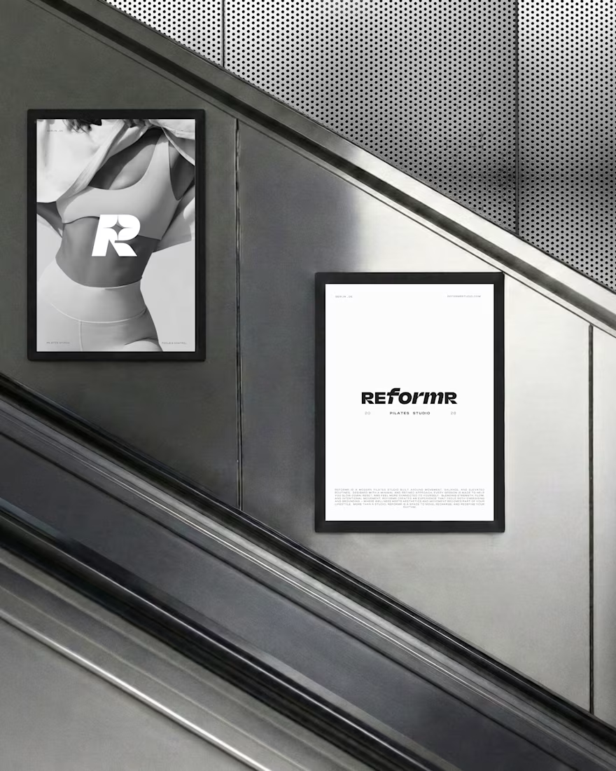
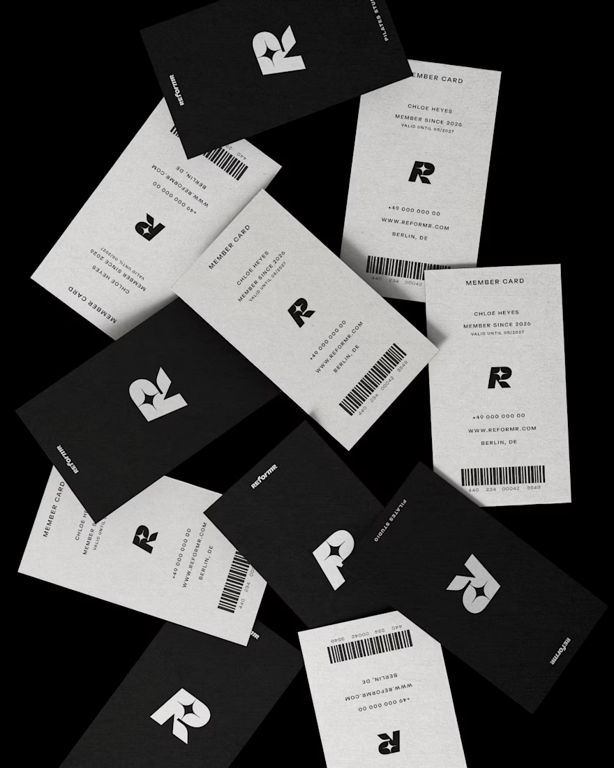
REFORMR — Pilates Studio Brand Identity
REFORMR is a self-initiated branding concept for a modern Pilates studio, built around movement, balance, and a refined visual aesthetic.
The visual identity combines bold typography, minimalist layouts, and monochromatic art direction to create a premium, contemporary brand. The project explores how a consistent visual language can translate across brand materials and advertising applications.
Scope: Logo design, visual identity, art direction, and mockup design.


Love the bold typography and minimal direction. It feels clean, modern, and premium.
Ramen Brand Identity
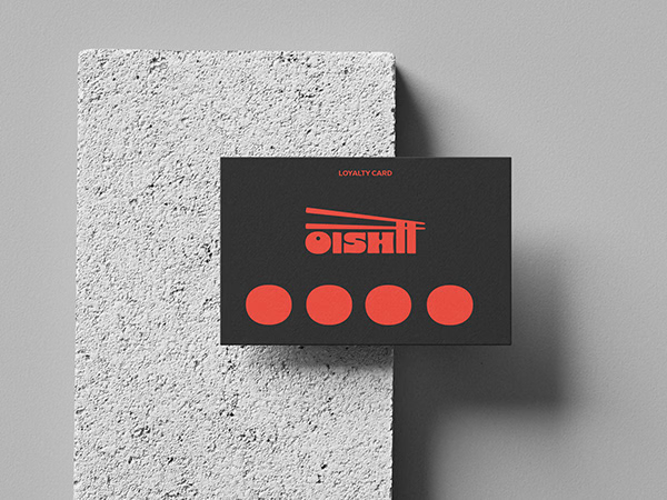
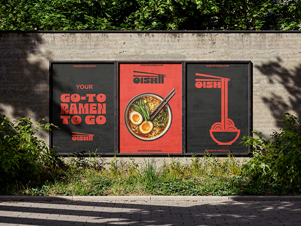
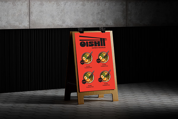
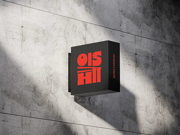
Oishii is a self-initiated branding project exploring the visual identity of a modern ramen brand. The concept combines Japanese-inspired aesthetics with a contemporary visual approach, creating a distinctive and cohesive identity across brand applications.
The project explores visual direction, typography, colour, and brand elements to build a memorable identity for a food brand.

Love the mix of Japanese-inspired style and modern branding. The identity feels cohesive and memorable.