The network for creativity
Join 1.25M professional creatives like you
Connect with clients, get discovered, and run your business 100% commission-free
Creatives on Contra have earned over $150M and we are just getting started
Back to feedPost

Introducing MONETA, a digital banking brand concept designed for modern businesses that need a banking experience built around clarity, speed, and confidence.



Thank you! Glad you like it 🙌

Tremendous work
Thank you!


the clarity in this brand direction is really strong. how did you land on the moneta name?
Thank you! I wanted the name to feel simple, premium, and closely connected to finance. “Moneta” comes from the Latin word for money and also has a strong, timeless sound, which felt right for a modern business banking brand.

Mind blown branding
Thank you!

wow the branding is surprisingly premium
Thanks!
Welcome man

The soft yellow and periwinkle palette with Space Grotesk feels fresh for banking. Way friendlier than the usual navy and gold, but still feels trustworthy.

Clarity, speed and confidence is exactly the trio a banking brand should lead with, and the identity actually looks like all three. The soft gradient mark against those crisp black UI shots feels trustworthy without being stiff. Strong system, Moneta could ship tomorrow.

Good work 💯

Great job man your designs and color palettes you use feels stunning 🔥🔥🔥🔥🔥

Top notch work!
The network for creativity
Join 1.25M professional creatives like you
Connect with clients, get discovered, and run your business 100% commission-free
Creatives on Contra have earned over $150M and we are just getting started











Related posts

A little peek at the brand work we did for Elio Mortgage.
A warm, approachable identity full of warm vibrant colors paired with soft sun rising inspired gradients, inner glows and custom illustrations & more. Loved this direction!
Full case study coming soon, from process to final identity.
Plenty of logo explorations to share too!


That color palette takes the whole identity to a different level!! I loove it.

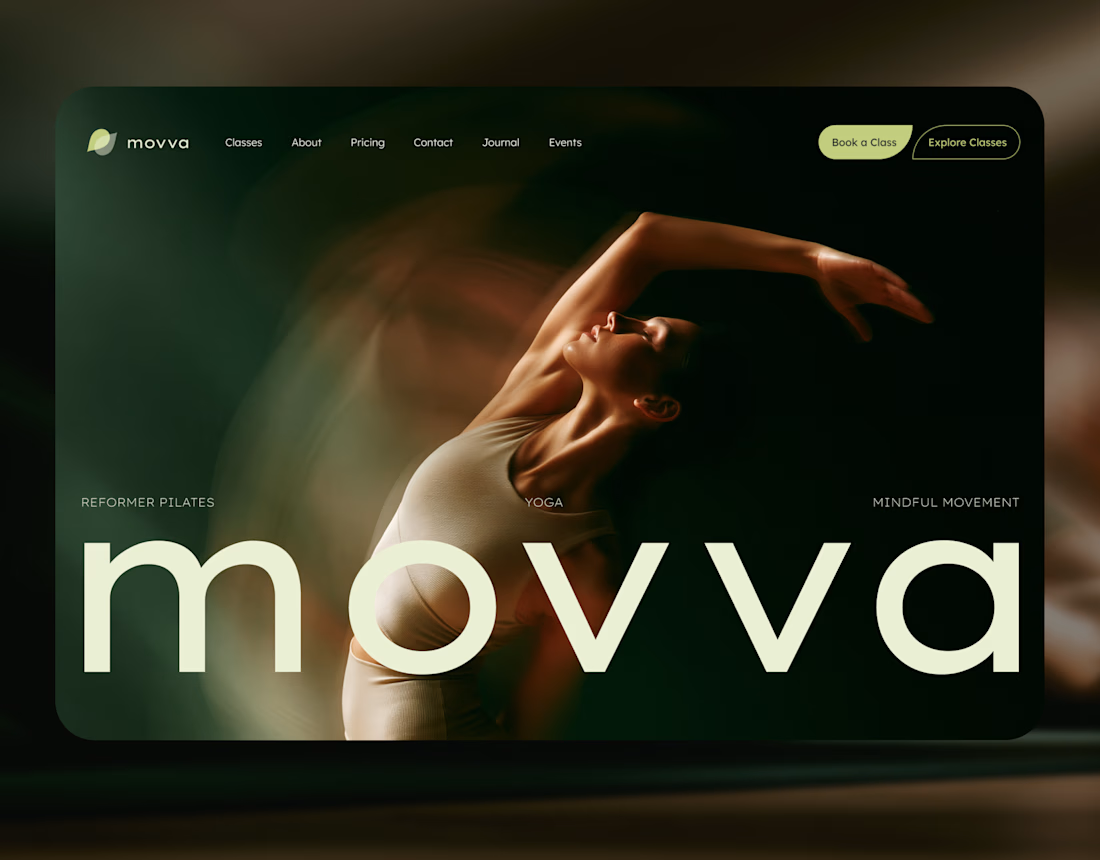
MOVVA is now featured on Contra 🤍
I’m especially happy about this because working on this template was a creative outlet for me.
I wanted to build something useful for a business: a website that covers what a studio needs when it opens, from an easy-to-use schedule to clearly structured class information, with a solid foundation for SEO.
At the same time, I wanted it to feel beautiful. To bring a sense of movement, lightness, and the joy of taking a class into the design. To capture that friendly atmosphere that makes you want to walk into a studio and give it a try.
Thank you, Contra team!


Huge congrats on getting featured! 🤍 MOVVA looks stunning - love the mindful movement vibe and that hero image. Super useful concept for studios. Well deserved feature!

Brand Expressions -- Olivir


Thats so crazy!!!!!! Seeing this I feel we humans are still far better than AI