The network for creativity
Join 1.25M professional creatives like you
Connect with clients, get discovered, and run your business 100% commission-free
Creatives on Contra have earned over $150M and we are just getting started
Back to feedPost


The network for creativity
Join 1.25M professional creatives like you
Connect with clients, get discovered, and run your business 100% commission-free
Creatives on Contra have earned over $150M and we are just getting started




Related posts

Hot take: Interaction isn't just decoration. It is the brand
I built this visual concept for a Peptides brand using WebGL and fabric physics. The fluid motion isn’t a gimmick it’s the core identity.


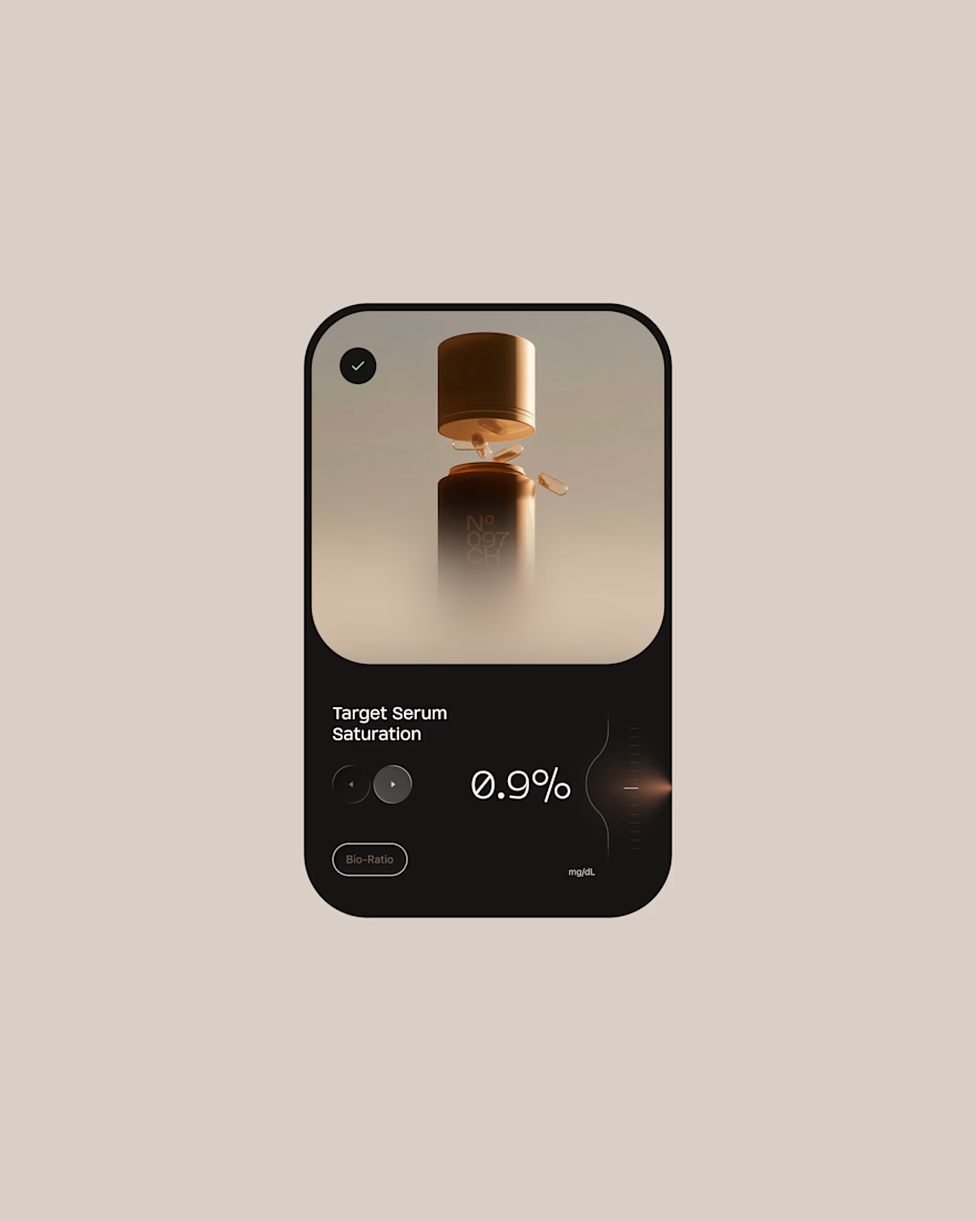
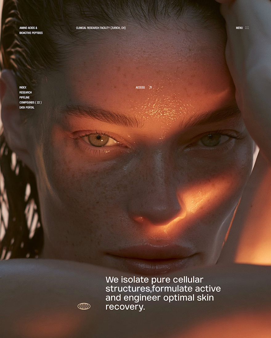
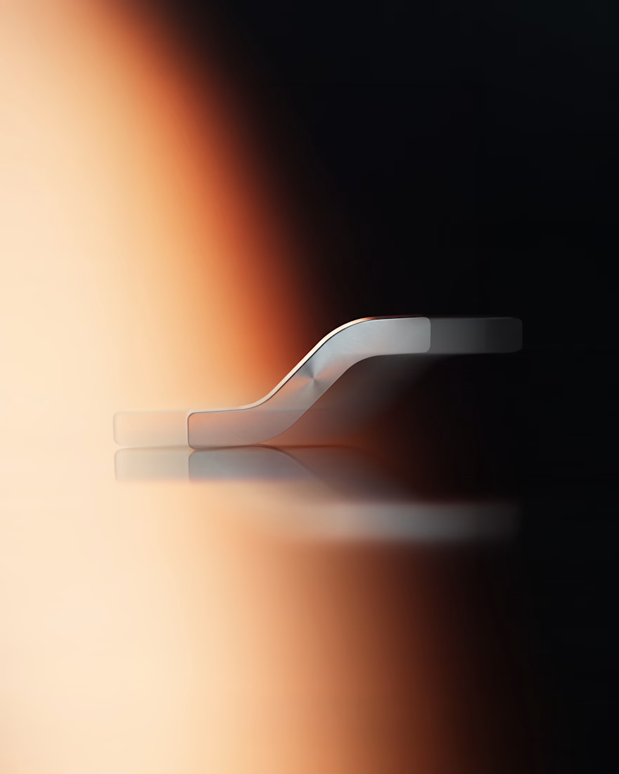
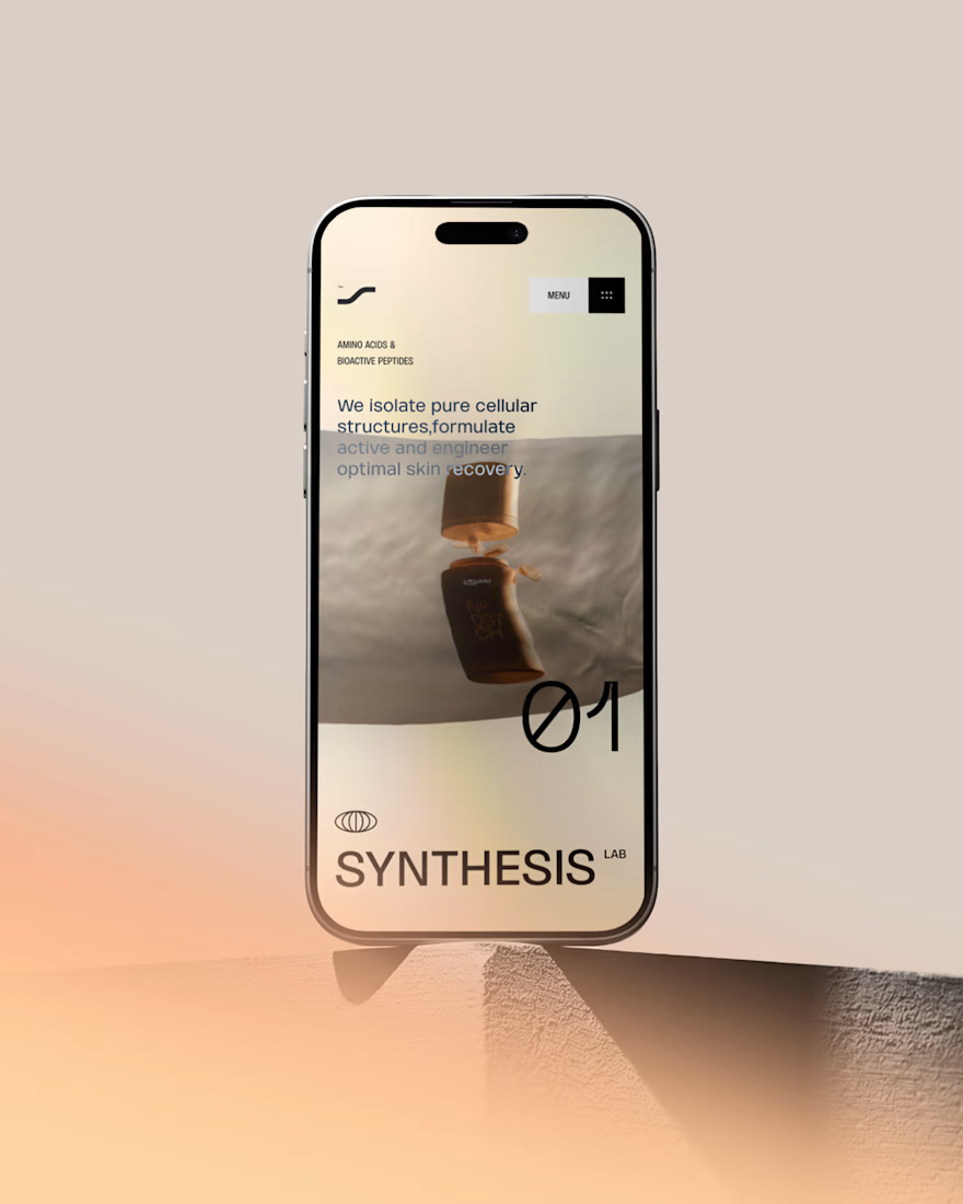

GOATED

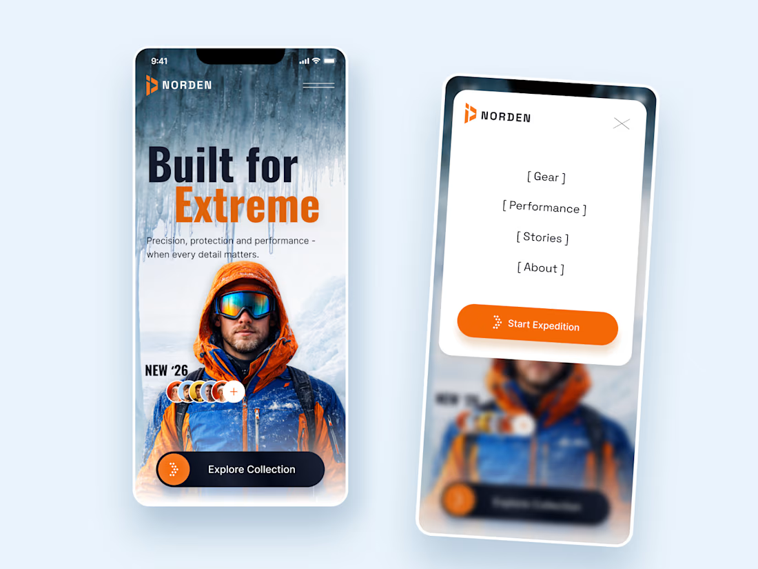
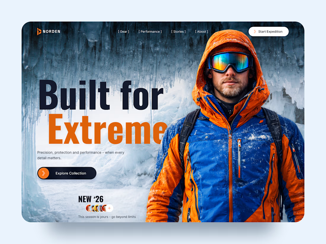
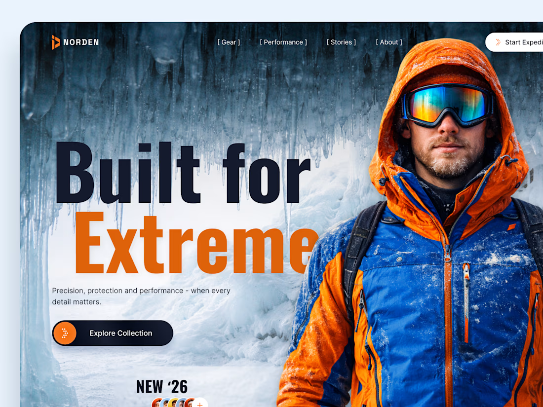
NORDEN — Outdoor Gear Landing Page 🏔️
NORDEN is a premium outdoor gear landing page concept inspired by extreme environments, exploration, and high-performance equipment.
The design combines dramatic icy landscapes, bold typography, and vibrant orange accents to create an immersive experience that captures the spirit of adventure.
Special attention was given to:
A cinematic hero composition featuring an explorer in extreme conditions.
Oversized typography that communicates strength and confidence.
A cold blue-and-orange color palette inspired by alpine environments.
Clear CTAs that guide visitors toward the collection and expedition.
Responsive mobile layouts that preserve the visual impact.
Minimal navigation that keeps the focus on the experience.
The result is a visually striking digital concept that connects outdoor performance with premium product storytelling.
Looking to create a distinctive website for your outdoor, sports, or lifestyle brand? Let's bring your vision to life. ⚡


How did you choose the hero image?

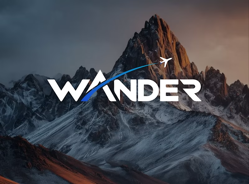
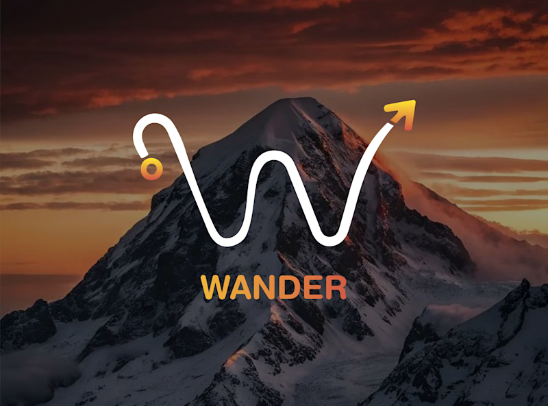
Which WANDER logo would you choose?
A travel brand doesn’t just need a logo —
it needs a visual identity that makes you want to explore.
So I explored 2 different directions for the same brand
Bold & Minimal
Vote in the poll.
And Tell me what made you choose it in the comments.
#LogoDesign #BrandIdentity #GraphicDesign #LogoInspiration #VisualIdentity
11 voted
92%
1 voted
8%
12 votes
Closed

Minimal for me. The W drawn as a winding mountain path is doing double duty, letterform and route in one, exactly what a travel brand wants. Bold is clean but the swoosh W tells a little story before you read a single word.