The network for creativity
Join 1.25M professional creatives like you
Connect with clients, get discovered, and run your business 100% commission-free
Creatives on Contra have earned over $150M and we are just getting started
Back to feedPost

Genesa | Brand Identity in Action
A logo is the starting point of a brand identity. What interests me just as much is how that identity works beyond the original design.
For Genesa, I explored how the logo, custom typography, and three coloured hexagons could carry across different applications, from apparel and merchandise to packaging and architectural signage.
The challenge is to maintain a consistent visual identity while adapting it to different materials, surfaces, and environments.
I created this short presentation to bring those applications together and show how a single design can become a recognizable brand across multiple touchpoints.
For me, good brand design isn't just about how a logo looks on a screen. It's about how well it works in the real world.
Brand Identity · Logo Design · Brand Applications · Graphic Design


This is exactly how identity work should be sold, Andre. The packaging shot with the Genesa bag and box together shows those three coloured hexagons doing their job at real scale, not just on a slide. Good brand design isn't just about how a logo looks on a screen is the line...
Good logo design has to take into consideration how that logo will work at different sizes and across different applications. And I believe it's our job as designers to help clients understand that.
I've had many situations where a client wanted to include fine details,...

The three hexagon dots work well across the cap and packaging. Nice thin wordmark too.
Thank you Rafee.
The network for creativity
Join 1.25M professional creatives like you
Connect with clients, get discovered, and run your business 100% commission-free
Creatives on Contra have earned over $150M and we are just getting started



Related posts


ESE GIN — Between the Dunes | Visual Identity & Packaging
ESE GIN draws its curves from the dunes. The signature S catches the light in sculpted olive glass and leaves its imprint in wax.

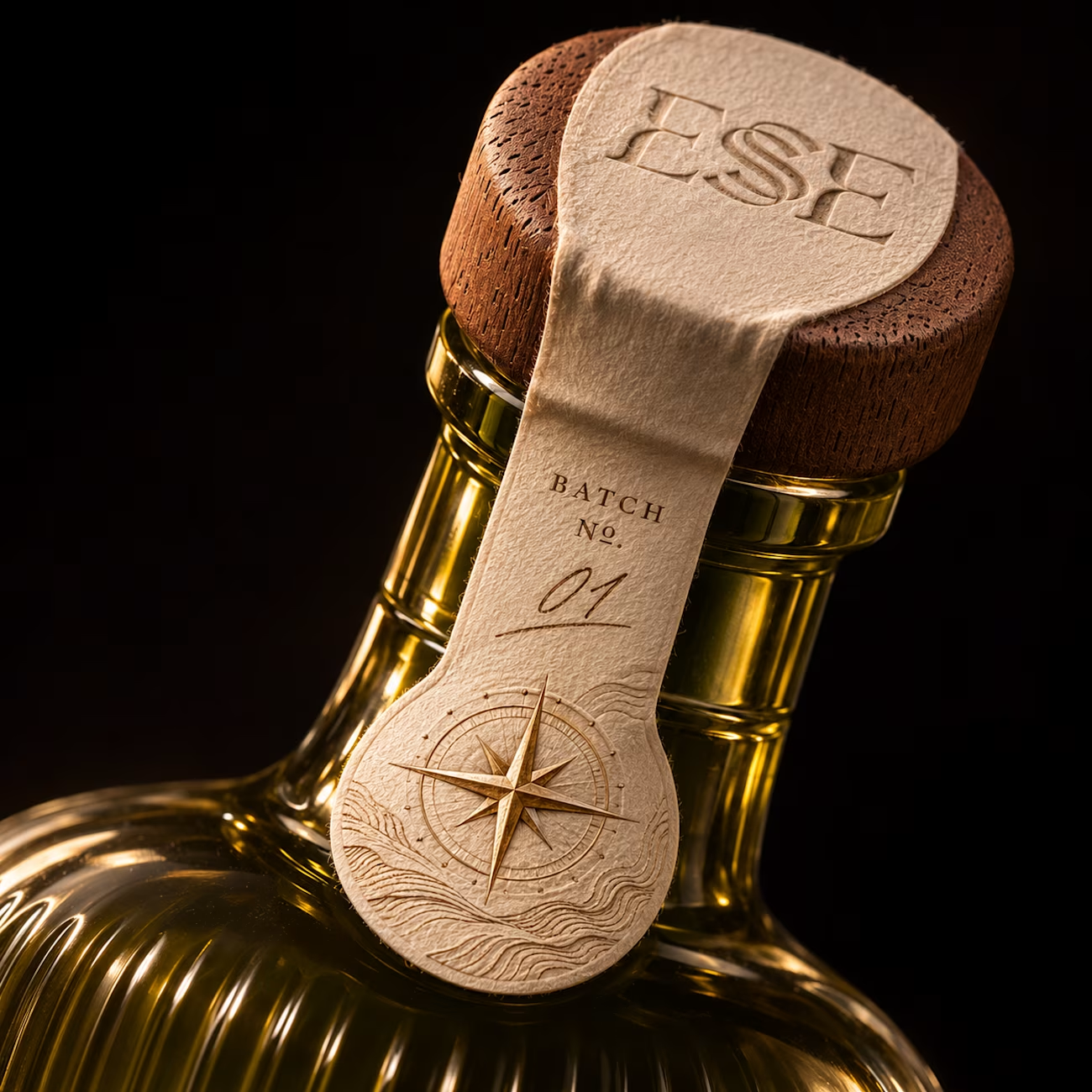
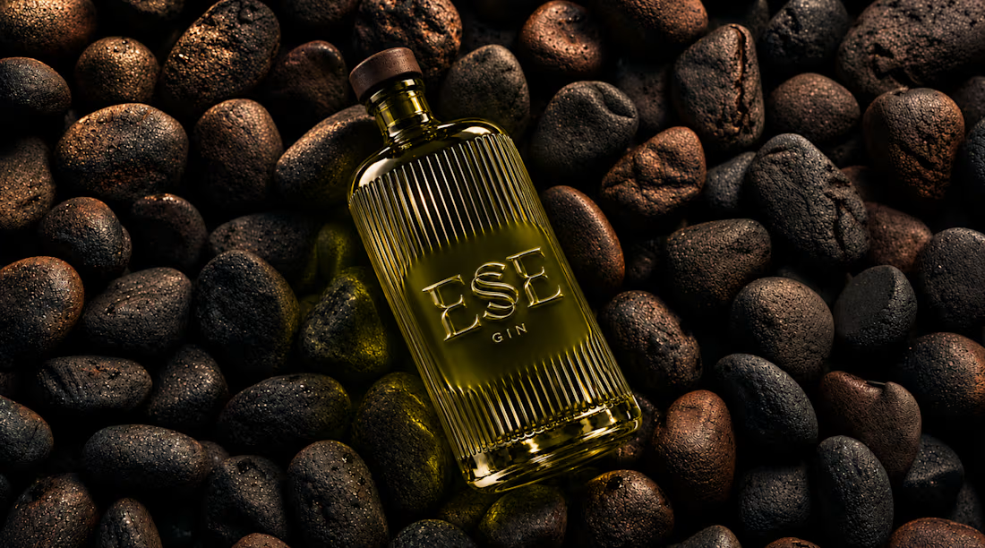
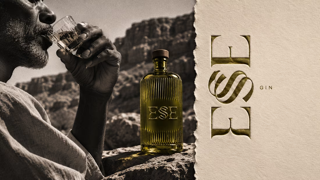
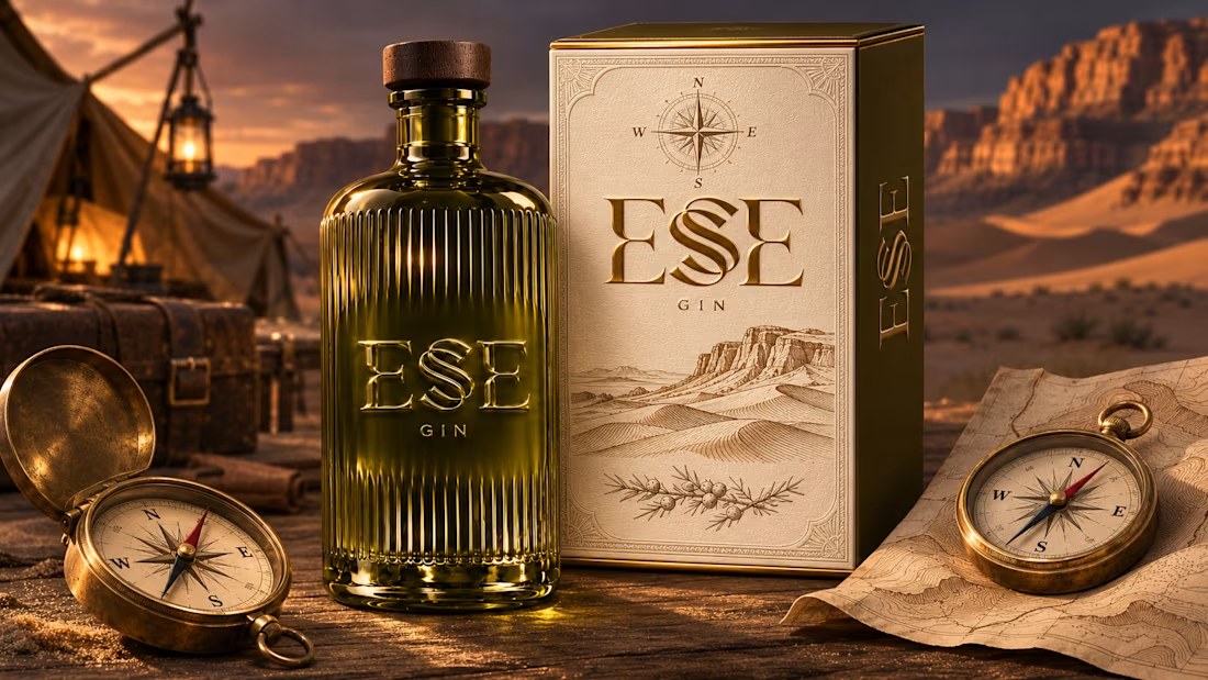

This is gorgeous, Maya — the sculpted olive glass with that S catching the light is such a clever way to carry the dunes into the bottle itself. And the wax seal imprint is a beautiful finishing touch, it gives the whole thing a crafted, almost apothecary feel. Really cohesive...

Ever wondered what a 1974 record shop would look like if it had a brand system?
Kodama Shōwa is coming soon: one old shopkeeper, five inks, and a camera at knee height.
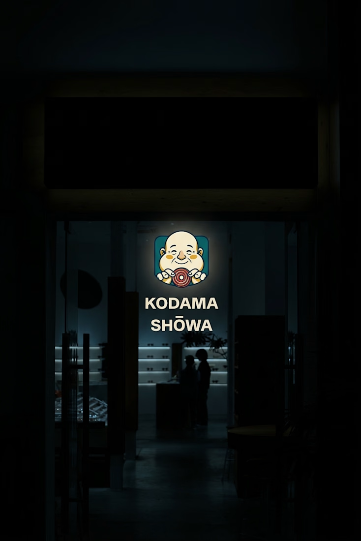
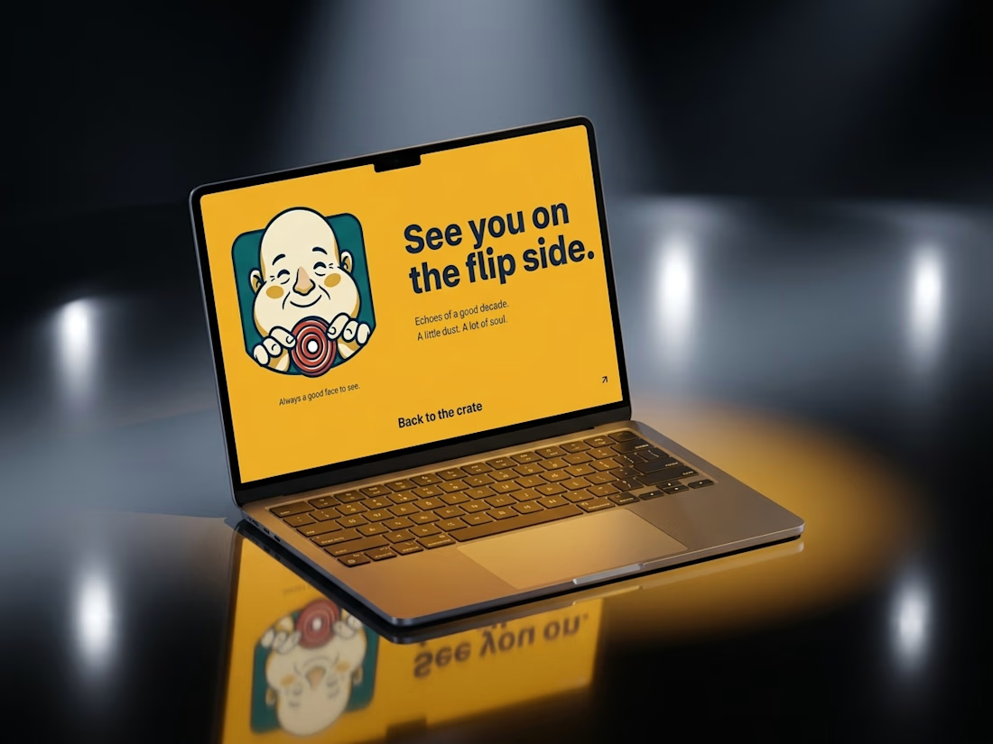
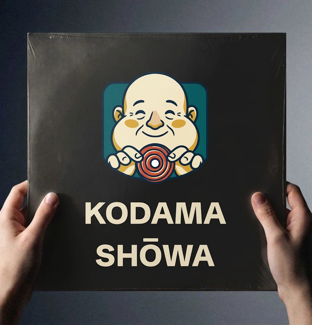

Nice!

These designs were made by the AI in my upcoming design tool for designers.
I don't know which is better, help me decide.
For those wondering where the remaining designs are, I'll drop it in my next post.
2 voted
40%
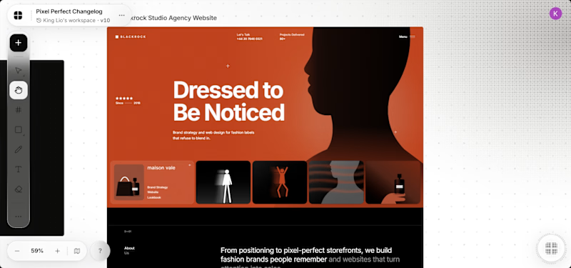
3 voted
60%
5 votes
Closed

It's the red one for me... Passed the message a lot better than the Orange