The network for creativity
Join 1.25M professional creatives like you
Connect with clients, get discovered, and run your business 100% commission-free
Creatives on Contra have earned over $150M and we are just getting started
Back to feedPost
Brand Identity & Packaging Design
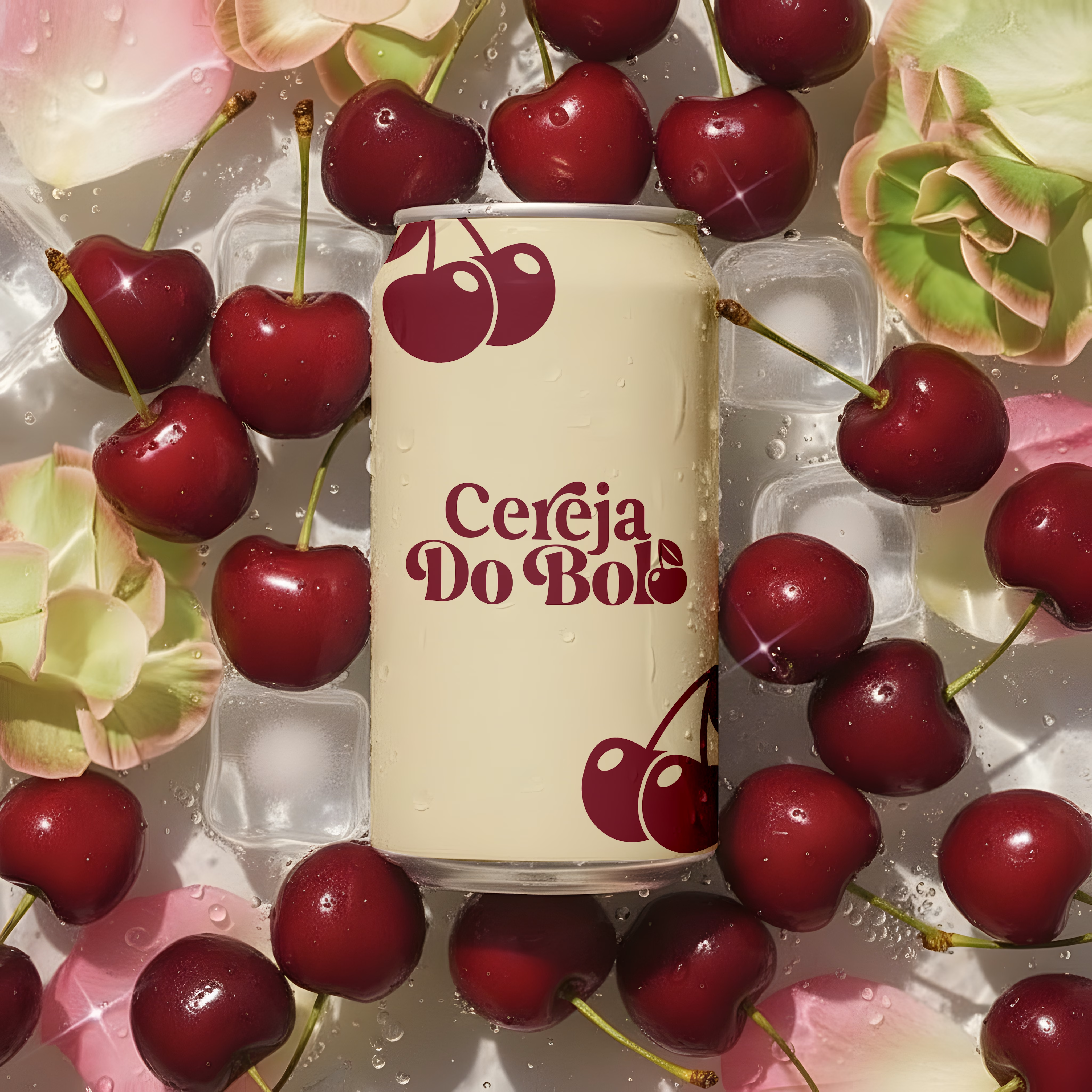
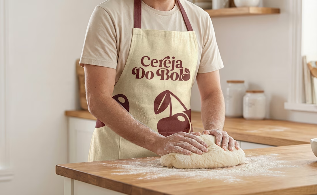
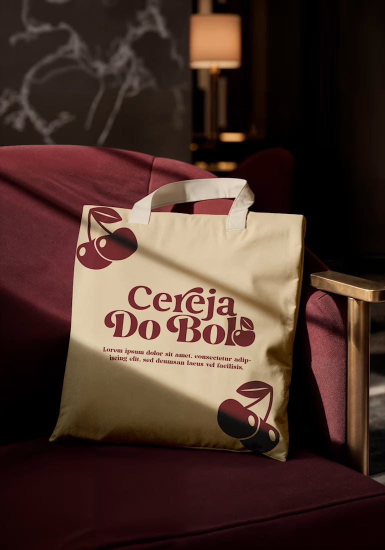
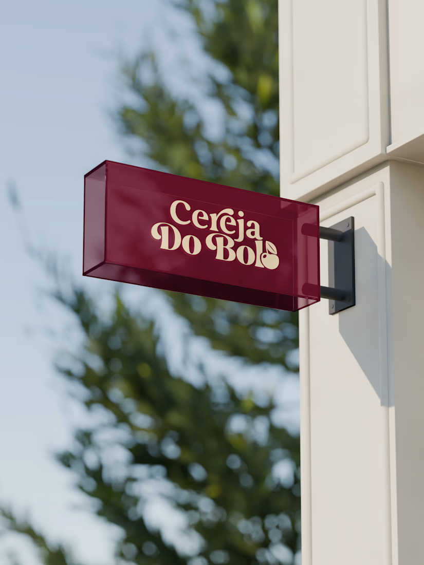
A complete visual identity and packaging concept for Cerveja do Bolo, including branded packaging, merchandise, and outdoor signage. I developed the visual direction and applied the brand consistently across multiple touchpoints to create a cohesive and recognizable identity.



Looks amazing!!

Thank u!🙌

gorgeous!
Thannkss🥰

Amazing.
Thaankss🥰

Cerveja do Bolo living from a tote to a hanging shop sign to packaging is exactly how you prove a brand holds together. That cherry motif plus warm cream and deep red feels appetizing and premium at once. Consistent across every touchpoint, really clean work.
Exactly! Yea! Thank u!!☺️

Professional work. Sweet Alisa.
Thank u!☺️

This is inspiring! Great work on the visual hierarchy and overall flow.
Thank u!🙌

Wow, love it
Thank you!🙌

Nice type work. I'd increase the gap between the "l" and cherry so it is a bit more consistent with the rest of the font

Great example of how a strong visual direction can bring consistency across multiple touchpoints. The packaging, merchandise, and signage working together should make the brand much more memorable and recognizable.
The network for creativity
Join 1.25M professional creatives like you
Connect with clients, get discovered, and run your business 100% commission-free
Creatives on Contra have earned over $150M and we are just getting started











Related posts

I created a brand identity concept for Velora, an AI productivity platform. I explored the logo, colors, typography, and how the brand could look across a website, mobile app, and everyday products. I wanted everything to feel consistent, modern, and easy to recognize.

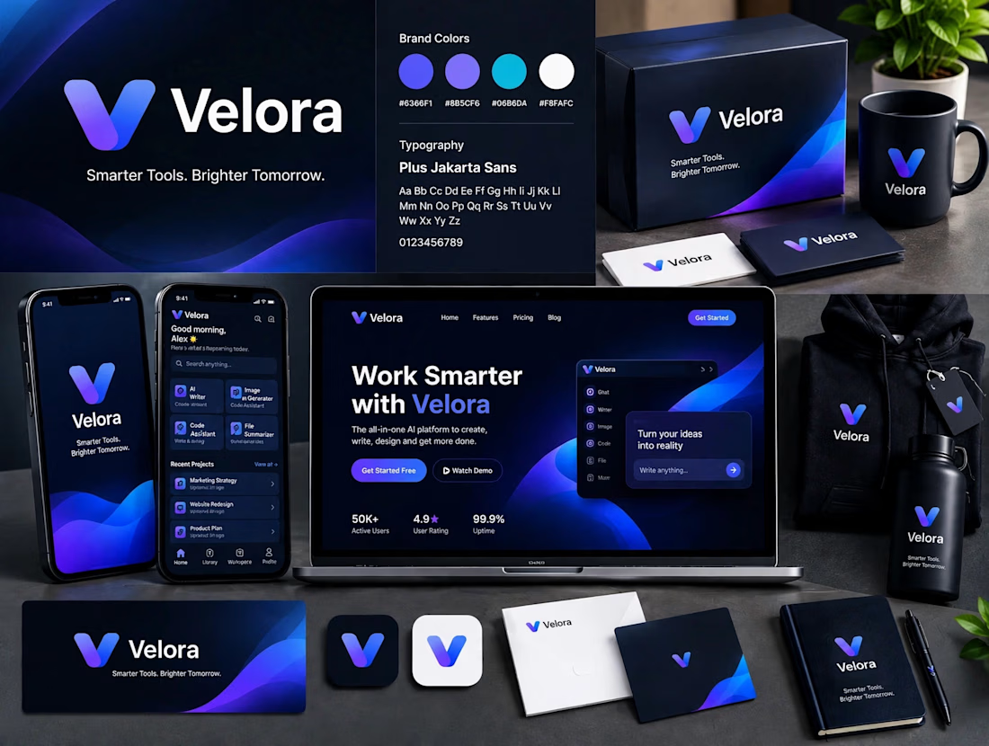

The blue is perfect for this. I’ve seen so many AI brands do boring black/white but this gradient gives it energy. And Plus Jakarta Sans was a great choice, keeps it friendly.

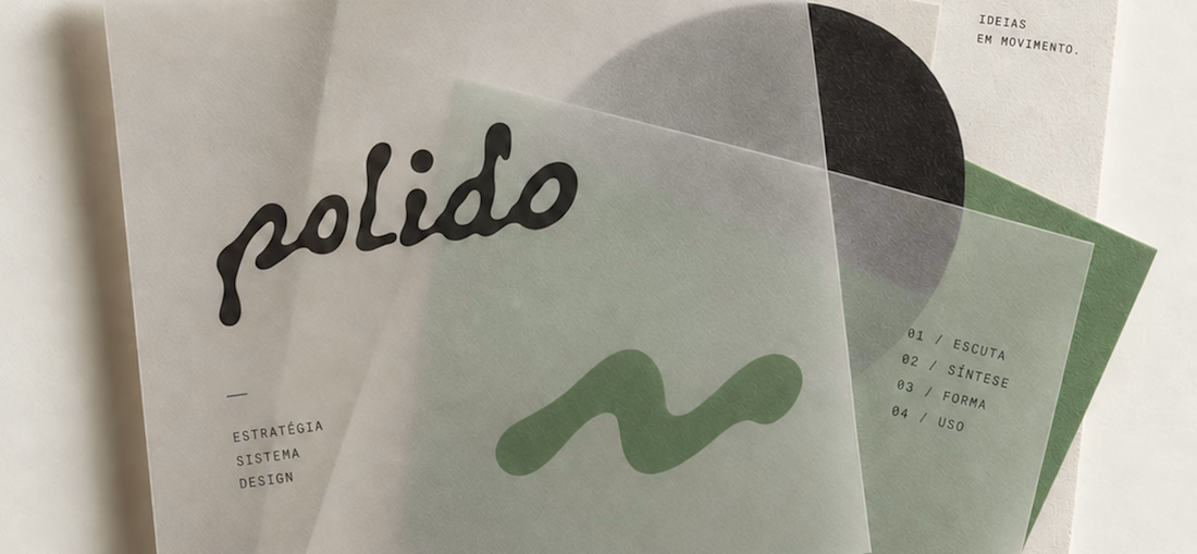
POLIDO — Brand Identity & Visual System
POLIDO is the visual identity of my independent brand design practice, shaped by a process of listening, synthesis, form, and use.
The identity brings together a hand-drawn signature, restrained typography, tactile materials, and a palette of warm paper, graphite, and Basil green.
From printed matter to apparel and physical applications, the project explores how a consistent visual language can adapt to different materials and contexts while maintaining its character.
Scope: Brand Strategy, Visual Identity, Art Direction, and Mockup Design.
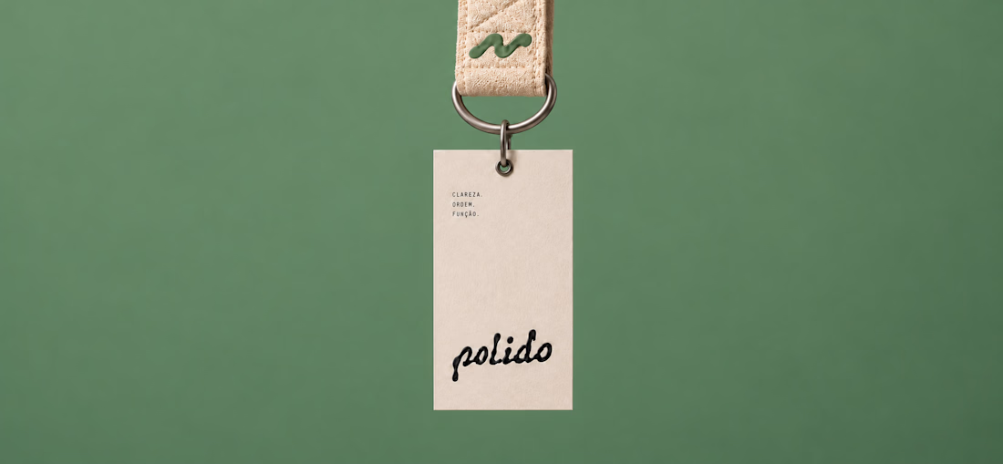
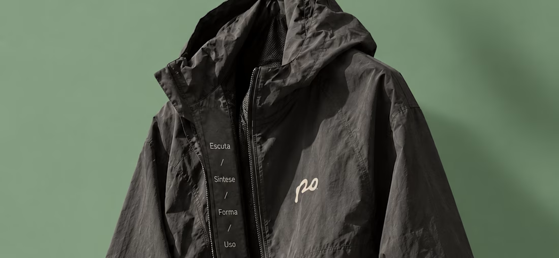
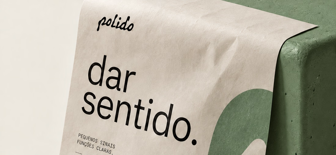

High end branding


One letter. Eight personalities. 🔤
I explored the letter S in 8 different directions: soft and rounded, sharp and angular, bold and blocky, and fast like a bolt.
Same letter, same white-on-black treatment. The only thing that changes is the character.
Each mark could suit a different kind of brand, from tech and sports to fintech and lifestyle.
Which S would you pick, and what kind of brand would it belong to? Drop the number below. 👇
Looking for a logo mark or a full brand identity? My services are on my profile.


S letter designs is the best ❤️
Great job Shahwaiz🔥🔥