The network for creativity
Join 1.25M professional creatives like you
Connect with clients, get discovered, and run your business 100% commission-free
Creatives on Contra have earned over $150M and we are just getting started
Back to feedPost
Taste Test
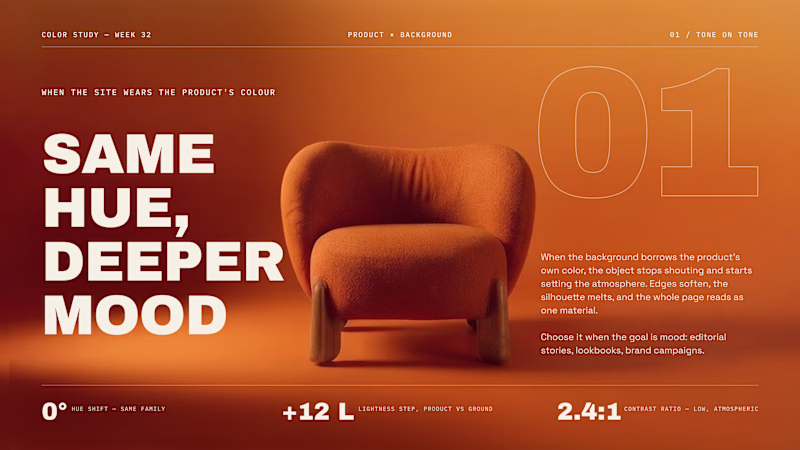
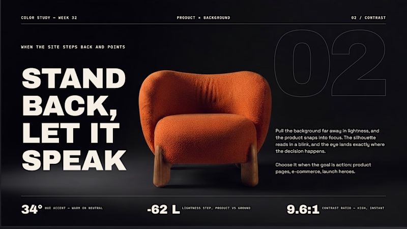
Should the site wear the product's color, or step away from it?
Same chair, two backgrounds. That one decision changes what the page is for.
01 - Tone on tone. The background borrows the product's hue. Edges soften, everything reads as one material. Mood over clarity, perfect for editorial stories and lookbooks.
02 - Contrast. Pull the background far away in lightness and the silhouette snaps into focus. Clarity over mood, built for product pages and launch heroes.
Neither is "better". One sets atmosphere, the other sells the object.
Which side do you reach for first when you start a page?

71 voted
59%
50 voted
41%
121 votes
Closed

tone on tone here! something about it sets a stronger mood, more convincing to a viewer looking for a piece to incorporate into a space's overall interior design.


tone on tone

Tone on tone for me - guessing this is for an interior or furniture brand, and there atmosphere always wins. The contrast version feels a bit too techy for that world.

Tone on tone


"Tone to tone" option feels that the colors work together very well

Contrast does it for me, really love the how the chair pops!! 🚀

The site wearing the product color makes it better

The site wearing the product color makes it better

Tone on tone feels more of an immersive and engaging experience. Plus, it offers more clarity and it's much easier on the eye.

Tone on Tone 🔥

Love the Tone on Tone one


The real decision here isn't tone-on-tone versus contrast, it's whether the page's job is to sell the object or sell the room it lives in - a launch hero and an editorial lookbook shouldn't default to the same background logic.

Tone on Tone works well and makes the product standout

Nice work as usual! Setting up subtle tone-on-tone background states makes product-focused web layouts feel insanely refined.

For the love of colors I will go with contrast

Tone on Tone is Awesome🙌

Tone on tone looks better.

Will go with tone on tone

I prefer the elegance of the color tone; it blends the chair into the background.

I think the product becomes the focal point when it contrasts with the background. If I were the seller, that's where I'd want customers to be looking.

Contrast!

contrast

Tone on Tone 😊


I appreciate that you tied the choice back to purpose (mood vs. clarity) rather than aesthetic preference. To answer your question: I default to 02 first, mostly because most briefs start as "does this convert" before they get to "does this feel like something." Contrast earns...

Tone works fine

I usually lean toward contrast for product pages. It makes the product stand out right away without losing the overall mood.

Tone definitely
The network for creativity
Join 1.25M professional creatives like you
Connect with clients, get discovered, and run your business 100% commission-free
Creatives on Contra have earned over $150M and we are just getting started








Related posts


Your Hero Section Has One Job: Be Clear.
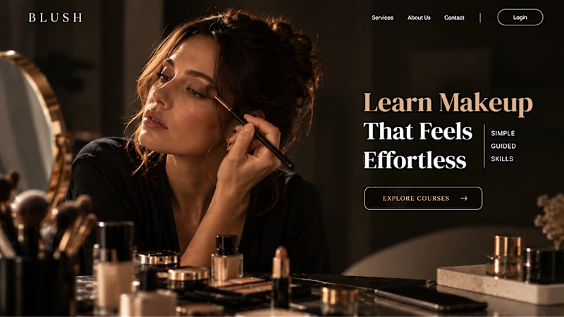
You don’t need huge headlines or long explanations. You need the right image + short headline + clear offer.
For the first version, we worked on the branding, the image and the copy together, so at first glance it’s clear: this is a makeup course, and here’s what you’ll get.
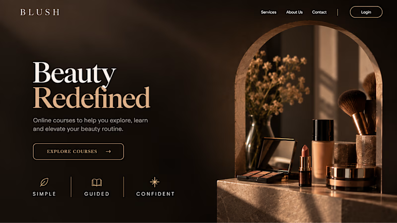
The second version is still beautiful and still feels like beauty. But what are you actually getting? A makeup course? Products? A store? That’s the problem with a Hero that looks good but isn’t thought through.
Your first screen doesn’t need to say everything. It just needs to say the right thing.

22 voted
61%
14 voted
39%
36 votes
Closed


Gorgeous 😍

Which colour palette would you choose for the banner design for a domain business? 🔥 Fiery or 🧊 Frosty?
20 voted
36%
35 voted
64%
55 votes
Closed

Frosty seems really cool for me!!