The network for creativity
Join 1.25M professional creatives like you
Connect with clients, get discovered, and run your business 100% commission-free
Creatives on Contra have earned over $150M and we are just getting started
Back to feedPost

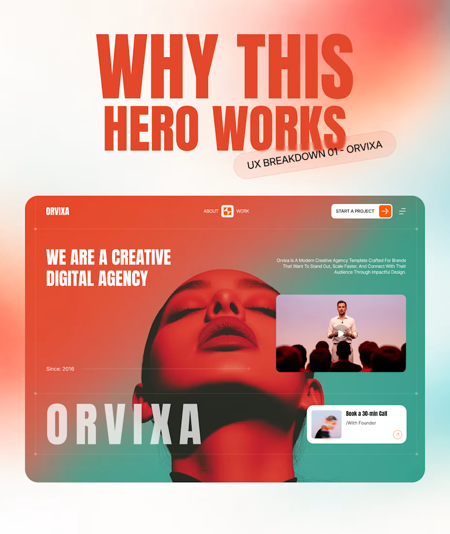
A creative website can be loud without making the experience loud.
That was one of the ideas behind Orvixa.
The hero looks expressive, but underneath the art direction, the structure is actually pretty simple.
Here are 5 decisions behind it:
01. Clear positioning
“We are a creative digital agency” tells you exactly what the business is before asking you to explore anything else.
02. One obvious primary action
“Start a Project” sits separately from the navigation, giving high-intent visitors a clear next step.
03. Visual content with a job
The video isn't there just to decorate the hero. It gives visitors another way to experience the studio and its personality.
04. Expression lives in the art direction
The portrait, typography, scale, and orange-to-teal treatment create the personality.
The underlying interface stays relatively simple.
05. A lower-friction path to talk
The founder call creates another route for someone who isn't ready to “start a project” but is ready to have a conversation.
That's the balance we were trying to create:
Be expressive in the presentation.
Be obvious in the experience.
Where do you draw the line between creative direction and usability?
The network for creativity
Join 1.25M professional creatives like you
Connect with clients, get discovered, and run your business 100% commission-free
Creatives on Contra have earned over $150M and we are just getting started








Related posts


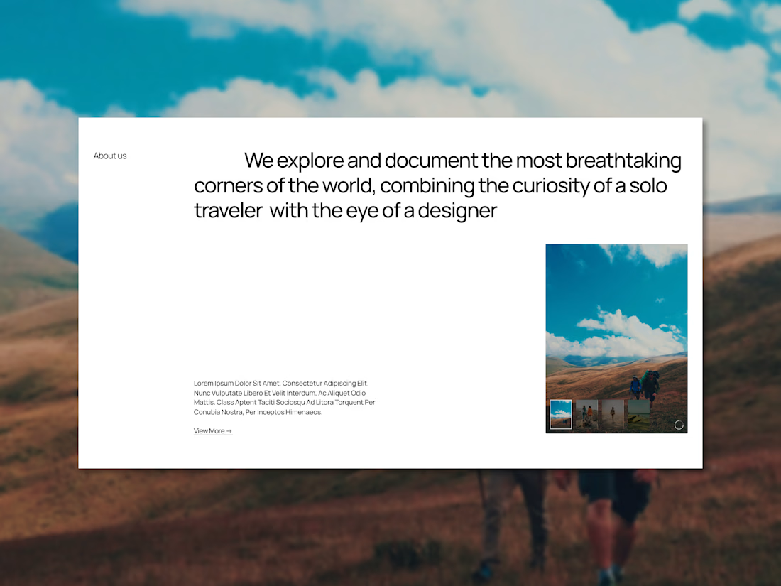
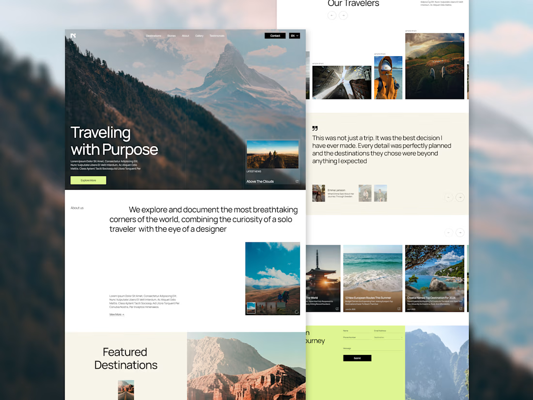
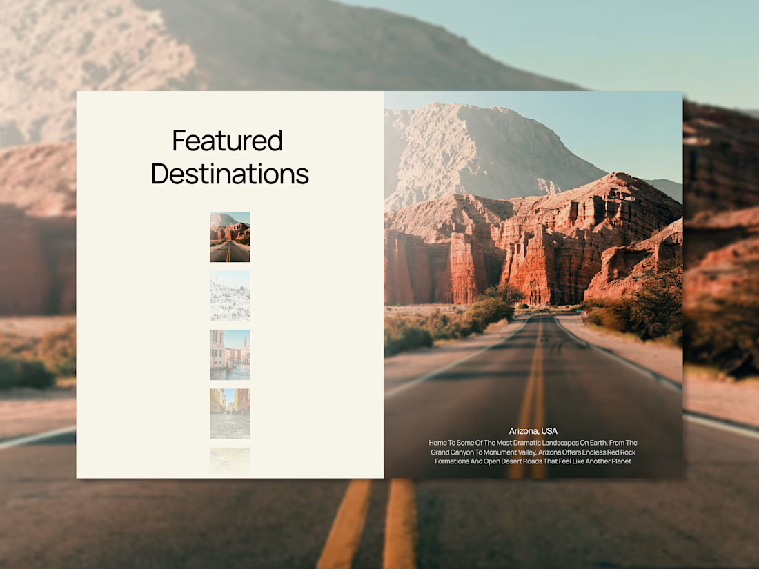
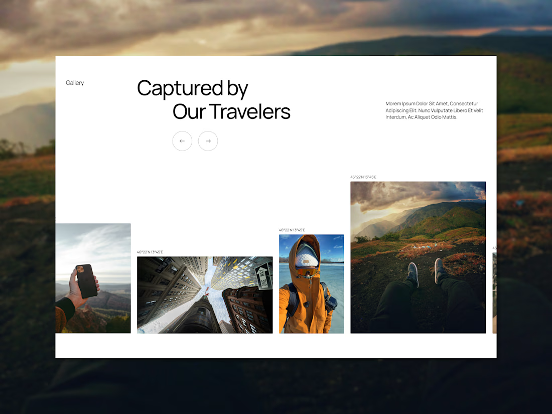

The photography does a lot of the work here. Cream background lets it breathe.
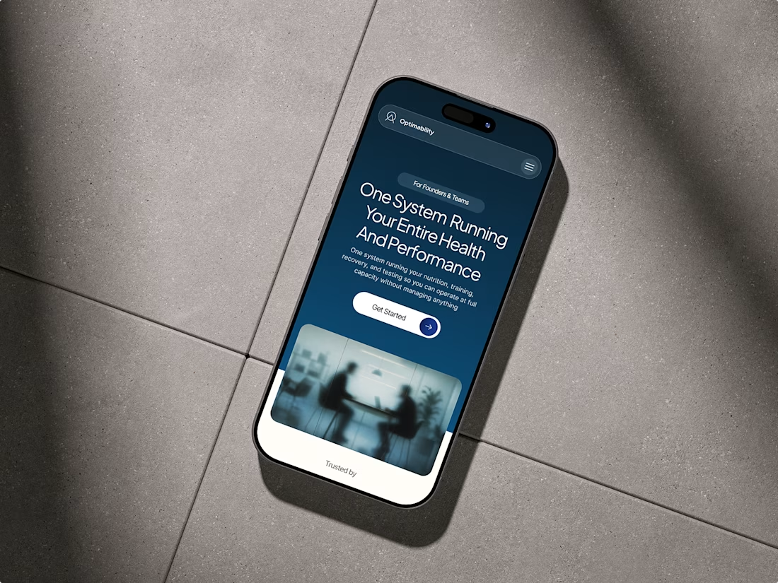
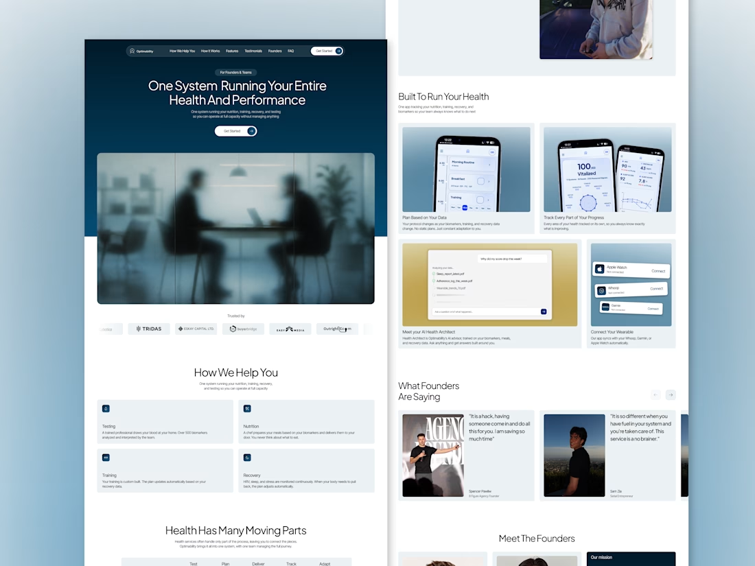
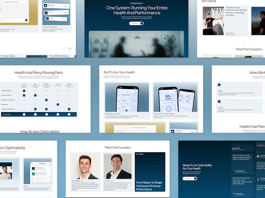
Website Redesign for Optimability, an all-in-one system running your health and performance
Optimability is a done-for-you health system for founders, built by Martin Nikolov and Ioan Popov in Vancouver. Instead of giving clients another plan to follow, they handle everything for them: chef-prepared meals, in-home blood tests, personal trainers who come to you, DNA and microbiome testing, a coaching team, and an app that brings it all together.
It was up to us to create a completely new flow for the website and add everything that was missing before the redesign, but in a thoughtful and smart way.
We rebuilt the website around one goal: show a founder, step by step, that Optimability gives him everything he needs.
Full case study coming soon on the website of the agency my friend and I are launching.


Great work man

Juice & Beverage Shopping App UI/UX Design
A fresh and modern juice and beverage shopping app designed to deliver a smooth and engaging shopping experience. Featuring vibrant product visuals, intuitive navigation, interactive animations, and a clickable prototype, this design makes it easy for users to explore beverages and enjoy a seamless ordering journey.
The project combines clean UI, thoughtful UX, and engaging micro-interactions to create a visually appealing and user-friendly mobile shopping experience.
