The network for creativity
Join 1.25M professional creatives like you
Connect with clients, get discovered, and run your business 100% commission-free
Creatives on Contra have earned over $150M and we are just getting started
Back to feedPost
Taste Test


Light or dark—which Kajabi library would you choose?
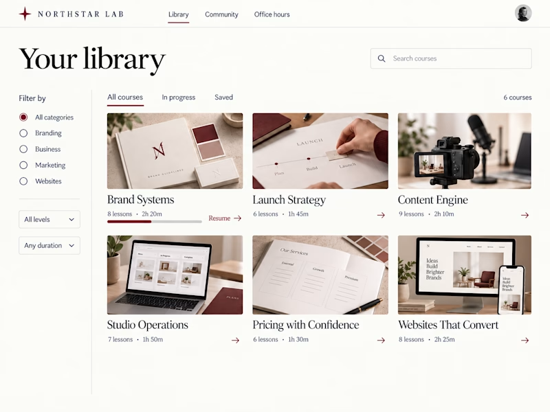
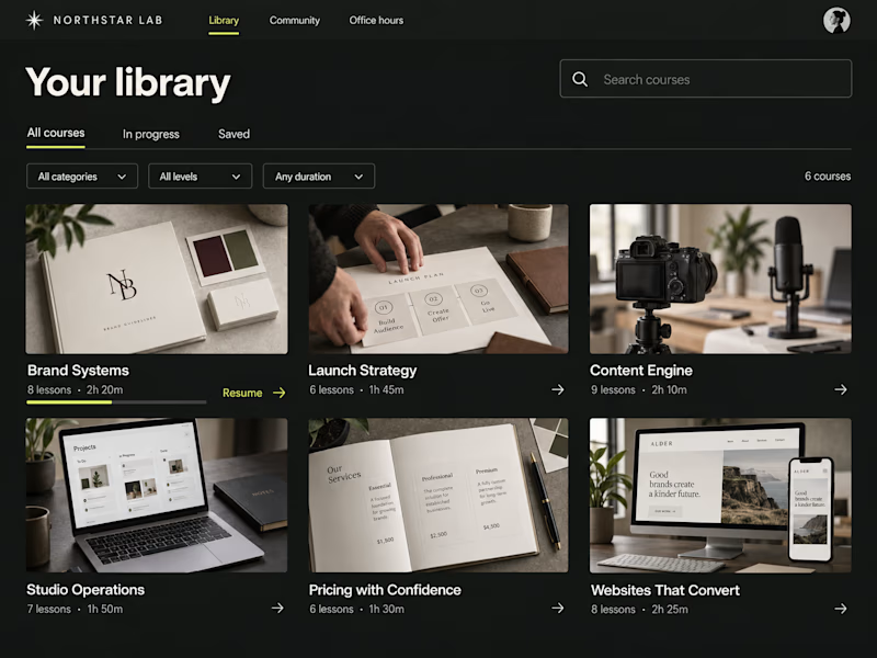
Two concepts for Northstar Lab, a fictional creative education brand. Same courses, two ways to browse:
A — Light Editorial: warm tones, serif type, and sidebar filters.
B — Dark Studio: charcoal, chartreuse accents, and compact dropdown filters.
Which would you rather learn in—and why?

38 votes
Ends in 12h


B, the chartreuse does it

Dark, if it have just 10-15% lesser opacity in bg color

Clean and professional. I prefer the light editorial style.

I’d go with B — Dark Studio. The darker interface feels more immersive and gives the content a stronger creative, studio-like character.

Both look really good! For some reason, I feel the dark version looks more polished. I’d love to see a light version with serif typography — I think that would look great as well. Excellent work!

GOing with the dark studio

A for me. When I'm actually learning I want it to feel calm, and sidebar filters are way easier to browse than dropdowns once the library grows.

Honestly Dark studio is better because it feels more premium specially with bold font it's nice

Light editorial is the winner for me


love the dark one

My gut says A for the warm tones, but honestly B's chartreuse accents feel like such an unexpected pop for an education brand. Did Northstar Lab's audience skew toward one aesthetic in your research, or is this genuinely a toss up?

i think for me. light does look better in this
The network for creativity
Join 1.25M professional creatives like you
Connect with clients, get discovered, and run your business 100% commission-free
Creatives on Contra have earned over $150M and we are just getting started




Related posts

2 same animations, different format. Which one do you like? Why??🤔
28 voted
50%
28 voted
50%
56 votes
Closed

The horizontal frame gives that line chart more room, but the square crop makes the red-to-blue type shift hit harder. Both feel tight.

What should a creative agency website actually feel like?
For Orvika, we didn't want another agency site built around the same safe layouts and predictable sections.
We pushed the visual direction further with oversized typography, editorial layouts, bold imagery, and stronger contrast, while keeping the experience structured enough to communicate the agency's work and capabilities clearly.
The goal wasn't just to make it look different.
It was to make the agency feel different.
Designed in Figma and built in Framer.
We're sharing more of the websites and digital experiences we've been working on here over the next few weeks.




Very neat man


B