The network for creativity
Join 1.25M professional creatives like you
Connect with clients, get discovered, and run your business 100% commission-free
Creatives on Contra have earned over $150M and we are just getting started
Back to feedPost
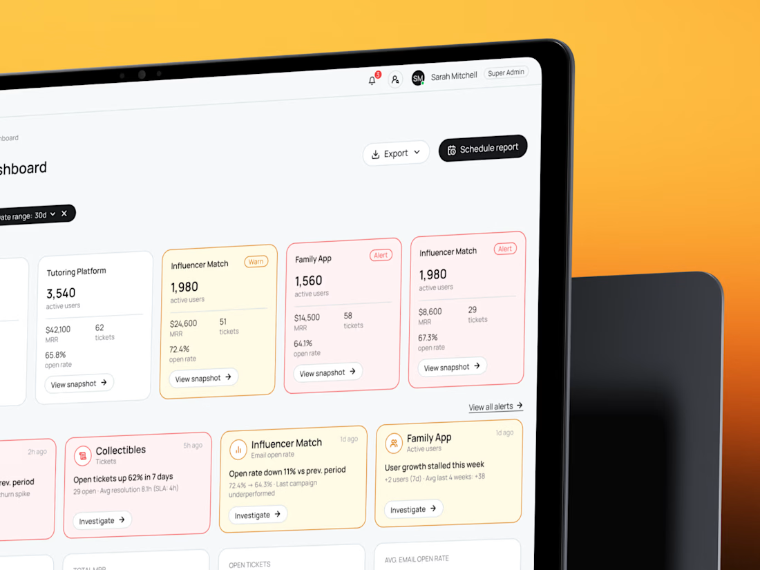
See how five products fit on one screen — B2B SaaS CRM dashboard and admin panel UX/UI🧡 Share your thoughts!

attention to operational detail here is top-tier! clean and functional admin panel. Loving the palette and layout hierarchy 🧡 Great case ❤️🔥

I'm super glad you noticed the details🤩

I bet it was a complicated task - to add 5 different products, but you did great!
Thanks, Kate☺️


Super clean UX, and not mediocre or average. We rate it 10/10! 🔥
10/10 from you guys means a lot😍

Dense B2B interfaces are judged by how quickly a user finds the next action. This structure makes that path visible, and I like that the admin panel keeps the same logic as the dashboard. 👍
The network for creativity
Join 1.25M professional creatives like you
Connect with clients, get discovered, and run your business 100% commission-free
Creatives on Contra have earned over $150M and we are just getting started








Related posts

Just published a new case study on Contra for Tiun.io 🚀
A 3-minute product launch video combining UI animation, motion graphics, and dynamic transitions to showcase their backend infrastructure platform.
Check it out and let me know what you think💭


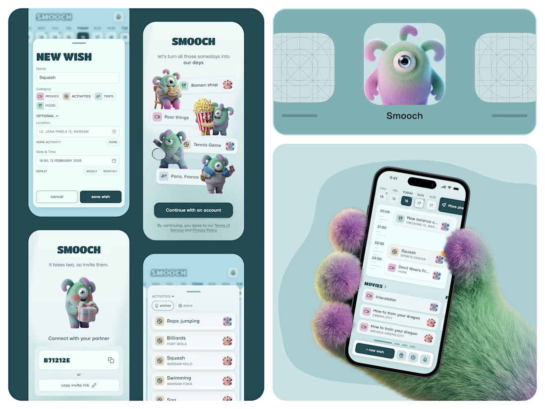
Smooch is live on the App Store 🥹
It started in January. My partner and I were planning trips for March and May, and suddenly realised we’d forgotten a movie we wanted to watch and a new Korean place we wanted to try. Big plans: fine. Small ones: gone.
So I built us a shared space for all those “we should try this someday” ideas. You save them together, drag one onto a day, and it becomes an actual plan.
I made it on my own: product, design, the build with Lovable, the website and the blog - Framer. 60 builds, a few App Store rejections, and one timezone bug that sent us to squash at 2am instead of 2pm xD
And there are no photos inside, just Smooches characters. Because who calls their person by their actual name anyway? (or it's just me there, huh)
The whole story is in the case study 🦄

That furry hand holding the phone is a scroll-stopper. These characters would be so fun animated, even just a little wiggle when a wish turns into a plan. Huge congrats on the launch.


Check it out
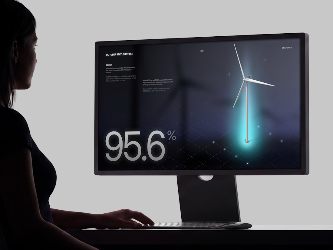
Just published: 0-1 design for an Energy Management System (EMS) ⚡
Designed a desktop platform monitoring wind turbines, PV parks, and battery storage across multiple sites. Keeping the interface mostly white, so green and red status indicators do the talking.
Operators managing critical infrastructure need to assess system health instantly. No visual noise, no cognitive overload. Just unmistakable state communication.


Cool work 👌