The network for creativity
Join 1.25M professional creatives like you
Connect with clients, get discovered, and run your business 100% commission-free
Creatives on Contra have earned over $150M and we are just getting started
Back to feedPost

Motion adds meaning, it earns its place. The animation isn’t decoration, it’s feedback that reduces uncertainty, keeps attention on status !


full version
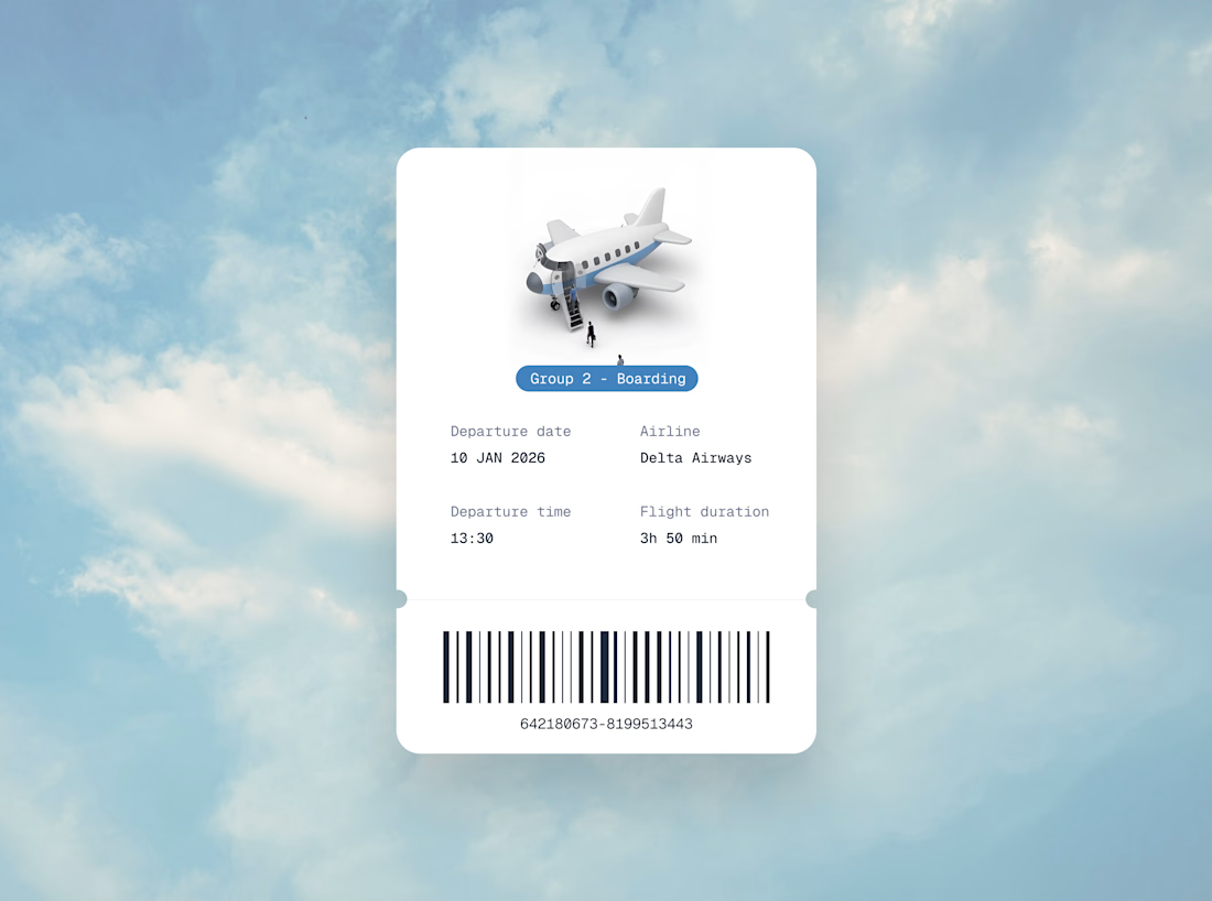
Thanks guys ! I hope airlines see this and design better boarding pass :) I never know which group is boarding

umm, so good, so different!

Motion wins over static displays most of the time. And you did that pretty well here )
It always does right !

This is such a good way to frame it — motion as feedback, not decoration.
When animation reinforces status + reduces uncertainty, it literally lowers cognitive load and builds trust in the UI. 🔥

Uuuu, animation well applied! 💯

Spot on! Motion design done right reduces cognitive load and keeps users engaged. The boarding animation is super clean!

Wow awesome😍 🔥

This would really be cool on an actual airline website

this is rlly good!

Great use of motion as feedback, reduces confusion

Goat winning idea it was ,Ved . Animations always do the job 🙌
The network for creativity
Join 1.25M professional creatives like you
Connect with clients, get discovered, and run your business 100% commission-free
Creatives on Contra have earned over $150M and we are just getting started

Challenges
View all


Related posts

It's all in the (motion) details
Editorial Motion Concept - Monument

NEXOR — Creative Digital Agency Website 🔥
NEXOR is a futuristic website concept for a creative digital studio focused on digital products, brand systems, and bold digital experiences.
The goal was to create a memorable first impression while keeping the agency’s services and next steps clear.
Special attention was given to:
• a bold hero composition with oversized typography and futuristic imagery;
• a vibrant orange and black palette that creates a distinctive visual identity 🟠;
• a strong visual hierarchy that balances creative expression with usability;
• clear CTAs for starting a project or booking a call;
• a contact form integrated directly into the hero section;
• responsive mobile layouts that preserve the visual impact 📱;
• a full-screen mobile menu with intuitive navigation and prominent contact options.
The result is an expressive digital experience that combines bold visual storytelling with a clear path to conversion.
Looking to create a distinctive website for your creative agency, digital studio, or technology brand? Let’s build something extraordinary together ⚡


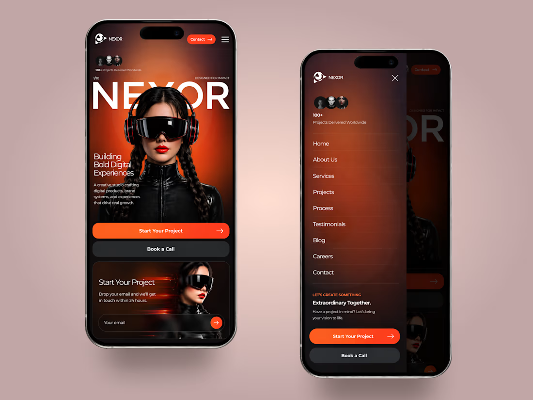
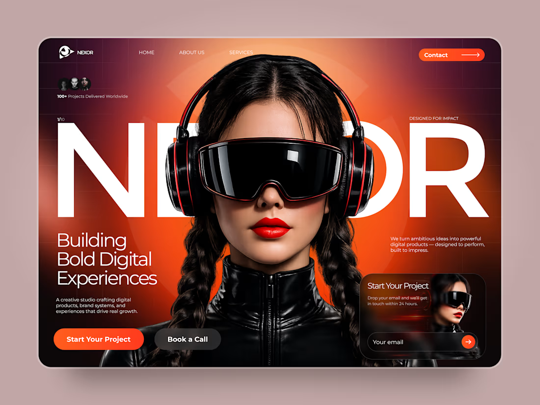
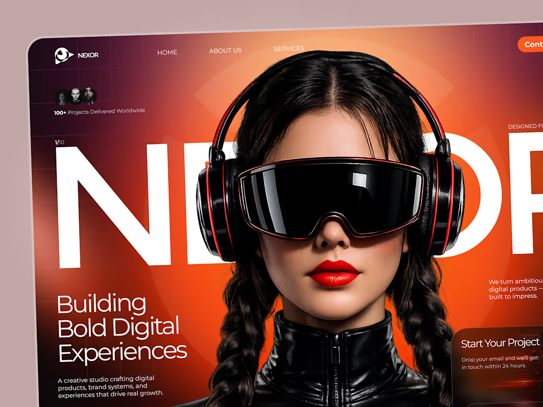

The orange-and-black system has real presence, and the mobile frames show the hierarchy holding together rather than just shrinking. The clear CTA placement is a smart counterweight to the oversized hero type.

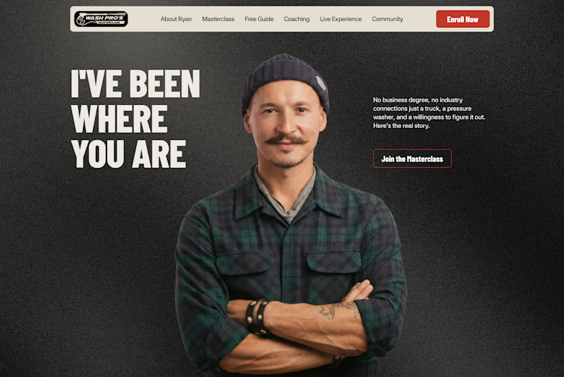
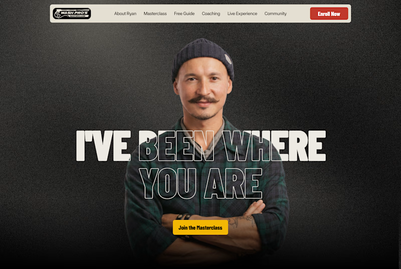
Which layout is better?
.
.
Curious which one wins? Follow along for more tests like this x.com/rightnextstep
20 voted
67%
10 voted
33%
30 votes
Closed

Hero 1 shows the hero text very well but you might need to work on the Hero CTA for "join the masterclass", I will probable miss it as a key action if I was a regular user