The network for creativity
Join 1.25M professional creatives like you
Connect with clients, get discovered, and run your business 100% commission-free
Creatives on Contra have earned over $150M and we are just getting started
Back to feedPost
Selected Works.
A collection of selected works from various projects —
each built with a different goal, but the same approach.
At NexaVisual, we don’t just design for visuals.
We design for clarity, intention, and impact.
Every project you see here represents:
– A problem to solve
– A message to deliver
– A visual system built with purpose
Different industries. Different styles.
But one consistent principle:
design that works, not just looks good.


Really like how clean and engaging this feels. If someone wanted to reach this level, what would you say makes the biggest difference in your process?

Thank you, I really appreciate that!
I think the biggest difference is focusing on clarity first—making sure the message is clear before making it look good. From there, I keep things minimal and consistent so users can easily understand and engage with the design.
The network for creativity
Join 1.25M professional creatives like you
Connect with clients, get discovered, and run your business 100% commission-free
Creatives on Contra have earned over $150M and we are just getting started
Related posts

Your design has 3 seconds to earn attention. Which skincare brand wins?
A leads with confidence, energy, and aspiration. B builds trust through nature, freshness, and simplicity.
Great design doesn’t just look good. It makes people feel the brand before they read a word.
A or B? Which would make you stop scrolling?

30 voted
52%
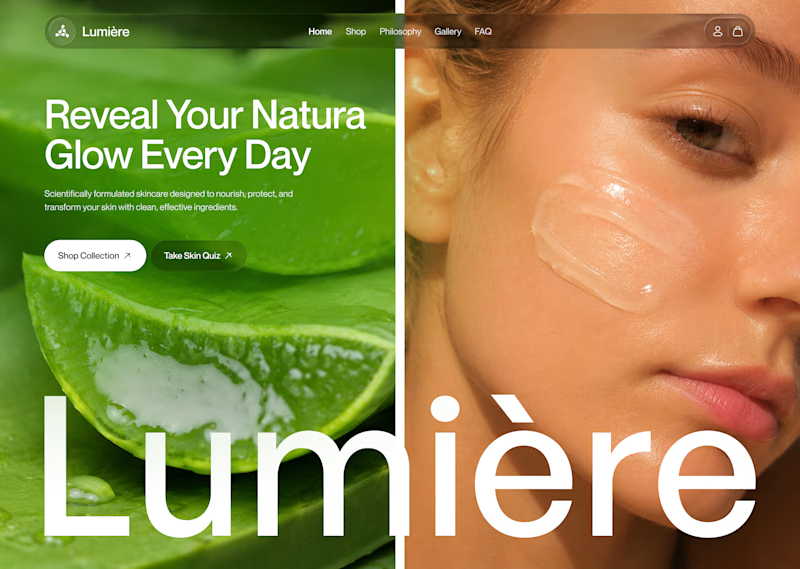
28 voted
48%
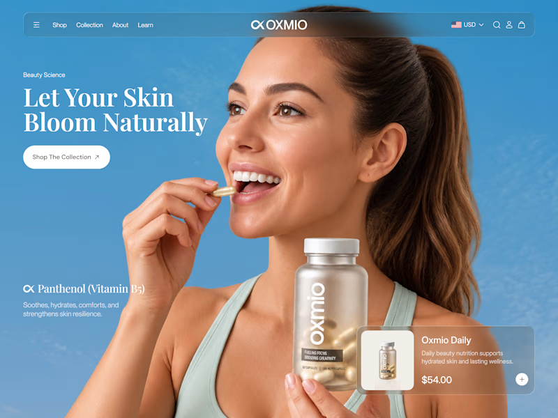
58 votes
Closed


B without questions


Designers, which direction would you go with: photography or illustration?
83 voted
69%
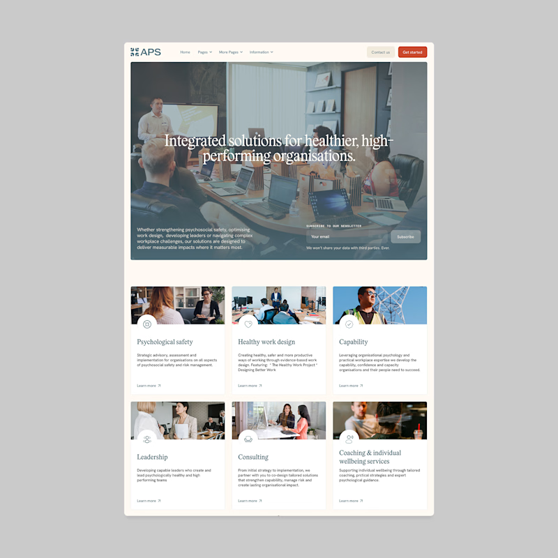
37 voted
31%
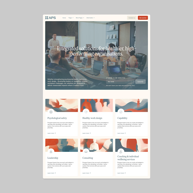
120 votes
Closed

I'll prefer photos, specially talking about organizations in your page, human faces and real scenarios can have a better effect in this case.


Celvana brand identity & packaging for a red light therapy brand launching in the US.
The category is crowded with identical, unbranded panels. Celvana sells precision, so the brand had to look like medical equipment you can trust: clinical, exact and professional.
Brand identity case study
Packaging case study

This is high end branding