The network for creativity
Join 1.25M professional creatives like you
Connect with clients, get discovered, and run your business 100% commission-free
Creatives on Contra have earned over $150M and we are just getting started
Back to feedPost
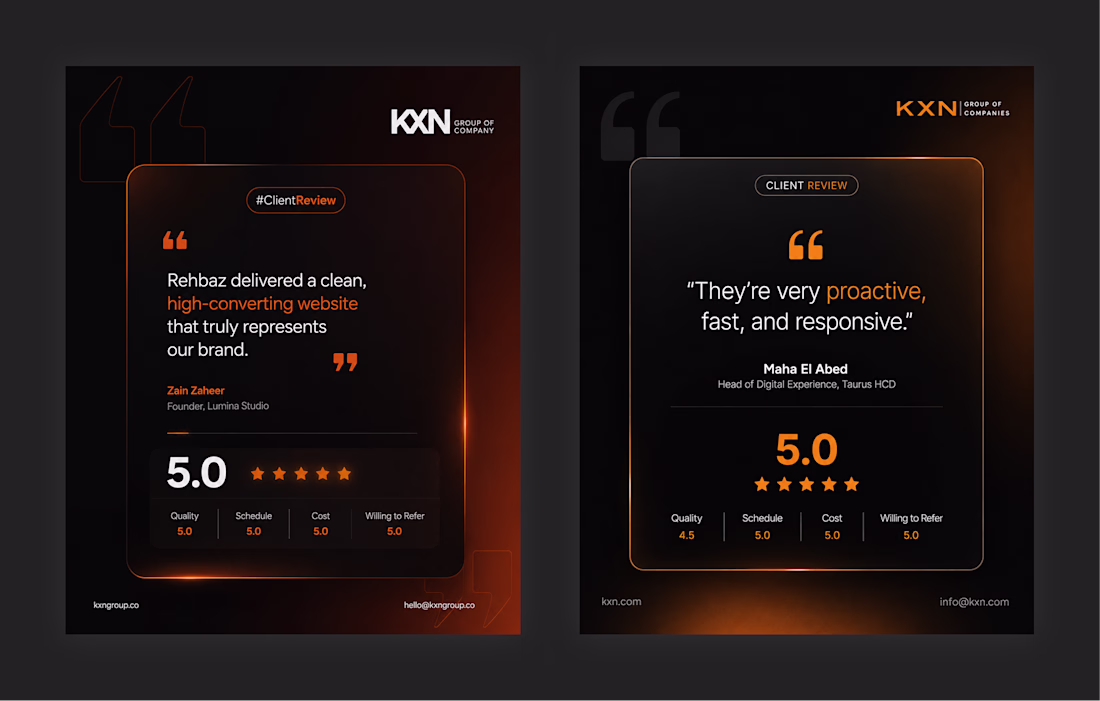
Most testimonial sections look forgettable.
So I explored 2 different directions for this client review card redesign:
→ Version 1 focused on bold energy and strong contrast
→ Version 2 focused on a softer premium feel
Same content.
Completely different emotional impact.
That’s the part most designers ignore:
UI is not only about layout.
It’s about perception.
Which direction works better for you — 1 or 2?
I like V2. I think the use of "white space" (in this case black space 😊 ) better highlights the positives.
best choice!
Nice work!
Amazing job!
The network for creativity
Join 1.25M professional creatives like you
Connect with clients, get discovered, and run your business 100% commission-free
Creatives on Contra have earned over $150M and we are just getting started
Related posts
Bureau — a dark PR & media agency Framer template. Team section featuring a halftone portrait effect built with a Canvas code component generated via Framer Workshop, customized and integrated into the full template design. Built in Framer.
Soo Coooollll!!!
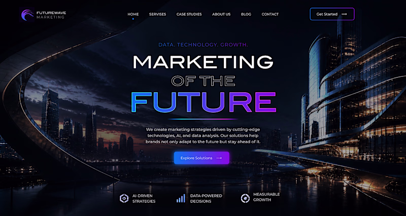
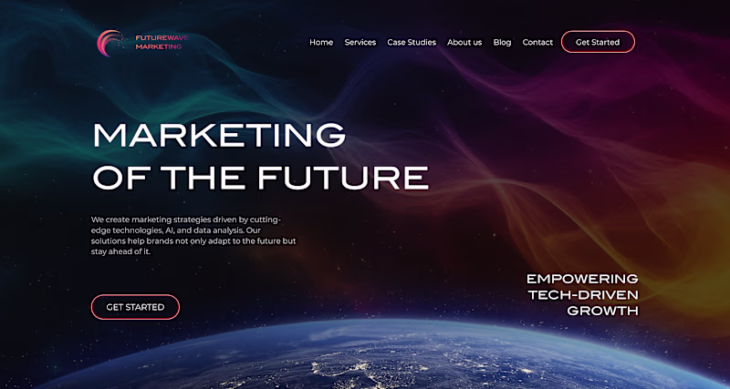
Sometimes a website doesn’t need a full rebuild – just a clearer, more modern experience. We recently redesigned this homepage and simplified the layout, messaging, and structure. Curious which version you’d trust more at first glance: old or new?
29 voted
50%
29 voted
50%
58 votes
Closed
Wow this is cool
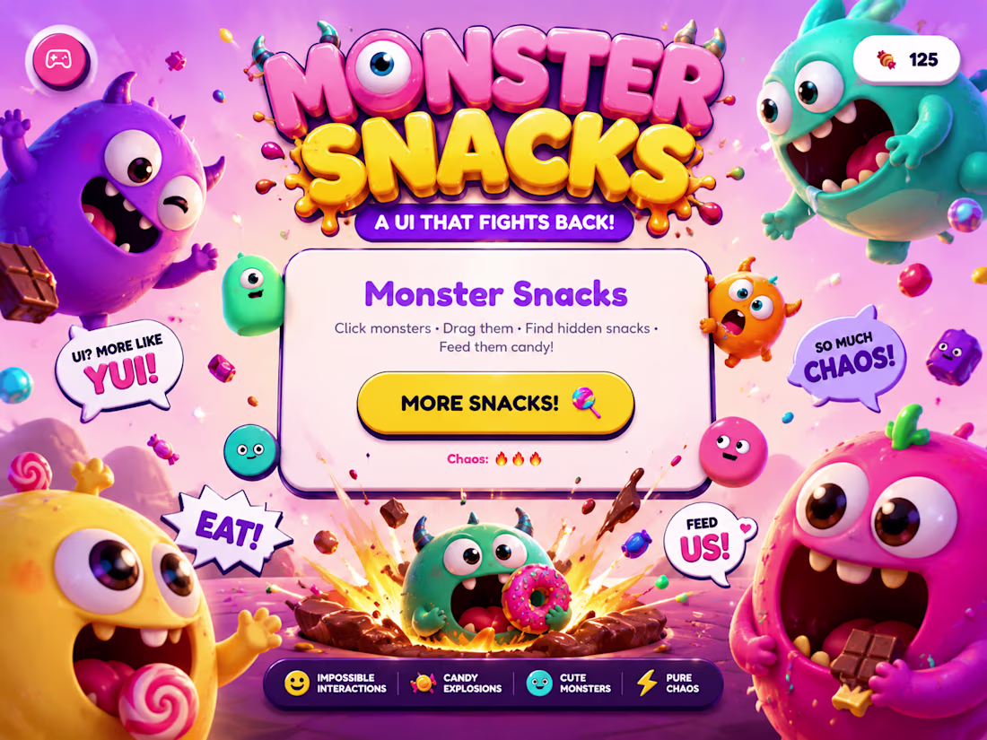
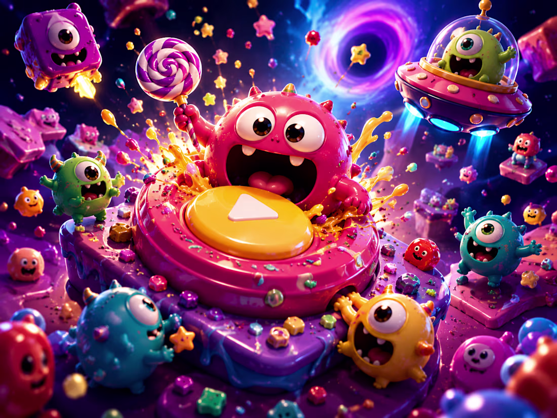
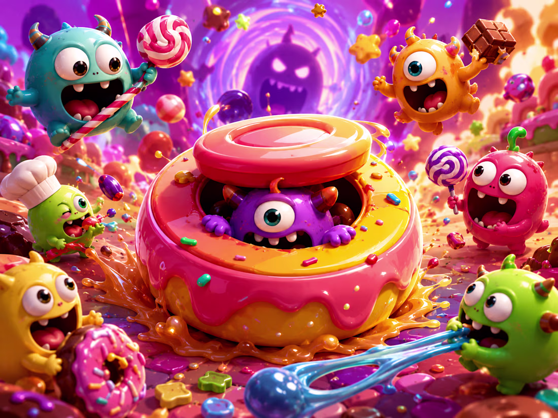
Most interfaces are designed to be used.
I wanted to build one that wanted to play back.
And here's Monster Snacks — a living cartoon UI where tiny chaotic monsters exist inside the interface itself.
Buttons panic when hovered. Menus stretch like chewing gum. Cards bounce with jelly physics. Monsters eat UI elements, chase the cursor, trigger candy explosions, and turn the entire screen into a playable animated playground.
The goal wasn’t to make a “clean UI”.
It was to create something that feels: ✨ impossible ✨ alive ✨ weirdly joyful ✨ impossible to ignore
Every interaction was designed with exaggerated squash/stretch motion, playful chaos, cartoon physics, and nonstop visual reactions to make the interface feel more like an animated toy universe than a website.
Built with Rive for the Impossible UI Challenge 🍬👾
yoo , this is really good.
Trending
Claude
Claude has entered the design space. How are you using Claude Design?
Contra University
Learn from expert creatives how to earn more using next-gen AI tools.
creativeaiflow
Creative AI workflows are evolving. What tools do you use, and what are their strengths and weaknesses?
portfolioreview
The best portfolios tell a story, not just show a grid. Share yours for feedback.
freelancerlife
Freelancer life is wins, pivots, and everything in between. What’s yours right now?