The network for creativity
Join 1.25M professional creatives like you
Connect with clients, get discovered, and run your business 100% commission-free
Creatives on Contra have earned over $150M and we are just getting started
Back to feedPost
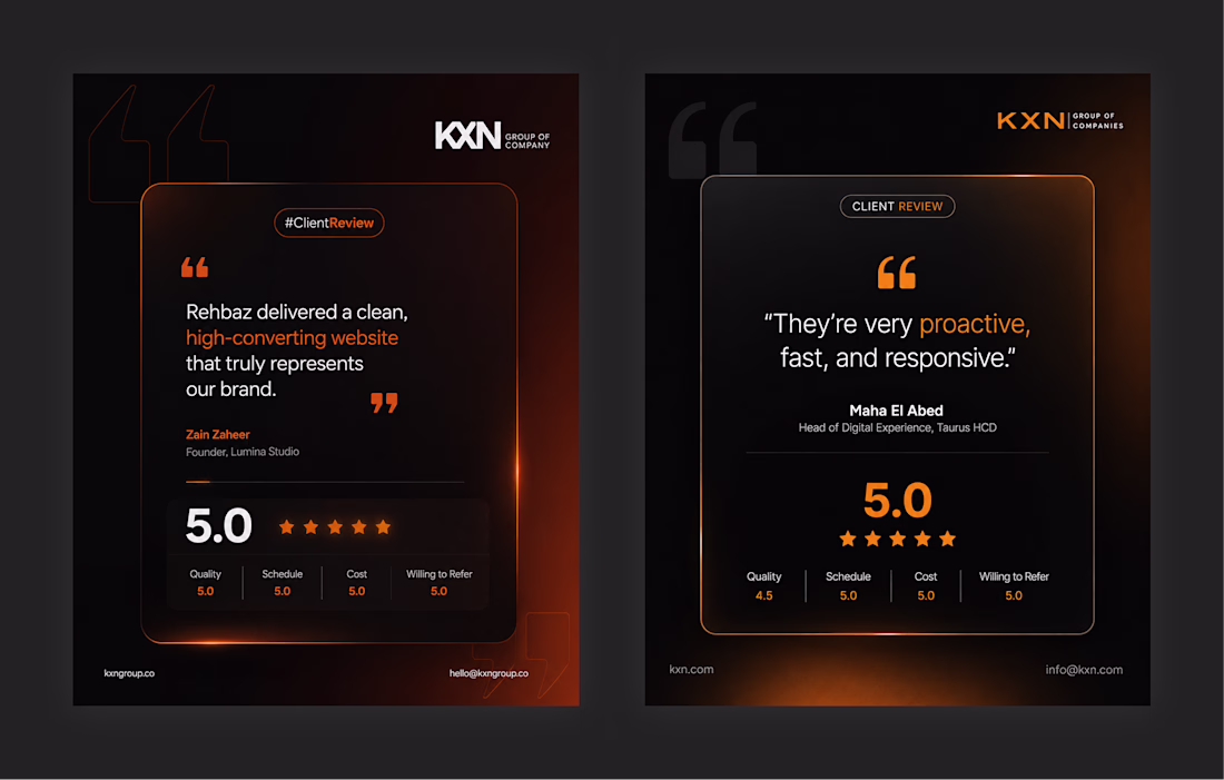
Most testimonial sections look forgettable.
So I explored 2 different directions for this client review card redesign:
→ Version 1 focused on bold energy and strong contrast
→ Version 2 focused on a softer premium feel
Same content.
Completely different emotional impact.
That’s the part most designers ignore:
UI is not only about layout.
It’s about perception.
Which direction works better for you — 1 or 2?
Nice work!
I like V2. I think the use of "white space" (in this case black space 😊 ) better highlights the positives.
best choice!
Amazing job!
The network for creativity
Join 1.25M professional creatives like you
Connect with clients, get discovered, and run your business 100% commission-free
Creatives on Contra have earned over $150M and we are just getting started
Related posts
I designed EyeText 👁️, an eye-controlled communication experience for people who have difficulty speaking or using their hands.
Using eye tracking and intentional blinks, users can navigate a keyboard, create messages, and convert them into speech. The experience also includes personalized calibration and quick communication cards for everyday needs.
What excites me most about this project is how quickly an idea became reality. Using Figma Make, I was able to transform a concept into a working interactive experience with a single prompt.
Design, accessibility, and technology coming together to help people express themselves.
🔗 Live Demo:https://serif-modify-89640782.figma.site
🔗X / Twitter Post: https://x.com/Naghdaliyevaart/status/2067282836021776819?s=20
This hero section background lowered my cortisol, great work Nigar!
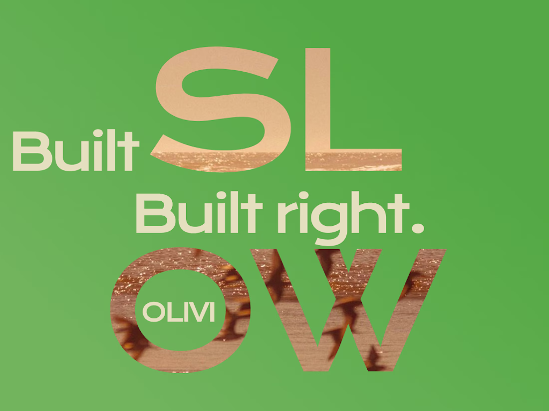
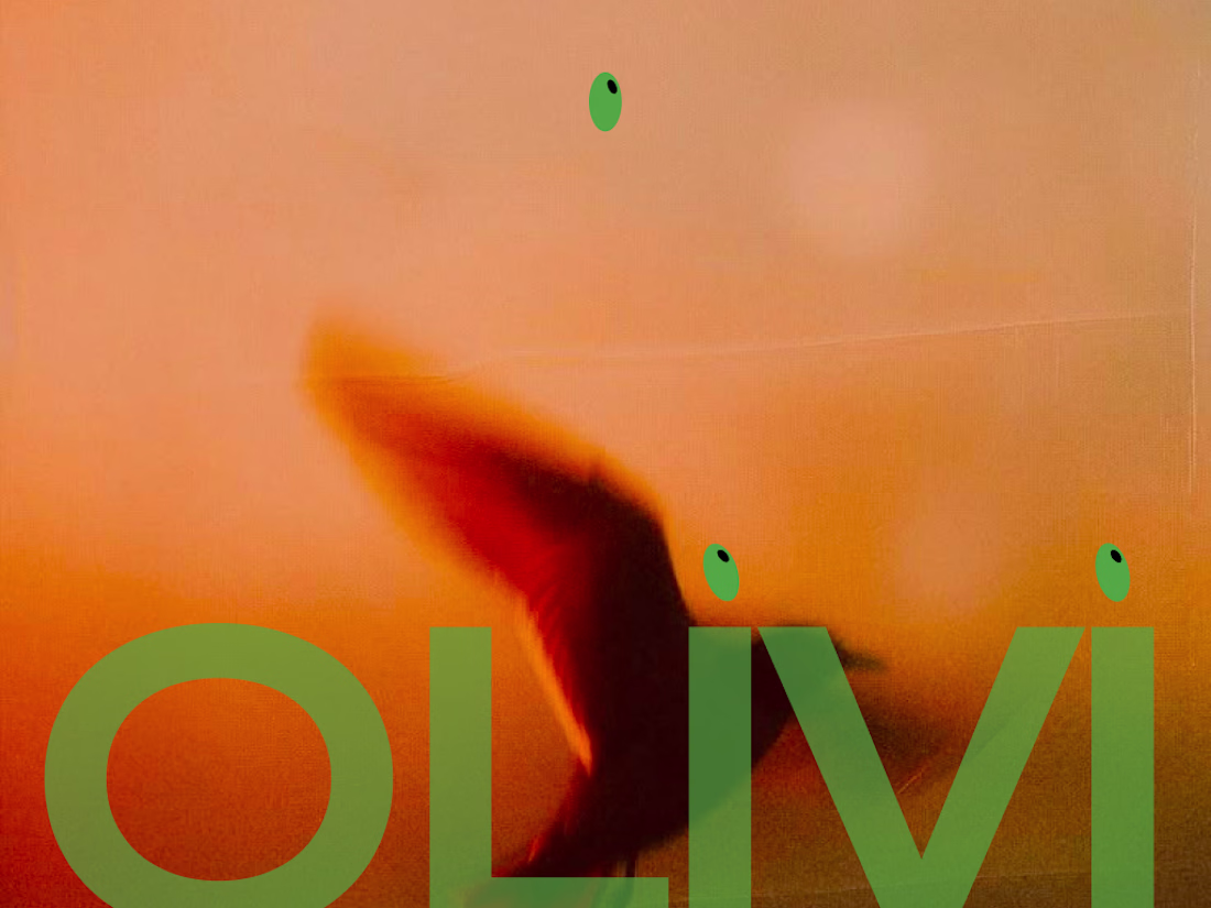
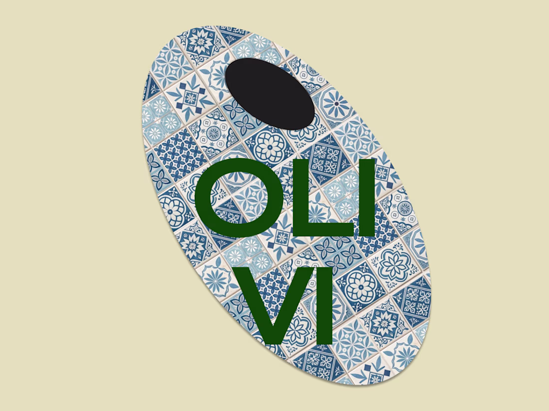
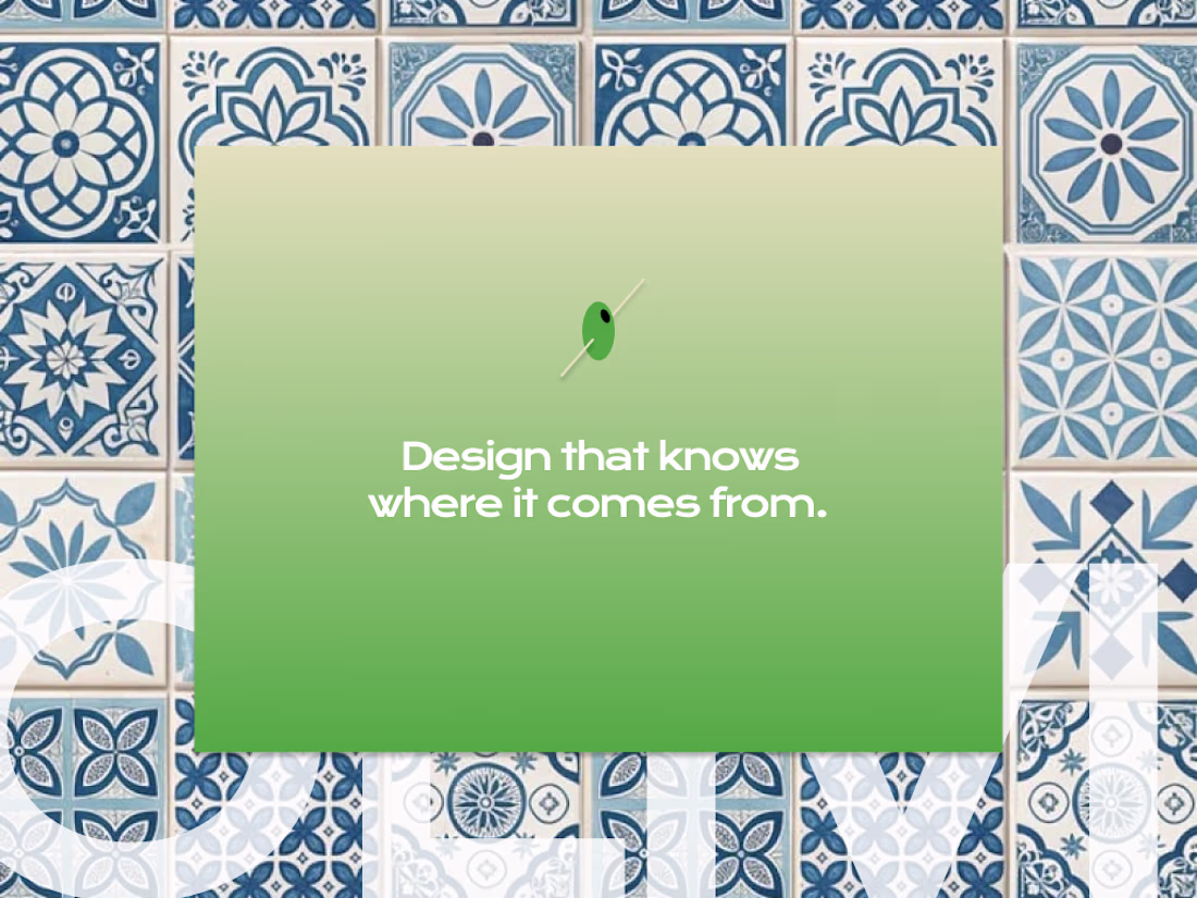
The brief was mine.
The constraints were real.
OLIVI is a branding and UI/UX studio identity built without a client, which meant no excuses.
Case study thread coming.
Amazing!
Amazing!
Trending
Claude
Claude has entered the design space. How are you using Claude Design?
Contra University
Learn from expert creatives how to earn more using next-gen AI tools.
MagicPath
The canvas is infinite, and exploration is becoming the workflow. How are you using MagicPath?
creativeaiflow
Creative AI workflows are evolving. What tools do you use, and what are their strengths and weaknesses?
freelancerlife
Freelancer life is wins, pivots, and everything in between. What’s yours right now?