The network for creativity
Join 1.25M professional creatives like you
Connect with clients, get discovered, and run your business 100% commission-free
Creatives on Contra have earned over $150M and we are just getting started
Back to feedPost
A client running a quantity-discount bundle on her leggings page messaged us confused: the bundle only let shoppers pick one size, even though the product itself had six sizes plus four colors.
Turns out the bundle app had snapshotted the product's variants back when it only had one size live. Sizes and colors added later never flow through automatically, since the bundle keeps its own copy of what it saw at build time.
The fix was a re-sync: open the bundle, re-attach the product, and it pulls in the current variant list. Nothing else about it, design, pricing tiers, copy, needed to change.
We build and run our own bundle app for this reason (Sleek Bundles Upsell), but this isn't specific to it. Any bundle, quantity-break, or variant picker app that snapshots a product on setup can go stale the same way.
Five-minute check: if you've added a size, color, or variant to a product since you first built a bundle or quantity discount on it, open that bundle and confirm every current option actually shows. A stale bundle doesn't throw an error, it just quietly limits what people can order.
Ecom Swift LLC

The network for creativity
Join 1.25M professional creatives like you
Connect with clients, get discovered, and run your business 100% commission-free
Creatives on Contra have earned over $150M and we are just getting started
Challenges
View all


Related posts


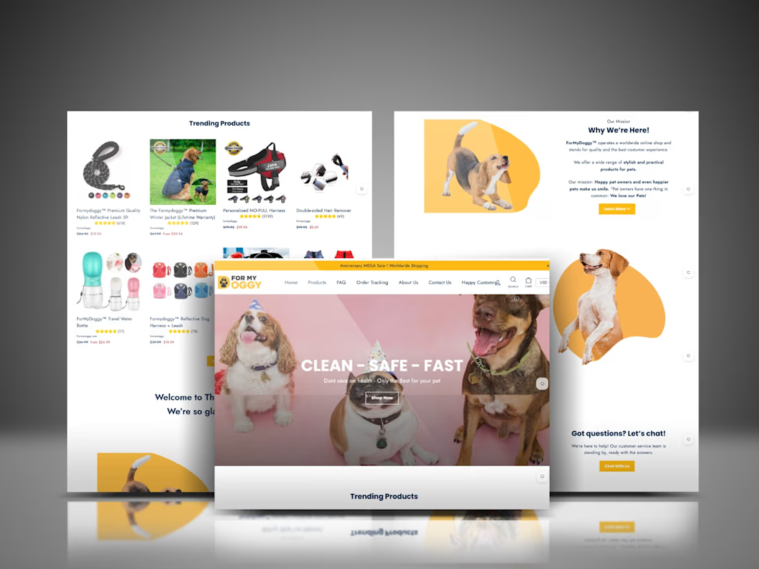
The trust bar before any product shows is the right call for pet gear specifically, the buyer isn't the one wearing the harness so safety proof has to land before style does. At 74 orders and 5.79% returning this early, is the repeat rate coming mostly from the email capture, or...

How do you make a beauty Shopify store feel premium without sacrificing conversion?
That was one of the questions behind my work on BLOME Beauty.
I focused on creating a shopping experience where brand storytelling, product education, trust signals, and conversion paths work together not compete with each other.
From product discovery and visual hierarchy to CTAs, social proof, mobile responsiveness, and the path toward checkout, every section was designed with the customer journey in mind.
The goal wasn't just to make BLOME look beautiful. It was to make the experience easier to understand, navigate, and buy from.
Built with Shopify.
Beauty is the category where product education usually loses to the aesthetic. Curious how you handled ingredient/claim detail on the PDP itself, woven into the page, tucked into an expandable section, or pushed to a separate guide? That's usually the tradeoff between a store...

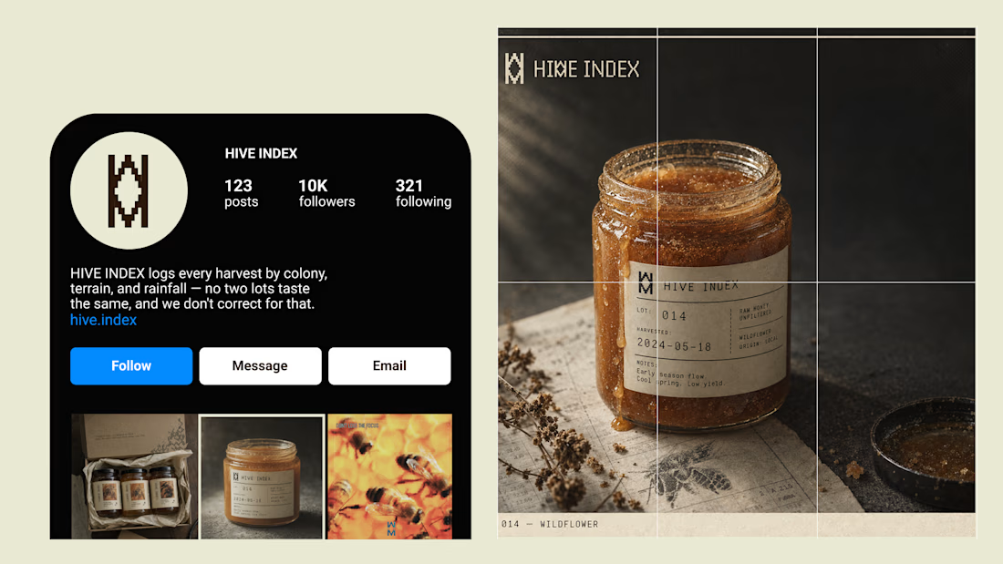
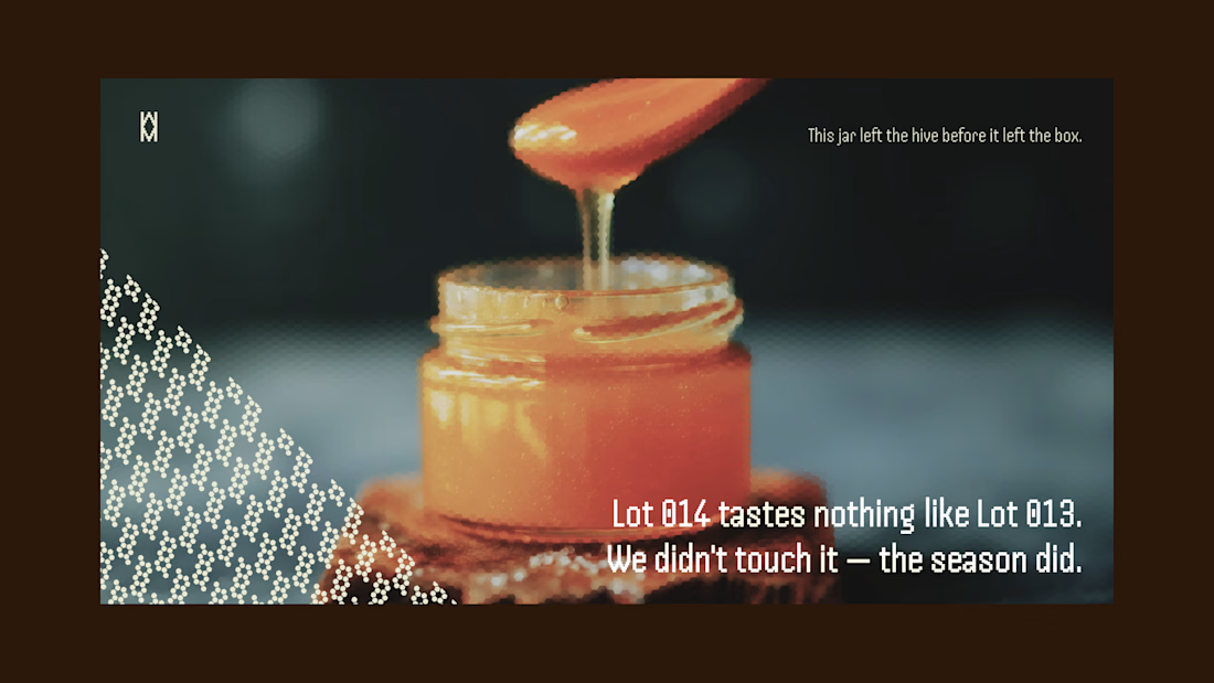
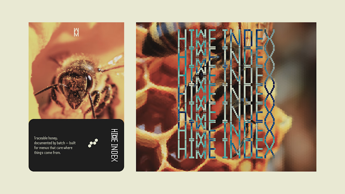
Most honey brands hide how much a jar changes harvest to harvest. I built HIVE INDEX to document it instead: specimen numbers, harvest dates, tasting notes logged like lab evidence, not marketing copy.
Case study's up.