The network for creativity
Join 1.25M professional creatives like you
Connect with clients, get discovered, and run your business 100% commission-free
Creatives on Contra have earned over $150M and we are just getting started
Back to feedPost

MAE — Art Direction & Brand Visual Identity
A visual identity concept developed for MAE, built around the idea of “Controlled Energy — Movement in Contrast.” The direction explores the tension between individuality and constant movement, using a sharp central subject surrounded by blurred figures to create a strong visual narrative.
The Challenge
The goal was to create a visual language that felt distinctive, contemporary, and emotionally engaging without relying on excessive graphics or conventional branding. The challenge was to communicate movement and energy while keeping the brand feeling refined, minimal, and controlled.
The Solution
I developed an art direction centered around contrast — stillness vs. movement, focus vs. distraction, and individuality vs. the crowd.
The orange environment creates a bold visual signature, while the motion-blurred silhouettes represent the constant movement surrounding the individual. The sharply focused central figure becomes the visual anchor, communicating confidence, identity, and control.
The same visual language was then extended into the brand composition through minimal typography, logo placement, graphic symbols, and structured spacing, creating a system that can work across campaigns, social content, editorial layouts, and brand communications.
My Role
Art Direction · Brand Identity · Visual Concept · Graphic Design · Typography · Brand Composition
I was responsible for developing the visual concept, defining the art direction, establishing the graphic language, and translating the concept into a cohesive brand presentation.
Concept → Art Direction → Visual System → Brand Application
Product DesignAdobe Premiere ProvisualidentityBrand DesignLogo DesignVisual DesignAdobe IllustratorAdobe PhotoshopFigma


Love this!
Thank you!

Clean work, like it
thanks Brother

Amazing work
Thanks, appreciate it

Controlled energy is a great concept and the visuals really deliver on it. Sharp work Danar
Thanks, Tabish. really appreciate the kind words! Glad the concept and visuals came through the way I intended.

Thanks, appreciate it

Using the motion-blurred figures as the system's way of encoding the brand world around the individual is a clean way to carry the concept into every touchpoint — the contrast is doing the narrative work instead of added graphic elements. The orange read as a deliberate move to...
Thanks for the thoughtful feedback! I really appreciate your perspective.
Thanks, Danar - happy the read was useful. The MAE direction is a strong one and the way you carried contrast into the system makes it feel like it could live beyond a campaign. Keep pushing it.
The network for creativity
Join 1.25M professional creatives like you
Connect with clients, get discovered, and run your business 100% commission-free
Creatives on Contra have earned over $150M and we are just getting started


Related posts

Rofella - Brand Expressions


The serif wordmark against that warm, textured paper feels so confident and timeless, and the deep burgundy gives the whole identity real character. Beautifully restrained work, keep going! Did the paper texture come from a real scan or did you build it digitally?

Are you still designing Brand Guidelines presentations from scratch?
I created this Mini Brand Guidelines template as a modular, editorial-style system built to help designers and studios present brand identity work with structure and clarity in no time.
Whether you’re delivering a new identity to a client or documenting internal brand assets, this template provides a confident, consistent framework.
Tap the link above to get it.

Clean and smooth, love it

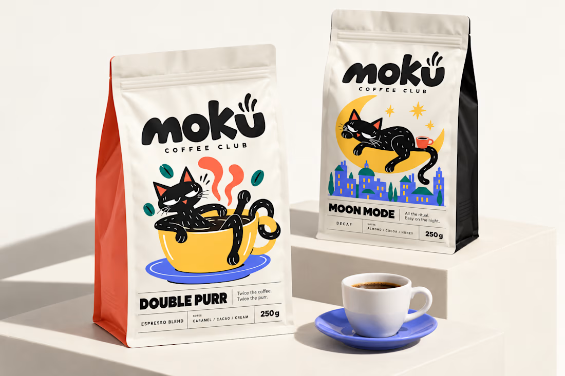
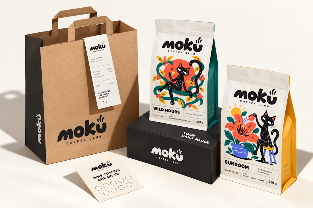
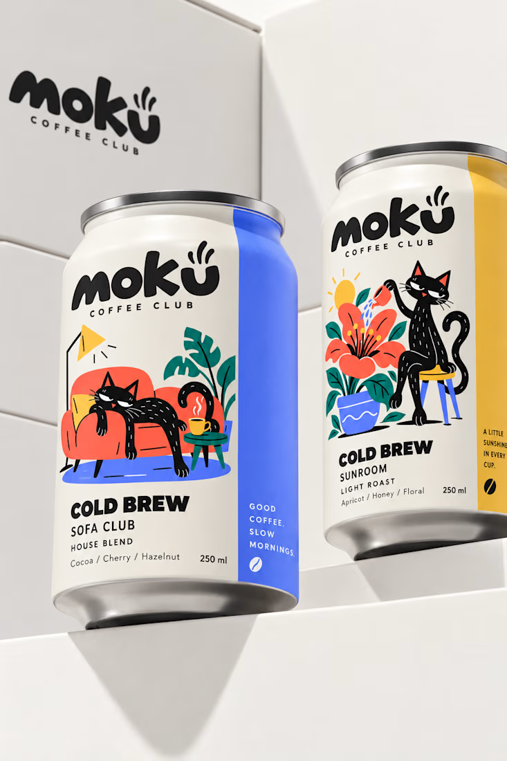
What if coffee packaging had a personality? 🐾
I designed Moku’s whole world, from bags and cold brew cans to drip packs and cups, around a cat who’s always having a better day than you.
See the full project and let me know what you think!

Woow Jerin that's stunning🔥🔥
The colors was so vibrant that's unbelievable