The network for creativity
Join 1.25M professional creatives like you
Connect with clients, get discovered, and run your business 100% commission-free
Creatives on Contra have earned over $150M and we are just getting started
Back to feedPost
Taste Test

Nailing down the final grid for L8.nite coffee bags.
Left or Right?
Look closely at the central spacing and let me know which arrangement feels more balanced.
6 voted
33%
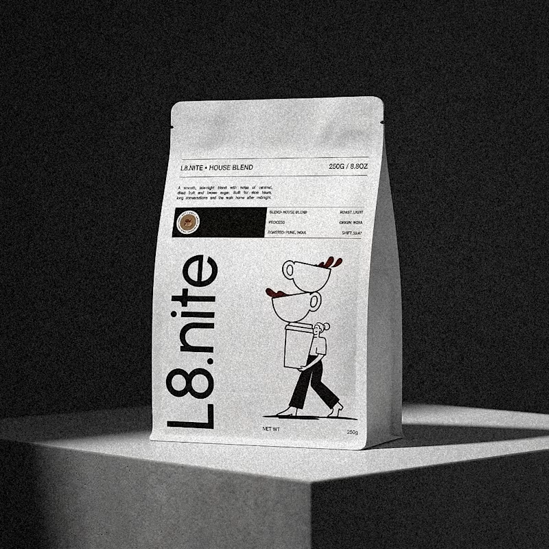
12 voted
67%
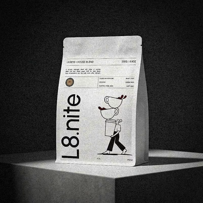
18 votes
Closed

The 02 one, definitely! It just makes the whole look more cohesive and your eyes immediately go to "L8.nite" or the illustration

2 lifted grid

The top one feels alot better ❤️❤️

02 feels stronger to me. The central spacing feels more even and comfortable.

Wow

01 Dropped Grid for me. Sitting the mascot slightly lower gives the bag more breathing room above and makes the character feel like it is walking out of the pack. Lifted looks tidier but Dropped has more personality, which is what a coffee brand called L8.nite should have.


Loved the Lifted Grid!

Lifted grid for me. The extra air under the mascot makes the bag feel less crowded.

2 lifted grid
The network for creativity
Join 1.25M professional creatives like you
Connect with clients, get discovered, and run your business 100% commission-free
Creatives on Contra have earned over $150M and we are just getting started





Related posts


Professional work Sergey

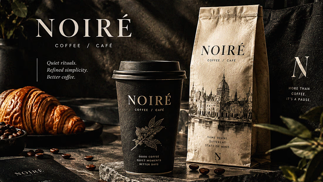
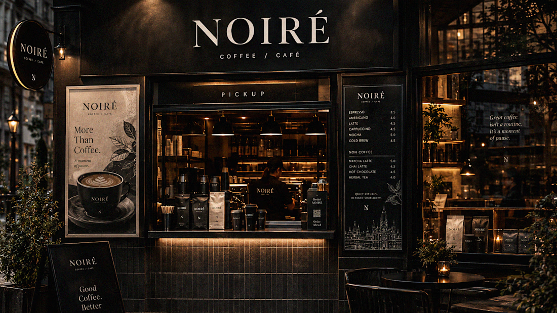
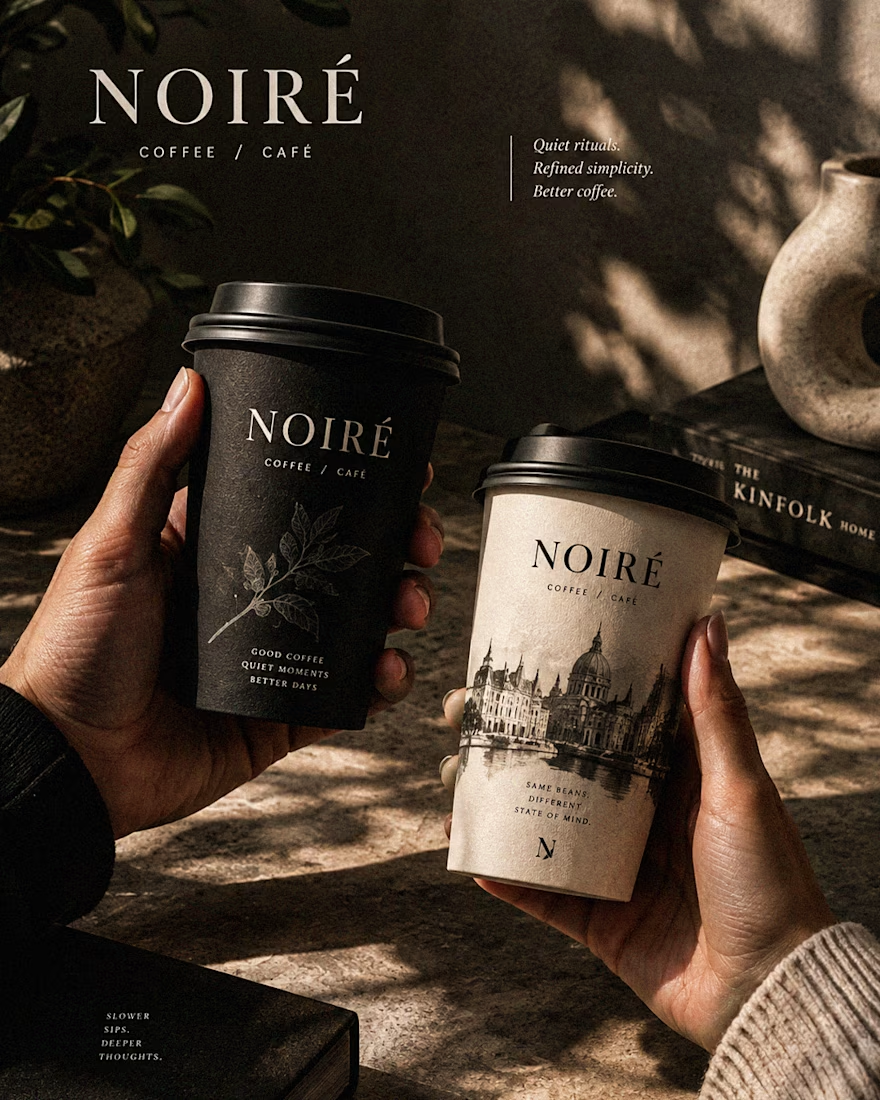
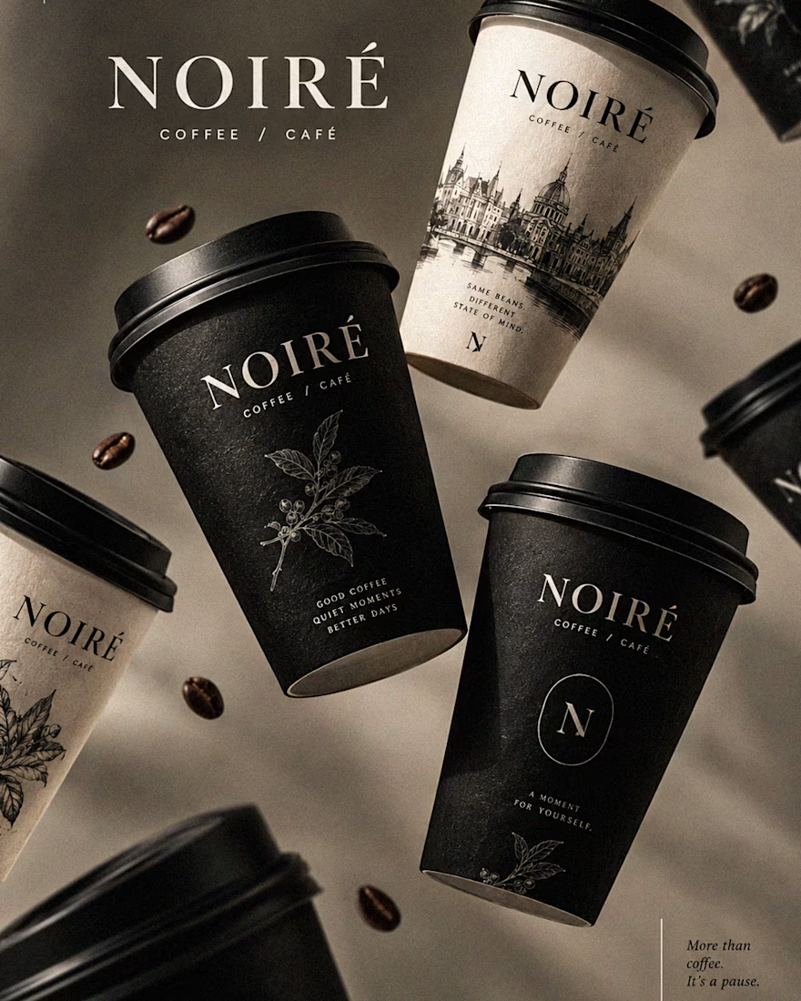
I Just Created NOIRÉ 🔥
A Coffee Brand Built Around the Pause.
NOIRÉ is a premium café brand built around a simple idea:
Great coffee should feel like a moment of pause, not another part of the
routine.
The project explores a complete visual identity, packaging
system, takeaway cups, coffee bags, tote bags, menu design, café applications and lifestyle campaign direction.
Instead of relying on the usual loud coffee aesthetics, I
built NOIRÉ around deep charcoal, warm ivory, soft graphite, refined
typography, subtle botanical illustrations and quiet editorial compositions.
The visual language is intentionally dark, tactile, and understated - giving every touchpoint the feeling of a slow morning, a quiet table, and coffee worth taking your time with.
From the cup in your hand to the café around you, every detail was designed to make the brand feel like a ritual.
Waiting for your thoughts in the comments 🙌🔥
branddesignertastetestBrand DesignGraphic DesignPackaging DesignAdobe IllustratorAdobe InDesignAdobe Photoshop




Which Kajabi course outline makes you want to enroll?
Same course. Two directions: a clean accordion or visual module cards.
Vote below. What tipped the scale for you?

10 voted
33%
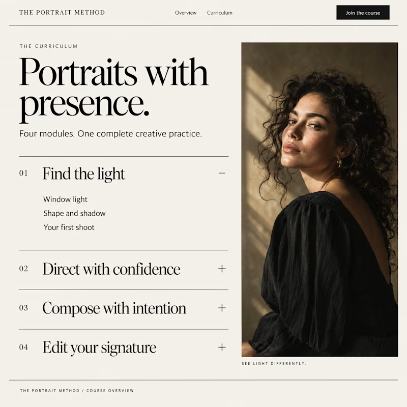
20 voted
67%
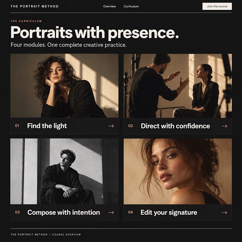
30 votes
Closed

Visual module cards win every time for user engagement—they give buyers an immediate sense of structural depth before they even enroll.