The network for creativity
Join 1.25M professional creatives like you
Connect with clients, get discovered, and run your business 100% commission-free
Creatives on Contra have earned over $150M and we are just getting started
Back to feedPost
Taste Test


Which Kajabi course outline makes you want to enroll?
Same course. Two directions: a clean accordion or visual module cards.
Vote below. What tipped the scale for you?

10 voted
33%
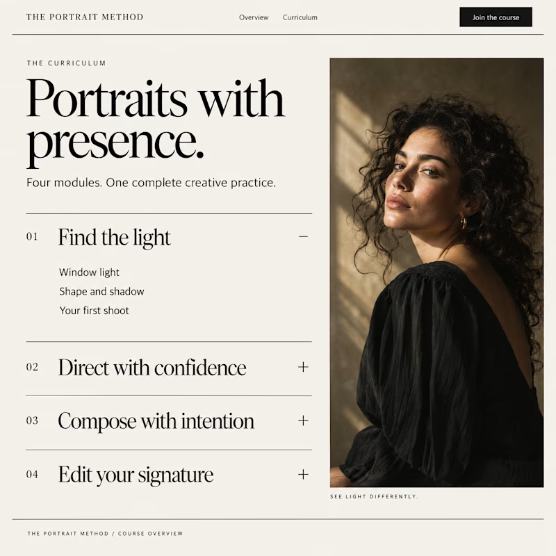
20 voted
67%
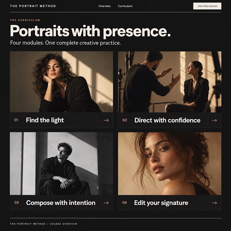
30 votes
Closed

Visual Modules attracts me!!

Accodrion seems better.

Visual module looks more like a course selection interface, the accordion right now is looking like a plain info section but it def looks more premium.

Visual module cards win every time for user engagement—they give buyers an immediate sense of structural depth before they even enroll.

Visual Module Cards for me. Mostly because the section header text says “Portrait with presence” so I was expecting to see “Portraits with presence”. If you get what I mean.

Visual modules give learners an at-a-glance view of the entire course content and structure.

I think "Visual module cards" more better.
The network for creativity
Join 1.25M professional creatives like you
Connect with clients, get discovered, and run your business 100% commission-free
Creatives on Contra have earned over $150M and we are just getting started











Related posts

Two visual directions for the same brief. Which do you prefer?
2 voted
29%
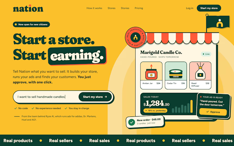
5 voted
71%
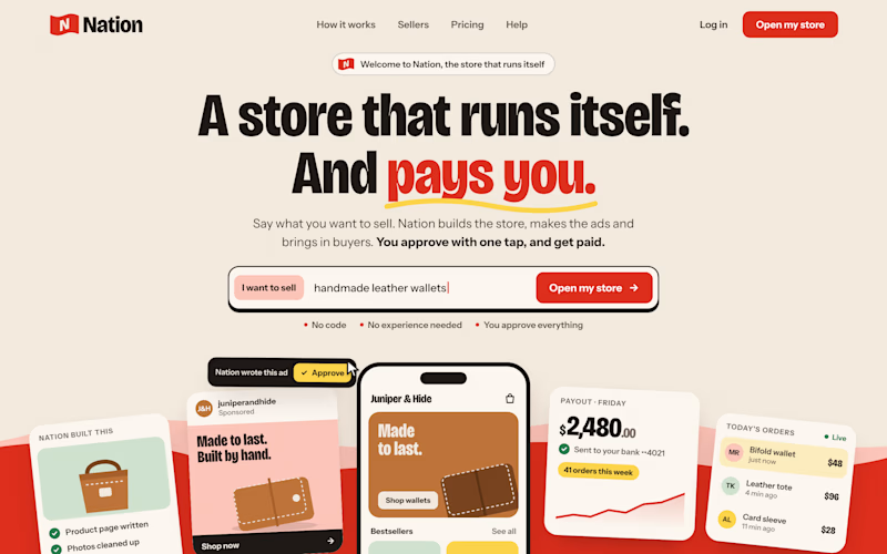
7 votes
Closed

Direction A is more better to me it feels modern professional cartoony style that's impressive ❤️❤️
Great job Ayoub🔥🔥

Design Exploration: Hero Section of Architecture Website. Which one do you think much better?


12 voted
43%
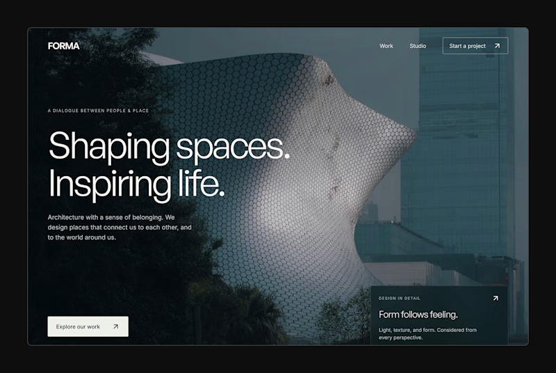
16 voted
57%
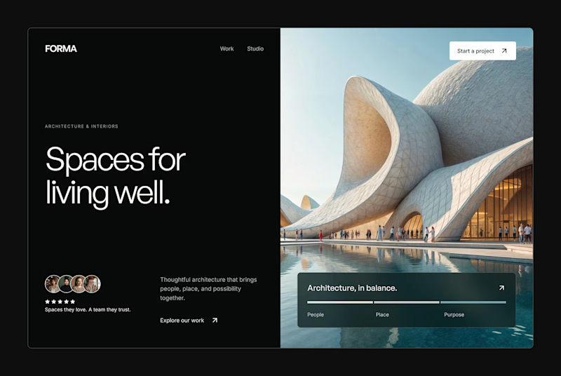
28 votes
Closed


This week client came to me with a new idea for their app's share feature. They were trying something with Claude... But let's simplify this thingy:)
Let's remove all the buttons that confused me already - imagine what they'd do to a user...
Take our predefined bottom sheet and give our users 3 simple choices.
GOALS:
make it as simple as possible for our target persona (35-55 y/olds that aren't necessarily as modern and advanced in tech)
Create an aesthetically pleasing UI frame for stories, that makes people want the app & their lifestyle.
Which one would you go with?
SPOILER ALERT 🚨 we absolutely went with the after result😆
0 voted
0%
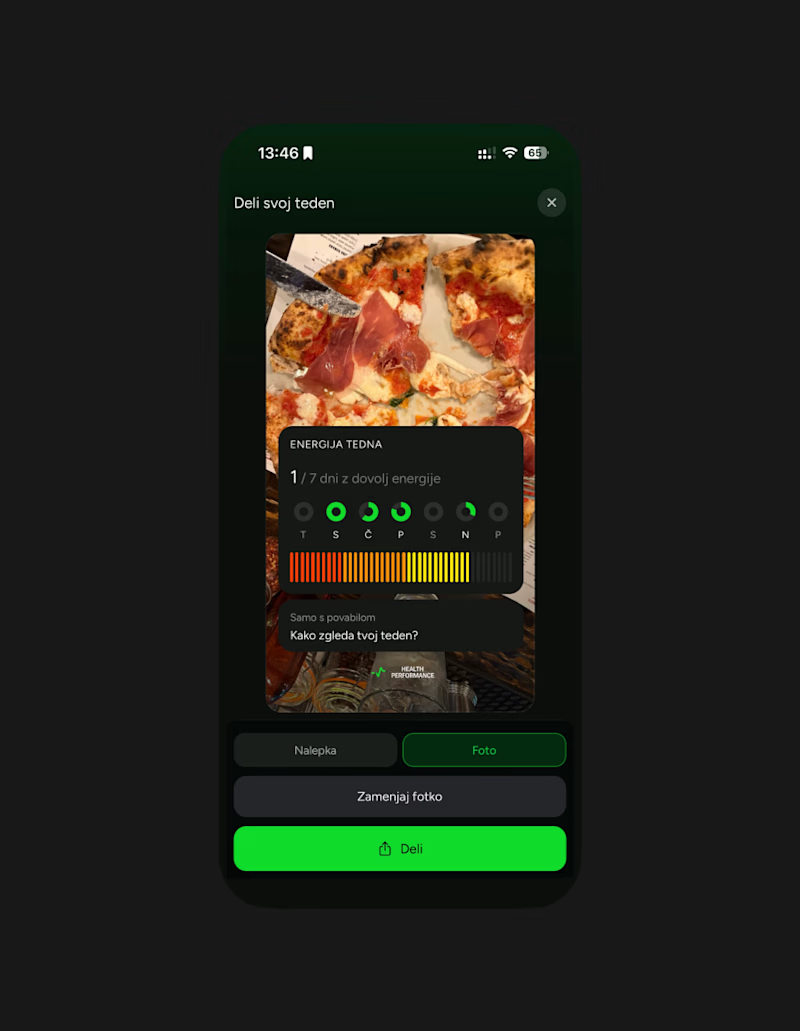
5 voted
100%
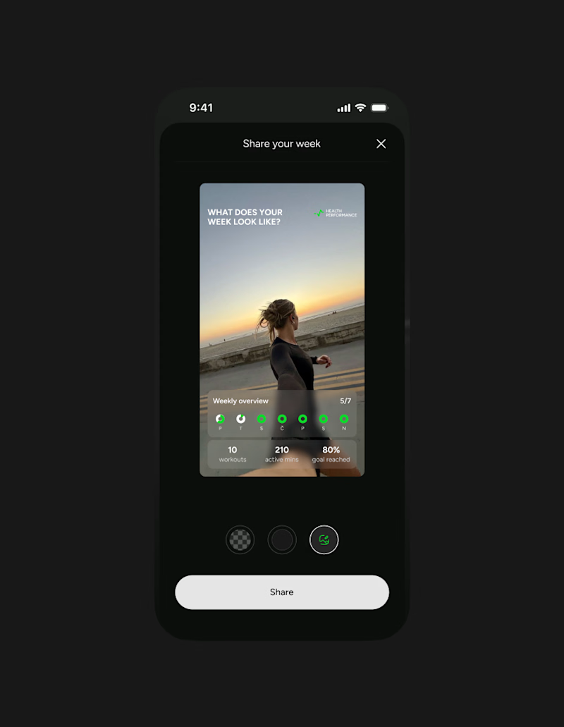
5 votes
Closed

Afterrrrr😊